Detached house project
-
Your rainwater pipes look quite big for such a small roof, unless you live in a monsoon district. There's no reason why you can't have the pipes away from the wall as long as they are self-supporting or suitably braced. If you go down that route I would make them look like they are supporting the roof.
The downstairs ceiling looks like it is on fire! It might not look so bad once you have landscape reflections as well.
Good start

-
Nice wall texture. Be careful where you crop your images - on the first one, the very tip of the roof is cut off (on the left).
-
thanks for your hint Daniel! I'll keep that in mind for the next renders!

-
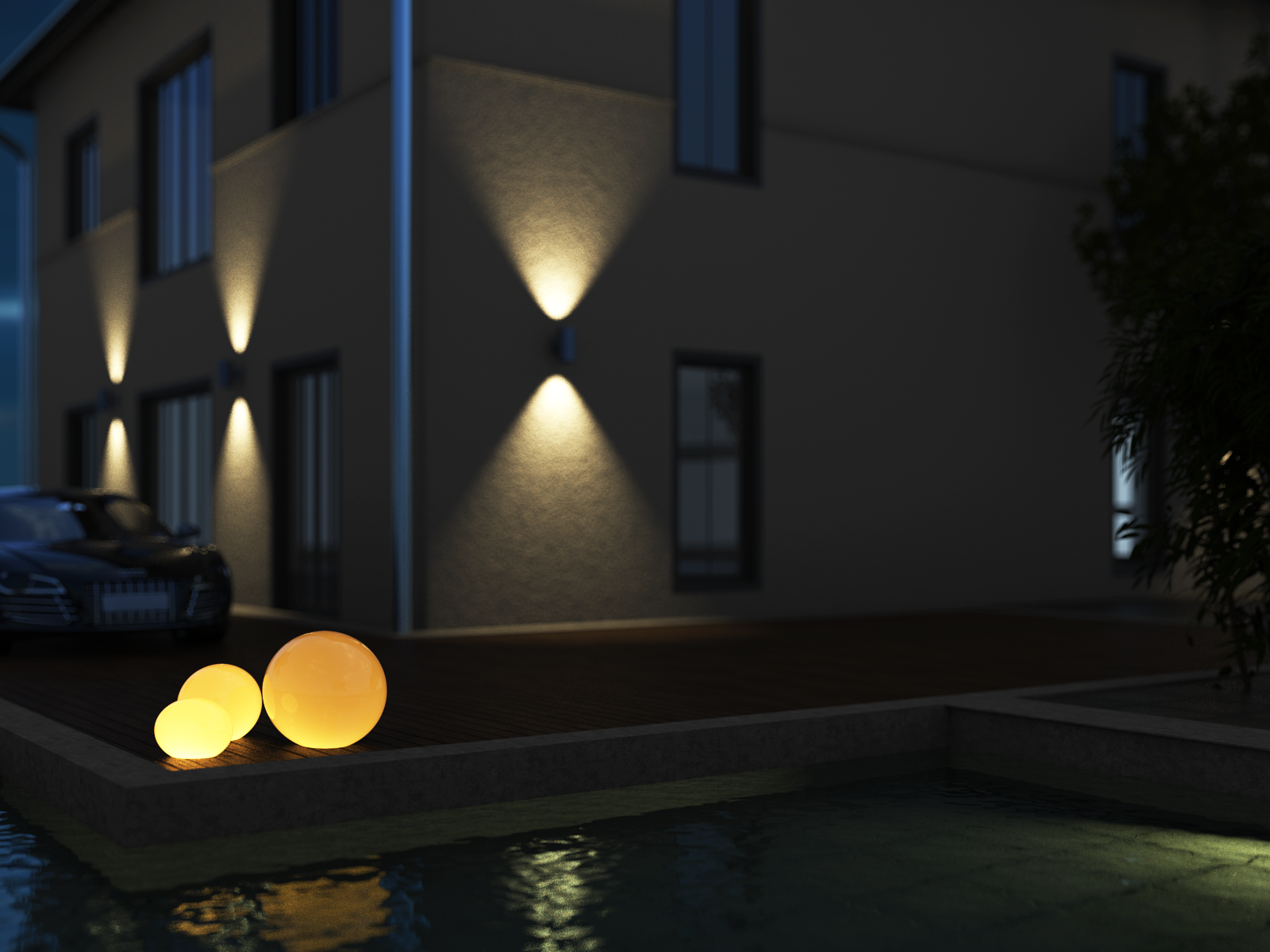
...just added some more lighting to the scene.

-
...what to do when you lack the motivation to model? Right...you render!

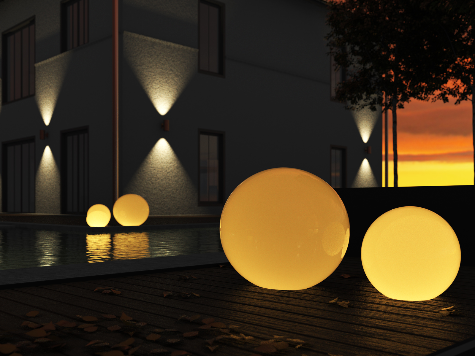
just testing some different IBL images for the scene and playing with the lighting parts here...
-
Looking good.

-
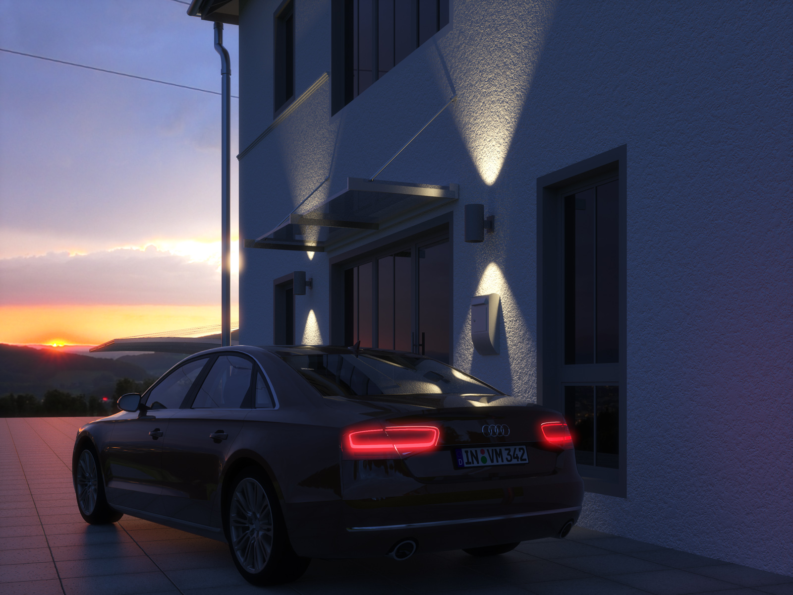
...some more environment testing

-
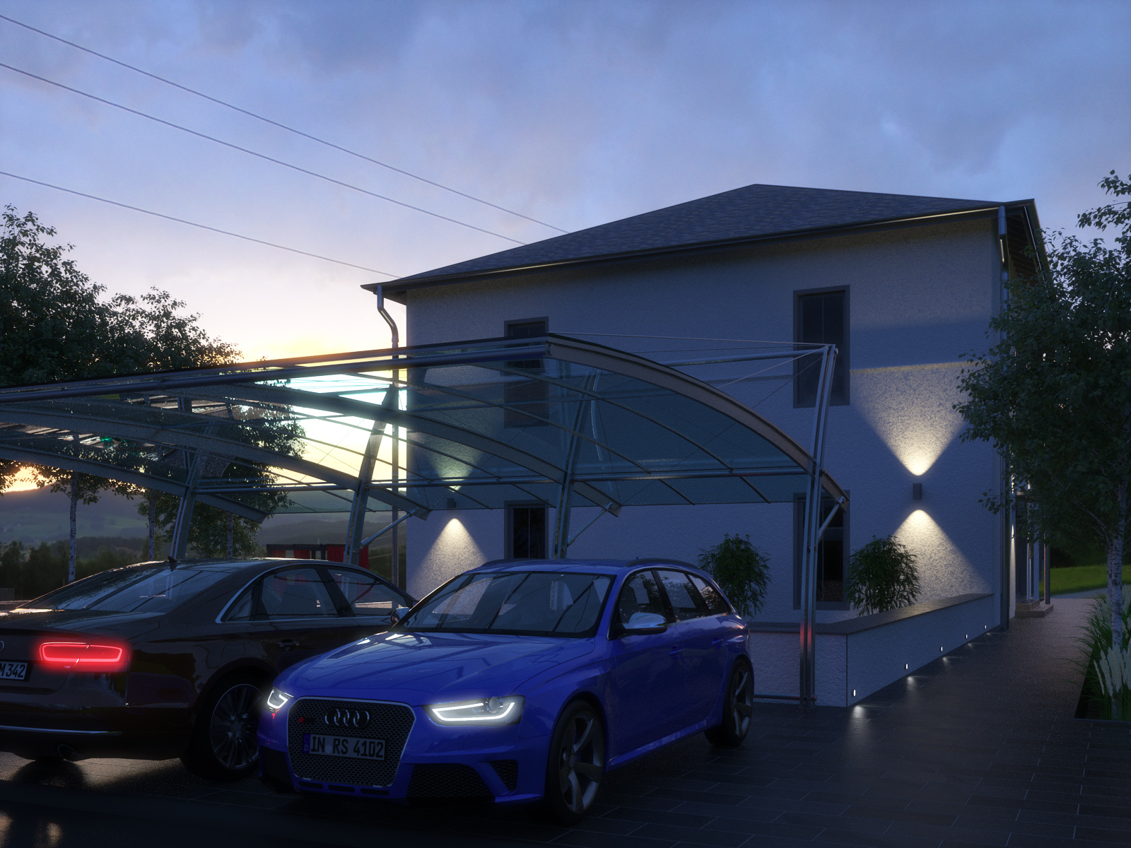
some model progress...and since i'm new to thea i'm testing all the possible render settings...this time no GPU render, instead had a go with unbiased TR 2.
-
Looking great Carloh especially the last one

John -
thank you John for the kind words! that's nice to read especially by a master like you

-
Oh wow.
And you say it isn't finished?

-
I've already commented on the last one on the Thea Render forum, but guess it doesn't hurt to post here as well...

One thing...
Can you share the technique you've used to create the big emitting glass bowls in the below render...?
Or perhaps you can even share a render ready 'skippy'...?

-
Very nice Carloh but steady on, it's possible to go right off someone THAT good.......

-
@mike amos said:
Very nice Carloh but steady on, it's possible to go right off someone THAT good.......

Erm...i have to admit that this is the first time here that my english skills leave me in the dark...all i get from this sentence is the thumbs up, so thanks for that

@frederik said:
One thing...
Can you share the technique you've used to create the big emitting glass bowls in the below render...?
Or perhaps you can even share a render ready 'skippy'...?
Of course...there's not much magic in these. it's just a sphere i got from the warehouse, put it through artisan to get a smoother surface and then stretched them a little with the scale tool to have a kind of ellipsoid body. the material is a standard frosted glass from the thea library and inside is a point light. anyways here's a thea scene you can use and modify for your needs

-
Your last render beat me to it, but I'll comment anyway....
When using IBL to illuminate a scene, it's always 100% more realistic to add some entourage between the subject foreground and background. You can see in your previous renders that the world just ends and a background appears, making the scene appear computer generated. Even something as simple as a tree line, some bushes, a garden wall etc. can all break up the line between foreground and background, allowing for a much more realistic scene.
So basically for a scene of this type you need:
1)Foreground entourage
2)Foreground
3)Subject
4)Subject background entourage
5)BackgroundInstead of: (which looks unrealistic)
1)Foreground
2)Subject
3)BackgroundYour last render does compensate for this, but I thought I'd share my views anyway.

-
Thanks for sharing, Carloh...

So the secret was the standard frosted glass from the Thea material library...
I had tried different materials, but couldn't find any I was happy with... -
thanks oli for your advice! i'll keep that in mind... there will be something like hedge vegetation along the boundary of the garden, so i hope this will add to realism of this scene

my pleasure Kim!

@bryan k said:
Oh wow.
And you say it isn't finished?

 yes, as the final output has to be an animation, i have to detail every corner where the camera will fly by...so there's still alot to do here
-
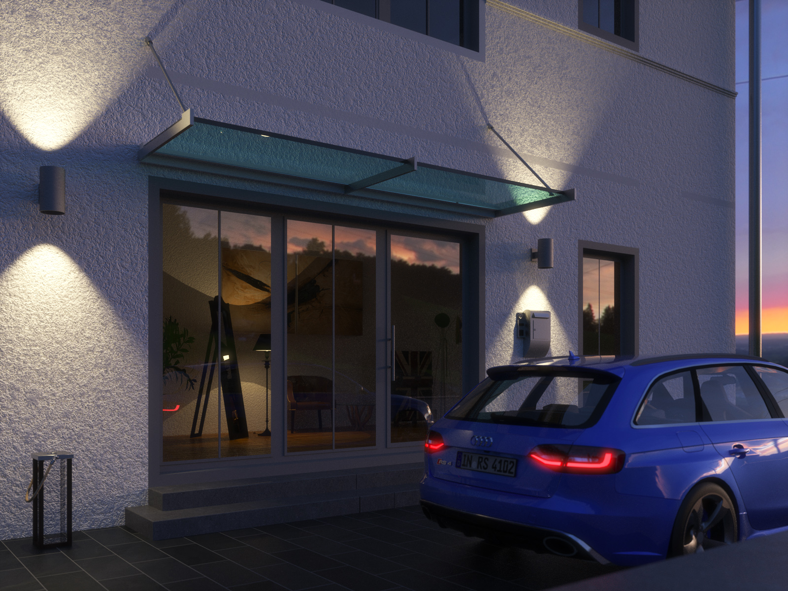
at the moment i'm concentrating on building the interior, so that the inside of the house won't be empty as i'm planning to illuminate it. here you can see the entrance part of it.
-
Looking great. That top step, in front of the door, should be deeper; it should be considered a landing, not a step.
-
@daniel said:
Looking great. That top step, in front of the door, should be deeper; it should be considered a landing, not a step.
yes i totally agree there with you Daniel...the problem is that i modelled this after the photo the tutor of this seminar provided as a guideline and there the front stair is really built like this

Hello! It looks like you're interested in this conversation, but you don't have an account yet.
Getting fed up of having to scroll through the same posts each visit? When you register for an account, you'll always come back to exactly where you were before, and choose to be notified of new replies (either via email, or push notification). You'll also be able to save bookmarks and upvote posts to show your appreciation to other community members.
With your input, this post could be even better 💗
Register LoginAdvertisement


