Additional Styles
-
Hello again.
I was wondering if you could let me know of any other places that I might be able to download some additional "styles" from other than http://sketchucation.com/shop/styles ?
I'm after a kind of 'arty' style with hints of colour ideally, something that would be nice for gardens etc.
Thanks in advance.
G
-
-
You may try to browse the "Components materials styles" subforum as Dave (and others) have shared some beauties there during the years.
ah. Dave beat me...

-
Thanks chaps, I shall have a look now.
PS: by "hints of colour" I mean something along the lines of a watercolour painting where the colour within the enclosed surface is very imprecise and maybe doesn't go to the edges, or maybe even goes beyond - though I doubt the latter is possible. The main SU "watercolour" isn't really what I'm after, so the search begins!

-
Unfortunately you won't be able to get that sort of thing with styles in SketchUp. That's going to require some post processing.
One easy way to get the watercolor feel to the drawing is to run it through Fotosketcher's Watercolor filter. I do this sort of thing once in awhile. I make separate exports of the edges and the faces so I can manipulated the colors and add texture without impacting the edges. I then overlay the lines in an image editor. I can show examples if you're interested.
-
@dave r said:
Unfortunately you won't be able to get that sort of thing with styles in SketchUp. That's going to require some post processing.
One easy way to get the watercolor feel to the drawing is to run it through Fotosketcher's Watercolor filter. I do this sort of thing once in awhile. I make separate exports of the edges and the faces so I can manipulated the colors and add texture without impacting the edges. I then overlay the lines in an image editor. I can show examples if you're interested.
Sounds Great Dave (though maybe a tad complex for lickle ol' me
 )
)I've just found some great Styles provided by Lidelin/Lin, but I'm interested in your suggestion too Dave.
I can't believe I'm only just finding out about these styles being freely available! I also can't believe I've never heard of Fotosketcher before today either!! What other fantastic secrets have you all got hidden?

-
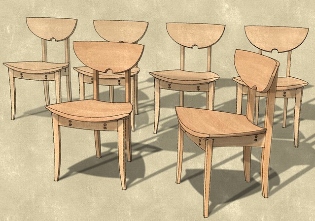
Here's a quick example. None of this stuff is very involved nor complex to do.
In this case I made four image exports from SketchUp. There's a lines only image (black lines on white background), a textured image with edges turned off and two shadows only export (start from Hidden Line with white background, turn off all edges).
The textured image went through Fotosketcher and then to the image editor. The lines drawing and shadows went straight to the image editor. I applied a blur to the shadows image and then combined all three images with the layers set to 'Multiply'. Done.
These chairs were done the same way with two shaodws only images with the time and date set differently for each to give the impression of multiple light sources.
-
-
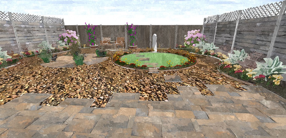
It took me a while to figure out what on Earth i was doing, but i eventually generated something kind of like i envisaged. There's a way to go I reckon, but I've taken the first tentative steps


-
Good work.
-
yes very nice start!

-
Yay! Positive feedback from the big boys! Makes a pleasant change to being told off for "plane clipping" and such like

-


If you're still working with this image, may I make a suggestion? And I mean in the most constructive way.

At least in the size shown in the forum and when I click on it, the rocks look like they are well below the flagstones in the front. I think it is caused by the very dark areas in the rock. It is much more contrasty than the other materials. I wonder if you could edit that material in Photoshop or whatever and reduce the density of those darks. That might help.
-
Have a look here Grizzler, you might be pleasantly surprised with the collection..
Styles Collection
Hello! It looks like you're interested in this conversation, but you don't have an account yet.
Getting fed up of having to scroll through the same posts each visit? When you register for an account, you'll always come back to exactly where you were before, and choose to be notified of new replies (either via email, or push notification). You'll also be able to save bookmarks and upvote posts to show your appreciation to other community members.
With your input, this post could be even better 💗
Register LoginAdvertisement


