Detroit Office Building and Hotel
-
A cool project bringing new life into an abandoned 700,000 sq foot office building in the heart of Detroit, MI. I went the NPR route to explain the project for a quick proposal. It came out great for the time invested.
Existing abandoned building linked below.

Bing Maps
Map multiple locations, get transit/walking/driving directions, view live traffic conditions, plan trips, view satellite, aerial and 3d imagery. Do more with Bing Maps.
Bing Maps (www.bing.com)
Check it out!
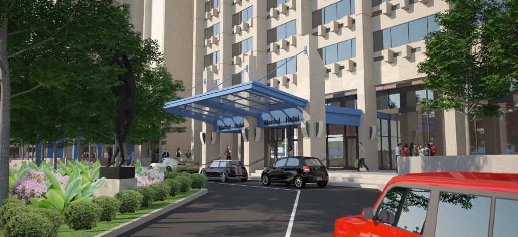
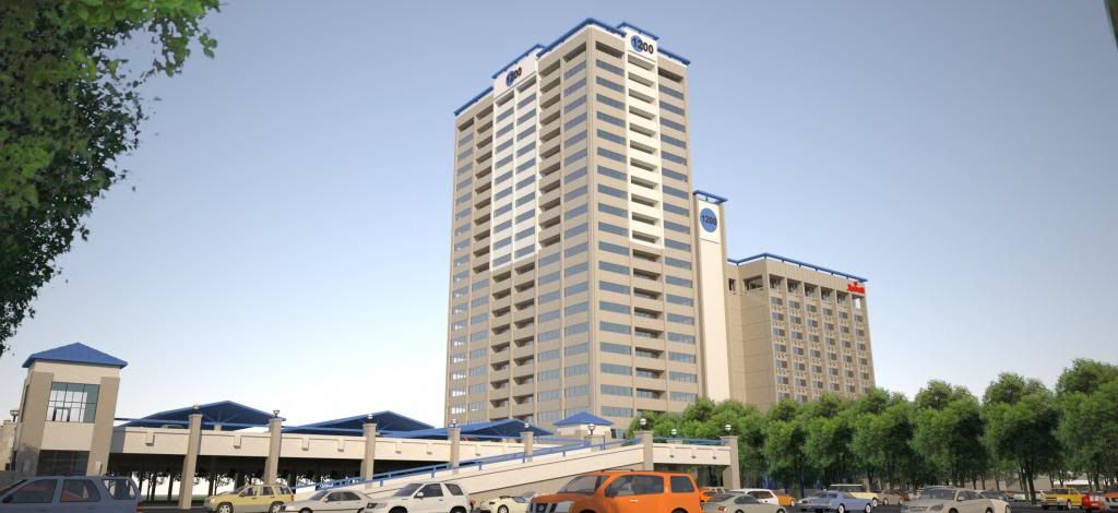
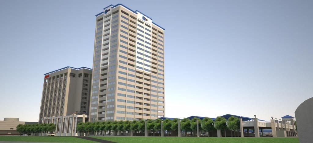
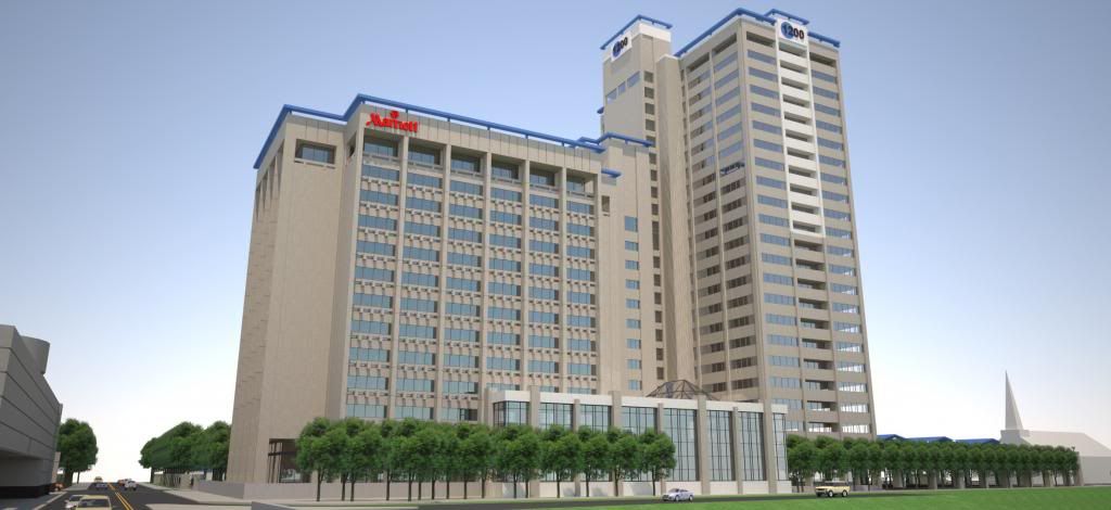
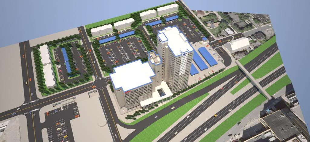
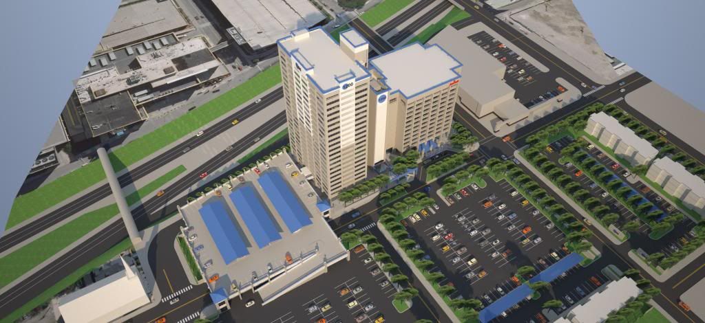
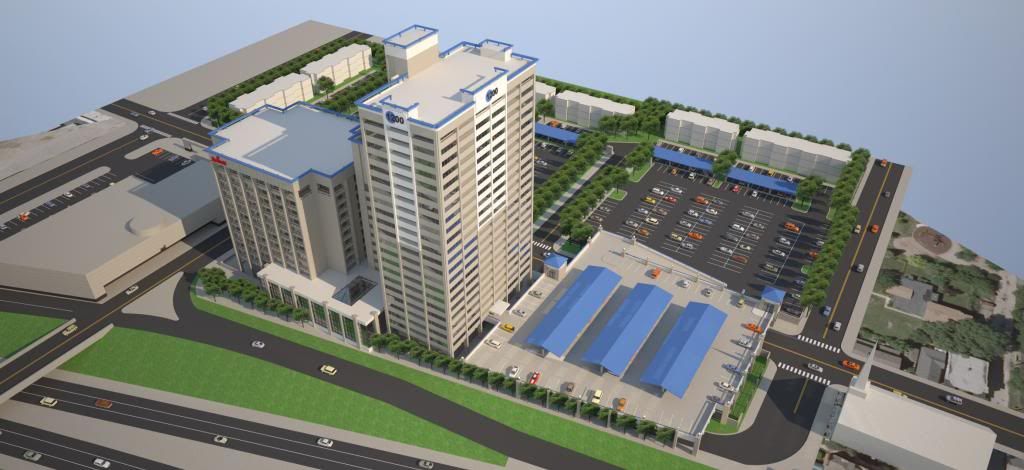
-
Real nice work. Good luckwith it.
Looking fo more post! -
Nice! Looks like a lot of work. Is this for a client?
-
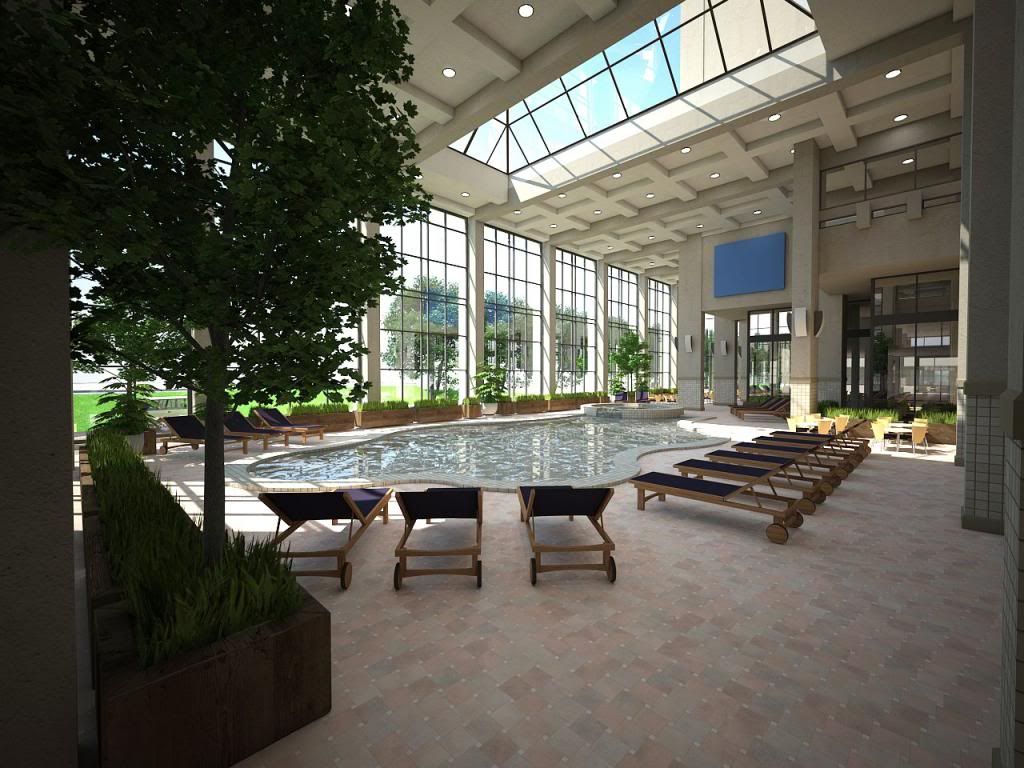
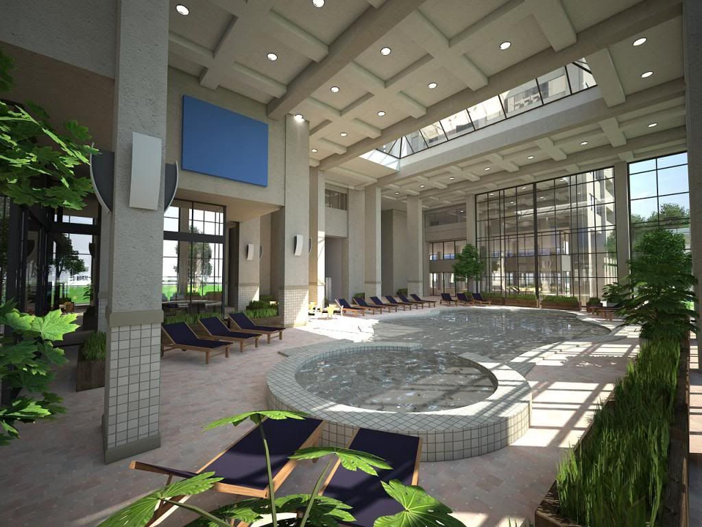
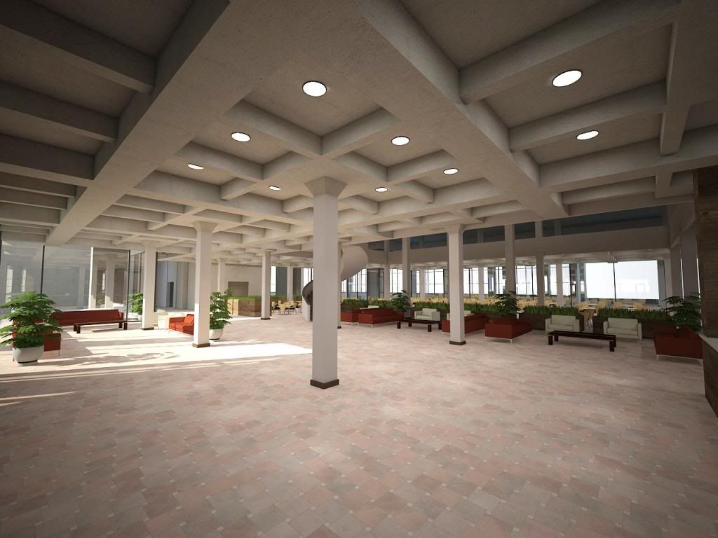
Some conceptual interiors for this project!
-
Exciting interiors! That's starting to edge into PR, but dramatic. I bet that wows the clients. Nice floor treatment.
In the last image somehow the column in the center of the image seems to float a little. The lights seem to be making the floor bright but not the column.
-
Wow. Great interiors.
-
The first interior is simply stunning!!

-
this is looking good! like the first interior...
best
V -
Great project
I like it a lot -
@pbacot said:
Exciting interiors! That's starting to edge into PR, but dramatic. I bet that wows the clients. Nice floor treatment.
In the last image somehow the column in the center of the image seems to float a little. The lights seem to be making the floor bright but not the column.
yeah, this struck me as well. I think the column is missing shadows which will tie it down.
Excellent renders!

-
Nice work.
If you have a chance for a second presentation, the shadows in the site plan go in opposite directions, between the aerial photo and the SU model.
-
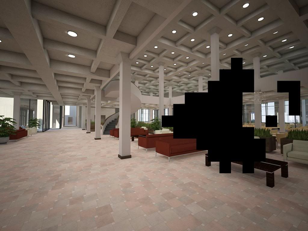
The interior renders had something like 250 lights, half IES, half rectangular lights for the can lights in the ceiling. It broke VRay to render them at 1280x960.
-
very nice images, especially the interior ones.
but I think the exterior images could be improved if you got rid of the convergence of vertical lines. have a look of pictures taken by pros or renders made by the top guys: vertical lines never converge unless the viewer is right infront of a tall building.
Hello! It looks like you're interested in this conversation, but you don't have an account yet.
Getting fed up of having to scroll through the same posts each visit? When you register for an account, you'll always come back to exactly where you were before, and choose to be notified of new replies (either via email, or push notification). You'll also be able to save bookmarks and upvote posts to show your appreciation to other community members.
With your input, this post could be even better 💗
Register LoginAdvertisement


