Another Remake
-
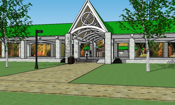
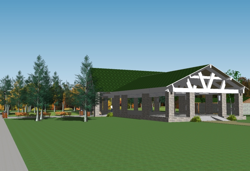
Park Pavilion. Another one of my very first from a few years ago.
Not as drastic a change as my garage apt. Just a few enhancements.
Before (1st) and after (2nd).
-
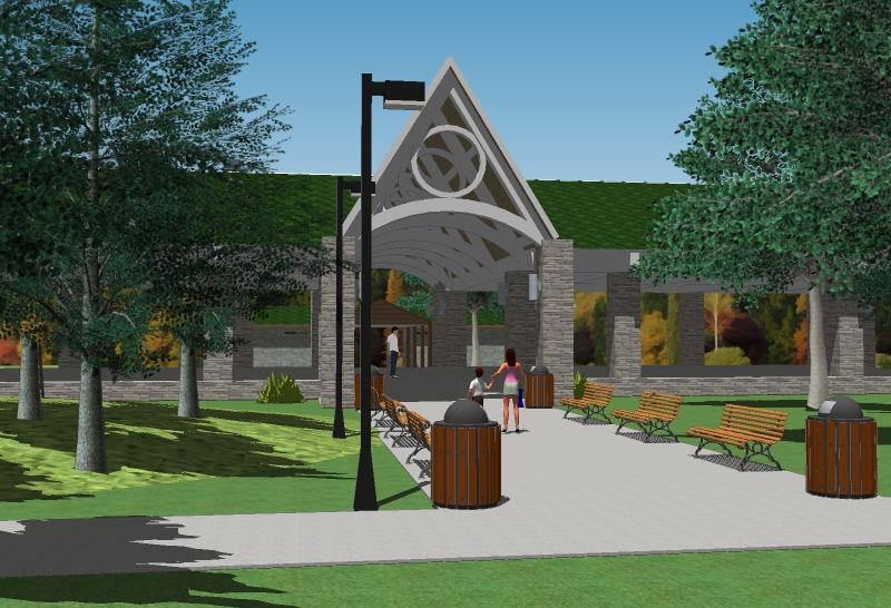
One last view.
-
Looks like an interesting design. i think it would help if you toned down the hue on the roosf - it looks cartoonish compared ot the rest of the image, and is distracting.
-
@daniel said:
Looks like an interesting design. i think it would help if you toned down the hue on the roosf - it looks cartoonish compared ot the rest of the image, and is distracting.
Ah ha! Excellent suggestion. I was wondering what was bugging me about the roof, but couldn't quite figure it out.
Will try it and post the change.
-
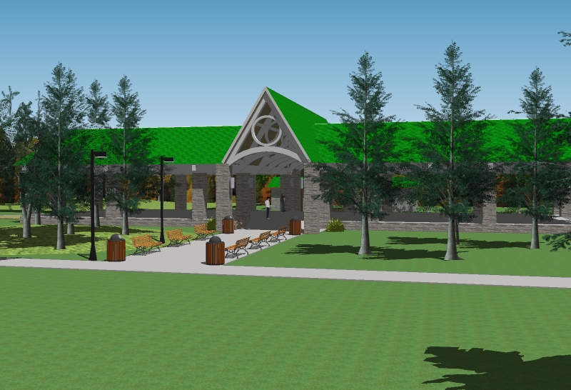
Is this better? Or should I tone it down some more?
-
I think it still looks a bit too bright. How about something like a dark olive drab, something with gray or brown in it.
Also, you could use a better grass texture. I've seen some people use a grass texture with "lawnmower stripes" in it - that would look good.
Then, throw in some people and VOILA! -
I agree the grass is half your image, it needs to be better.
-
@daniel said:
I think it still looks a bit too bright. How about something like a dark olive drab, something with gray or brown in it.
Also, you could use a better grass texture. I've seen some people use a grass texture with "lawnmower stripes" in it - that would look good.
Then, throw in some people and VOILA!Great suggestions.
However, I like the green shingles. I've seen this used on many roofs.
I'd love to make the grass better. I have the fur plug-in, but it's too much for my PC and stops the program almost dead for the scale of lawn.
Better people would be great as well, but I don't know where to get good ones for free. I'll check the 3D Warehouse again.
Thanks again for the very good suggestions.
-
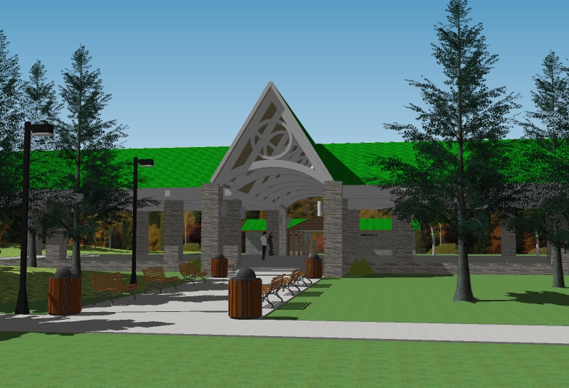
I would say,purely from a compostional viewpoint,the first view is better.it has more dynamic angles such as created by the paths, which guide us toward the entance.
Also, If you are going to have a large area of landscape at the front,such as your last image, then break it up - dont have blank areas at the front of the building.
-
@davidh said:
I would say,purely from a compostional viewpoint,the first view is better.it has more dynamic angles such as created by the paths, which guide us toward the entance.
Also, If you are going to have a large area of landscape at the front,such as your last image, then break it up - dont have blank areas at the front of the building.
Excellent. I'll try those.
-
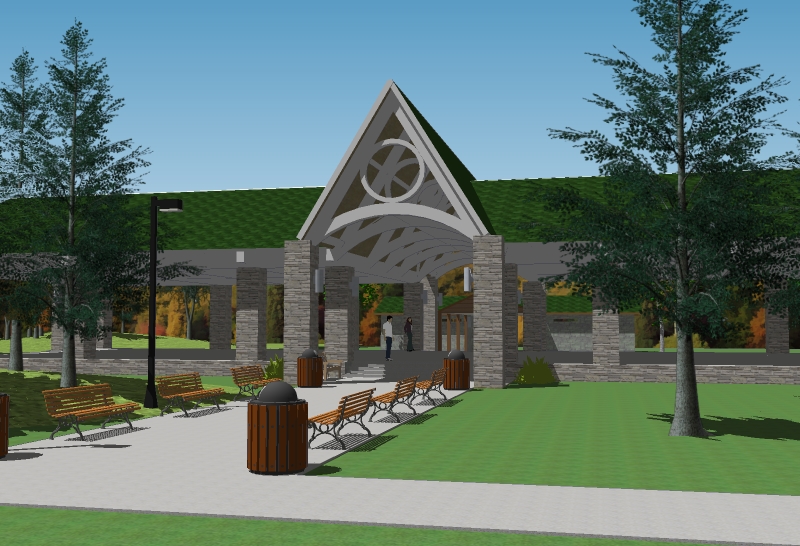
Another view with just a few people and more trees.
-
hi Bryan!
I must agree that the grass is not helping your image, if the make-fur plugin is not working probably you could try to make it in photoshop (use a grass shaped brush and paint it in a new layer) here comes a link for a tutorial:
http://www.peachpit.com/articles/article.aspx?p=30882
may I ask what software are you using to render??
best
V -
@novena said:
hi Bryan!
I must agree that the grass is not helping your image, if the make-fur plugin is not working probably you could try to make it in photoshop (use a grass shaped brush and paint it in a new layer) here comes a link for a tutorial:
http://www.peachpit.com/articles/article.aspx?p=30882
may I ask what software are you using to render??
best
VThanks. I'll take a look at the tutorial.
Render? What render? That's just straight SU output.

-
straight SU output???? wow I feel myself like this
 & like this
  ,
,
best
V
Hello! It looks like you're interested in this conversation, but you don't have an account yet.
Getting fed up of having to scroll through the same posts each visit? When you register for an account, you'll always come back to exactly where you were before, and choose to be notified of new replies (either via email, or push notification). You'll also be able to save bookmarks and upvote posts to show your appreciation to other community members.
With your input, this post could be even better 💗
Register Login


Advertisement