sketchucation logo sketchucation
    • Login
    โ„น๏ธ Licensed Extensions | FredoBatch, ElevationProfile, FredoSketch, LayOps, MatSim and Pic2Shape will require license from Sept 1st More Info

    Another Remake

    Scheduled Pinned Locked Moved Gallery
    14 Posts 5 Posters 424 Views 5 Watching
    Loading More Posts
    • Oldest to Newest
    • Newest to Oldest
    • Most Votes
    Reply
    • Reply as topic
    Log in to reply
    This topic has been deleted. Only users with topic management privileges can see it.
    • Bryan KB Offline
      Bryan K
      last edited by

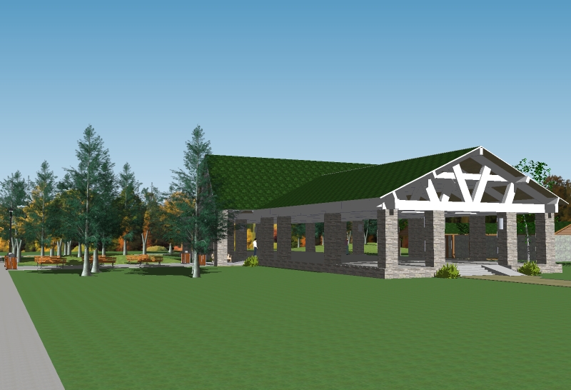
      One last view.


      parkpavilion2013b.jpg

      See my portfolio at https://delphiscousin.blogspot.com/

      1 Reply Last reply Reply Quote 0
      • DanielD Offline
        Daniel
        last edited by

        Looks like an interesting design. i think it would help if you toned down the hue on the roosf - it looks cartoonish compared ot the rest of the image, and is distracting.

        My avatar is an anachronism.

        1 Reply Last reply Reply Quote 0
        • Bryan KB Offline
          Bryan K
          last edited by

          @daniel said:

          Looks like an interesting design. i think it would help if you toned down the hue on the roosf - it looks cartoonish compared ot the rest of the image, and is distracting.

          Ah ha! Excellent suggestion. I was wondering what was bugging me about the roof, but couldn't quite figure it out.

          Will try it and post the change.

          See my portfolio at https://delphiscousin.blogspot.com/

          1 Reply Last reply Reply Quote 0
          • Bryan KB Offline
            Bryan K
            last edited by

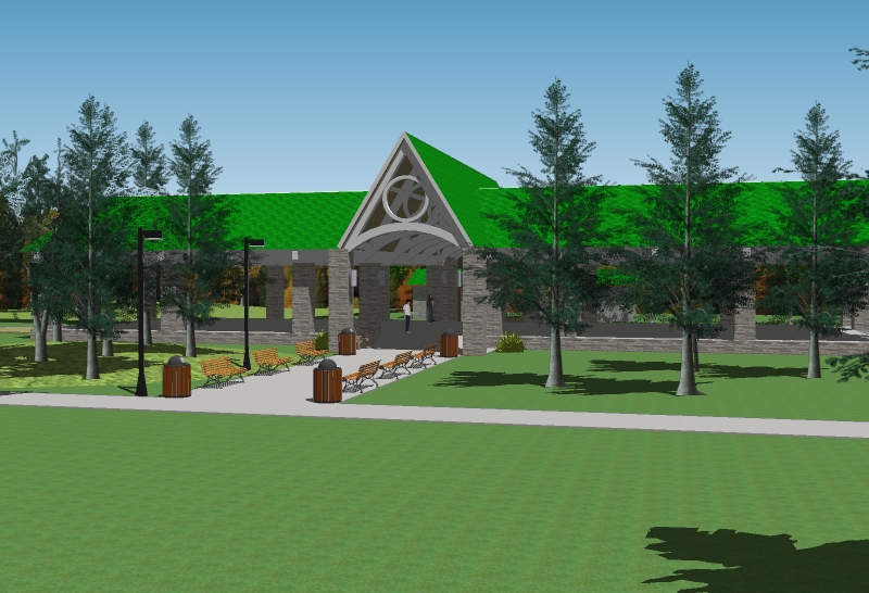
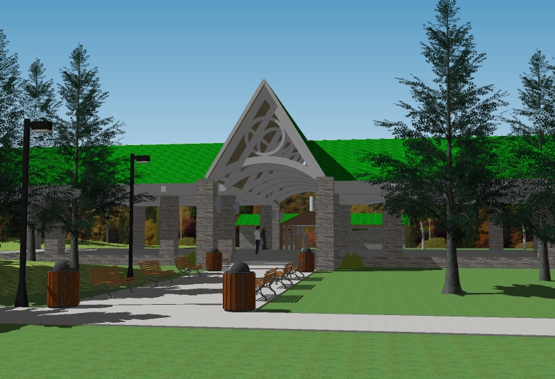
            Is this better? Or should I tone it down some more?
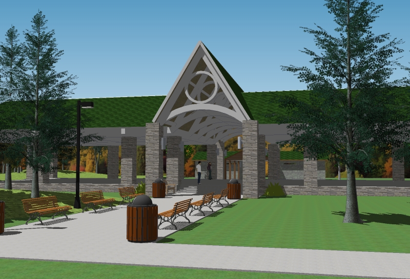

            parkpavilion2013c.jpg


            parkpavilion2013d.jpg

            See my portfolio at https://delphiscousin.blogspot.com/

            1 Reply Last reply Reply Quote 0
            • DanielD Offline
              Daniel
              last edited by

              I think it still looks a bit too bright. How about something like a dark olive drab, something with gray or brown in it.
              Also, you could use a better grass texture. I've seen some people use a grass texture with "lawnmower stripes" in it - that would look good.
              Then, throw in some people and VOILA!

              My avatar is an anachronism.

              1 Reply Last reply Reply Quote 0
              • cheddaC Offline
                chedda
                last edited by

                I agree the grass is half your image, it needs to be better.

                Kraken Wrangler https://www.flickr.com/photos/132441293@N03/

                1 Reply Last reply Reply Quote 0
                • Bryan KB Offline
                  Bryan K
                  last edited by

                  @daniel said:

                  I think it still looks a bit too bright. How about something like a dark olive drab, something with gray or brown in it.
                  Also, you could use a better grass texture. I've seen some people use a grass texture with "lawnmower stripes" in it - that would look good.
                  Then, throw in some people and VOILA!

                  Great suggestions.

                  However, I like the green shingles. I've seen this used on many roofs.

                  I'd love to make the grass better. I have the fur plug-in, but it's too much for my PC and stops the program almost dead for the scale of lawn.

                  Better people would be great as well, but I don't know where to get good ones for free. I'll check the 3D Warehouse again.

                  Thanks again for the very good suggestions.

                  See my portfolio at https://delphiscousin.blogspot.com/

                  1 Reply Last reply Reply Quote 0
                  • D Offline
                    davidh
                    last edited by

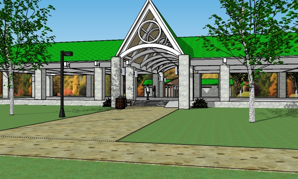
                    I would say,purely from a compostional viewpoint,the first view is better.it has more dynamic angles such as created by the paths, which guide us toward the entance.

                    Also, If you are going to have a large area of landscape at the front,such as your last image, then break it up - dont have blank areas at the front of the building.

                    1 Reply Last reply Reply Quote 0
                    • Bryan KB Offline
                      Bryan K
                      last edited by

                      @davidh said:

                      I would say,purely from a compostional viewpoint,the first view is better.it has more dynamic angles such as created by the paths, which guide us toward the entance.

                      Also, If you are going to have a large area of landscape at the front,such as your last image, then break it up - dont have blank areas at the front of the building.

                      Excellent. I'll try those.

                      See my portfolio at https://delphiscousin.blogspot.com/

                      1 Reply Last reply Reply Quote 0
                      • Bryan KB Offline
                        Bryan K
                        last edited by

                        Another view with just a few people and more trees.
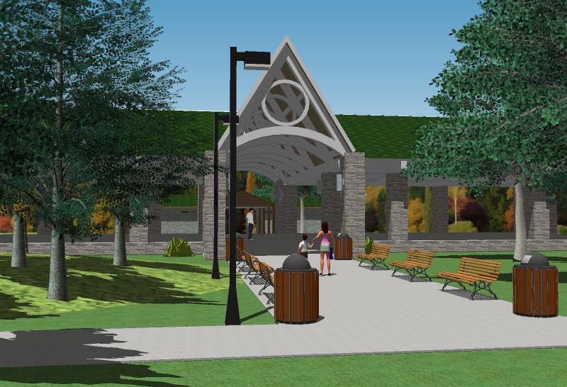

                        parkpavilion2013e.jpg

                        See my portfolio at https://delphiscousin.blogspot.com/

                        1 Reply Last reply Reply Quote 0
                        • novenaN Offline
                          novena
                          last edited by

                          hi Bryan!
                          I must agree that the grass is not helping your image, if the make-fur plugin is not working probably you could try to make it in photoshop (use a grass shaped brush and paint it in a new layer) here comes a link for a tutorial:
                          http://www.peachpit.com/articles/article.aspx?p=30882
                          may I ask what software are you using to render??
                          best
                          V

                          http://hdzarkitektur.wordpress.com/

                          1 Reply Last reply Reply Quote 0
                          • Bryan KB Offline
                            Bryan K
                            last edited by

                            @novena said:

                            hi Bryan!
                            I must agree that the grass is not helping your image, if the make-fur plugin is not working probably you could try to make it in photoshop (use a grass shaped brush and paint it in a new layer) here comes a link for a tutorial:
                            http://www.peachpit.com/articles/article.aspx?p=30882
                            may I ask what software are you using to render??
                            best
                            V

                            Thanks. I'll take a look at the tutorial.

                            Render? What render? That's just straight SU output. ๐Ÿ˜„

                            See my portfolio at https://delphiscousin.blogspot.com/

                            1 Reply Last reply Reply Quote 0
                            • novenaN Offline
                              novena
                              last edited by

                              straight SU output???? wow I feel myself like this ๐Ÿ˜ณ & like this ๐Ÿ˜ฎ , ๐Ÿ˜„
                              best
                              V

                              http://hdzarkitektur.wordpress.com/

                              1 Reply Last reply Reply Quote 0
                              • 1 / 1
                              • First post
                                Last post
                              Buy SketchPlus
                              Buy SUbD
                              Buy WrapR
                              Buy eBook
                              Buy Modelur
                              Buy Vertex Tools
                              Buy SketchCuisine
                              Buy FormFonts

                              Advertisement