How to create a Mask in Layout
-
I just did this. I have sculpted sloping site and a section of the grade is ugly with all the underside of the terrain and footings etc. seen beyond. Be sure you like your elevation view. I traced a polygon in LO along the grade with bumps, retaining walls etc. and continued down in a rectangular fashion to make a filled shape covering up the terrain below. I duplicated that and trimmed everything but the ground line, and changed that to a thick unfilled line. I found I wanted to simplify it some afterwards from the shape I used in the mask. All sorts of variations are possible, unfortunately if you change the elevation in SU...
-
@pbacot said:
I just did this. I have sculpted sloping site and a section of the grade is ugly with all the underside of the terrain and footings etc. seen beyond. Be sure you like your elevation view. I traced a polygon in LO along the grade with bumps, retaining walls etc. and continued down in a rectangular fashion to make a filled shape covering up the terrain below. I duplicated that and trimmed everything but the ground line, and changed that to a thick unfilled line. I found I wanted to simplify it some afterwards from the shape I used in the mask. All sorts of variations are possible, unfortunately if you change the elevation in SU...
I wound up doing something similar but, with a minor change:
-
Draw a poly to hide the stuff I wanted to hide. Top line was drawn to represent the grade and the bottom and side lines were just drawn straight (to complete the mask).
-
Highlight the mask border line.
-
In the Shape Style box: Select "Fill"
-
In the Shape Style box: Deselect "Stroke" (to hide the mask border line.
-
Draw a new (Heavy)line to represent the Grade - tracing the top of the mask.
Voila!
-
-
Charles - that is exactly how I do it. Works really well and super fast.
-
Yup. That is how i go about it as well.
-
you can also draw a shape in sketchup, put it on a relevant layer, and place it in front of the geometry you want to hide.
i do this often with shop and production drawings, hiding things behind the section cut.
works well for elevations / etc. -
I thought that's what I said, Mike.
 You said it better, though.
-
@dave r said:
I thought that's what I said, Mike.
 You said it better, though.
guess so. i thought you were suggesting hiding geometry with layers (which i do), but it can get tricky with foundations that might stick partially out of the ground. i usually just draw in a white shape, move it in front of the geometry i need to hide, and proceed to layout.
all good though!
lots of ways to work between the 2 programs! -
Ah. We were talking about something different after all. I was talking about drawing the shape in LayOut instead of in SU. I have created masks in SketchUp, though. Awhile back I did an animation of a sewing machine making a lock stitch. There's a mask like a mat in front of the geometry which allows components to move out of view. Most of the components are drawn 2D at different distances from the camera and some actually mask others.
-
@dave r said:
Ah. We were talking about something different after all. I was talking about drawing the shape in LayOut instead of in SU. I have created masks in SketchUp, though. Awhile back I did an animation of a sewing machine making a lock stitch. There's a mask like a mat in front of the geometry which allows components to move out of view. Most of the components are drawn 2D at different distances from the camera and some actually mask others.
and yes, sometimes is just quicker to draw over your model in layout...

really depends on views / etc.
-
@unknownuser said:
Charles - that is exactly how I do it. Works really well and super fast.
As do I, Charles. It is the easiest way to form ground planes in section / elevation....
-
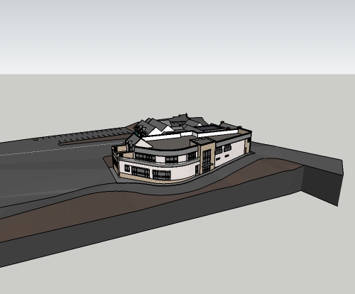
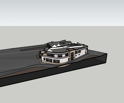
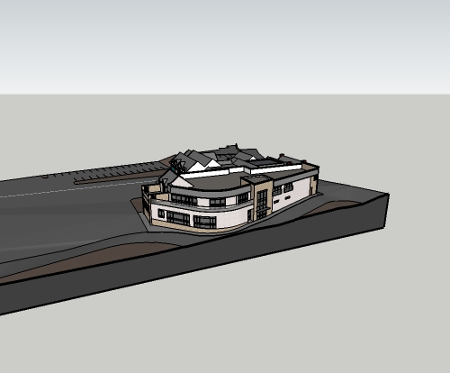
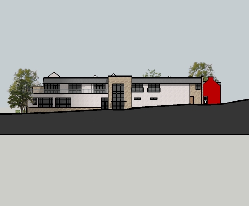
I've just done a masks for a model with a steep enough gradient. I took the ground surface and built down below ground to create a plinth. I set up my views (2D elevations for now) using section planes, then added a section cut face to the section planes to hide all the unwanted geometry. the section cut face colour can then be changed to match the background leaving only the thick section cut line as the ground line. It was very quick to set up the 'plinth' and it gives the freedom to add and change any view with minimal extra work.
hope this makes sense.
-
Pictures, man. Pictures. Or it didn't happen.


-
here you go Dave.
i kept my section cut face dark as i reckoned it looked good, especially with a light text for the drawing description placed in the dark area of the plinth (did this in autocad, not using Layout anymore, just exporting jpegs from sketchup and importing into cad, and scaling up as appropriate).
the bottom of the plinth can be moved down so you don't see the second heavy line, but i'm just clipping it with a viewport in cad.


-
Ah, yes. I see.
Why aren't you using LayOut?
-
@dave r said:
Ah, yes. I see.
Why aren't you using LayOut?
i've been using sketchup (free) casually for years, but really ramping up my use this year. I saw Nick Sonders video, and decided to give Layout and pro a chance. Did a full project in it to get a feel for it, but found a few things a bit annoying, slowness mostly, getting proper dimensions on 2D views, and a few other things. So i just left the trial run out, and haven't purchased the pro version (money is a bit tight for me at the minute
 ).
).so since i was doing a lot in sketchup i needed someway to properly title drawings, so just decided to import jpegs into cad and use viewports like a normal cad drawing.
-
I see.
About 90% of the work I do in LayOut involves dimensions, lots of dimensions, and I don't have any trouble getting accurate dimensions. Maybe it's just me.
-
@dave r said:
I see.
About 90% of the work I do in LayOut involves dimensions, lots of dimensions, and I don't have any trouble getting accurate dimensions. Maybe it's just me.
I started getting this ~ symbol in some dimensions as well as there being problems getting vertical dimensions from 2D elevations, where it was picking up different points in the 3rd dimension. i'm just so used to autocad dimensioning (setting up styles etc.) that it's second nature to me. only thing that annoys me is i can't snap to a point with the jpegs.
but sure if layout works for you, keep going.

-
The ~ just indicates that your dimensions don't fall on increments set by the Precision.
Ah, well. To each his own.
-
@porch_unplugged said:
@dave r said:
I see.
About 90% of the work I do in LayOut involves dimensions, lots of dimensions, and I don't have any trouble getting accurate dimensions. Maybe it's just me.
I started getting this ~ symbol in some dimensions as well as there being problems getting vertical dimensions from 2D elevations, where it was picking up different points in the 3rd dimension. i'm just so used to autocad dimensioning (setting up styles etc.) that it's second nature to me. only thing that annoys me is i can't snap to a point with the jpegs.
but sure if layout works for you, keep going.

so how are you getting accurate dimensions in autocad by dimensioning jpgs?
like dave said, to each his own, but i get accurate dimensions...


-
Mike, those are beautiful.

Hello! It looks like you're interested in this conversation, but you don't have an account yet.
Getting fed up of having to scroll through the same posts each visit? When you register for an account, you'll always come back to exactly where you were before, and choose to be notified of new replies (either via email, or push notification). You'll also be able to save bookmarks and upvote posts to show your appreciation to other community members.
With your input, this post could be even better 💗
Register LoginAdvertisement


