Whale House
-
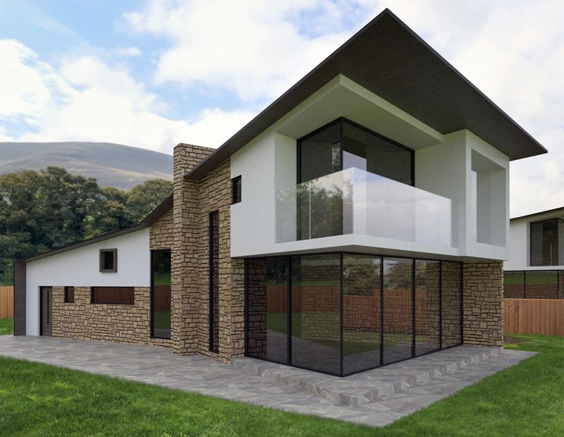
Playing with my new HDRI Tree Lines pack. Rendered in thea, foreground grass added afterwards. I designed and textured the house in just under two hours so please excuse any mistakes! Really loving the lens shift in thea.
 Will post a few more renders when they come out the oven.
sketchUcation shop:

Lamps pack | SketchUcation
HDRI pack contains 12 spherical panoramas in both HDR and JPEG format. 24 files in total.
(sketchucation.com)

-
lens shift = like a fish eye ?
-
Nice work

For me the perspective is difficult to figure out. It's like it's huge in front and tiny in the rear, and it doesn't look like it's from the camera lens or whatever, it looks like it's really built that way. (Hope you know what I mean, I can't express myself very well)
-
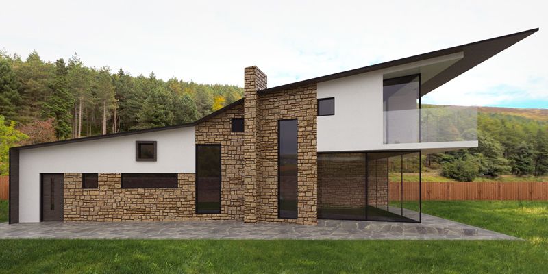
yeah thats why I called it the whale house! big head, little tail! We used to laugh at work and call this shape a whale, I find it quite satisfying! I've emphasized it I imagine.

lens shit just corrects vertical convergence. http://www.thearender.com/forum/viewtopic.php?f=61&t=2604&start=0
-
I don't know. To be honest I've seen enough fisheye with my camera I feel like a fish!! I suppose you could make a spherical projection and then take at fisheye from that. But yes like shiftn, or free transform in photoshop.
conifers!

-
Ah ok like ShiftN !

Does Thea has this sort of things (fish eye)
From Blender site, Cycles by Brecht
-
check out that soffit!


-
Looks like you still have your touch, Oli! Good job

-
Really nice design and the modelling/renders are nothing to be sniffed at for a few hours work.
I personally like that extreme transition and can imagine it creating an interesting flow as you move from the rear to the front of the house. It's not mutch different to a single storey home where you have a cluster of small bedrooms and bathrooms that then open up to larger open plan spaces, except here (presuming there is a mezzanine) you have the added dimension of height to enhance the effect and create more drama.
-
Nice design and render, Oliver. You might want to adjust your shadows - the step up in the stone paving around the glass walls doesn't read too well. How/what would that roof be constructed (to get such a thin profile)?
-
@olishea said:
check out that soffit!


If you want a really big overhanging soffit look at Copenhagen Opera House !
Until you stand under it, it's difficult to appreciate its enormity... -
The roof can be done easily, remember the extended part is not insulating, the roof area that covers the house is much thicker. Look at some tom kundig houses, he is a sucker for soffit too.
 YEah I realized front step was too subtle after rendering, I think material is a bit flat, sorting it out now cheers.
Check out these built houses in manchester, the roof appears to be very thin, yet it's actually thick where it needs to be.

tom kundig house (probably my favorite residential architect)

-
To olishea:
Nice work. Intriguing. -
Thanks, it was a good bit of fun. Also, hello d12 it's been a while since we've spoke
 TIG that's a beauty! I don't know why they appeal to me!
few more kundigs, really beautiful:


-
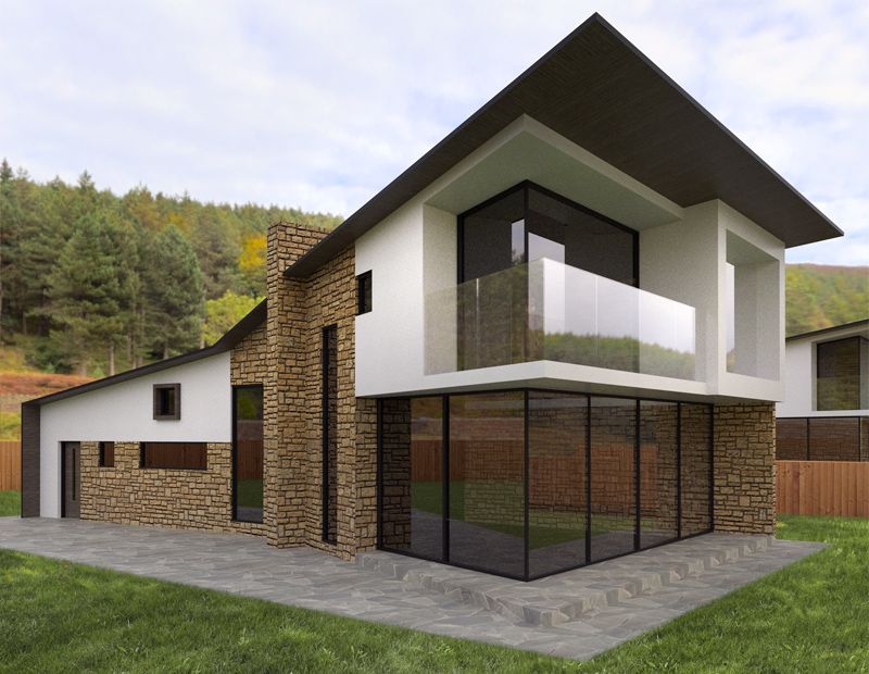
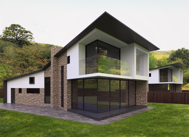
another render, up in the hills. changed materials a bit...

-
I need to look at some more of Kundigs work

The latest building render looks a lot better, but the context doesn't work for me. I would populate the surrounding landscaping with high quality trees and use a backplate for the background.
Great stuff though
-
cheers, its just a different scene, there are quite a few to choose from! Ordinarily I'd use lots of foreground/mid trees but I'm just playing with different landscapes and light.
-
Looking forward to future 'playing'.
-
Nice. Hill crest too sharp though, a retouch in photoshop to soften will do the trick.
Thanks for your comments on Rome. Trying to put toghether a short animation, will post it when done... -
At Lucerne by Jean Nouvel


Hello! It looks like you're interested in this conversation, but you don't have an account yet.
Getting fed up of having to scroll through the same posts each visit? When you register for an account, you'll always come back to exactly where you were before, and choose to be notified of new replies (either via email, or push notification). You'll also be able to save bookmarks and upvote posts to show your appreciation to other community members.
With your input, this post could be even better 💗
Register LoginAdvertisement


