A brand new home for SketchUcation
-
@dan rathbun said:
So did you make it a point to mimic SketchUp's new logo red, ie, in brightness ??
This red (#E82C2E) was already in the "design" before they announced Trimbleship. Not to speak about the new release (or even beta testing).
-
What about the Chinese rank/badge system?

-
@beginner said:
What about the Chinese rank/badge system?
That'd make the place look like Command and Conquer

-
Very nice job everyone who participated. I like the pop out attachments window and the new layout altogether. I have one request maybe to late now. When replying to a post I wish the curser I guess you call it defaulted to the text box I don't know how many times I started typing only to find I didn't type anything maybe my most repeated Dah moment.
-
Hi Walt,
I cannot remember now but on the old forums, did it give focus (as it is called) to the message box automatically?
I know it can be done (I could not): when "reply mode" is on,focus can be given to any element that has an id) with javascript I think.
Try the "Quick reply" button where it does. Is this what you mean?
-
Yes the quick reply gives focus to the text box but the post reply still does not, but that's ok need something to keep me on my toes.
-
@gaieus said:
Hi Jan,
The system is programmed that once you subscribe to premium membership, you automatically become a member of the Premium users usergroup (his is how we can organize certain permissions on the forums) and this will automatically become your default usergroup as well. But you are still a "Registered member", too (and member of any other usergroups you have added ourself).
Premium members have the possibility to change their default membership however. Please, go to your UCP and if you do not like the striking red (I can understand that), change your default usergroup to whatever you wish. Here is a (reduced) version of my memberships. On the left, select the checkbox and press the button.
[attachment=0:1vs10c1q]<!-- ia0 -->default-group.png<!-- ia0 -->[/attachment:1vs10c1q]
 the ad machine... This was a request on the old forums - to make some visual difference between the "real" posters and the ad machine.It's a real co-incidence the colours ended up like this but you are right, it is not very dignified this way so I will find some other colour for that machine.
Now as for "private consulting rooms" - these are not something automated but we set them up as soon as requested. Here is yours for instance.
 We have already prepared a (growing) list of the available services Premium members are entitled but decided to dump the page at the last minute as new features were added* even yesterday and the whole thing needs to be rewritten.
*e.g. we managed to introduce a new feature - currently only with external plugin authors but this is planned to expand - where Premium members get a 20% discount straight from the developers (purchasing straight through their channels). Note that SketchUcation does not get any commission - it's just something we hope to be useful and mutually beneficial for both Premium membership and plugin authors who we can support this way.
Thanks for your clarifications. I still think the premium banner stands out too much. Surely we don't need this kind of public distinction between users? At least make it much smaller.
-
Thank you for the great work done for the sketchup community.
-
@unknownuser said:
The system is programmed that once you subscribe to premium membership, you automatically become a member of the Premium users usergroup (his is how we can organize certain permissions on the forums)
The new site is a pass but the move to privatize is a step backwards. Good luck with your private forum guys.
-
Roland, there are people who cannot discuss certain project publicly due to clients not allowing. This is where this "private" forum comes in. We do not intend to "generally educate" anyone in these private forums - that's what the open forums are or SketchUp Training is for (which you - or in fact any other people - are also "locked out" of course as that is also "private").
If there is no "private forum" like this, you will never see those projects or problems being solved anyway because then they simply do not post them at all or things are dealt with in private messages. So all-in-all: you will not lose anything, believe me. This is not something "elitist" here but extended service. -
@gaieus said:
Roland. . . . This is not something "elitist" here but extended service.
Good thing. . ..I would never want to join a club that would have me as a member.
---Groucho Marx -
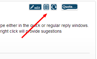
Paul, that's not a spell checker but a "Solved topic" button. Only the topic starter and moderators can see it (true that TS's also should have the permission - will look into this)
-
@unknownuser said:
The new site is a pass but the move to privatize is a step backwards. Good luck with your private forum guys.
Hi Roland Joseph,
Could you please explain why you state New SketchUcation is a retrograde step? I am genuinely interested in understanding your perspective on this.
Mike
-
What is the significance of the Resources and Special Interest forums being locked?
-
~~In Chrome I'm not getting the spell checker comming up as I type either in the quick or regular reply windows.
Normally any misspelled word gets underlined as I type and a right click will provide sugestionsJust tried it in Firefox and its working as expected......odd~~
Edit:
Opps its a error in the latest build of the Chrome Beta, not the forum.Additionally there seems to be a frame around a lot of the smaller graphics:

-
Ignore my 'Spelling not working' message, it was Chrome not the forum.
-
@unknownuser said:
What is the significance of the Resources and Special Interest forums being locked?
Locked isn't really the correct term for the Special Interest. You need to add these in your UCP. They don't get added as part of registration.
The resources top level forum is locked as we allow posting within it's subforums to keep things organised.
Nothing sinister here it has always been like this. Just the new icons highlight that there is some restriction in these.
Nothing has changed to the forums in the upgrade. Everyplace remains as is.
-
Adding yourself in the UCP is only for the foreign languages forums.
Now here the "locked" sign only means that there are no general discussion topics at the top level but only under the subforums.
There are forums with subforums where there are also discussions at the top level (SU, LO, Gallery, Extensions, Corner Bar etc.) They are also "open" at top level. And indeed, this is something we used to have on the old forums, too - only the new icons are a bit more amphysising these things.
-
Maybe the icon for solved should be a trophy or blue ribbon. (Using a check is confusing.)
-
@rich o brien said:
Nothing sinister here it has always been like this. Just the new icons highlight that there is some restriction in these.
I noticed that access wasn't restricted or anything like that, and didn't suspect anything shady was going on. Just curious about all the new shiny things is all. I haven't explored all the new things yet, but what I see, I like.

Hello! It looks like you're interested in this conversation, but you don't have an account yet.
Getting fed up of having to scroll through the same posts each visit? When you register for an account, you'll always come back to exactly where you were before, and choose to be notified of new replies (either via email, or push notification). You'll also be able to save bookmarks and upvote posts to show your appreciation to other community members.
With your input, this post could be even better 💗
Register LoginAdvertisement


