New Cards - Feedback
-
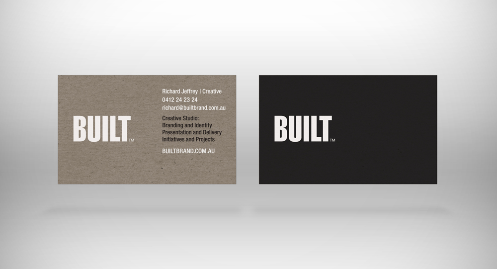
Just in the throws of ordering some new cards as I've made application for a new trademark (which takes some time my god!).
So going for a box board look - either real if I can find a darn printer capable of printing white onto box board or I'm just going to fake it.
Would love some feedback - One of those things when doing stuff for yourself you can NEVER MAKE A DARN DECISION!

Trying to keep them clean and not too flash, sort of approachable and not too "building" orientated despite the BUILT trademark. I'm going to print both types so as one can get the work I want and the other aimed for fill in jobs.
-
I like them both, if I have to choose one, it would be the first.
If you only need a few of them, this could be an alternative to printing?

http://www.formulor.de/material/cardboard -
I like em both. But I read 'Richard Jeffrey i Creative'.
As in 'I am creative' which you are, but wouldn't a forward slash or dot be better? -
Thanks Cotty and Barry, Thats a cool link for Formulor! Even if for just going through all the material properties!
@ Baz, mate I'll see what I can do with that separator, I'm inclined to leave it though might extend it or replace with a lighter / longer line. Its something I commonly use as a divider as a slash alawys looks out of place it text now with such overuse in links! Thanks though I can certainly see your point. Like you said a dot might well be the go!
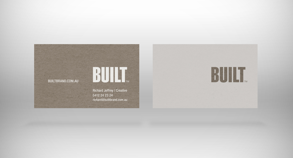
BTW there isn't a choice between the two I'm doing both and maybe a third!
-
At one point, I was planning on using a similar material for cards, Richard. I did get a test run done where they used an image and it looked 'ok' but not as good as the real thing.
doing the white on chipboard shouldnt be an issue if its screen printed. obviously, these guys are in the states but maybe you can find someplace down under with a similar process.. http://www.mamas-sauce.com/
and, for the record, i dig the black one.
-
#1
-
When you approach a woman in a saloon, do you slap your card on the bar and circle "built" with a marker?
I like "1" the best, but with the black back, a potential client can't make a note on the back of the card.
-
do you guys remember the cd-rom cards? I thought they would be huge... Never materialized.
-
Thanks guys for the feedback, and the link Jason, it looks like I will have to go the fake route as I cant seem to find anyone who can print white, yet it can be done as it is with packaging now on mass! Roger, you have to leave them to find somethings out the hard way!
I remember the CD cards, a collegue of mine had to replace a clients drive as the cards could easily slip through the CD drawer and mash it! Never gave out another!
-
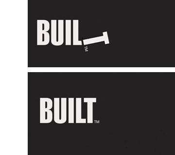
Ok, I'm getting picky now. I haven't got that typeface so I had to fudge it, but typography is all about white space, or in this case black space.
Can you see the difference?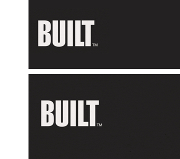
I could tweak it further if I had the typeface.
-
Sorry, couldn't resist.... -
@richard said:
@ Baz, mate I'll see what I can do with that separator, I'm inclined to leave it though might extend it or replace with a lighter / longer line. Its something I commonly use as a divider as a slash alawys looks out of place it text now with such overuse in links! Thanks though I can certainly see your point. Like you said a dot might well be the go!
Agree with you about the slash, but forget the dot, too naff. I reckon use a black line, same weight, on both. Will look especially good on the second one.
baz -
Richard
You are the Master of understatement.
I'd love to clone your gene that resists embellishment, a bane to most of us.Cards are interesting, I believe they appeared at first in France, mostly as a visitor announcement, and then moved into use by businesses as a form of advertising.
Probably now they have become more commonplace as a tool to get recipients to your website, which has no doubt become the centre piece in most marketing strategies.
But they really are the "Branding" face of most small businesses.
I'd love to hear your experiences as one who works in this field Richard. -
If you want a clean white on colored stock, you need to go to foil stamping, but you pay a premium for that. Also a tag line or differentiator is a good thing to set in your audience's mind. IE BUILT - Architecture that endures.
-
I like them both, although if you go for the first one, I would change the color of the font on the black side to sepia, and reverse on the sepia side, similar to the concept on the white card.
-
Nº1 is by far the best.
Just replace the awkward|with a simple·and it's good-to-go -
Richard has mentioned a couple of times that that it's not 'either/or'.
He intends to use them both for different purposes. -
Hi
if you want to print white on card search for 'foil blocking' or 'gold blocking' - any printer will point you in the right direction
Ed -
Rich, a few comments...
- The seperator - I do the same thing. To get more emphasis from it just make it bold and maybe a size or two larger...
- First one is my pick; not a big fan of a full black card. Why? I dunno.... there's just something about people who have black cars, where black, etc....
- The back of the card; is it white? It should be I reckon to write down that girls' number...
- And just go for a standard finish. Nothing worst than trying to write on a glossy card and it smudges....

-
Wow, Thank you, thank you, thank you all!!!! Some great feedback! Thanks especially to you Barry for coming back and putting a few more two cents in!
@unknownuser said:
Ok, I'm getting picky now. I haven't got that typeface so I had to fudge it, but typography is all about white space, or in this case black space.
Can you see the difference?Barry in regards to the letter spacing, the font is Helvetica LT Std (Extra compressed) - I actually have spaced it out over the default but admittedly I've probably pulled the T in to far, stretching it out further I found was tending to weaken it. Hey I do like your play with the T as a hammer! I used a Hammer as a T in an entry in a 99desgins comp recently - the first I'd entered and won it was pretty chuffed with that!


Advertisement