New Cards - Feedback
-
do you guys remember the cd-rom cards? I thought they would be huge... Never materialized.
-
Thanks guys for the feedback, and the link Jason, it looks like I will have to go the fake route as I cant seem to find anyone who can print white, yet it can be done as it is with packaging now on mass! Roger, you have to leave them to find somethings out the hard way!
I remember the CD cards, a collegue of mine had to replace a clients drive as the cards could easily slip through the CD drawer and mash it! Never gave out another!
-
Ok, I'm getting picky now. I haven't got that typeface so I had to fudge it, but typography is all about white space, or in this case black space.
Can you see the difference?
I could tweak it further if I had the typeface.
-

Sorry, couldn't resist.... -
@richard said:
@ Baz, mate I'll see what I can do with that separator, I'm inclined to leave it though might extend it or replace with a lighter / longer line. Its something I commonly use as a divider as a slash alawys looks out of place it text now with such overuse in links! Thanks though I can certainly see your point. Like you said a dot might well be the go!
Agree with you about the slash, but forget the dot, too naff. I reckon use a black line, same weight, on both. Will look especially good on the second one.
baz -
Richard
You are the Master of understatement.
I'd love to clone your gene that resists embellishment, a bane to most of us.Cards are interesting, I believe they appeared at first in France, mostly as a visitor announcement, and then moved into use by businesses as a form of advertising.
Probably now they have become more commonplace as a tool to get recipients to your website, which has no doubt become the centre piece in most marketing strategies.
But they really are the "Branding" face of most small businesses.
I'd love to hear your experiences as one who works in this field Richard. -
If you want a clean white on colored stock, you need to go to foil stamping, but you pay a premium for that. Also a tag line or differentiator is a good thing to set in your audience's mind. IE BUILT - Architecture that endures.
-
I like them both, although if you go for the first one, I would change the color of the font on the black side to sepia, and reverse on the sepia side, similar to the concept on the white card.
-
Nº1 is by far the best.
Just replace the awkward|with a simple·and it's good-to-go
-
Richard has mentioned a couple of times that that it's not 'either/or'.
He intends to use them both for different purposes. -
Hi
if you want to print white on card search for 'foil blocking' or 'gold blocking' - any printer will point you in the right direction
Ed -
Rich, a few comments...
- The seperator - I do the same thing. To get more emphasis from it just make it bold and maybe a size or two larger...
- First one is my pick; not a big fan of a full black card. Why? I dunno.... there's just something about people who have black cars, where black, etc....

- The back of the card; is it white? It should be I reckon to write down that girls' number...
- And just go for a standard finish. Nothing worst than trying to write on a glossy card and it smudges....

-
Wow, Thank you, thank you, thank you all!!!! Some great feedback! Thanks especially to you Barry for coming back and putting a few more two cents in!
@unknownuser said:
Ok, I'm getting picky now. I haven't got that typeface so I had to fudge it, but typography is all about white space, or in this case black space.
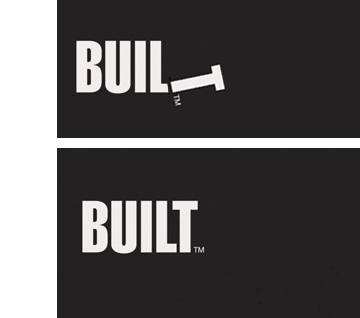
Can you see the difference?Barry in regards to the letter spacing, the font is Helvetica LT Std (Extra compressed) - I actually have spaced it out over the default but admittedly I've probably pulled the T in to far, stretching it out further I found was tending to weaken it. Hey I do like your play with the T as a hammer! I used a Hammer as a T in an entry in a 99desgins comp recently - the first I'd entered and won it was pretty chuffed with that!

-
I've just got to duck to a meeting then after will respond to the other replies! Thanks all!
-
@dale said:
Richard
You are the Master of understatement.
I'd love to clone your gene that resists embellishment, a bane to most of us.Cards are interesting, I believe they appeared at first in France, mostly as a visitor announcement, and then moved into use by businesses as a form of advertising.
Probably now they have become more commonplace as a tool to get recipients to your website, which has no doubt become the centre piece in most marketing strategies.
But they really are the "Branding" face of most small businesses.
I'd love to hear your experiences as one who works in this field Richard.Thanks Dale, mate I love the points Deiter Rams (designer for BRAUN) put down about design and one inparticular "Design as little as possible". I tend to go the other way at the start though and then take away until I have the minimum!
Yeah cards are a funny thing, they can make or break. How often have we picked up a card and judged a firm or person on the quality or the contained graphic or information - part the reason I'm wanting more than one card. One to give some hint at what I do and the other so it can be furnished toward any type of work.
The last card I had was square and printed with 3 different colour face options, it allowed me to hand out all 3 at most meetings and always created some interest and comment. "Hmmm? nice cards!". It certainly worked! In fact a massive job came along the other week from exactly that - the chap years later called about a massive project and commented that he had kept my card because he liked it and it was the only way he had even remembered my name!
-
@roger said:
If you want a clean white on colored stock, you need to go to foil stamping, but you pay a premium for that. Also a tag line or differentiator is a good thing to set in your audience's mind. IE BUILT - Architecture that endures.
Thanks Roger, yeah I actually looked at doing letterpress but as you mention the cost goes ballistic!
I'm not a lover of tag lines, well I will sometimes recommend them to clients but if it is warranted or very relative! With the tradesman link logo above they suggested what about a tag "linking tradesmen" - hmmmm? Ah doesn't it already say that?
In my case I'm chasing branding and cataloguing of home ranges, the domain BUILTBRAND is aimed itself as a sort of tagline! "Brands built"
-
@unknownuser said:
I like them both, although if you go for the first one, I would change the color of the font on the black side to sepia, and reverse on the sepia side, similar to the concept on the white card.
Thanks mate, I decided on white on the black (main card) as this will be how it most appears on other collateral and website!
-
@clarencecat said:
Hi
if you want to print white on card search for 'foil blocking' or 'gold blocking' - any printer will point you in the right direction
EdThanks Ed, yeah as I mentioned in reply to Roger, I looked at foiling but wow the price rockets, and mate here we seem to be short of printers who aim to help! Most good stuff here comes out of Melbourne - a fair way from Sydney!!
-
@utiler said:
Rich, a few comments...
- The seperator - I do the same thing. To get more emphasis from it just make it bold and maybe a size or two larger...
- First one is my pick; not a big fan of a full black card. Why? I dunno.... there's just something about people who have black cars, where black, etc....

- The back of the card; is it white? It should be I reckon to write down that girls' number...
- And just go for a standard finish. Nothing worst than trying to write on a glossy card and it smudges....

WHEN'S BEER????
Yeah I've fallen in love with the "|" separator, and like you generally bump it up a point or two and adjust the baseline to keep it centred.
I'm like you mate, don't love black cards - the back seems ok but on the from it's wishy washy!
The card has plenty of writing space and I'm always carrying artline felt tip which will write on anything!!
Thanks mate and again - WHEN's BEER?
-
On BEER... hope to get down to SYD again soon Rich.... I'll let you know when I do.
[a day after....
 ]
]
Hello! It looks like you're interested in this conversation, but you don't have an account yet.
Getting fed up of having to scroll through the same posts each visit? When you register for an account, you'll always come back to exactly where you were before, and choose to be notified of new replies (either via email, or push notification). You'll also be able to save bookmarks and upvote posts to show your appreciation to other community members.
With your input, this post could be even better 💗
Register LoginAdvertisement


