Trimble Version
-
@panixia said:
if the icon is the one and only "improvement" i will stay with m3 for now..
The icon isn't the only change - check the changelog. Always keep your software up to date - it makes the life of us plugin developers much easier when people have all the latest bug fixes. Don't get caught up on the icon - you can change your shortcut if you really insist on using the old icon.
-
@kwistenbiebel said:
@unknownuser said:
What should have happened was an open competition for logos. Crowd source the logo and make it born from the community of avid users who understand the product.
Great idea

People would still be unhappy - the community doesn't speak with one voice - it'd just be even more.
-
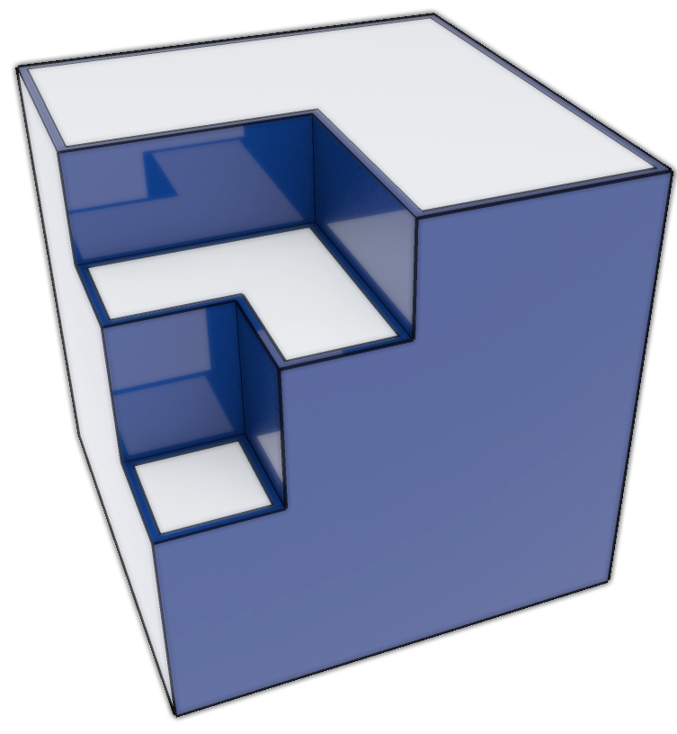
@ Marian: Do you have that in Trimble blue?
-
@thomthom said:
@panixia said:
if the icon is the one and only "improvement" i will stay with m3 for now..
The icon isn't the only change - check the changelog. Always keep your software up to date - it makes the life of us plugin developers much easier when people have all the latest bug fixes. Don't get caught up on the icon - you can change your shortcut if you really insist on using the old icon.
ok, i was joking, but now, after reading the changelog, i found that actually it is quite a useless upgrade for me, i don't like the logo at all, i don't use mac, i don't export to layout.. in addition they don't claim any bug-fixes on this relase..
and i recently reinstalled for M3, cleaned up the plugin folder, tweaked the workspace a bit more and EVEN MY TOOLBARS are behaving properly.
it works so nice i don't want to touch it at all at the moment.anyway how it is possible in win7 to change the icon of a program? that would be nice..
-
-
@panixia said:
it works so nice i don't want to touch it at all at the moment.
I'd still recommend you update. Some times there are some things that doesn't get mentioned in the release log. In some releases changes to the API hasn't been mentioned which is important to plugin develoers.
@panixia said:
anyway how it is possible in win7 to change the icon of a program? that would be nice..
You can set the icon for the shortcuts you use - just right click and inspect the Properties.
-
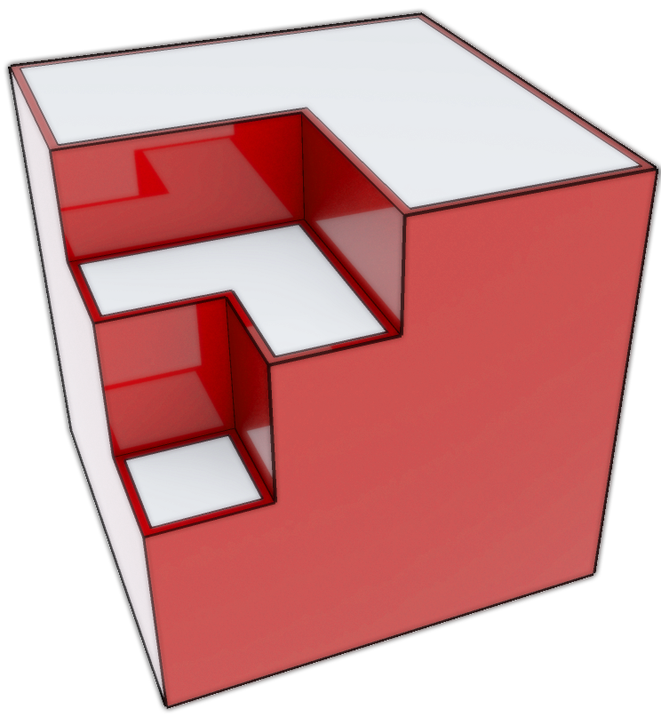
I Like the logo, it represents a 3D model, I don't know what all the fuss is about, it's just a logo, changes are made and we have to adapt to it, it doesn't change the UI and workings of SU, nice model Marian, I'm sure Trimble would approve, but yeah it would of being a nice touch if it were a competition to design but come on, it's a logo, out with the old and in with the new, in my opinion this is a sign that Trimble are taking this software seriously and improvements are more likely than when it was with google, welcome it and look at it as a new era

-
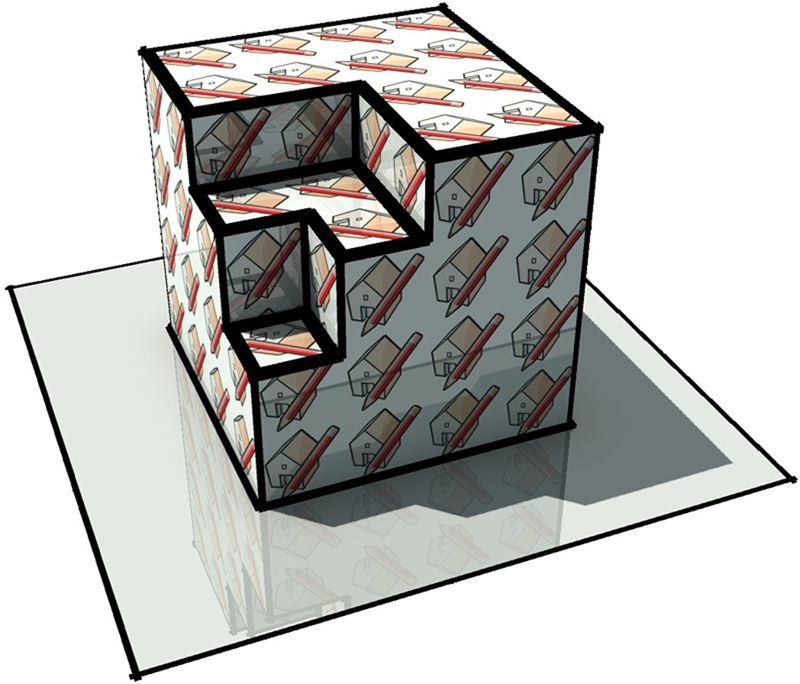
LOL that was quick Marian, and with reflections! Now I'm going to feel guilty if I don't use it.

-
@thomthom said:
@panixia said:
anyway how it is possible in win7 to change the icon of a program? that would be nice..
You can set the icon for the shortcuts you use - just right click and inspect the Properties.
i know you can for desktop shortcut, but not in the win7 taskbar were i use to keep the SU link, or i'm missing something?
-
Can you drag the shortcut onto the taskbar?
-
I have the old SketchUp icon in my taskbar - from the old version when I pinned it. But when I start SU it changes to the new application icon. Don't know if it can be changed. Didn't see it as an issue. Not using an application because of its icon doesn't seem ... rational...
-
@arcad-uk said:
LOL that was quick Marian, and with reflections! Now I'm going to feel guilty if I don't use it.

Don't worry about it. It was simple to do.

@iichiversii said:
nice model Marian, I'm sure Trimble would approve, but yeah it would of being a nice touch if it were a competition to design but come on, it's a logo, out with the old and in with the new, in my opinion this is a sign that Trimble are taking this software seriously and improvements are more likely than when it was with google, welcome it and look at it as a new era
Thanks
 .....yeah it's just a logo but it's too bland the way it is. I mean they completely missed the mark. It would have been better in Trimble blue, it could have been shaded and it could have been both shaded and had edges outlines like in SU. I have no trouble with the shape of the logo but with the way it was executed...it tells nothing about SU and in that red it does not convey any friendlyness.
 -
@thomthom said:
Not using an application because of its icon doesn't seem ... rational...
naa i just specified i was joking.. i said that i won't touch it because at the moment it is working great as it never had before.
it was just a little off-topic on how customize icons.. that's all..
also i'm on holidays with a crappy internet key.. maybe i will update when i come back home.
but first of that i will buy your new stunning plugin for sure!
-
-


-
Hi,
With the new logo we have to live, and we will get used to it very quickly. Ido not hate the new logo but about Beauty is debatable. Until now, SketchUp is still SketchUp. I wonder more what direction will go further changes.
Charly
-
-

reminded me of something...
-
a question.
The new Spanish version is available for download?because from the page ( http://www.sketchup.com/intl/en/gsu8/download.html ) can only download version sketchup8 m3
-
anyone knows why it SU was sold to trimble and for how much

Hello! It looks like you're interested in this conversation, but you don't have an account yet.
Getting fed up of having to scroll through the same posts each visit? When you register for an account, you'll always come back to exactly where you were before, and choose to be notified of new replies (either via email, or push notification). You'll also be able to save bookmarks and upvote posts to show your appreciation to other community members.
With your input, this post could be even better 💗
Register LoginAdvertisement


