Trimble Version
-
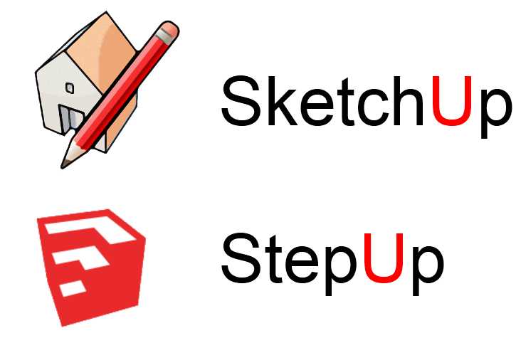
I'm not too fond of these new logos to be honest.

-
@unknownuser said:
Will this site be Trimblucation now lol?
No, as it wasn't @Lastucation or Googlecation before.

-
Does this version overwrites the old one or we are free to install it in another folder ?
-
@unknownuser said:
Does this version overwrites the old one or we are free to install it in another folder ?
It overwrites your previous version 8. (Your version 6 is safe
 )
) -
@marian said:
I'm not too fond of these new logos to be honest.
+1
the new logo is so crappy and anonymous..
if the icon is the one and only "improvement" i will stay with m3 for now.. -
@panixia said:
@marian said:
I'm not too fond of these new logos to be honest.
+1
the new logo is so crappy and anonymous..
if the icon is the one and only "improvement" i will stay with m3 for now..I posted two polls. Come and vote!
Add your thots in those threads, if you like.
Should be interesting topic(s).[Poll] What do you think of the new SketchUp logo designs ?
[Poll] What do you think of the new SketchUp logo color ?
~
-
@krisidious said:
I didn't read it... I just click and wait for something wonderful to happen. I'm often disappointed. as with this all I get is new Icons I won't recognized for a month or two.
You should read before agreeing, ever watched the south park episode "the human centipad"?
-
I'll keep an original Google SU 8 installer and a not updated version on one of my many computers just for the sake of old times.
-
I don't like this so called "professional" minimalist look that's popular today with companies... e.g. Microsoft's new logo is a joke...you mean to tell me that people really got paid for that?
The new SU logos are not as bad as that, but the old logo seemed more friendly and gave an idea of what the program does. The colours stood out but were not "screaming" at you.The new logo seems disconnected from the program it represents.
I think visually it looks ok, but it doesn't fit SU at all. First it lacks recognition, that can be fixed, second it doesn't show any clue as to what the program does if you aren't familiar with it, third the color just doesn't work.
They could have at least kept the lines on the edges or different shades on the faces.

-
What should have happened was an open competition for logos. Crowd source the logo and make it born from the community of avid users who understand the product.
-
Are there any changes other than to the logo? I don't see anything obvious.
I just downloaded and installed it and now I realize that was a bit of a mistake. I rarely ever read the disclaimers, I just Accept, but in this case I should have looked for any comments about our original license status and if it changes at all.
-
@arail1 said:
Are there any changes other than to the logo? I don't see anything obvious.
The new changes have been now added to the Release Notes page:
http://support.google.com/sketchup/bin/static.py?hl=en&page=release_notes.cs -
..Yes, the workspace looks absolutely stunning now on Retina display!

-
@unknownuser said:
What should have happened was an open competition for logos. Crowd source the logo and make it born from the community of avid users who understand the product.
Great idea

-
@archheni said:
..Yes, the workspace looks absolutely stunning now on Retina display!

Not only the workspace. The models are so sharp!!!!! Now i know why i bought the macbook pro retina.
-
@panixia said:
if the icon is the one and only "improvement" i will stay with m3 for now..
The icon isn't the only change - check the changelog. Always keep your software up to date - it makes the life of us plugin developers much easier when people have all the latest bug fixes. Don't get caught up on the icon - you can change your shortcut if you really insist on using the old icon.
-
@kwistenbiebel said:
@unknownuser said:
What should have happened was an open competition for logos. Crowd source the logo and make it born from the community of avid users who understand the product.
Great idea

People would still be unhappy - the community doesn't speak with one voice - it'd just be even more.
-
@ Marian: Do you have that in Trimble blue?
-
@thomthom said:
@panixia said:
if the icon is the one and only "improvement" i will stay with m3 for now..
The icon isn't the only change - check the changelog. Always keep your software up to date - it makes the life of us plugin developers much easier when people have all the latest bug fixes. Don't get caught up on the icon - you can change your shortcut if you really insist on using the old icon.
ok, i was joking, but now, after reading the changelog, i found that actually it is quite a useless upgrade for me, i don't like the logo at all, i don't use mac, i don't export to layout.. in addition they don't claim any bug-fixes on this relase..
and i recently reinstalled for M3, cleaned up the plugin folder, tweaked the workspace a bit more and EVEN MY TOOLBARS are behaving properly.
it works so nice i don't want to touch it at all at the moment.anyway how it is possible in win7 to change the icon of a program? that would be nice..
-
Hello! It looks like you're interested in this conversation, but you don't have an account yet.
Getting fed up of having to scroll through the same posts each visit? When you register for an account, you'll always come back to exactly where you were before, and choose to be notified of new replies (either via email, or push notification). You'll also be able to save bookmarks and upvote posts to show your appreciation to other community members.
With your input, this post could be even better 💗
Register LoginAdvertisement


