New sketchucation HERE @LAST
-
Wow, nice praise. Glad you like it. It was a looot of work, I can tell. Rich was nitpicking with me for every pixel he did not like.

-
Nice changes...just one issue for me, the profil informations under the photos are really long and should be trimed when the post is just one line long ! in order to have a more condensed and clear lecture of the thread.
For the rest, I like it, a lot.
Regards
-
I wondered why I couldn't get on the forum last night: now I know. It is an impressive change and will take some time to get used to, but

-
I wished there was a 'View active topics' button on top of this page.
-
I agree the top bar should be consistent on all pages:
 Having to click 'Board index' to get those options is a pain - twice as much RSI.
Also why include 'Visit your posts' when you are actually in 'Your posts' etc?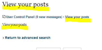
-
@tig said:
I agree the top bar should be consistent on all pages:[attachment=0:2ejvfzyj]<!-- ia0 -->top.PNG<!-- ia0 -->[/attachment:2ejvfzyj] Having to click 'Board index' to get those options is a pain - twice as much RSI.
Also why include 'Visit your posts' when you are actually in 'Your posts' etc?Iv being having that problem too, well not really problem but it does annoy me that i need to go to the community dropdown menu from "view my posts" to "view active posts"
-
-
@gaieus said:
Wow, nice praise. Glad you like it. It was a looot of work, I can tell. Rich was nitpicking with me for every pixel he did not like.
Ye deserve it Csaba, great job
-
@Pilou
I agree: and what do they mean? -
Just a smaller frame would help a lot
-
What "frame" do you mean?
-
What they mean I'm not sure but I see what you mean by the bold and regular look, I must admit I like both, but what I will say is the bold icons stand out more and I find eye catching, I'm sure there is good reason for this

-
I think it would be nice to use the newSU logo as icons.
SU discussion - SU Icon
SU LayOut discussion - LO Icon
SU Style Builder discussion - SB Icon
And possibly few more for other Groups (Developers, Gallery, Special Interest etc.)


-
Csaba reference Pilous post where the icons are edited to show a lighter tone to the frame around the top 2 icons
-
Posted images are 640 px maximum.
Images larger than this (mine usually at 700 px) will be resized to 640 px as preview.
Not too bad, considering that it still keeps its color profile. That's new in SCF (keeping color profile) and these are good news. Good work.
So, from now on, post your images converted to an sRGB c space. To be sure that everybody sees something similar. Under a decently tuned operation system, of course. lolRegarding tools icons, still guessing what they mean and it works in most cases.

But, this bright UI still burns my eyes...
-
Both attached and embedded (external) images are clickable and will pop up at full resolution. Try that, please, to see how it works.
-
wow... Tons of changes. You guys have done a lot of work. Looks great. Thanks a bunch.
-
It's my navigator or the icons are really "bold" like this ?

If yes will be not more quiet relaxing for the eyes like this
(the 2 first for example)
-
Looks good! Seems to run a little quicker on my machine.
-
Whoa... just noticed this on logout. What is this "premium" of which you speak? What is the content that is offered? $50/yr.
Hello! It looks like you're interested in this conversation, but you don't have an account yet.
Getting fed up of having to scroll through the same posts each visit? When you register for an account, you'll always come back to exactly where you were before, and choose to be notified of new replies (either via email, or push notification). You'll also be able to save bookmarks and upvote posts to show your appreciation to other community members.
With your input, this post could be even better 💗
Register Login


Advertisement