Single Room-WIP
-
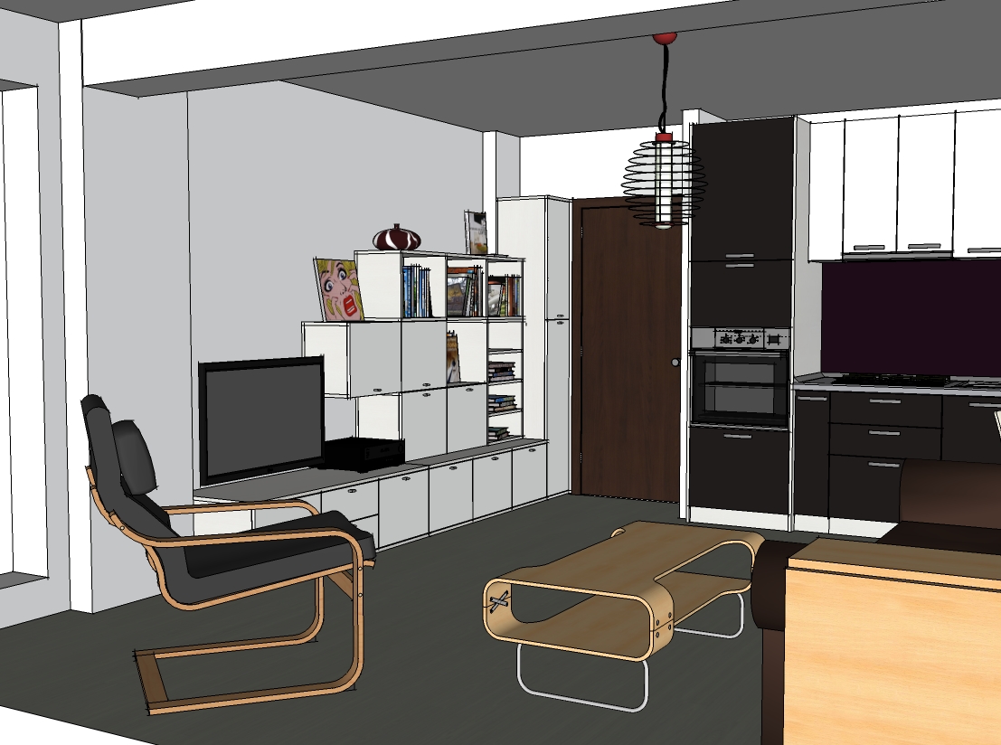
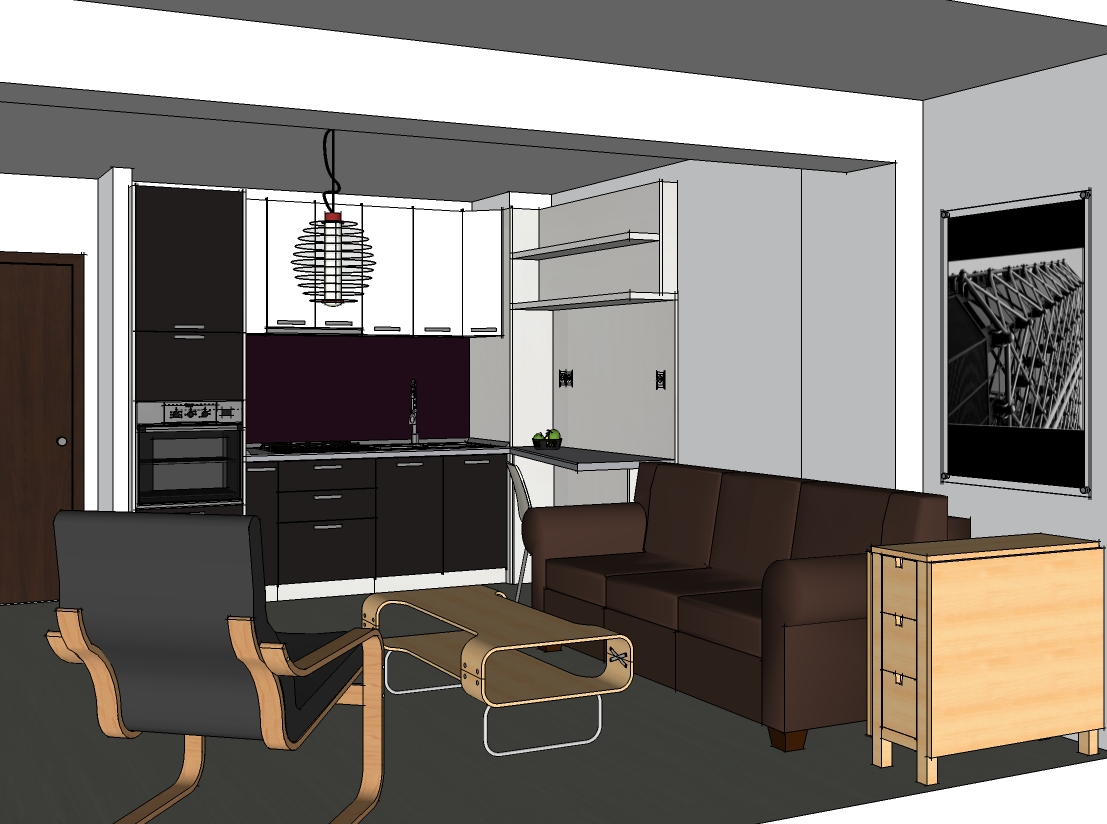
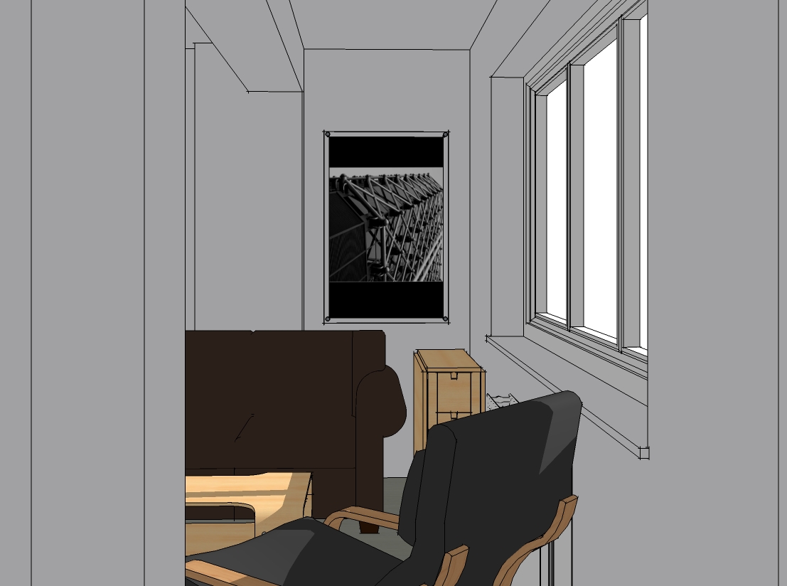
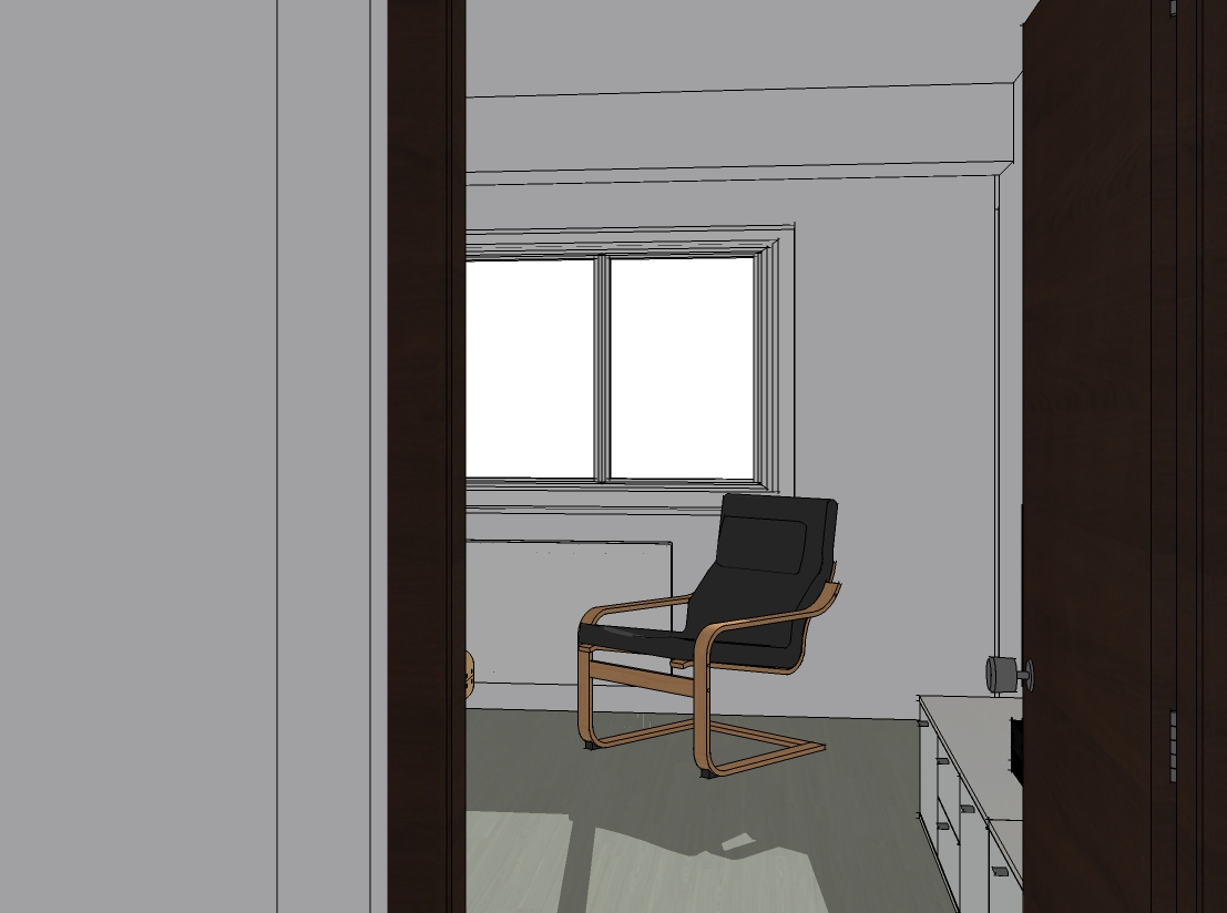
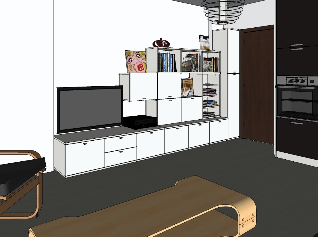
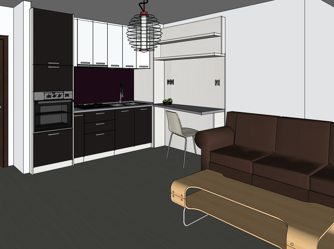
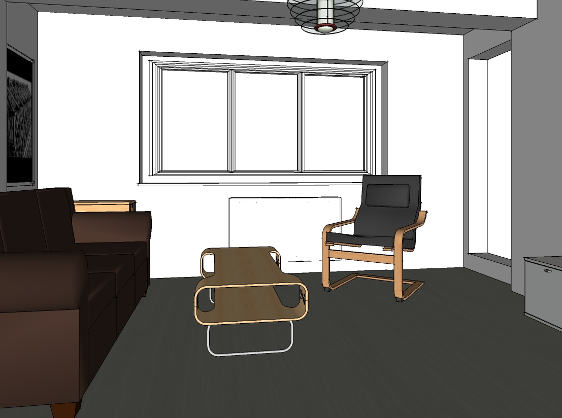
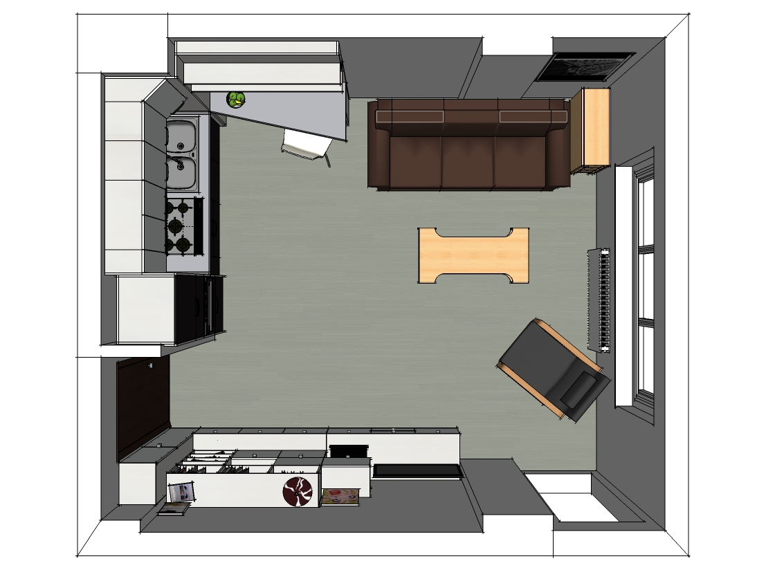
Hi all, some recent work in a difficult space. I think I managed to fit all the things client need.
Some c&c would be awesome. Sofa, chairs and tables are components from the warehouse.
Regards,
Stefan
-
Its tight and so for me the somewhat jumbled, informal look of the media/shelving wall does not work as well as the others. I think if you brought some order and elegance to that wall things would be more relaxed and successful, but that is certainly a view fraught with personal preference...
Is the pendant light fixture (honey server) your own design?
-
@brookefox said:
Is the pendant light fixture (honey server) your own design?
No, I forgot about that, sorry, must be a 3ds model saved in my personal library, but I can share it if you need it tomorrow,when I go to work.
I really appreciate your comments, thank you, I'll try something else to that wall, something easy to the eyes, but it's tricky, since that is a gypsum wallboard type of wall.
Regards,
Stefan -
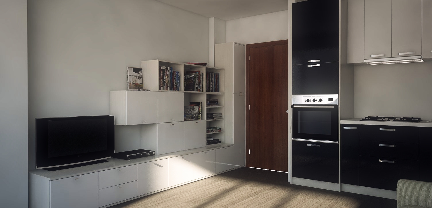
This is a render I did in early stages just to test materials. I'll cook some more, after I meet with the client.
I have some issues with the noise in reflections, due the fact that I have the sun going through the glass. I have to tweak the settings more. This is a V-ray render, by the way.
-
@stefanq said:
@brookefox said:
Is the pendant light fixture (honey server) your own design?
No, I forgot about that, sorry, must be a 3ds model saved in my personal library, but I can share it if you need it tomorrow,when I go to work.
Certainly only if it is convenient and can be imported natively. Thanks for the offer.
-
-
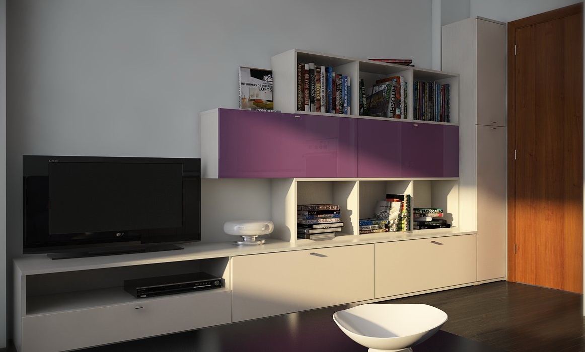
People and color choices....

-
Nice render.
-
Thanks Tom. Previous, I had to do some "gymnastics" in the V-ray frame buffer(adjustments) in order to make the image brighter, but I remembered Fernando's technique who basically used nothing in the GI slot, but a blue color with a big multiplier (40 or so), and enabled the sun in global switches (Default Lights). In this way, you don't need to put rectangular lights in the windows. I used HSV Exponential as color mapping, because I wanted to keep my colors saturated. I like the quality of the render, but I think this approach of lighting the scene was responsible for the pleasing result.
In the end, all that matters is to find what works best. I bet if I had to render a different scene with the same approach, it will turn worse, or.... better.
Cheers! -
Stefan, thanks for posting the light fixture.
-
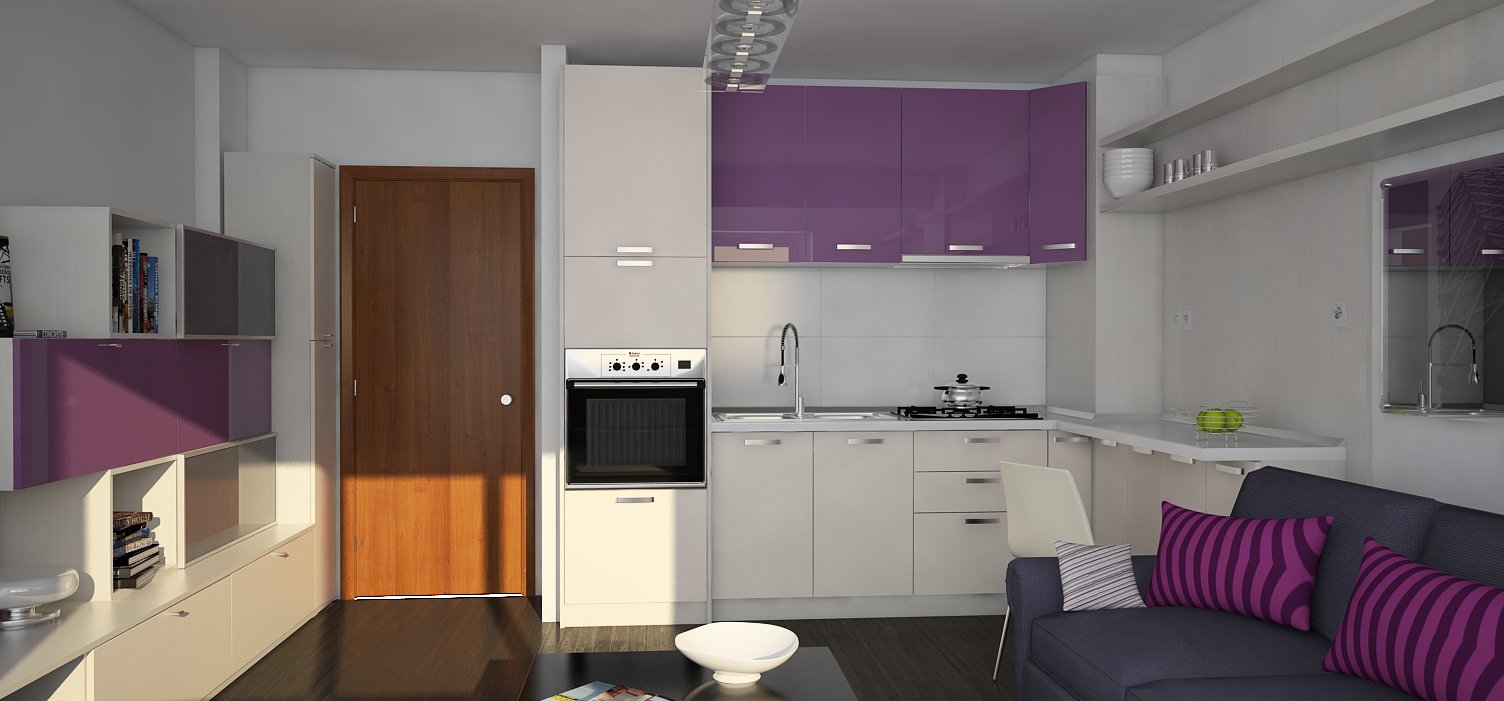
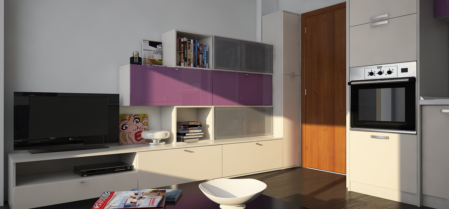
You're welcome! OK, some more images with minor modifications, these should be the last ones, as I got bored of the project. It's coming along quite slow. Still, it was fun, I was missing rendering so much.
Regards,
Stefan
-
Maybe you should try black, white, beige, dark brown colors?! Awe!
-
Ciao Nino, I've used different color combinations, but now it's out of my hands. Like I said in a previous post: "people and color choices" .
Thanks for your comment!
Hello! It looks like you're interested in this conversation, but you don't have an account yet.
Getting fed up of having to scroll through the same posts each visit? When you register for an account, you'll always come back to exactly where you were before, and choose to be notified of new replies (either via email, or push notification). You'll also be able to save bookmarks and upvote posts to show your appreciation to other community members.
With your input, this post could be even better 💗
Register LoginAdvertisement


