Watermark as a Title Box - Can't get it consistent
-
I've tried using the watermark feature in the free version of Sketchup to print a title box as follows but am running into one snag. I create a title box in a graphics program and then import it as a watermark. I position it centered on the bottom of the screen and print it to 1":1' scale (using the free program pdfprint to generate a 11"x17" pdf file, which I then email it to Fedex Office for printing). The problem is that the watermark resizes along with what is printed across different pfds and although I can get it close I cannot get it the same on each pdf. I've tried drawing guidelines on the screen for a 11"x17" box and then using zoom window just to zoom just inside of the guidelines hoping that will make what appears on the pdf file about the same but that doesn't work either. Is there a method to get the watermark consistently sized the same?
I did try the Cartouche plugin for a title block and although it's quite flexible the output is a fixed font and you cannot include graphics. If I create and import my own graphic I can make it look exactly how I want it to look with my logo, font, etc.
I guess my other option is to print out the title blocks separately using another program and then to just paste them on the printouts, but that negates part of the reason for using a CAD program.
-
Noel,
Straight up. I think this is where you need to invest in the pro version of SU. You've spent enough time futzing around trying to get this sort of thing to work and it's almost a no brainer in LayOut. If your time is worth anything at all, the investment in the pro version would be a relatively small one. And you would get a lot more than just LayOut that would be useful to you.
Watch for an e-mail from me.
Dave
-
I use a separate 'sheet' (and layer) positioned at an appropriate Z for each view which I wish to print or document. This actually works quite well for me once I learned some little tricks, like making masks of various transparencies placed again at appropriate Z to aid in the process. I've set up plans, sections, elevations, etc. in this manner. It ain't perfect, by a long shot, and in that sense, a lot like Layout. Dave is happy with LO, though, as are many and perhaps it would suit you.
-
I just wouldn't be doing what I do without it.
-
@brookefox said:
I use a separate 'sheet' (and layer) positioned at an appropriate Z for each view which I wish to print or document. This actually works quite well for me once I learned some little tricks, like making masks of various transparencies placed again at appropriate Z to aid in the process. I've set up plans, sections, elevations, etc. in this manner. It ain't perfect, by a long shot, and in that sense, a lot like Layout. Dave is happy with LO, though, as are many and perhaps it would suit you.
What do you mean by a 'Z'?
-
I mean in the 'z' direction: up/down, vertically in SU, rather than x,y. So in plan view, looking down, moving a logo group or component in the 'z' direction would move it in frot of or behind other entities; likewise any opaque or semi-opaque masks used to hide parts of the drawing, which might be on otherwise visible layers.
-
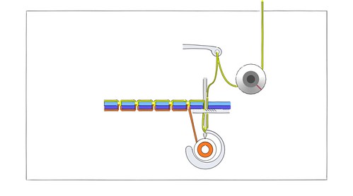
That's a good method. I used something similar when I did an animation of a sewing machine making a lock stitch. This is the first frame:
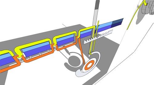
And part of it when you zoom in and use Perspective mode.
Everything but the tensioning knob is drawn flat but they are at different distances from the camera so some things are partially hidden behind others.
Hello! It looks like you're interested in this conversation, but you don't have an account yet.
Getting fed up of having to scroll through the same posts each visit? When you register for an account, you'll always come back to exactly where you were before, and choose to be notified of new replies (either via email, or push notification). You'll also be able to save bookmarks and upvote posts to show your appreciation to other community members.
With your input, this post could be even better 💗
Register LoginAdvertisement


