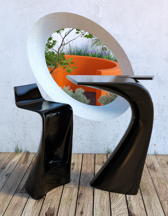
[WIP] Wing Stool & Table
-
I wouldn't take the time to learn 3dsmax as you're not working for a big company that uses it. As freelance I would learn something cheaper (3dsmax +-3500euro <=> rhino +-1000euro) or even Blender. It's maybe not an industry standard but for freelancers 3dsmax is a huge investment to make every year.
rhino and skethup: I don't really know because I didn't try but rhino imports and exports skp files so I think it's an easy workflow between the two. The main difference with sketchup + 3dsmax workflow is that rhino is mainly a nurbs modeller. Your imports from sketchup will be meshes where rhino is not really strong. Try it out, the trial has 30x save limit but except that it's fully functional. It imports really a huge amount of different formats so as freelancer it could be a good polyvalent choice. (I say it could because I'm not really an experienced user of rhino so I did not try every import yet)
But what I can say from the times I used it: It's easy to learn (comming from a cad background), I needed a modeller for organic architecture for one of my projects and I started the project with rhino. I felt almost instantly at home, you just type in the command you need (or something close) and rhino instantly completes the word and gives you a choice of commands which use the same part of word.
I spent more time using 3dsmax then rhino and still I feel I understand rhino well compared to 3dsmax which is still a big question mark for me.
to the topic: Your chair material is much better, but maybe try one with a more dramatic lighting and maybe the background will not look like a picture anymore.
-
@dbalex said:
Try it out, the trial has 30x save limit but except that it's fully functional.
That's good to know - I find the usual 30 day limit very restrictive.
@unknownuser said:
you just type in the command you need (or something close) and rhino instantly completes the word and gives you a choice of commands which use the same part of word.
Oh no, that sounds like AutoCAD. I'll still give it a chance though.
@unknownuser said:
Your chair material is much better, but maybe try one with a more dramatic lighting and maybe the background will not look like a picture anymore.
I think you might be right about the lighting, but I think the chair plastic is a bit too blurry.
-
MoI's trial comes in 2 flavours. Unlimited with no save or 30 days.
That recent alessi jug (I think) you did was a 3 step operation in MoI. Rounding edges was a breeze.
Don't get me wrong here. I'm not pushing a product just observing that for some things SketchUp doesn't always suit.
-
@hieru said:
Oh no, that sounds like AutoCAD. I'll still give it a chance though.
Haha I understand exactly what you mean.. at first I was disappointed because it looked like another autocad feature and I must say I'm disgusted by everything that looks like autocad, but here it's intelligent: in autocad you have to type the exact command to get it, here you just type something close and it gives you different choices while typing, it's a lot easier and sometimes I discovered features I needed just by typing the word I was looking for and then clicking on the choice I thought was good. It's not as fast as sketchup for designing something from scratch to finish, but it's really close (and I'm an experienced user of sketchup and a noob in rhino)
But I'm talking from an architect's point of view, I need good cad like snapping tools, be able to make plans and sections of my projects, ... if you need something only for rendering, then I would advise you to look at a more complete package that renders, models and is able to make some animations. Then Modo (or blender) is a better choice. Modo's renderer is really fast (almost instantly) and it is not an autodesk product (so it should be easier to learn)
-
@unknownuser said:
MoI's trial comes in 2 flavours. Unlimited with no save or 30 days.
Good to know

@unknownuser said:
Don't get me wrong here. I'm not pushing a product just observing that for some things SketchUp doesn't always suit.
I appreciate where you are coming from and I wouldn't want to lose SU from my workflow.
For instance, the basic form of the above orange curved wall was a breeze in SU, but adding the bevel was a pain - round corners couldn't handle it and I had to use Artisan. I know that other software can handle that kind of smoothing very easily (only a couple of clcks) and the ideal workflow would be:
-
Build the basic form in SU
-
Export
-
Modify the modelling
-
Import the model back into SU or my render app.
Things like the above furniture or Alessi watering can would be a different matter - probably better to start out in something like MoI. I would still however like the ability to bring models back into SU if necessary.
Edit: I've got another personal WIP that I might post later today: just to show you how much of a glutton for punishment I am.
-
-
A little more progress:

I haven't done anything else with SU, other than re-texturing the wall and adding the grass at the edge of the decking. I've mostly been working on materials and the vegetation in the background.
-
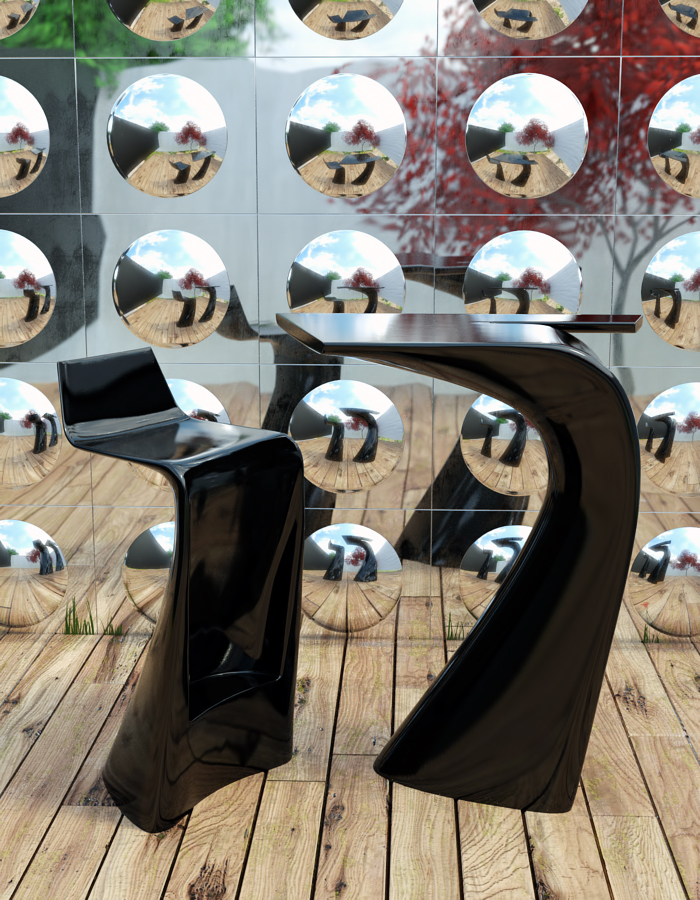
I think it would pop if the hole was filled with a mirror (convex/concave).
For some reason I'm drawn to the hole and miss the point of interest.
-
Funny you should mention mirrors, as my first idea before committing to modelling was to position the furniture in front of a wall of convex mirror tiles.
I had dismissed it because I thought that the reflections would be too busy and even more distracting. I know that this isn't what you had in mind but I gave it a shot anyway:

-
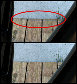
I just thought I'd share my solution to a problem I encountered with these renders.
For some reason I was getting an unwanted horizontal artifact towards the edge of the planking, where it meets the wall. It's more noticeable in the mirror wall scene.
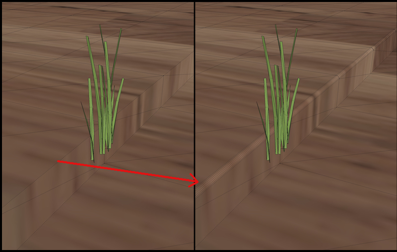
It turns out that this was somehow caused by softening all of the floor edges - which is needed for subdivision within Thea.
My workaround was to bevel the problem edge. Before & after images:


-
@hieru said:
I just thought I'd share my solution to a problem I encountered with these renders.
For some reason I was getting an unwanted horizontal artifact towards the edge of the planking, where it meets the wall. It's more noticeable in the mirror wall scene.
It turns out that this was somehow caused by softening all of the floor edges - which is needed for subdivision within Thea.
My workaround was to bevel the problem edge. Before & after images:
Hard to see from the image, but perhaps you have used Thea Displacement > Normal Smoothing, that should be usually turned off in cases like this. But anyway, for the best visual result, beveling sharp edges is always recommended.
-
When I first noticed the problem one of the first things I checked was whether normal smoothing was checked, but unchecking it didn't make any difference.
The weird thing is I just tried this again and unchecking normal smoothing works fine.
Regardless, you are right about the bevelling.......it looks much better and doesn't exactly take long to do.
Advertisement


