Is everyone satisfied with SU UI ?
-
I've been staring at the stark white UI for years now, and would like the possibility of having the choice of changing it to something more like some other 3D programs.
Some time ago, a remember seeing someone posting a "greyer" version on this forum, but have not seen anything since. Is there a plugin that someone may have written or is it even possible to do this? ...any thoughts out there? -
You don't even need a Ruby. Just open the Styles dialog, go to In Model Edit and change the background colour to some kind of mid-light grey. Save that empty file as your default template...or do you mean the toolbars themselves?
-
Thanks for the quick response Alan, and I have done that, however I'd like to change all the toolbars also.
-
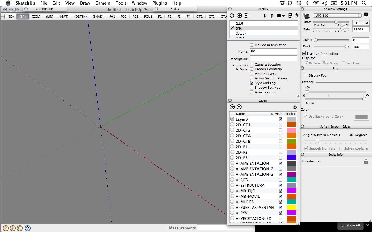
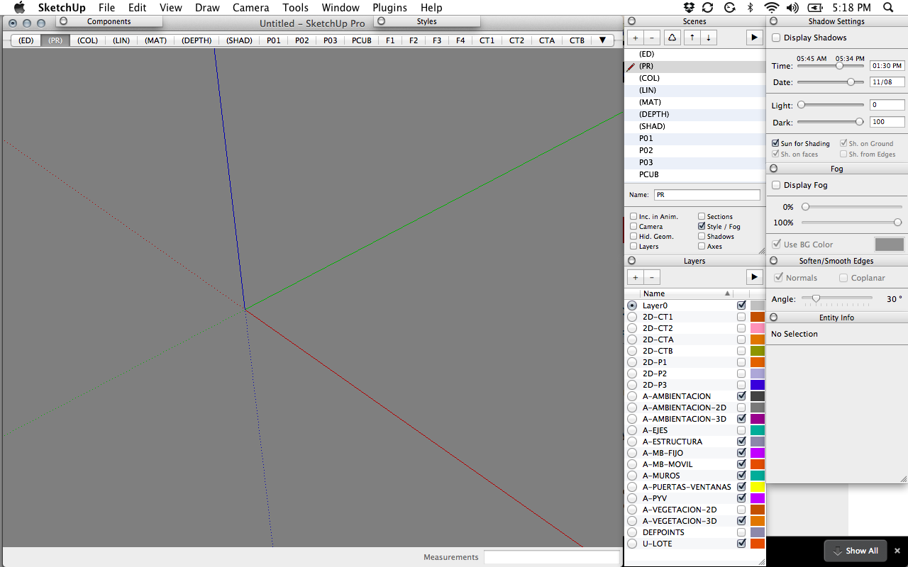
Here's a couple of samples that I'd like the choice to change to.
-
You could always change the UI style of Windows itself.
-
How would I do that Thomas?
-
Well, it depends on what Windows version you use.
With Win7 you mainly change the tint of the Aero theme. Though you can disable it and use the classic UI where you can then edit the colours your self.
This is all done from the Control Panel. Appearance I think it's under English.
But if you want true control - and be able to choose from more complex styles, get Windowsblinds: http://www.stardock.com/products/windowblinds/
I used this for many years. Even made some skins myself. Let you modify every aspect of the UI. And there's many skins available. Wincustomize and deviantArt are major repositories.
-
Thanks Thomas, I'm on windows 7, I downloaded demo of windowblinds and will give it a shot.

-
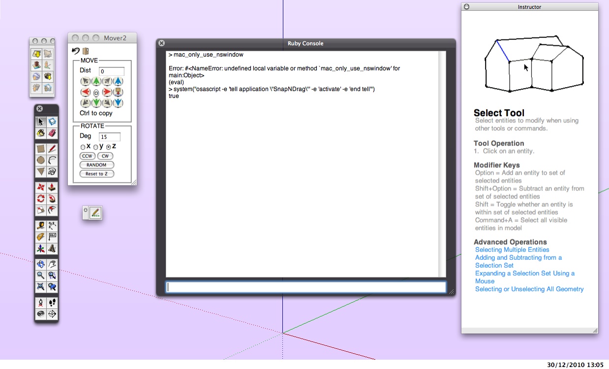
I am searching for a way to control the dialog windows on Mac. whatever I do they end up disconnected and all over the place, (often off-screen as I change monitors). Why don't they stay connected? They need stronger magnets
 .
.Would like a plugin, if possible, to bring them all closed in a dock, barring completely locking them into a single pane. Yes, I usually don't want them all on screen, but handling them individually is "pain" in itself.My other programs seem to keep window position.
Toolbars: toolbars on the Mac stink. besides some in the window toolbar, I don't leave them open.
Then there's the materials browser...

-
An alternative for using native Windows themes is to unlock that feature with UXtheme Multi-Patcher or UxTheme Patch for Windows 7.
I wish to attach dialogs into the main window so that they can't mess everything up and move dialogs onto other workspaces. Like this...

And disable dialog-snapping. It can be very annoying.
-
(Here's 3 minutes in photoshop),... and speaking only for myself, this is close to what I'd like to have in SU.
Can't tell you exactly why, but I'd still would like the choice to be able to change the interface.
I don't want to give it up entirely, just another choice or two as options.
-
I use sketchup on a macbook 13". It's easy to lug around, but has a small screen. I was unhappy, not with the color, but with the size of most of the palettes. So, i installed xcode on my mac, made a copy of the sketchup app, and modified some of the .nib files to my taste. One thing i did was change the min width, from 250 to 200 px. I guess, if you wanted, you could also change the bg color of the windows.
Interface builder, the app used to create ui's for osx apps is really easy to use (for this particular task), even for a non programmer such as myself.


-
@caronte01,
sent you a PM re mac nibs...

-
Would this be similar to "skins" in some media player console or something?
-
It is a pity that no one has come with a solution yet... I agree with Vicspa.. the colour of the Sketchup UI is too eye-tiring ... The color has to dim down a bit...After all, we spent hours in the front of this program... I am an architect myself...
-
@pbacot said:
I am searching for a way to control the dialog windows on Mac. whatever I do they end up disconnected and all over the place, (often off-screen as I change monitors). Why don't they stay connected? They need stronger magnets

Tell me about it! Floating all over the place, rarely where you left them. It also chooses to load certain toolbars by default even though in my previous session I hid the toolbar/plugin.
I get jealous of how permanent and tidy the windows sketchup UI appears to be.

Another -1 for mac!

-
@olishea said:
I get jealous of how permanent and tidy the windows sketchup UI appears to be.

 Until toolbar-bug-of-doom shows its ugly face and shuffles everything around. And not to mention the registry mess that appear from time to time slowing SU down to a crawl forcing you to reset all toolbars.
...yea, much to be desired on both platform.
-
Let's make a new sketchup!!!

no, seriously
-
@mitcorb said:
Would this be similar to "skins" in some media player console or something?
You can "simply" install a window theme for your operating system's included theming engine (examples). Probably the best place to change the appearance and colors is on system level. Of course SketchUp could implement its own theming, but it could easily create ugly visual inconsistency and bloat the software.
I like to remind us of this thoughtful post by Jody:
https://productforums.google.com/d/msg/sketchup/HhjWUcKxnNg/5jjg3SkE_A0JYes, a rewrite using state-of-the-art technology and 10+ years experience could be a right step.
[url=https://productforums.google.com/d/msg/sketchup/XvrSablaXg8/ZEXOWYV4PgsJ:504cgfu4]User Interface (UI) Improvements Should Be a Priority[/url:504cgfu4]@unknownuser said:
It also chooses to load certain toolbars by default even though in my previous session I hid the toolbar/plugin.
That sounds like a bug in these (many) plugins. Possibly the author didn't use [url=http://www.sketchup.com/intl/en/developer/docs/ourdoc/toolbar#get_last_state:504cgfu4]toolbar.show if toolbar.get_last_state == 1[/url:504cgfu4] (contact the author and point to that [url=http://www.sketchup.com/intl/en/developer/docs/ourdoc/toolbar#get_last_state:504cgfu4]link[/url:504cgfu4]).
Hello! It looks like you're interested in this conversation, but you don't have an account yet.
Getting fed up of having to scroll through the same posts each visit? When you register for an account, you'll always come back to exactly where you were before, and choose to be notified of new replies (either via email, or push notification). You'll also be able to save bookmarks and upvote posts to show your appreciation to other community members.
With your input, this post could be even better 💗
Register LoginAdvertisement


