Entrance hall + staircase -- study [second edition]
-
 Entrance hall + staircase -- study [second edition].
SU + Vray + PS.I would like to know which one you like the most and which one interior's style would you prefer in your home (if you have to chose)
 .
.
This is a study and I am trying different materials – I would like to know, how they match with the rest of room and how other people feel that
Feel free to comment .-
image

-
image

-
image

-
image

-
image

-
image

-
image

-
image

-
image

-
image

-
image

-
image

-
image

-
image

-
image

-
image
[url=http://imageshack.us/photo/my-images/856/javorbetonstenyfinal.jpg/:1t23cok7][img:1t23cok7]http://img856.imageshack.us/img856/6673/javorbetonstenyfinal.jpg[/img:1t23cok7][/url:1t23cok7] -
image
[url=http://imageshack.us/photo/my-images/713/javorbilestenymoreny.jpg/:1t23cok7][img:1t23cok7]http://img713.imageshack.us/img713/2025/javorbilestenymoreny.jpg[/img:1t23cok7][/url:1t23cok7] -
image
[url=http://imageshack.us/photo/my-images/824/orechobklad2.jpg/:1t23cok7][img:1t23cok7]http://img824.imageshack.us/img824/5533/orechobklad2.jpg[/img:1t23cok7][/url:1t23cok7] -
image
[url=http://imageshack.us/photo/my-images/31/orechtapetafinal.jpg/:1t23cok7][img:1t23cok7]http://img31.imageshack.us/img31/1971/orechtapetafinal.jpg[/img:1t23cok7][/url:1t23cok7] -
image
[url=http://imageshack.us/photo/my-images/600/javorbilestenyfinal.jpg/:1t23cok7][img:1t23cok7]http://img600.imageshack.us/img600/500/javorbilestenyfinal.jpg[/img:1t23cok7][/url:1t23cok7]
I hope, you enjoyed pictures . -
-
All very good, but 15 is with out a doubt my favorite
-
#9 for me.
I just do not like the image used for exterior, needs a little depth blur and desaturation, maybe even a reflection to show there is glass.
-
11 for me.
-
@solo said:
#9 for me.
I just do not like the image used for exterior, needs a little depth blur and desaturation, maybe even a reflection to show there is glass.
yes, you are true. there is no glass in the window due to faster rendering. I am not satisfied with background image, but it always was my problem.
OK i give my vote to #10 image
 .
. -
5 or 14
6 is also nice -
9 and 11 for me. The door handle and lock placed in the middle of the door, makes the scene feel out of scale, like short people would live there.
-
17....I like the darker wood against the white wall.
-
I like the bright, clean look of no. 5. Not a fan of busy walls.
Why is the casing on the door head thinner than the casing on the jambs? -
17 is my choice.
-
@daniel said:
I like the bright, clean look of no. 5. Not a fan of busy walls.
Why is the casing on the door head thinner than the casing on the jambs?yes, you are right - I dont know how that happened. thx for notice
.@unknownuser said:
9 and 11 for me. The door handle and lock placed in the middle of the door, makes the scene feel out of scale, like short people would live there.
very short people
. -
I think that the metal balusters in an otherwise wooden staircase are rather perverse.
Anssi
-
jaryn
These are great.
#9 for me, but I would really like to see #2 with other colors as the concept is quite interesting. -
@anssi said:
I think that the metal balusters in an otherwise wooden staircase are rather perverse.
Anssi
best selling staircases in Czech rep. are with stainless steel components.
@dale said:
jaryn
These are great.
#9 for me, but I would really like to see #2 with other colors as the concept is quite interesting.something specific?
-
I like #20
-
17!
I also like the realistic white paint texture you use -
Number 7.
-
...... i like #5
-
@dale said:
jaryn
These are great.
#9 for me, but I would really like to see #2 with other colors as the concept is quite interesting.something specific?[/quote]
Two thoughts:
My first impression was just wondering what other colors would look like, as I really liked the way the white accentuates some of the shapes, particularly the staircase, by forming a nicely proportioned border. But I would also like to see the dark color taken down the greyscale to see how the effect of softening the contrast looks.
My second though after looking at them all again:
Have you ever used backpainted glass?
You get the subtle reflections but the color of your choice. It can be very effective.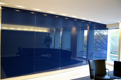
There are specific paints available now, but we used to do it by using a clear auto body undercoat primer and lacquer sprayed onto the back of glass.
Cheers and Merry Christmas.


Hello! It looks like you're interested in this conversation, but you don't have an account yet.
Getting fed up of having to scroll through the same posts each visit? When you register for an account, you'll always come back to exactly where you were before, and choose to be notified of new replies (either via email, or push notification). You'll also be able to save bookmarks and upvote posts to show your appreciation to other community members.
With your input, this post could be even better 💗
Register Login


Advertisement