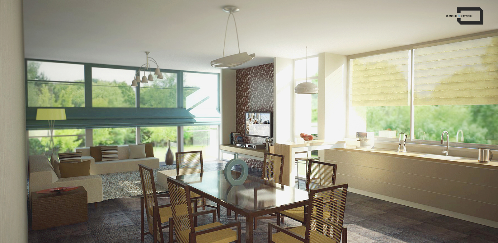
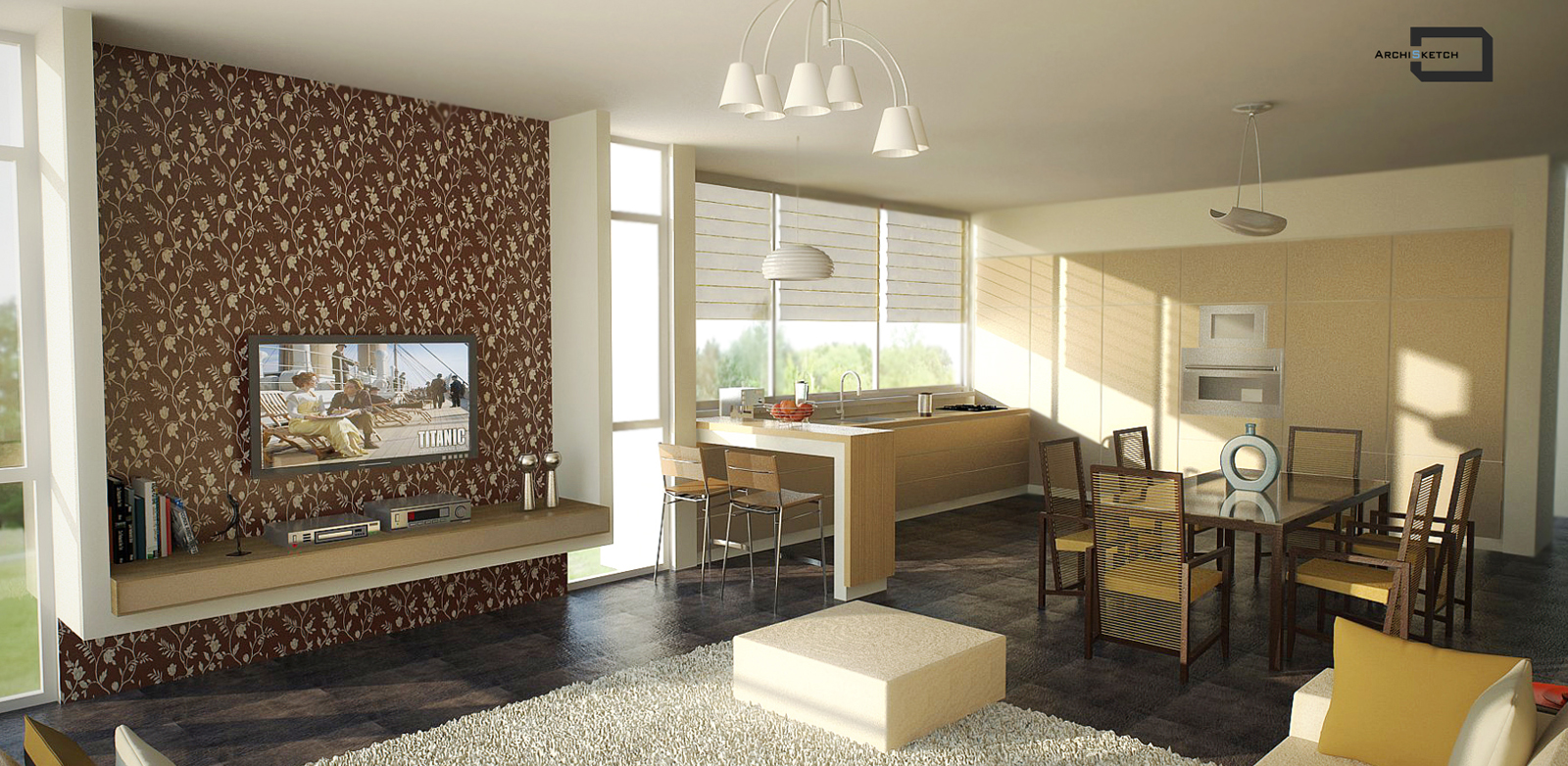
Living room render
-
Hi all,
post my new renders,comments for improvement welcome as always:)this is was the file with invisible background through windows,although when i was hiding glass material, i could see landscape in render, the issue was in painting landscape image on front face of arc surface,since it was on back face,it caused white surface after rendering


-
verry nice design and render, I like it too much.


-
Thanks,i tried to make something different from modern - minimalistic(sometimes pretty cold)
-
Great renders!
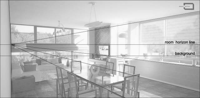
I think that you can tune a little bit more the background. In the first picture it looks like the horizon line of the background doesn´t match with the room. -
Thank you,you think in first picture- trees should be higher?i mean to rise horizon line?
-
I get the feeling that the room is floating. I think the picture might be a little more integrated with the background if the focal points become coincident as possible.

-
Thank you very much for your kind explanation,so it would be better if i would rise slightly background line?it is not too much high to coincide with room horizon line?
-
I think it would be better for the final result retouch the backgroud ... but it's up to you to decide. You should do what you think it looks better.
-
Yes,of course,it's my decision,thanks a lot

-
How long was the cook time on each of these?
-
You mean whole the work?it's my design too, so it was kind of"wasting" time on planning decisions or you mean render production?Let's say 35-40 hours all together - planning,modelling,textures mapping,render testing and render production+ Photoshop
Hello! It looks like you're interested in this conversation, but you don't have an account yet.
Getting fed up of having to scroll through the same posts each visit? When you register for an account, you'll always come back to exactly where you were before, and choose to be notified of new replies (either via email, or push notification). You'll also be able to save bookmarks and upvote posts to show your appreciation to other community members.
With your input, this post could be even better 💗
Register LoginAdvertisement


