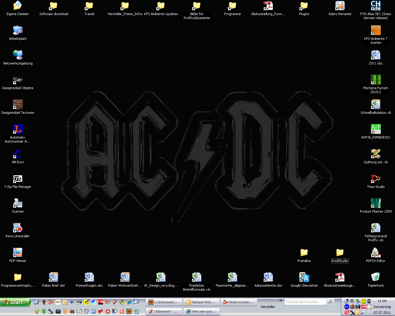
Show us yer desktop ...
-
nothing more to say...
-
@gaieus said:
@richard said:
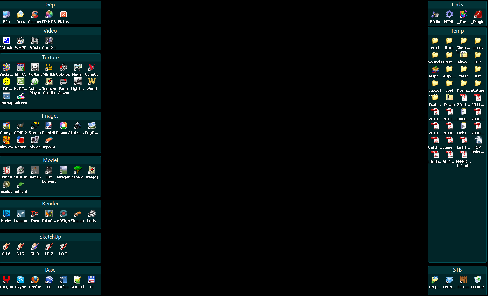
Organised right / Temp left!
What do you use for that, Richard?
I have had a look at the ones linked in this topic already but I am not convinced yet.
Mate I just organised my icons into groups on my desktop (titled: Temp files, music / pitures, references, projects, applications, system) then took a screen shot. Then used that in photoshop as a guide, created a background that I liked with lines and titles for the groups. Then save and use as wallpaper. Easy!
Problem I changed my screen res since and have been too lazy to relocate the divisions.
I find it a really efficient way to stay organised, at any time just hit the "show desktop" icon and then go straight to the exact shortcut / file / app!! So easy!
Everything working pretty much ends up on the left side for eventual filing when it fills!
-
@unknownuser said:
Then used that in photoshop as a guide, created a background that I liked with lines and titles for the groups. Then save and use as wallpaper. Easy!
You didn't use LayOut? That's a first

-
Yeah!
 Funny! Way pre LO days!
 -
Too bad. I would like a simple desktop utility with which I can split my desktop into regions like that. I tried what Rich suggested but it is more complex than if I do not have anything but mess.

-
@gaieus said:
Too bad. I would like a simple desktop utility with which I can split my desktop into regions like that. I tried what Rich suggested but it is more complex than if I do not have anything but mess.

Gaieus, Fences has been mentioned a few times above, I 'lurve' it, you might too, very easy to set up and customise and free.
Baz
http://www.stardock.com/products/fences/downloads.aspEdit: Just noticed you have been pointed to it already.
-
Yes, there have been a couple mentioned here and I am checking them out all. Thanks for bumping it - this is next then!

-
Okay, played around with Fences (although once I completely screwed up my desktop). So does it seem any better now?

Anyway, for me this is not a perfect solution either. It does not allow custom location inside the fences (works like as if automatic icon sorting were on in the Default Windows desktop settings).
I will try to get used to it and see what's next. Thanks!

-
What are you exactly looking for?
-
Something like this actually. I keep many things on my desktop - but do not use the quick launch bar for instance. So things on my DT need some organizing. This is not bad for the time being.
Whenever I download something (meant as temporary thing like an skp file helping someone out), I also download it to my DT instead of my documents somewhere. This will eventually clutter my DT and needs regular clean-up. Now as I can separate my "normal" stuff from the litter I download every day, maybe it will be better.
-
I also use my desktop for temporary files or downloaded files. Thus I decided to ban all program icons from the desktop so that it's not anymore mixed. If I don't need a file anymore, I archive it into a well-sorted folder structure (or delete it).
For programs, I use a launcher and a quicksearch, but there are many alternatives, like a programs menu, or Launchy (as mentioned above) or JumpPad (which is like a desktop).
-
I presume your speaking about Dexpot? I do find it very useful. There's also a plugin for FF that can send particular file extensions to defined areas. So you can place .rb directly into your plugins when you download. QTT is an explorer that allows tabs in Windows Explorer with a handy image preview on hover and the ability to dig through folders without the clicking. I could go on
 but it's kinda OT
 -
The left alignment of the fences takes some time getting used to, but the double click desktop cleanup never gets old

-
@gaieus said:
Whenever I download something (meant as temporary thing like an skp file helping someone out), I also download it to my DT instead of my documents somewhere. This will eventually clutter my DT and needs regular clean-up. Now as I can separate my "normal" stuff from the litter I download every day, maybe it will be better.
Thats what I love about the organisation I've used - anything downloaded and dumped to DT ends up on the left side naturally.
Clean up is then just a drag and drop from the files left onto the folder shortcuts on the right!
-
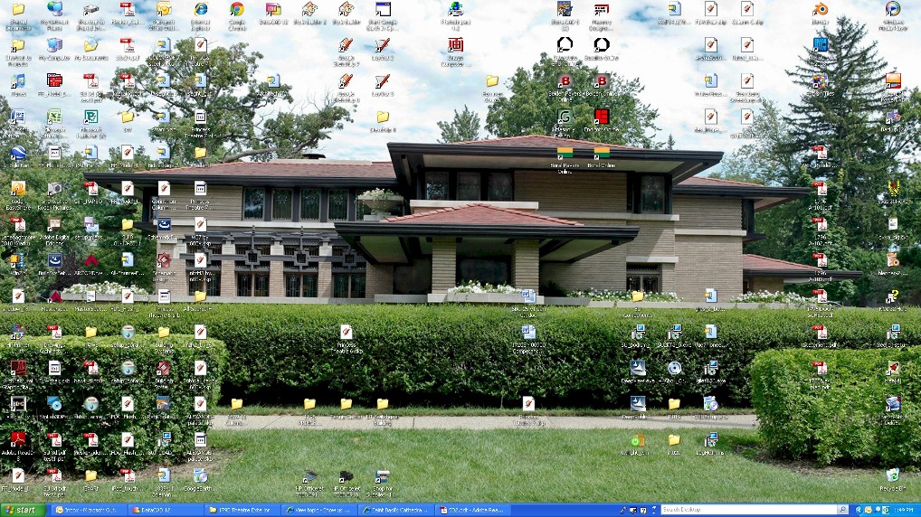
Work computer - picture of the Meyer May house, taken by my father. At home, I use Microsoft's blue crystal background.
-
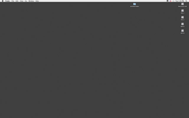
Just this.
This particular grey color is coming from 2000. The same I used for Win XP, still the same now, on all my computers-OSs.
No inspiration But never, never shortcuts and documents on this. Even the apple dock is hidden.
-
@Micha
Zen but you lost a tempo for open something!
-
@unknownuser said:
@Micha
Zen but you lost a tempo for open something!
There is certainly a fine line between minimalism and productivity loss. I tried setting my windows taskbar to autohide for awhile and removing some of the programs I had pinned there. As it turned out it just meant that every time I opened one of the 8 or so programs or folders I use most often instead of one click it took a lot longer either waiting for the taskbar to reappear or typing out the program name.
Now I try to remember that minimalism doesn't mean cutting out EVERYTHING, but rather cutting out the non-essentials.
-Brodie
-
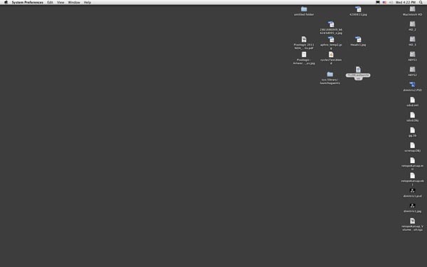
Hey, I'm not losing a tempo. I keep desktop clean because when working on a project I put everything in front. I don't like to search among lot of documents. After this, I store everything. You have to see my desktop when working.
 Today is like this:
-
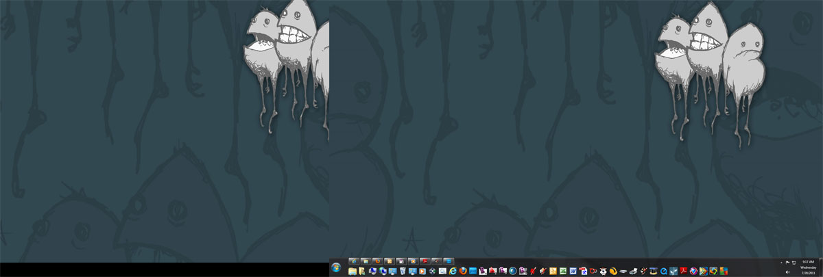
Dual Screen
No icons.
Desktop toolbar enabled.
Hello! It looks like you're interested in this conversation, but you don't have an account yet.
Getting fed up of having to scroll through the same posts each visit? When you register for an account, you'll always come back to exactly where you were before, and choose to be notified of new replies (either via email, or push notification). You'll also be able to save bookmarks and upvote posts to show your appreciation to other community members.
With your input, this post could be even better 💗
Register LoginAdvertisement


