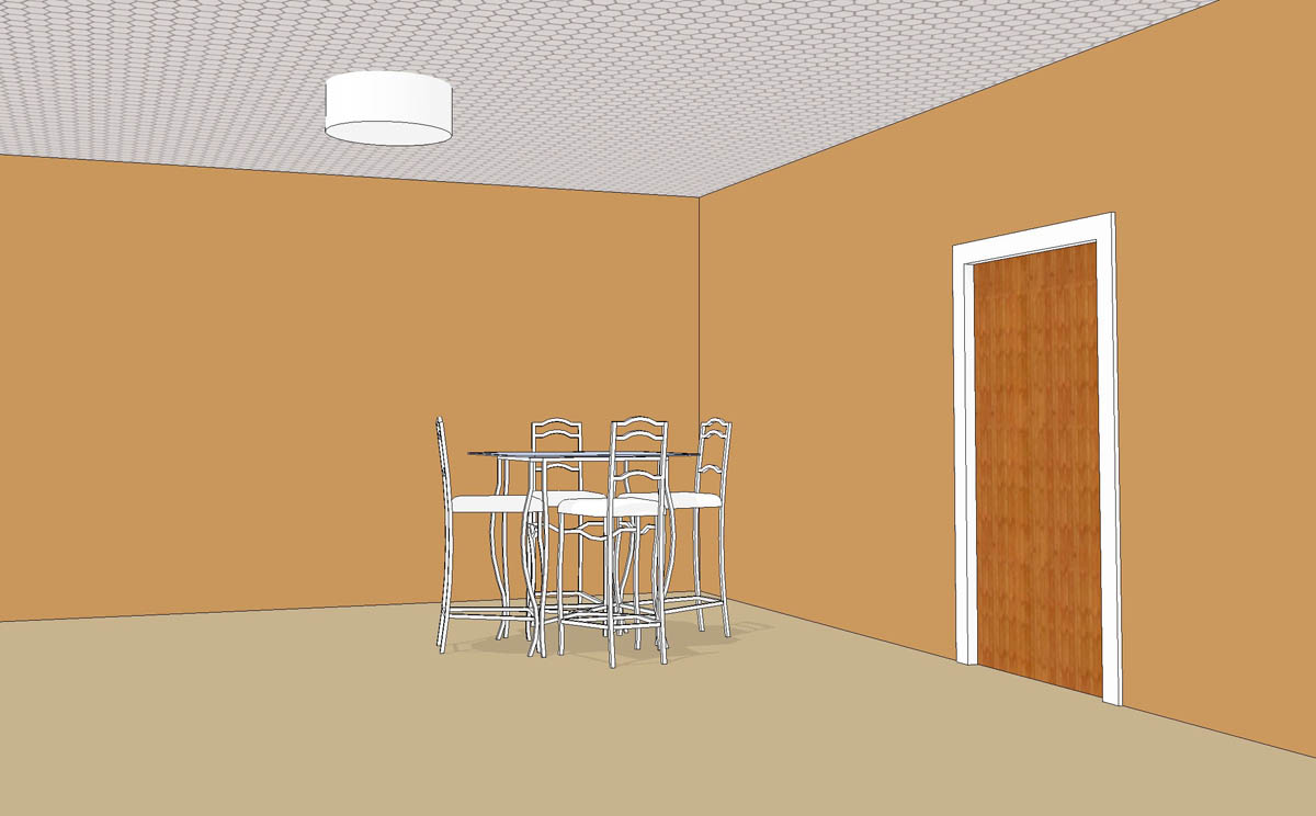
Can you override the shading on one object/material?
-
What's above the ceiling in the model?
-
Nothing. I don't know if we're on the same brain path, but I tried doing a .png where the metal was a light gray and the actual tile was transparent. Then I changed my background to white. That actually worked pretty well except for my ceiling lights (which aren't in my screenshot). They're representing a specific type of light and I have to model it with depth, so it ruined the effect because you could see the part of the light which is above the ceiling. It would probably be an issue in a couple spots where I have soffits.
-Brodie
-
That was one thing I was thinking of but it sounds like that's out. Another idea I had is to put the material on the top face and paint the bottom face of the ceiling with a transparent material. I'm not sure that would work but I was about to try it. The lights throw a wrench in the works, though.
Would you be interested in post processing to get a lighter ceiling? It's not as nice as just doing it in SU but it might be better. You could make two image exports from the same camera angle. One export would have the ceiling painted some flat color you could select and replace with transparency. The other export would be just the ceiling made with the transparent tiles as you tried. Import both into your image editor with the ceiling behind the room view. Then make the ceiling in the room view transparent and you'll see the ceiling. Since the part of the lights above the ceiling won't be visible in the room view, they won't even be there to show in the export.
-
Normally post processing would be jim dandy. I've done that exact sort of thing a few times before. Problem is this time, I've got to export to a video which complicates things. Given time and talent I could probably export a second animation to create some sort of mask for the ceiling and still process it but it's not worth all the crazy hassle that would cause.
-Brodie
-
I understand that. Hmmm....
You mentioned adjusting the sliders. I assume you meant for shadows. Did you set the Light slider to the left and the Dark slider to the right?
-
@dave r said:
I understand that. Hmmm....
You mentioned adjusting the sliders. I assume you meant for shadows. Did you set the Light slider to the left and the Dark slider to the right?
yeah, that seems to be the best bet.
you might have to re-apply the colors to the rest of the model but at least the ceiling will be white. -
This is where being an old timer really pays off. We had to invent these kind of workarounds all the time when the rendering options consisted of basically exporting the entire model to 3ds and rendering it in Max or Vue.
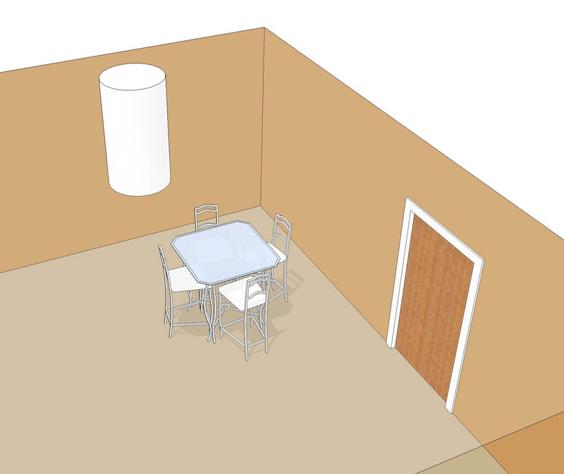
Your best bet for interiors is to reverse the relative positions of the light sliders. You don't even need to turn the sun off...that way you can get an (albeit hard-edged) but fairly soft ambient shadow effect that suits interiors. (See underneath the table)So how do you get the sun to shine through a solid ceiling? You leave the under surface as ceiling, but paint the top as clear glass.

I pushed a crude cylinder through the ceiling to illustrate your ceiling lights dilemma.


-
Brilliant, thanks guys. That has worked out really well.
Thanks for the sun shadow tip too Alan. That really helps ground my furniture so it looks a bit less floaty. It leaves a bit of a long shadow on my wall mounted items as I have to have the sun at high noon to get decent shadow position elsewhere but I think it might be worth it.
BTW, I finally understand the Light/Dark sliders (more or less)! I've always found them terribly unpredictable. For example, when you have Light at 35 and Dark at 70, I'd think that the shading should be all reversed but it's not - the top sides of things are still lighter than the bottom. I see now that surfaces essentially fall somewhere in the Light or Dark spectrum depending on their orientation. So Light 0 is the same value as Dark 100 (creating a very even image with no shading...could be useful). What might be more intuitive is if Dark went from 0-50 and Light went from 50-100. However, it doesn't seem to be that simple. For some reason Light 100 Dark 0 makes a very dark image. It would appear that the orientation angle seems to favor the dark side of the spectrum as opposed to the light. Doing a quick test on a sphere, everything facing even slightly away from the sun is 100% dark (meaning 1/2 the sphere is at it's darkest...like the moon) and it's only the glancing angles that receive something in between total dark and total light.
-Brodie
-
If you've got wall lights, or whatever casting shadows that are too distracting, just turn of their shadow casting ability in Entity Info.
-
Brilliant! totally forgot about that, thanks again!
-Brodie
Hello! It looks like you're interested in this conversation, but you don't have an account yet.
Getting fed up of having to scroll through the same posts each visit? When you register for an account, you'll always come back to exactly where you were before, and choose to be notified of new replies (either via email, or push notification). You'll also be able to save bookmarks and upvote posts to show your appreciation to other community members.
With your input, this post could be even better 💗
Register LoginAdvertisement


