Twilight project
-
@jo-ke said:
The modell is to big to upload (39MB) but I took the walls and the ceiling with the lights in a seperarte file. I hope that helps.
Thanks...
I see some issues with your model...
1.) Please remember to model with faces showing front...
(A lot of the geometry in your model is facing back-face)
2.) Point light components are very big and interfear with mesh in the light component.
I suggest you take a look at the Lights - render times thread at the TWR forum, which should give you a lot of help creating light components...
Please also see the Light Components for TwilightHope this can help you improve...
-
@jo-ke said:
@unknownuser said:
I have to agree that the second one looks better.
Is this an interior furnishings store? Looks nice.
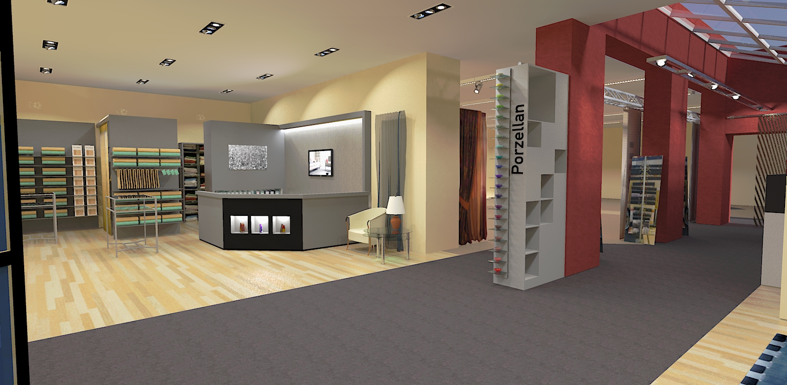
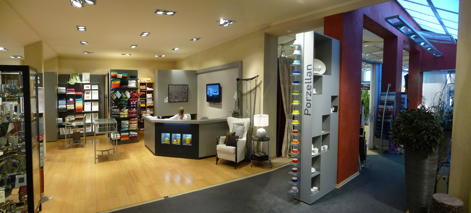
Yes, that is how my interior design shop should look like after the reconstruction in july.
Excellent!
-
Jo-ke, did my advice help you or do you need more guidance...?
-
Hmm. Yes and no. First of all thank you for yout support. It helped because now I know where the problem is but i don't have a solution right now. The light theme is very complex, I will need some weeks to understand that but at first I have to turn around the faces. How can I see if a face is on the right site or not?
-
turn on the 'monochrome' face style. the white ones are good, the light-blue ones are bad...
When this kind of stuff is important in a model, I like to make the back-color a bright red... this can be changed in the styles/edit/faces dialog. -
@jo-ke said:
Hmm. Yes and no. First of all thank you for yout support.
My pleasure...
@jo-ke said:
It helped because now I know where the problem is but i don't have a solution right now.
Not that this is a real fix, but an easy way you can try is the following...
Actually you only have three point-light components, so it's quick to make adjustments...
1.) Click the "Open Twilight Light Editor" icon...
2.) In the top bar click the "From Scene" and select the first PointLight[21] component...
3.) Use the -tool and move the components down and away from the ceiling by 50mm...
4.) While the pointlight is still selected, you can adjust the "Light Strength" from the current 5 to i.e. 1...
5.) Repeat step 2-4 on the remaining two point-light components...Under normal circumstances, I would have replaced the point lights with spot lights and in the light can placed some square emitter planes...
But please try the above quick adjustment, and I'm sure you'll soon adapt the light system in a render application... -
@unknownuser said:
turn on the 'monochrome' face style. the white ones are good, the light-blue ones are bad...
When this kind of stuff is important in a model, I like to make the back-color a bright red... this can be changed in the styles/edit/faces dialog.This was very usefull. Here's the result:
-
Now all you need to do is to select all back-faces, right click and select "reverse face" et voilΓ‘ they should all face front...
Please remember that you'll need to re-apply some materials and textures...I also saw that some of your faces don't have any material and/or texture applied at all...
I suggest that you always apply a texture or a material to a face before rendering...
For white surfaces, I recommend that you adjust the RGB values to i.e. 240, 240, 240...
Real white (255, 255, 255) doesn't actually exist in real life and these can become too bright when you render them... -
OK, Faces are reversed.
Now I tried to adjust the light settings but I'm not really satisfied. I enclosed the scene for you to look for the settings.
-
OK... Took a quick look and made a few adjustments...
1.) Removed some parts from the light components
2.) Added a square mesh and applied an Emitter material using the TWR material editor
3.) Adjusted the TWR spot-lights
(Decreased the light strength from 5.000 to 2.000... Adjusted the Falloff to 120 degree and the HotSpot to 90 degree)I've attached the model below and hope you can learn from it...
P.S. I also moved the floor up... You can see in your render that it's below the pillars and the walls...
Please also be careful when placing the light components...
I moved them up (app. 7,2mm) in order to prevent light leaks...P.P.S. Sorry about the TWR watermarks... I'm currently at the office and had to use a demo version of TWR...
-
thank you so much. that helped a lot. I'm going to update the scene as soon as posible. I played a bit with the light. 2000 was to dark. I setted the light to 3000 and it looked great. Many things are clear to me now.
-
@unknownuser said:
turn on the 'monochrome' face style. the white ones are good, the light-blue ones are bad...
When this kind of stuff is important in a model, I like to make the back-color a bright red... this can be changed in the styles/edit/faces dialog.Back faces are real killer for most renderers - you might get excessive reflection (like in Twilight or Kerkythea) or faces won't render all or they render black (it's all up to the engine). I don't know many render engines that can handle back faces, even in Thea they do matter, if one uses displacement or instancing brush. Making back faces to a strikingly different color, do help a lot. There is also a neat style for troubleshooting the scene.
Second common problem I seen is that light sources do intersect with the geometry. Third common issue is the scene scale - when you use a physically based renderer, you must model in the correct scale. -
@jo-ke said:
thank you so much. that helped a lot.
My pleasure...
@jo-ke said:
I played a bit with the light. 2000 was to dark. I setted the light to 3000 and it looked great.
Eeehhh... You got me confused there for a second...
It's not 2000 (two thousand) but 2 point 000...A question... Can I ask you if you play games on the computer you're also using to render models with...??
Reason for asking is simple... Since most of your renders seem over exposed, I tend to believe that your monitor is calibrated very dark...
I've seen it before that users who are using the computer to both play games on and also render models always seem to be over exposed... -
@frederik said:
A question... Can I ask you if you play games on the computer you're also using to render models with...??
Reason for asking is simple... Since most of your renders seem over exposed, I tend to believe that your monitor is calibrated very dark...No I'm not gaming but the lights in that room are really very strong. I will show a picture after the reconstruction is finshed.
-
here's the brand new render with perfect TWL- lights.
-
I just played around with the spotlights, edited the emitter and turned the direction. Now it comes pretty close to reality.
-
Looks great, jo-ke...!
To make it look even more real, you can exchange the spot-lights with a suitable IES-light...
-
Yes IES would be the next lesson for me.
I'm loving it playing around with the lights. I've just added many flourescent lights and a new spotlight at the neightbour room.
here's another render...
-
very nice, jo-ke! I always like to see such an improvement in a project!
-
We started this week with the reconstruction. I hope that we are finished at the end of the week.
Advertisement