• Login
sketchucation logo sketchucation
  • Login
🤑 30% Off | Artisan 2 on sale until April 30th Buy Now

Twilight project

Scheduled Pinned Locked Moved Gallery
42 Posts 12 Posters 4.8k Views
Loading More Posts
  • Oldest to Newest
  • Newest to Oldest
  • Most Votes
Reply
  • Reply as topic
Log in to reply
This topic has been deleted. Only users with topic management privileges can see it.
  • J Offline
    jo-ke
    last edited by 9 Jun 2010, 06:35

    I used twilight render preset 10 interior+ 19h rendering ray tracing 122/10000 but I'm not happy with the result. The low preset is even better. What have I done wrong?


    umbau028-kl.jpg

    http://www.zz7.de

    1 Reply Last reply Reply Quote 0
    • O Offline
      olishea
      last edited by 9 Jun 2010, 14:46

      light strength is far too intense. remember twilight is physically accurate.

      oli

      1 Reply Last reply Reply Quote 0
      • D Offline
        D-space
        last edited by 9 Jun 2010, 16:07

        ...or try to tone map. Lower the exposure at the camera tab. 😉

        http://blibestmentalt.no/54981

        1 Reply Last reply Reply Quote 0
        • J Offline
          jo-ke
          last edited by 11 Jun 2010, 06:20

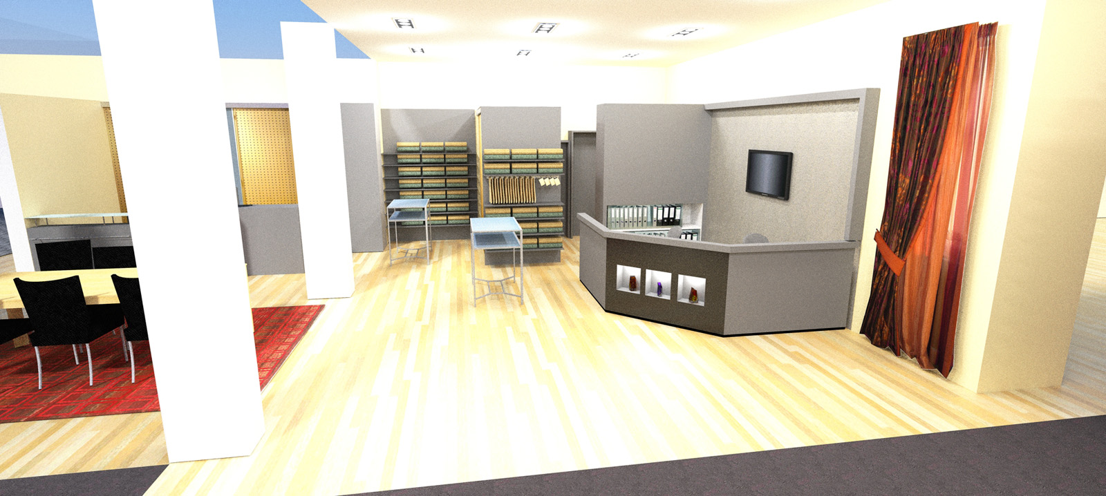
          this is the twilight render in preset 2 "low" and I like the quality more then the previous one.


          umbau031-kl.jpg

          http://www.zz7.de

          1 Reply Last reply Reply Quote 0
          • D Offline
            dermotcoll
            last edited by 11 Jun 2010, 09:38

            Jo-ke

            I get the same problems when i render with twilight - its me not the render engine! I just need to keep practicing, looking in the forums and practicing some more to get it right. Lighting is so critical in rendering and material choices affect lighting so much that you have to marry the two together very carefully to get the perfect image. I tend to start off at very low levels of lighting and slowly increase the strength to a level where I am happy to show a client. Keep going you will get there in the end.

            When you burn your arse - you gotta sit on the blisters!!

            1 Reply Last reply Reply Quote 0
            • F Offline
              Frederik
              last edited by 11 Jun 2010, 11:17

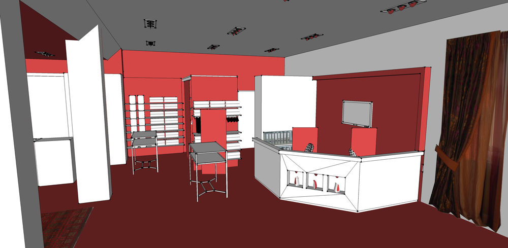
              Something strange going on in your scene...
              To me it looks as if you've applied an emitter material to parts of the wall and ceiling...
              Can you post the scene enabling me to take a look and revert with suggestions to improvements...??

              Cheers
              Kim Frederik

              1 Reply Last reply Reply Quote 0
              • O Offline
                olishea
                last edited by 11 Jun 2010, 13:26

                the quality of low preset should not be the best....its pretty much the worst! interior progressive is most realistic IMO.

                why not post your model in twilight forum? would be a good challenge to improve it and you will learn a lot from feedback.

                oli

                1 Reply Last reply Reply Quote 0
                • J Offline
                  jo-ke
                  last edited by 11 Jun 2010, 16:27

                  Thank you for your help.

                  The modell is to big to upload (39MB) but I took the walls and the ceiling with the lights in a seperarte file. I hope that helps.


                  umbau-tw1.skp

                  http://www.zz7.de

                  1 Reply Last reply Reply Quote 0
                  • B Offline
                    Bryan K
                    last edited by 11 Jun 2010, 19:00

                    I have to agree that the second one looks better.

                    Is this an interior furnishings store? Looks nice.

                    See my portfolio at https://delphiscousin.blogspot.com/

                    1 Reply Last reply Reply Quote 0
                    • X Offline
                      xrok1
                      last edited by 11 Jun 2010, 19:06

                      almost looks like an emitter material on the posts. 😕

                      “There are three classes of people: those who see. Those who see when they are shown. Those who do not see.”

                      http://www.Twilightrender.com try it!

                      1 Reply Last reply Reply Quote 0
                      • J Offline
                        jo-ke
                        last edited by 11 Jun 2010, 19:33

                        @unknownuser said:

                        I have to agree that the second one looks better.

                        Is this an interior furnishings store? Looks nice.

                        Yes, that is how my interior design shop should look like after the reconstruction in july.

                        http://www.zz7.de

                        1 Reply Last reply Reply Quote 0
                        • J Offline
                          jo-ke
                          last edited by 12 Jun 2010, 10:54

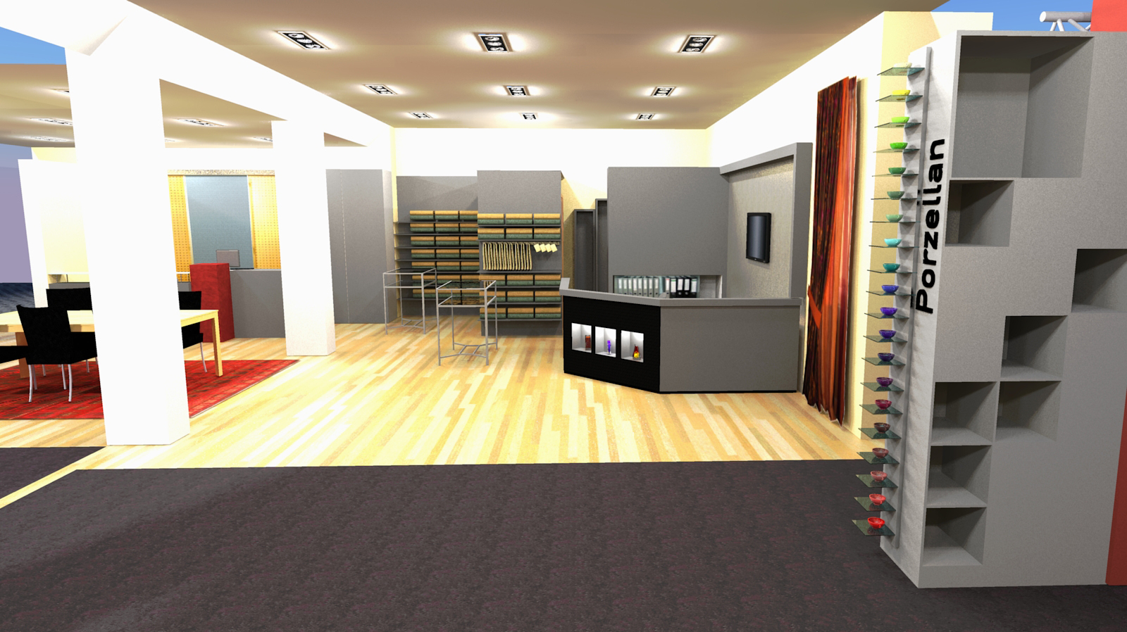
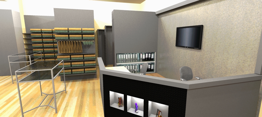
                          A detail of that project:


                          ansicht019.jpg

                          http://www.zz7.de

                          1 Reply Last reply Reply Quote 0
                          • F Offline
                            Frederik
                            last edited by 12 Jun 2010, 21:36

                            @jo-ke said:

                            The modell is to big to upload (39MB) but I took the walls and the ceiling with the lights in a seperarte file. I hope that helps.

                            Thanks...

                            I see some issues with your model...
                            1.) Please remember to model with faces showing front...
                            (A lot of the geometry in your model is facing back-face)
                            2.) Point light components are very big and interfear with mesh in the light component.
                            I suggest you take a look at the Lights - render times thread at the TWR forum, which should give you a lot of help creating light components...
                            Please also see the Light Components for Twilight

                            Hope this can help you improve...

                            Cheers
                            Kim Frederik

                            1 Reply Last reply Reply Quote 0
                            • B Offline
                              Bryan K
                              last edited by 13 Jun 2010, 00:05

                              @jo-ke said:

                              @unknownuser said:

                              I have to agree that the second one looks better.

                              Is this an interior furnishings store? Looks nice.

                              Yes, that is how my interior design shop should look like after the reconstruction in july.

                              Excellent!

                              See my portfolio at https://delphiscousin.blogspot.com/

                              1 Reply Last reply Reply Quote 0
                              • F Offline
                                Frederik
                                last edited by 15 Jun 2010, 21:11

                                Jo-ke, did my advice help you or do you need more guidance...?

                                Cheers
                                Kim Frederik

                                1 Reply Last reply Reply Quote 0
                                • J Offline
                                  jo-ke
                                  last edited by 15 Jun 2010, 23:29

                                  Hmm. Yes and no. First of all thank you for yout support. It helped because now I know where the problem is but i don't have a solution right now. The light theme is very complex, I will need some weeks to understand that but at first I have to turn around the faces. How can I see if a face is on the right site or not?

                                  http://www.zz7.de

                                  1 Reply Last reply Reply Quote 0
                                  • P Offline
                                    pyroluna
                                    last edited by 16 Jun 2010, 03:43

                                    turn on the 'monochrome' face style. the white ones are good, the light-blue ones are bad...
                                    When this kind of stuff is important in a model, I like to make the back-color a bright red... this can be changed in the styles/edit/faces dialog.

                                    1 Reply Last reply Reply Quote 0
                                    • F Offline
                                      Frederik
                                      last edited by 16 Jun 2010, 06:24

                                      @jo-ke said:

                                      Hmm. Yes and no. First of all thank you for yout support.

                                      My pleasure... 😄

                                      @jo-ke said:

                                      It helped because now I know where the problem is but i don't have a solution right now.

                                      Not that this is a real fix, but an easy way you can try is the following...

                                      Actually you only have three point-light components, so it's quick to make adjustments...
                                      1.) Click the "Open Twilight Light Editor" icon...
                                      2.) In the top bar click the "From Scene" and select the first PointLight[21] component...
                                      3.) Use the -tool and move the components down and away from the ceiling by 50mm...
                                      4.) While the pointlight is still selected, you can adjust the "Light Strength" from the current 5 to i.e. 1...
                                      5.) Repeat step 2-4 on the remaining two point-light components...

                                      Under normal circumstances, I would have replaced the point lights with spot lights and in the light can placed some square emitter planes...
                                      But please try the above quick adjustment, and I'm sure you'll soon adapt the light system in a render application... 😉

                                      Cheers
                                      Kim Frederik

                                      1 Reply Last reply Reply Quote 0
                                      • J Offline
                                        jo-ke
                                        last edited by 16 Jun 2010, 07:02

                                        @unknownuser said:

                                        turn on the 'monochrome' face style. the white ones are good, the light-blue ones are bad...
                                        When this kind of stuff is important in a model, I like to make the back-color a bright red... this can be changed in the styles/edit/faces dialog.

                                        This was very usefull. Here's the result:


                                        umbau036.jpg

                                        http://www.zz7.de

                                        1 Reply Last reply Reply Quote 0
                                        • F Offline
                                          Frederik
                                          last edited by 16 Jun 2010, 07:21

                                          Now all you need to do is to select all back-faces, right click and select "reverse face" et voilá they should all face front...
                                          Please remember that you'll need to re-apply some materials and textures...

                                          I also saw that some of your faces don't have any material and/or texture applied at all...
                                          I suggest that you always apply a texture or a material to a face before rendering...
                                          For white surfaces, I recommend that you adjust the RGB values to i.e. 240, 240, 240...
                                          Real white (255, 255, 255) doesn't actually exist in real life and these can become too bright when you render them...

                                          Cheers
                                          Kim Frederik

                                          1 Reply Last reply Reply Quote 0
                                          • 1
                                          • 2
                                          • 3
                                          • 1 / 3
                                          1 / 3
                                          • First post
                                            17/42
                                            Last post
                                          Buy SketchPlus
                                          Buy SUbD
                                          Buy WrapR
                                          Buy eBook
                                          Buy Modelur
                                          Buy Vertex Tools
                                          Buy SketchCuisine
                                          Buy FormFonts

                                          Advertisement