Twilight project
-
OK, Faces are reversed.
Now I tried to adjust the light settings but I'm not really satisfied. I enclosed the scene for you to look for the settings.
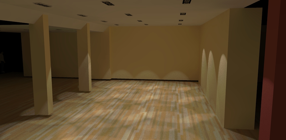
-
OK... Took a quick look and made a few adjustments...
1.) Removed some parts from the light components
2.) Added a square mesh and applied an Emitter material using the TWR material editor
3.) Adjusted the TWR spot-lights
(Decreased the light strength from 5.000 to 2.000... Adjusted the Falloff to 120 degree and the HotSpot to 90 degree)I've attached the model below and hope you can learn from it...

P.S. I also moved the floor up... You can see in your render that it's below the pillars and the walls...
Please also be careful when placing the light components...
I moved them up (app. 7,2mm) in order to prevent light leaks...P.P.S. Sorry about the TWR watermarks... I'm currently at the office and had to use a demo version of TWR...


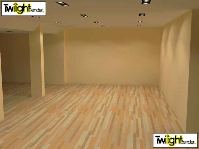
-
thank you so much. that helped a lot. I'm going to update the scene as soon as posible. I played a bit with the light. 2000 was to dark. I setted the light to 3000 and it looked great. Many things are clear to me now.
-
@unknownuser said:
turn on the 'monochrome' face style. the white ones are good, the light-blue ones are bad...
When this kind of stuff is important in a model, I like to make the back-color a bright red... this can be changed in the styles/edit/faces dialog.Back faces are real killer for most renderers - you might get excessive reflection (like in Twilight or Kerkythea) or faces won't render all or they render black (it's all up to the engine). I don't know many render engines that can handle back faces, even in Thea they do matter, if one uses displacement or instancing brush. Making back faces to a strikingly different color, do help a lot. There is also a neat style for troubleshooting the scene.
Second common problem I seen is that light sources do intersect with the geometry. Third common issue is the scene scale - when you use a physically based renderer, you must model in the correct scale. -
@jo-ke said:
thank you so much. that helped a lot.
My pleasure...

@jo-ke said:
I played a bit with the light. 2000 was to dark. I setted the light to 3000 and it looked great.
 Eeehhh... You got me confused there for a second...
It's not 2000 (two thousand) but 2 point 000...A question... Can I ask you if you play games on the computer you're also using to render models with...??
Reason for asking is simple... Since most of your renders seem over exposed, I tend to believe that your monitor is calibrated very dark...
I've seen it before that users who are using the computer to both play games on and also render models always seem to be over exposed... -
@frederik said:
A question... Can I ask you if you play games on the computer you're also using to render models with...??
Reason for asking is simple... Since most of your renders seem over exposed, I tend to believe that your monitor is calibrated very dark...No I'm not gaming
 but the lights in that room are really very strong. I will show a picture after the reconstruction is finshed.
 -
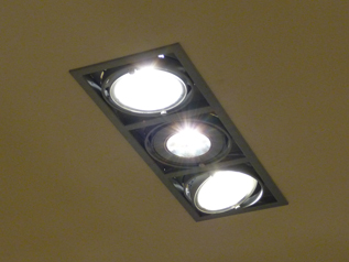
here's the brand new render with perfect TWL- lights.
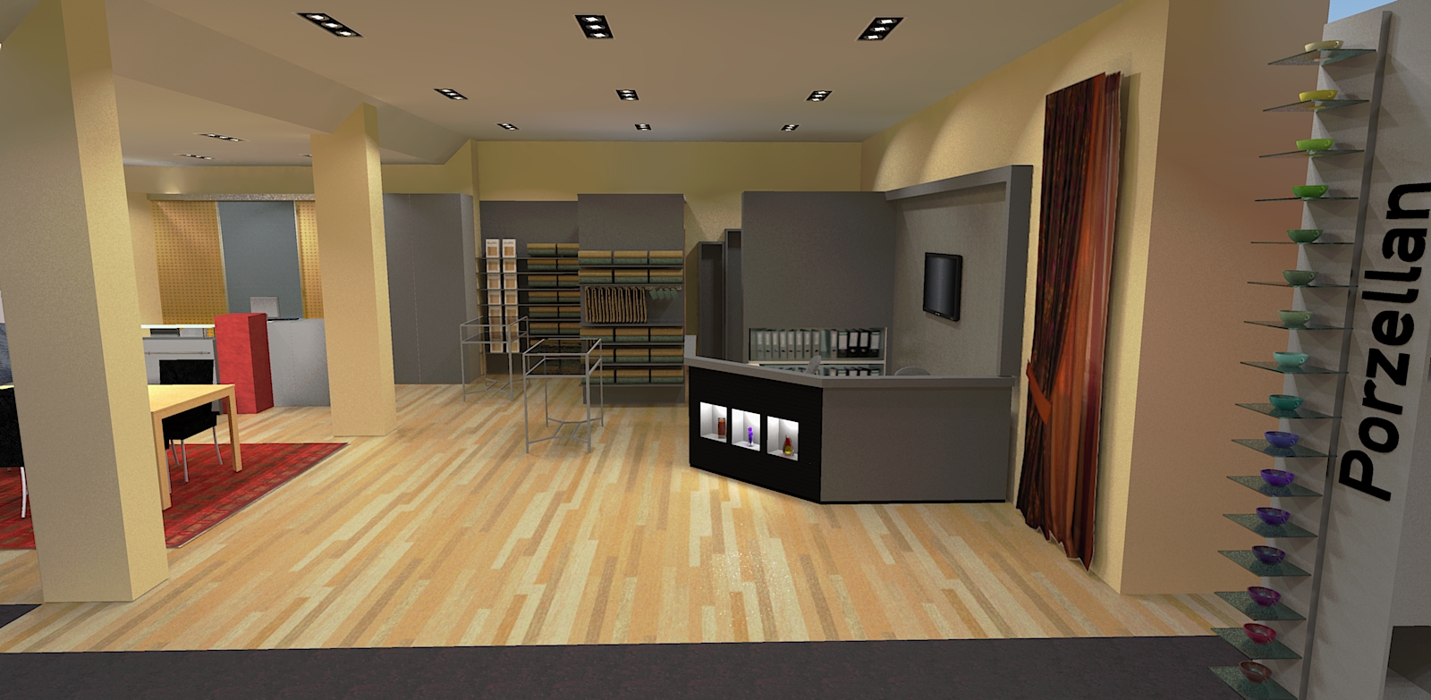
-
I just played around with the spotlights, edited the emitter and turned the direction. Now it comes pretty close to reality.
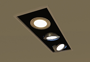
-
Looks great, jo-ke...!

To make it look even more real, you can exchange the spot-lights with a suitable IES-light...
-
Yes IES would be the next lesson for me.
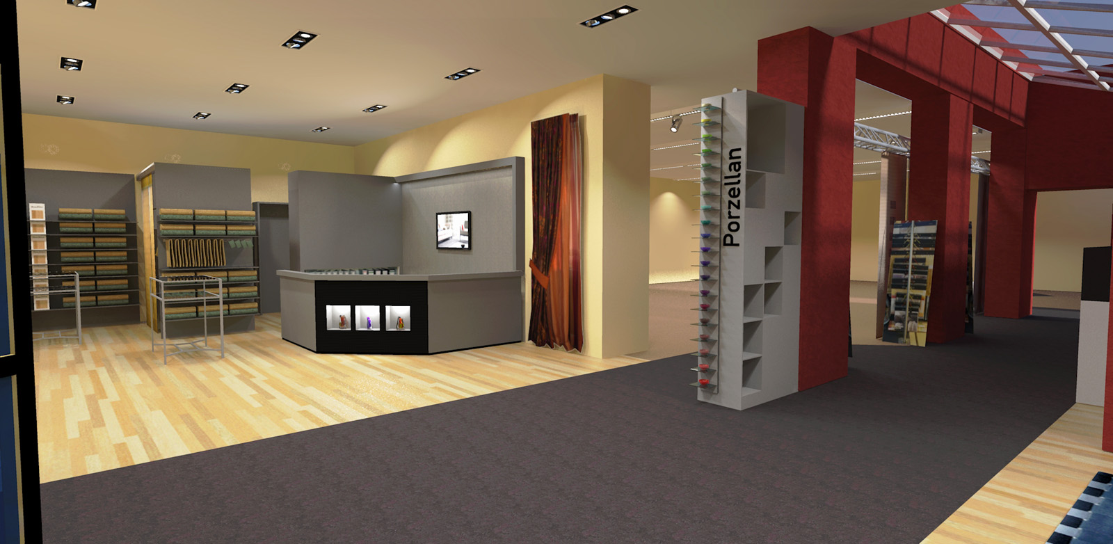
I'm loving it playing around with the lights. I've just added many flourescent lights and a new spotlight at the neightbour room.
here's another render...
-
very nice, jo-ke! I always like to see such an improvement in a project!

-
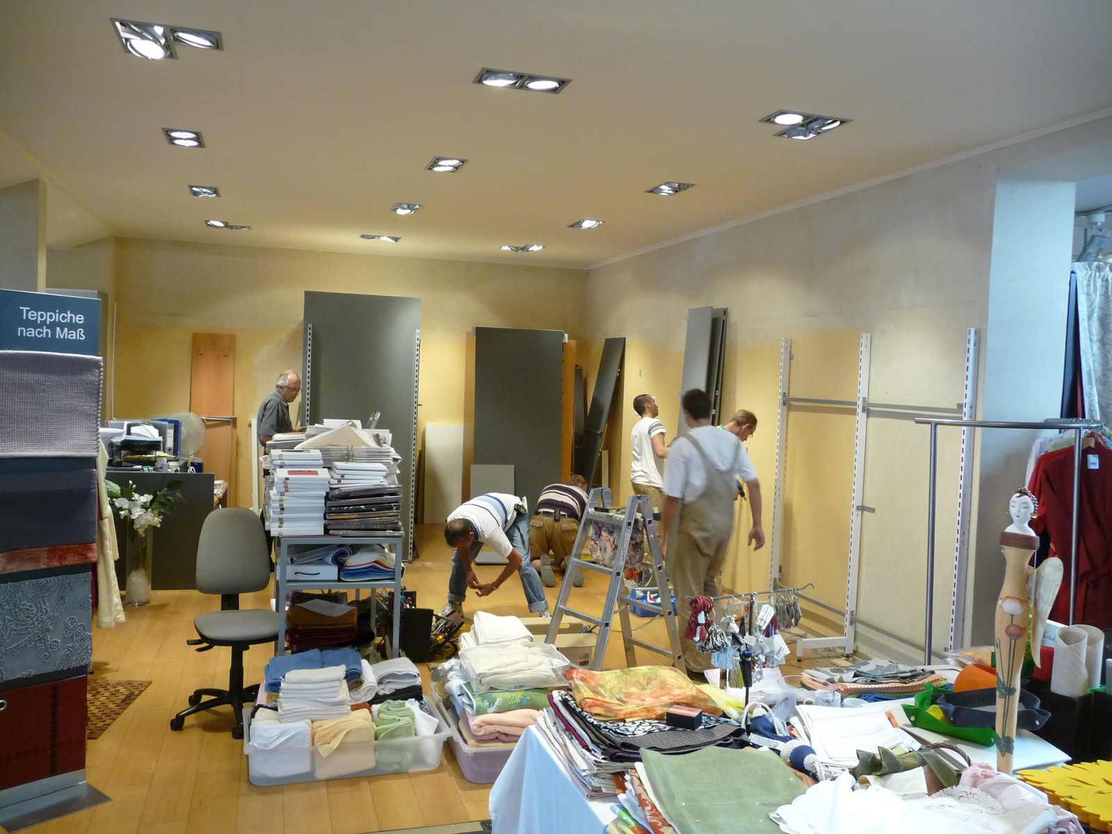
We started this week with the reconstruction. I hope that we are finished at the end of the week.
-
Ooohhh... It's always great to see a project comming to life...

-
Is that a render
 or a photo?
-
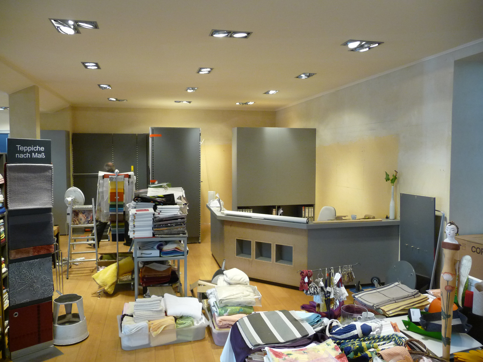
and the next step is done
-
most of the work is finished. Next week, we're going to make the decoration.
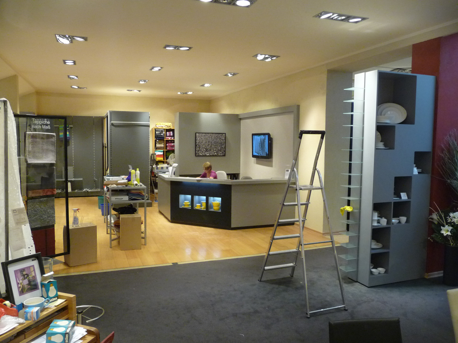
-
nearly finished.
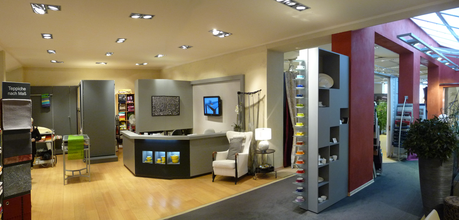
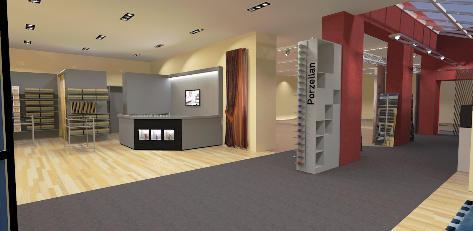
-
OK... Although it's easy to see the difference between real and render, the render is really good...
As you can see yourself, the fake emitter in the spot lights need to be increased in power and the floor also need some extra glossiness...
Overall really nice to see this project evolving...
-
Right Frederik, I second that. It is very rare to see a whole project documented - I like to watch that.
Good job jo-ke! -
thank you very much for your c+c. it was very helpfull.
I am going to make a new render and a new foto next week, when everything is on its place.
Hello! It looks like you're interested in this conversation, but you don't have an account yet.
Getting fed up of having to scroll through the same posts each visit? When you register for an account, you'll always come back to exactly where you were before, and choose to be notified of new replies (either via email, or push notification). You'll also be able to save bookmarks and upvote posts to show your appreciation to other community members.
With your input, this post could be even better 💗
Register LoginAdvertisement


