Latest Kitchen
-
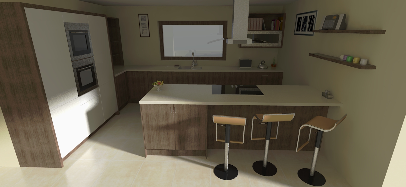
Here's a render from me. twilight. not really happy with the light and the materials.

-
@jo-ke said:
Here's a render from me. twilight. not really happy with the light and the materials.
It should be rendered with interior presets (#9) with lights intensity lowered.
Or you might use some exposure adjustments at the camera tab.
Nice try btw!
-
@jo-ke said:
Here's a render from me. twilight. not really happy with the light and the materials.
Good effort Jo-ke. If the model was improved it would result in better renders so sorry to all of you for that.
-
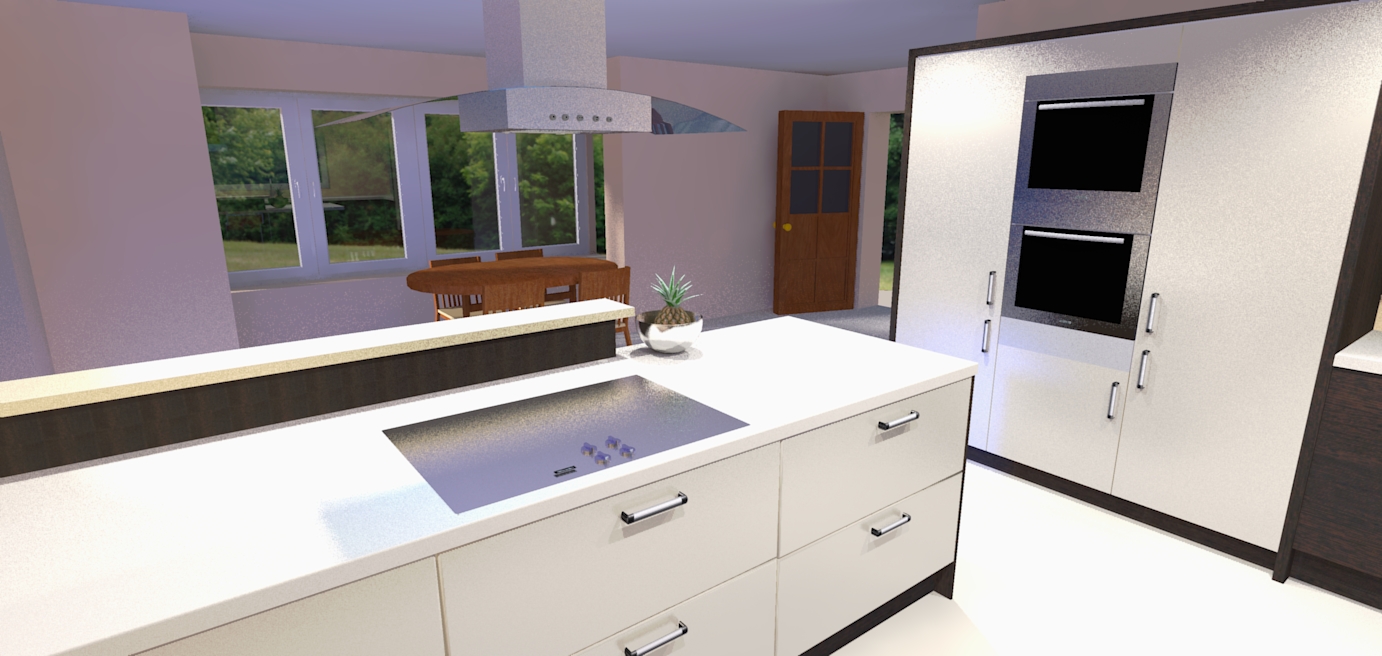
Dermot I am confused (but I am used to that). The wall on the left of your first picture is curved which is an artifact I expect from some camera lenses but not SketchUp or rendering engines. How do you explain that or is this a form of double agentry designed to convince people that beyond a doubt this is photography and not a render?
-
Roger
I only noticed it after you pointed it out. It must be a lens issue as you pointed out. It is certainly not a render - I am no where near that level - think big crayons in a fist - style drawings or even better cave drawings - thats more my level!!!
-
I thought it was a render. I guess I am the one sitting on the blister.
This says a lot about the state of the render art when it becomes easy to loose the line between render and photography.
-
hats off. most excellent work. you should be proud, but if you're like the rest of us all you can see (that only you can see) are the things you should have done differently.

-
Cheers Rocky. Its praise indeed coming from you. BTW how did your project finish up - havent seen any images for quite some time! You must be busy doing instead of drawing!!
-
@dermotcoll said:
Cheers Rocky. Its praise indeed coming from you. BTW how did your project finish up - havent seen any images for quite some time! You must be busy doing instead of drawing!!
right you are. i will post pics when i can, but my works not quite up to your level.

-
Your SU modelling and rendering are way better than mine and I dont see myself as being that good - I try to do the best I can - if I'm not satisfied with the quality I rip it out and do it again - my motto is " If its not good enough for my own house - it is not good enough for any house!" It works !
-
@unknownuser said:
" If its not good enough for my own house - it is not good enough for any house!"
my feelings exactly.
-
Digging through some render attempts and discovered this...

Must try and find that file! Thanks for sharing that by the way

-
Rich
I love it - really cool feeling and like the entourage you have used on the shelves. Cheers!!

-
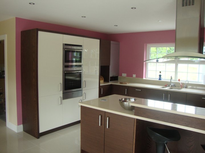
Finally got a photo of the finished room - her idea of what the colour violet is, and mine, are a wee bit different - I want her to change it - what do the rest of you think?

-
Hummm. Looks Pink, not Purple. To each their own I guess. The cabinets and counter looks great. Nice a clean. The paint colour, well.....
Nice job Dermot -
I was about to say, "great rendering...good job on the hood, maybe the floor is too reflective"... but it's a photo.
That looks like "hot pink" on my monitor. Maybe "strawberry ice cream" in the shadows. What's your idea of violet? Did you render it?
Kitchen looks really great though, and bears out the models and renderings. Nice to see the whole process to the reality. And the reality is everyone has their own color taste.
Congratulations!
-
Design and equipment are great Dermot, but I agree with the others that the "hot pink" or "bubble gum pink", what ever,
 is unfortunate.
Maybe photograph it in black and white for the old portfolio?
-
i don't think pink is too much of a problem. However it would have been more striking if it was just painted onto one wall.
nice clean designs dermot

-
Nice outcome Dermott! Strong color though but each to their own I suppose.
PS.
How's the health? Hope all is well
-
pink is not my taste but if the customer likes it....
Hello! It looks like you're interested in this conversation, but you don't have an account yet.
Getting fed up of having to scroll through the same posts each visit? When you register for an account, you'll always come back to exactly where you were before, and choose to be notified of new replies (either via email, or push notification). You'll also be able to save bookmarks and upvote posts to show your appreciation to other community members.
With your input, this post could be even better 💗
Register LoginAdvertisement


