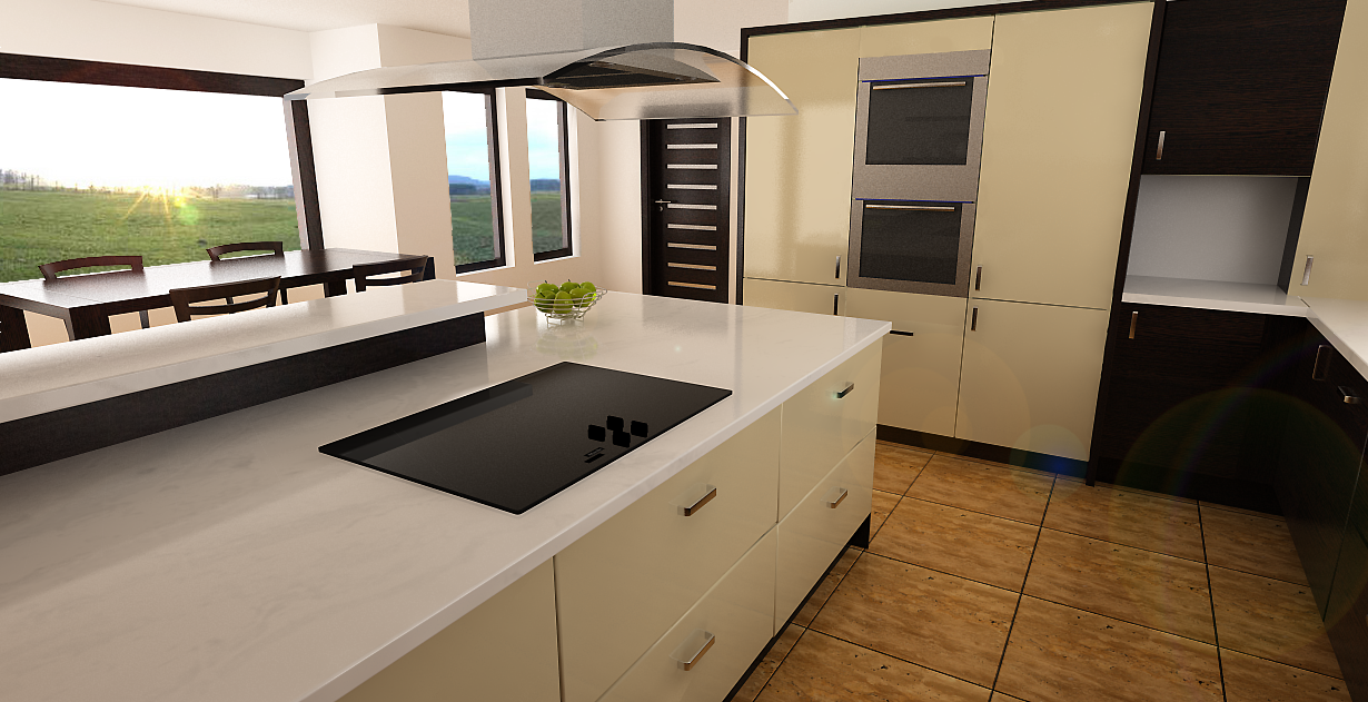
Latest Kitchen
-
 I'm still looking at that portion of "bar" over the counter, and I can't figure it out how did you make it stay still, how did you fixed it. How did you jointed the wood and the "engineered stone".
Excuse my English!!
-
Cheers Oli, Frederik and Coremaster
@stefanq - i could tell you but then I would have to kill you afterwards!!!! Holes in the main worktop to screw up from underneath, then two spaces in the base of the upstand to screw the small worktop onto the granite.
-
@stefanq - see attached quick model to show you how it was done - a picture speaks a thousand words!! (and you dont need a translator for them!!!)Upstand Attachment to Granite.skp
-
Dermot, thank you for the model, it's simple yet effective solution. To be honest, I wouldn't have the guts to drill the worktop. I had bad experiences with those "granite like" materials. Maybe because we didn't had the right tools.
Anyway, it seams that the amount of work was bigger that the image of the kitchen let an untrained eye to see.
I hope that manufacturing process still brings you joy, as I know I have these days, when I barely touched the PC.
Good Luck! -
No problem. I wish I was busier doing bigger projects but they are harder and harder to get nowadays. Everyone is cutting their prices just to get a wage. Competition is fierce right now. I am busier trying to get work than I ever was but not as busy manufacturing. I know with my improving skills in modelling and rendering I will win more as time goes on. Good luck to you.
-
Dermot you've done a great job there bud. Wish I'd had you to fit my kitchen in my last house - it looked similar to this on the surface but the fitters just didnt do that good of a job on it, so when you looked at it in detail there were a few imperfections to it here and there. Maybe my next one eh?

-
Cheers cadmunkey. I am actually thinking of touting for business over there in the "mainland" as it is extremely difficult in Ireland at the minute and i will have to cast my net wider for business. I am trying to get a website up and running and am running around taking pics of previously fitted kitchens to put up on the web so I can attract the business. I take great pride in doing a job that I would want done in my own home and to date have never disappointed anyone. I hope to convey that in future models and renders also though the more I look at that last model I cringe - it is terrible. Im much better at the real thing. Thanks for your comments.
-
Dermot, making a website it's a great idea. I know for sure, because, after they made our website, my bosses barely move their @sses now. They have the choice to refuse some of the jobs.
-
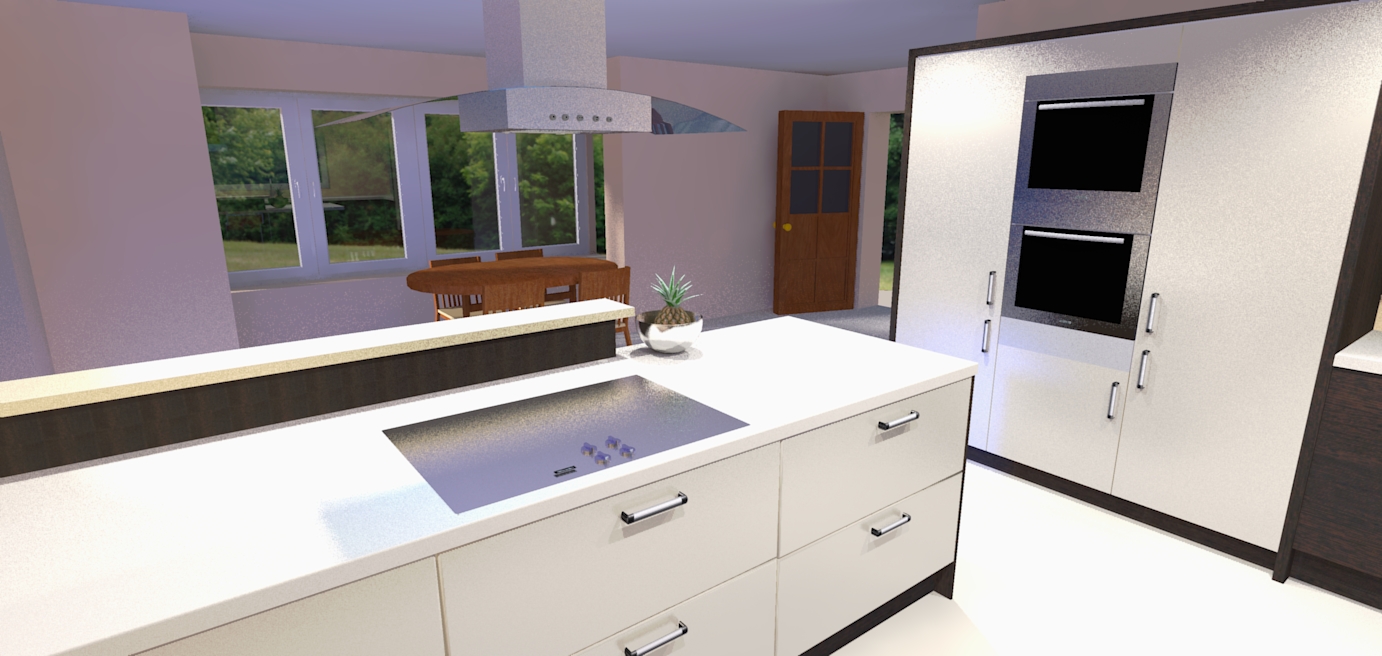
Hi dermot, I like the style of kitchen
 and design of kitchen. I couldn't resist to render it. It's up to you, if you want me to erase the picture I'll understand that.

-
I thought it WAS a render!
Great design. Great install.
-
@jarynzlesa said:
Hi dermot, I like the style of kitchen
 and design of kitchen. I couldn't resist to render it. It's up to you, if you want me to erase the picture I'll understand that.
Jarynzleasa - you did a great job. I dont have the skills yet to render like this. I wish more people would render it and give some info on how to do it. Thanks.
-
@unknownuser said:
I thought it WAS a render!
Great design. Great install.
Thanks ecofeco. I enjoyed designing and installing it - it went great.
-
Here's a render from me. twilight. not really happy with the light and the materials.

-
@jo-ke said:
Here's a render from me. twilight. not really happy with the light and the materials.
It should be rendered with interior presets (#9) with lights intensity lowered.
Or you might use some exposure adjustments at the camera tab.
Nice try btw!
-
@jo-ke said:
Here's a render from me. twilight. not really happy with the light and the materials.
Good effort Jo-ke. If the model was improved it would result in better renders so sorry to all of you for that.
-
Dermot I am confused (but I am used to that). The wall on the left of your first picture is curved which is an artifact I expect from some camera lenses but not SketchUp or rendering engines. How do you explain that or is this a form of double agentry designed to convince people that beyond a doubt this is photography and not a render?
-
Roger
I only noticed it after you pointed it out. It must be a lens issue as you pointed out. It is certainly not a render - I am no where near that level - think big crayons in a fist - style drawings or even better cave drawings - thats more my level!!!
-
I thought it was a render. I guess I am the one sitting on the blister.
This says a lot about the state of the render art when it becomes easy to loose the line between render and photography.
-
hats off. most excellent work. you should be proud, but if you're like the rest of us all you can see (that only you can see) are the things you should have done differently.

-
Cheers Rocky. Its praise indeed coming from you. BTW how did your project finish up - havent seen any images for quite some time! You must be busy doing instead of drawing!!
Hello! It looks like you're interested in this conversation, but you don't have an account yet.
Getting fed up of having to scroll through the same posts each visit? When you register for an account, you'll always come back to exactly where you were before, and choose to be notified of new replies (either via email, or push notification). You'll also be able to save bookmarks and upvote posts to show your appreciation to other community members.
With your input, this post could be even better 💗
Register LoginAdvertisement


