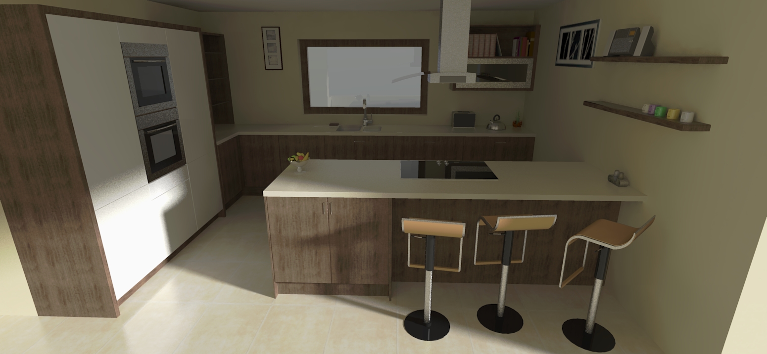
Latest Kitchen
-
@dermotcoll said:
Cheers Rocky. Its praise indeed coming from you. BTW how did your project finish up - havent seen any images for quite some time! You must be busy doing instead of drawing!!
right you are. i will post pics when i can, but my works not quite up to your level.

-
Your SU modelling and rendering are way better than mine and I dont see myself as being that good - I try to do the best I can - if I'm not satisfied with the quality I rip it out and do it again - my motto is " If its not good enough for my own house - it is not good enough for any house!" It works !
-
@unknownuser said:
" If its not good enough for my own house - it is not good enough for any house!"
my feelings exactly.
-
Digging through some render attempts and discovered this...

Must try and find that file! Thanks for sharing that by the way

-
Rich
I love it - really cool feeling and like the entourage you have used on the shelves. Cheers!!

-
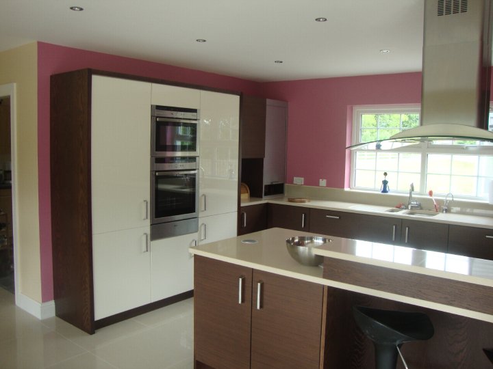
Finally got a photo of the finished room - her idea of what the colour violet is, and mine, are a wee bit different - I want her to change it - what do the rest of you think?

-
Hummm. Looks Pink, not Purple. To each their own I guess. The cabinets and counter looks great. Nice a clean. The paint colour, well.....
Nice job Dermot -
I was about to say, "great rendering...good job on the hood, maybe the floor is too reflective"... but it's a photo.
That looks like "hot pink" on my monitor. Maybe "strawberry ice cream" in the shadows. What's your idea of violet? Did you render it?
Kitchen looks really great though, and bears out the models and renderings. Nice to see the whole process to the reality. And the reality is everyone has their own color taste.
Congratulations!
-
Design and equipment are great Dermot, but I agree with the others that the "hot pink" or "bubble gum pink", what ever,
 is unfortunate.
Maybe photograph it in black and white for the old portfolio?
-
i don't think pink is too much of a problem. However it would have been more striking if it was just painted onto one wall.
nice clean designs dermot

-
Nice outcome Dermott! Strong color though but each to their own I suppose.
PS.
How's the health? Hope all is well
-
pink is not my taste but if the customer likes it....
-
I will be using photoshop to change the colour in the photograph to something more pleasing to the eye. Thanks for all the comments on the kitchen. Hope to do more of these soon!
@rich24As for my health my artery is still blocked and I am doing a treadmill test next week to see if it is worth going for surgery to unblock it. It is a branch off one of the major arteries and the body has remarkably rechannelled a blood supply to the area of the heart which was being supplied by the blocked artery. There are some risks involved with the surgery and they want to weight them up against the treadmill data to see how necessary the surgery maybe (medication could do the job over time). Fingers crossed I wont need the knife!! Thanks for your concern.
P.S. Jealous as hell about the Basecamp (Jammy gits!)
-
Dermot,
Kitchen looks great!
RE: Color
I think you should throw away the shirt you are wearing in your Avatar and deny ever approving of such a color.
Hope you see the humor in that!
All the Best,
Charlie -
The pink color doesn't match nice kitchen.

But kitchen is still nice.
-
Thanks for all the comments and critiques - The Colour was the choice of my client - NOT ME!!
It is not lilac either and she loves it - she is the only one who loves it - but she paid me for my job and thats all that I care about.
I apologise if this bumps this thread - consider it dead now.
-
Just wanted to add a note about the color. As a desinger, probably a fourth of my projects are kitchens but these two tones dont go together at all. I understand the client wanted this color, but if you were the designer on the project you should have incorporated this color much earlier on with the rest of the design. The design to me is somewhat mediocre and its a shame she spent so much money on these Italian cabinets for it to come out this way. I do understand however if it was a design build, then these items dont always get nailed down upfront and can cause a lot of greif! Sorry if I was harsh, just sharing from my experiences.
-
Hi JHuman
I designed the cabinetry and the layout - the client did not choose the colour of the walls until the cabinets were installed. We had talked about a wheat colour for the walls and I was as shocked as most people were when the walls were painted. You are not being harsh - just giving your opinion and I appreciate all comments - good and bad - that s how I get better! Cheers for posting. Now can we please kill this thread!
Hello! It looks like you're interested in this conversation, but you don't have an account yet.
Getting fed up of having to scroll through the same posts each visit? When you register for an account, you'll always come back to exactly where you were before, and choose to be notified of new replies (either via email, or push notification). You'll also be able to save bookmarks and upvote posts to show your appreciation to other community members.
With your input, this post could be even better 💗
Register LoginAdvertisement


