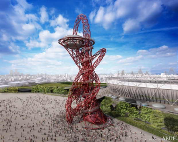
New London tower
-
What do you think?
The tower is being built for the Olypics in London in 2012

I love it!!
Read more:

BBC News - Anish Kapoor chosen for landmark 2012 sculpture
A spiralling sculpture designed by Turner Prize-winning artist Anish Kapoor is chosen as the monument to mark the London 2012 Olympic Games.

(news.bbc.co.uk)
-
Some more of Anish Kapoor's sculptures
and an article about Cecil Balmond, the engineer who will make it work as a stable structure
http://www.guardian.co.uk/books/2002/oct/27/art
Regards,
Bob -
It got a fair bit of criticism on the BBC news this morning.
-
Irritable-bowel syndrome meets car-crash... rather than a gleaming-spire ?
It looks like the worst idea he's had...
Wonky and weird.
Matches the 2012 logo though !!!
-
Bloody hell, even Gormley could come up with something less atrocious!
-
I dunno, with the 'Eye of London' and this 'Rollercoaster from hell', I am seeing a theme.
-
Not really appreciating this. Structurally and technically it is interesting, but JMO aesthetically it does nothing for me. Perhaps another example of "just because you can, doesn't mean you should...".
-
@solo said:
I dunno, with the 'Eye of London' and this 'Rollercoaster from hell', I am seeing a theme.
The London Eye is a feat of engineering for profit from tourism, the tower is simply a piece of engineering for Mittal advertising.
-
It would seem to me that we have a good theme for a competition. To design an alternative to Anish Kapoor's tower.
A few design rules/guidelines:
- It should work as a structure, ie. be possible to build
- It should be inspired by the Olympic Games
- It should be inspired by the location (UK, London)
- It should be have a long shelf-life (like the Eiffel tower)
- It should serve the community or tourism after the games have finished
- It should ...
Perhaps someone could think up a few more guidelines.
Personally, I quite like it. To my eye it looks like the Olympic torch threaded through with the the five rings of the Olympic symbol.
Regards,
Bob -
It's definitely not to my taste. It is hardly iconic, and lacks any kind of visual appeal.
-
Just the latest variation on the theme of "the kings new clothes" subsidised by public money.
-
It perfectly reflects the state of Britain at the moment - a comprehensive clusterf..
-
Eiffel tower designed by a committee...
Anssi
-
It reminds me of the Jeff Goldblum version of The Fly....when he gets the baboon from the other end of the transporter
-
Wonder how much it will cost to ride it.

-
once upon a time there were the idea and the sense of beauty that ruled the world,
say, the renaissance times,
This, New London Tower idea, reflects the uglyness of our times, and that should not be claimed as beauty and, even worse, be built.
I just cant believe that we are talking about it.
i think i´ll get under the water for a long while.
be good,
._) -
Well, I like it, except for the colour. It should, of course, be painted Oxford blue.
-
What's to like ?
-
Gerry Anderson called, he wants that part of the Thunderbirds set back... it's supposed to blow up soon...
-
Hello! It looks like you're interested in this conversation, but you don't have an account yet.
Getting fed up of having to scroll through the same posts each visit? When you register for an account, you'll always come back to exactly where you were before, and choose to be notified of new replies (either via email, or push notification). You'll also be able to save bookmarks and upvote posts to show your appreciation to other community members.
With your input, this post could be even better 💗
Register LoginAdvertisement


