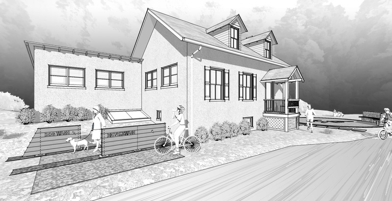
.Park Building.
-
here is another small project... did this a few months ago and they are JUST now getting back to me with comments.. glad they rushed me on it
 this is a renovation of a small building in a park alongside a running trail, going to house a yoga studio and some other stuff i think..
still trying to work out a good method for backgrounds in this style.. this one is a few translucent rings in the background with a forest texture mapped on it..


-
Good looking style! I like these black/white images your making as I've seen too in the other thread.
And I know how you feel about clients getting back late, just finished one of those jobs, had a hard time finding the file though

Maybe for the background you can use 2D tree silhouettes? Like these:
http://sketchup.google.com/3dwarehouse/details?mid=576577aa6eb9c834c279d1a2b5eb54ff&ct=mdrm&prevstart=0Cheers!
-
Nice Jason.
-
Looks nice. I like those trees and bushes in the back.
-
Looks really good.
The people are interesting. Where did you get them? I like the style.
-
@unknownuser said:
The people are interesting. Where did you get them? I like the style.
They are Formfonts models.
http://www.formfonts.com/Nice work Jason.
I have used this style myself very successfully for a planning application. -
Nice to know I am not the only one rushed to get a job out only for it to be shelved or reviewed weeks later. I just make sure to charge a "rushed rate".
Once again, these are fantastic. The style is almost calming.
-
I guess I risk being the only critic here...but here goes! I think the background is emphasized too much and it not only detracts from the building and other elements, but creates an oppressively gray overcast mood, whereas all your active people and shadows suggest to me a bright sunny day. You might try removing the background and inserting something more transparent in post. Also the one plant in the center of each "lawn" seems odd.
The one difficulty with applying textures (which probably have a color)is that when viewed in grayscale the gray tones may be too similar. I think you've done a really good job keeping these images readable. And the modeling is nicely detailed.
-
yeah...good call red_shift.. probably should've lowered it all down a bit to get some brighter sky in the background.. this was a quick and easy way to do the background, but not sure i'll use it again or not...
thanks for the help.
-
or maybe a darker sky, I think contrast between foreground and background will help.
quick rehash.

-
that looks awesome, steven...love it. that said, my client would hate it! haha..
-
Hí marked001,
i think that the building...going to house a yoga studio...
i´ll better leave it without any more stuff.
i like itits cold for me but i can get the spirit of the proposal and i think that you are going to have to calm the kids around
cheers
will like to see the progress
.)
background like a sunrising between the mountains ? -
I'm still bothered by the dark background..."there's a storm coming!"
-
dont worry, i think this background was a one-time experiment
 haha.
haha.
Hello! It looks like you're interested in this conversation, but you don't have an account yet.
Getting fed up of having to scroll through the same posts each visit? When you register for an account, you'll always come back to exactly where you were before, and choose to be notified of new replies (either via email, or push notification). You'll also be able to save bookmarks and upvote posts to show your appreciation to other community members.
With your input, this post could be even better 💗
Register LoginAdvertisement


