Help Me Draw A Dome [TUTORIAL]
-
@d0me said:
Chris, are you talking about the door width or the height?
Btw, how is the one you built holding up?
I think it was the height that was more critical (perhaps for combustion) but the width is important if you want to make "classic" 300 mm diameter pizzas.
Yes it is fine but I encased it with brick walls and granite paving slabs (recycled) as we experience torrential rain in typhoons around these parts. I put the sketches and pics on an old remote hard drive; will see if I can recover them.
-
Hehe... While posting my last part (and kept "previewing" it), I missed Chris' posts.
Well, indeed, with the "entrance" part we already had the discussion about the size above (when we gave thickness to it and all). As the construction of the dome now is, it will allow easy modification (redoing) of that part however...
-
Hi Gai
That part was easy. Saved me the trouble of redoing the opposite end.
So now that leaves the back and front of the stand.
-
Okay but it is decision time again.
If I copy the side component along the red axis...
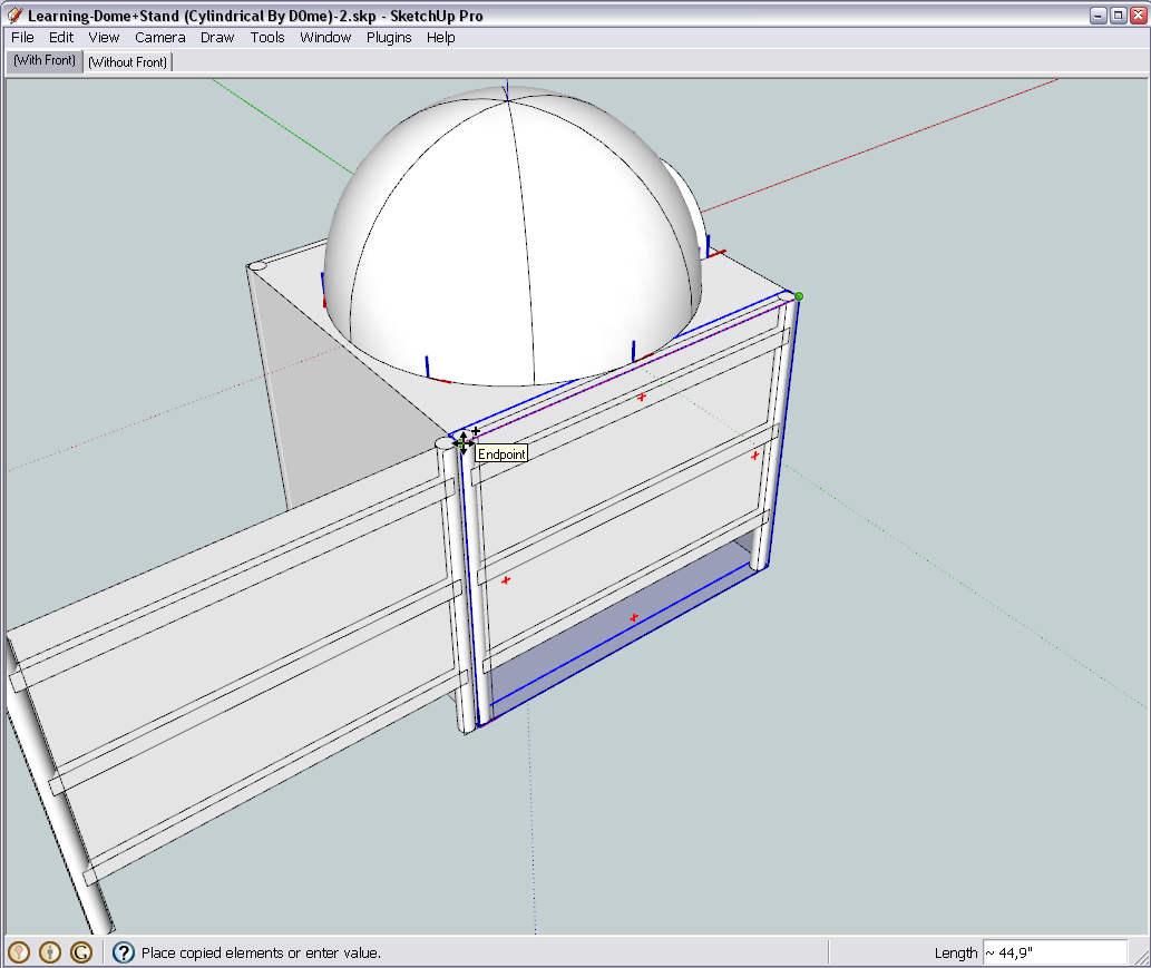
Then rotate it to form the back side...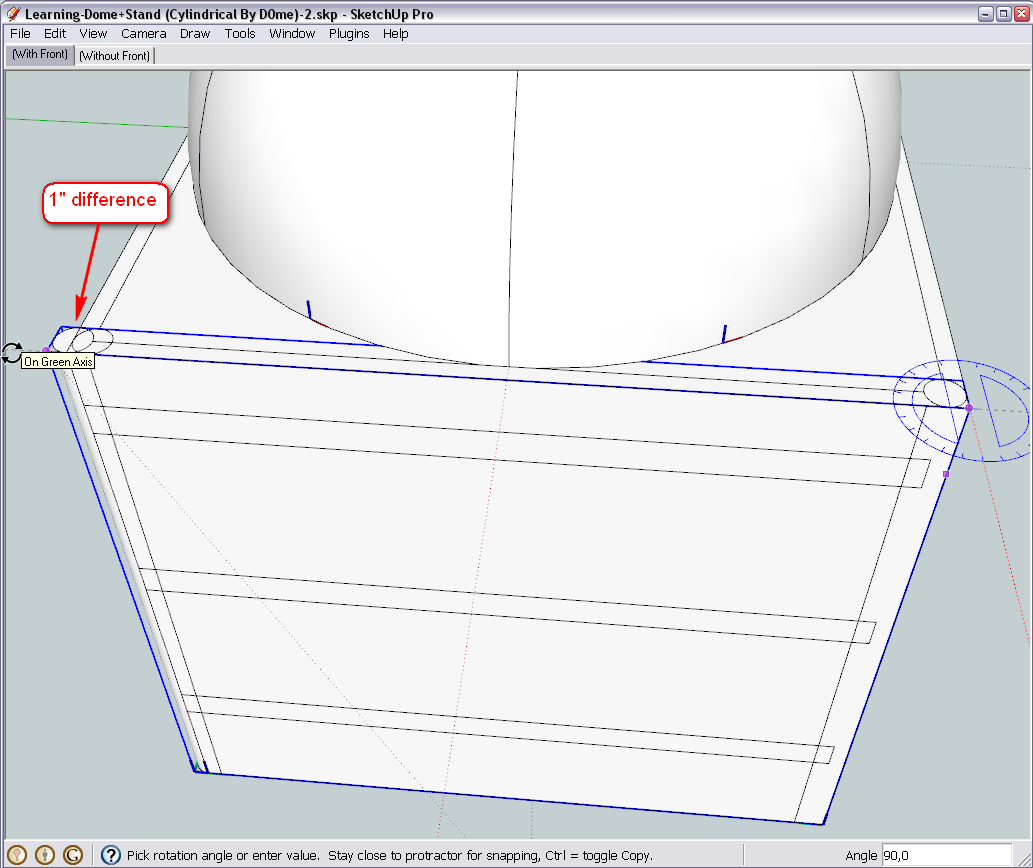
It turns out that our sides are longer than the back. This is of course due to the somewhat bigger space we left for the entrance. Now we have two choices:- to make these back pieces unique - this way we lose the advantage to edit the components "at once" when making changes - and also maybe you lose the advantage to "order" a number of exactly the same pieces (which would be simpler and cheaper I guess)
- or we can decide how to adjust the whole structure in a way that all two sides and the back could be exactly the same.
We have some possibilities in the front: there is still 2" "left" - 1" deceasing would not necessarily affect the construction too much
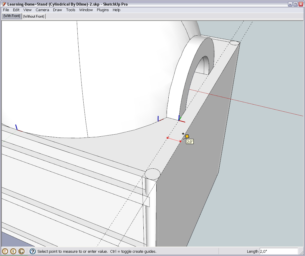
OR, we can move the side components out by 1/2" on each side (they got closer by moving the siding panels in anyway)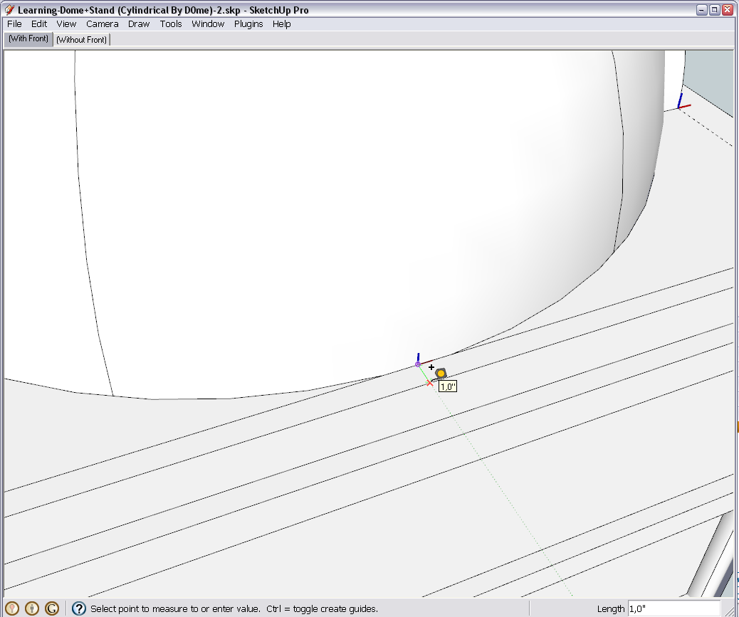
So? What should be the next step according to your decision?And of course, don't be annoyed with these little issues as they always come up when designing something "from scratch". It's a constant thinking and re-thinking and changing and adjusting process - but of course that's exactly the advantage and strength of SU to allow us to do this always "on the fly"
-
Hi Gai
@unknownuser said:
we can move the side components out by 1/2" on each side (they got closer by moving the siding panels in anyway)
This works for me perfectly.
@unknownuser said:
And of course, don't be annoyed with these little issues as they always come up when designing something "from scratch". It's a constant thinking and re-thinking and changing and adjusting process - but of course that's exactly the advantage and strength of SU to allow us to do this always "on the fly"
Yep designing something from scratch on paper has both the up and downside. To me the upside is you don't go halfway through the actual building process to find that you've done some miscalculation and the downside is you always changing the design for the better which in fact if you look at it from a different light, it is an upside.
-
@d0me said:
...the downside is you always changing the design for the better...
Believe me or not, I have never finished any project, any model in my life.
There are a lot of course that I abandoned and became "ready as is..." but if I had to do them again, I would start adding and tweaking until I run out of deadline and hand it in again "as is..."

So back to our lesson (as later I may have to leave)
Move one side component 1/2" inch out along the green axis (remember; green axis lock is the left arrow key on your keyboard). As we are in decimal inches, the Measurement box (aka "VCB" = Value Control Box until SU 6 as you may find in older tutorials) will display 0.5" (more exactly 0,5" on myscreen as that is the decimal divider on many non-English operating systems).
Of course, typing either 1/2" or 0,5" will do the same (moreover, as our model's default unit is inch, you can even omit the " symbol)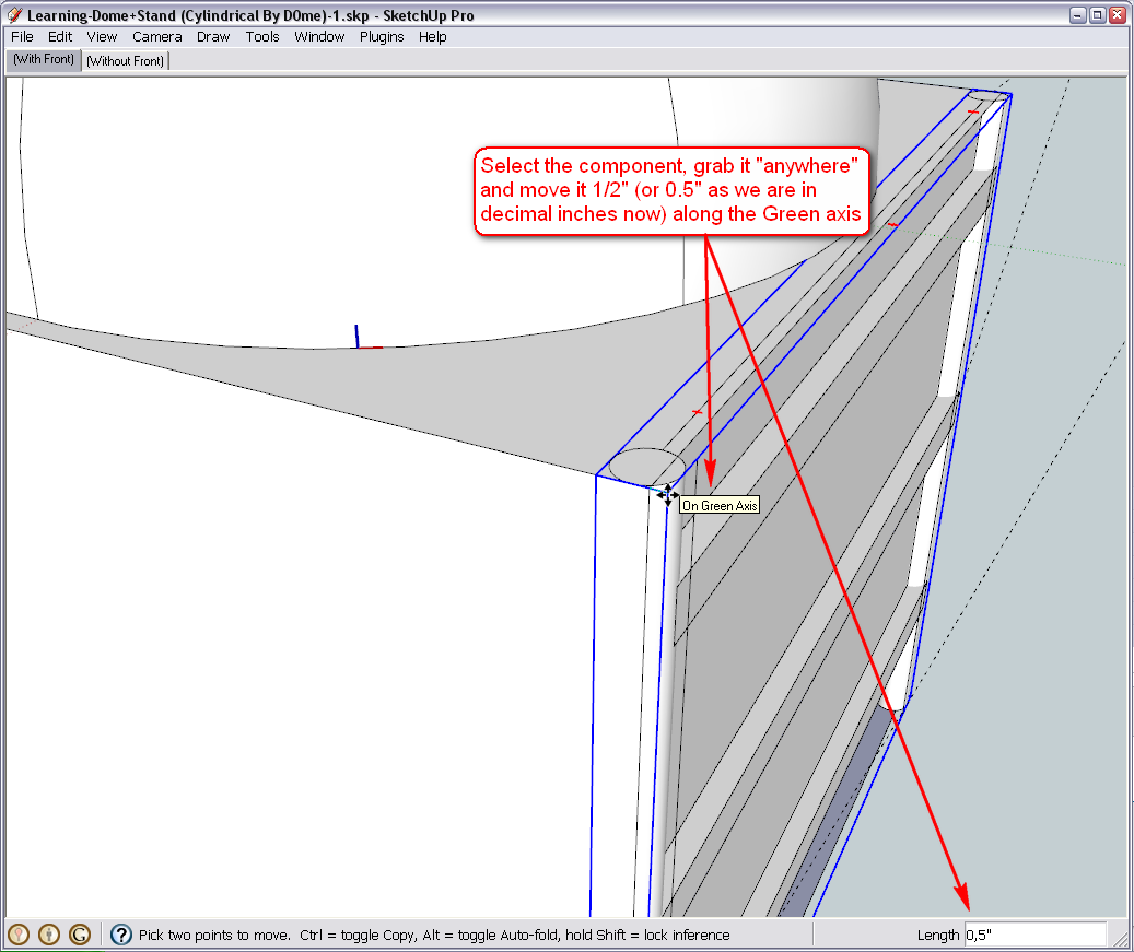
Do the same on the other side...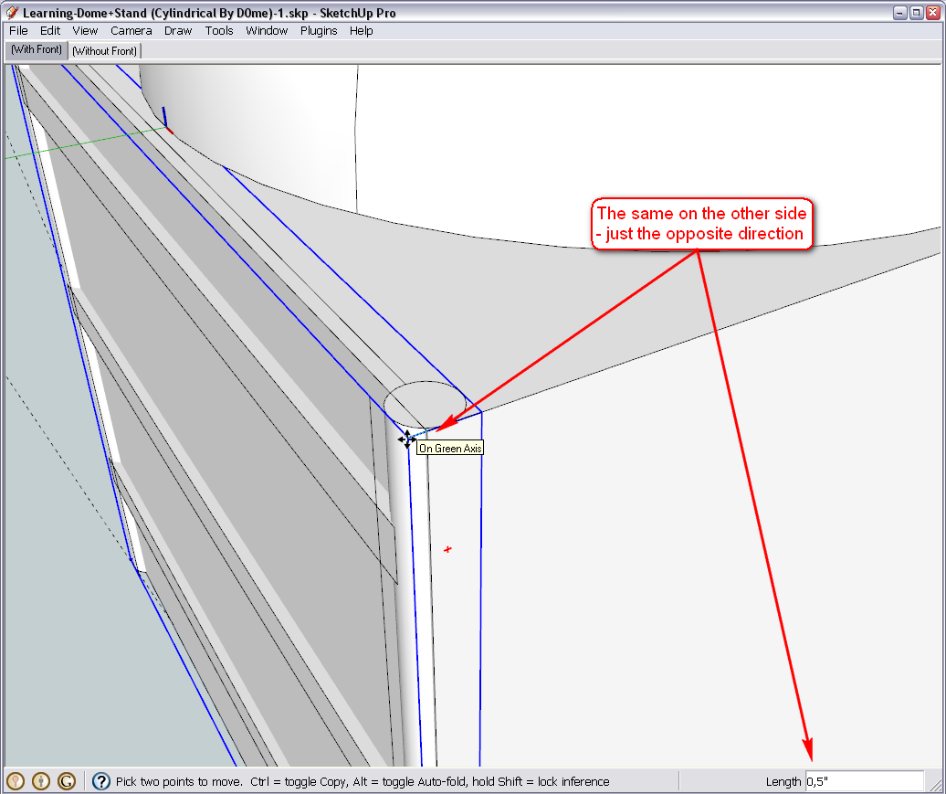
Now still using our "useless geometry" we left in the leg component (remember when I said it is very comfy there?), grab the still selected side component and Copy-Move (Ctrl + ) it along the red axis to snap to the opposite endpoint of the same, useless geometry.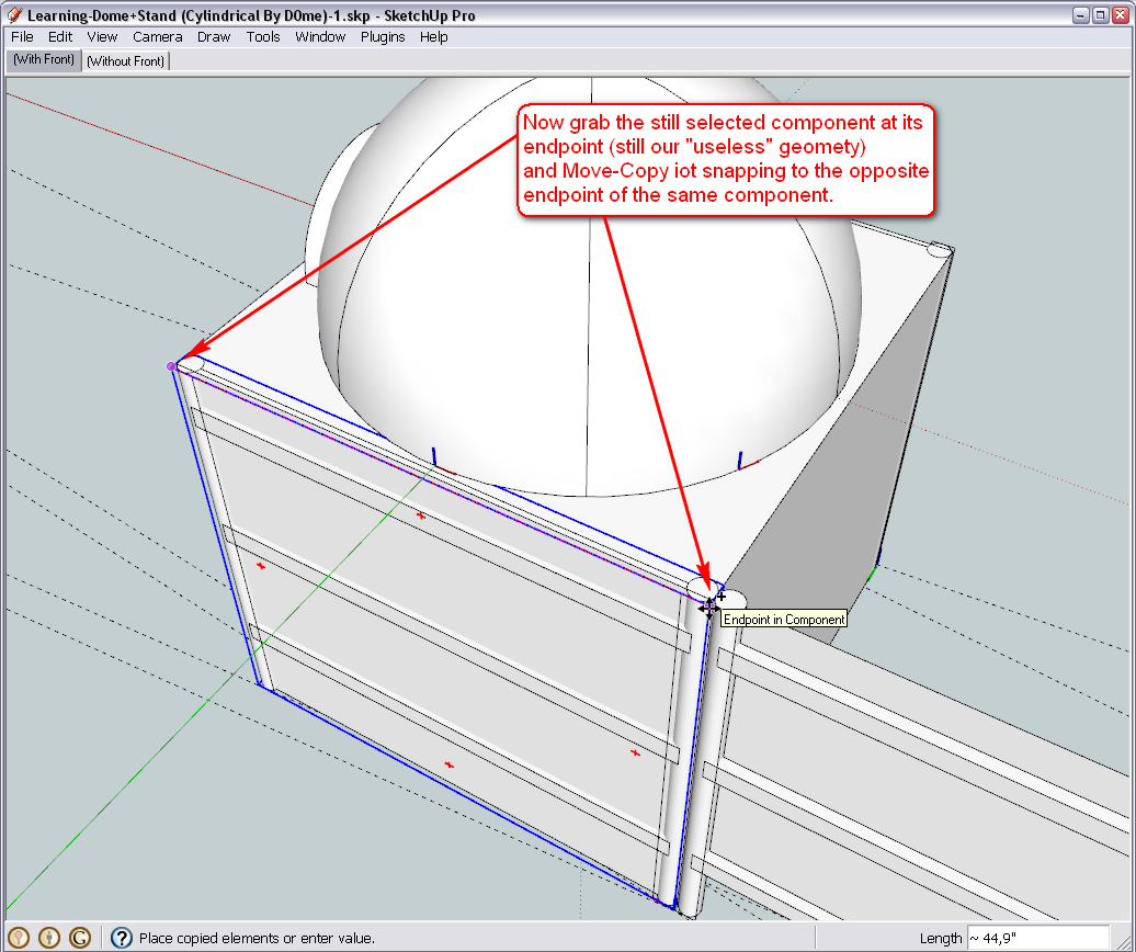
Now we rotate it in place - still using the useless endpoint...
We need to do this along the blue axis (see the blue protractor to make sure we are along the blue axis). If you have hardships aligning it along the blue, use the top of the base box to get a blue protractor and the Shift key to lock it there - then move it to the endpoint and click to establish it.
Now drag the component and rotate it by 90 degrees.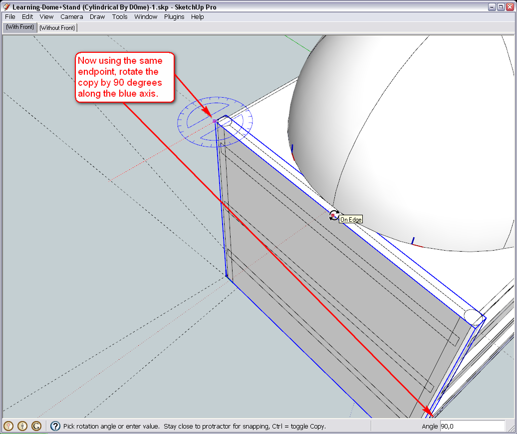
We are actually done - there are still those side faces (ungrouped and outside of any component) that cover the back and "north" side of the original base block - lose them...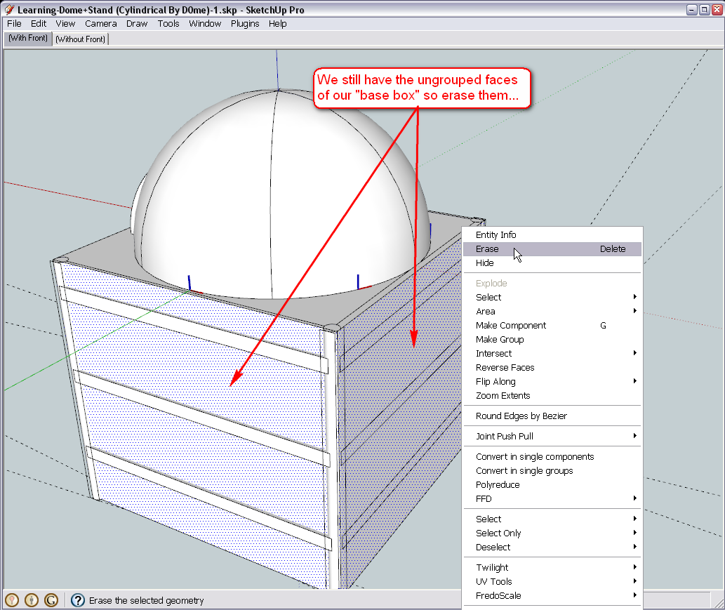
Note that now we have overlapping geometry in the model as the back side and the "side side" components both contain the legs on the back corners. We do not care with them at the moment but will need to remember.Next step will be to reuse some nested components in our "side" components to cover the front of the base but that will be a different cover of course.
To prepare for this step, repeat the
- Copy (to clipboard)
- Move
- Flip (still along the "Component's green" axis as that is now different from the World axes) 1. Paste in place
(you can also delete the front, ungrouped face just like in the last image above)
process outlined in this step above now doing it with the back side copying it to the front. Don't worry if that should be different - we shall deal with it later.
-
Hi Gai
This stand now is taking Shape.
I've prepped for the front using the method you provided. I copied the back side covering to the front.
All good to continue.Thanks
-
Okay, this is my time to leave now so sorry but will be back to the project later.

-
Okay, back again with the next step. We are going to start to finalize this whole stand now.
First we make sure that by modifying the front, we do not modify the rest of the side components. This can be done two ways;
- right clicking and "Making unique" - but there is no much sense in doing this as we do not have any advantage of keeping it as a components at all
- so we simply explode this front instance of the "side" component instead
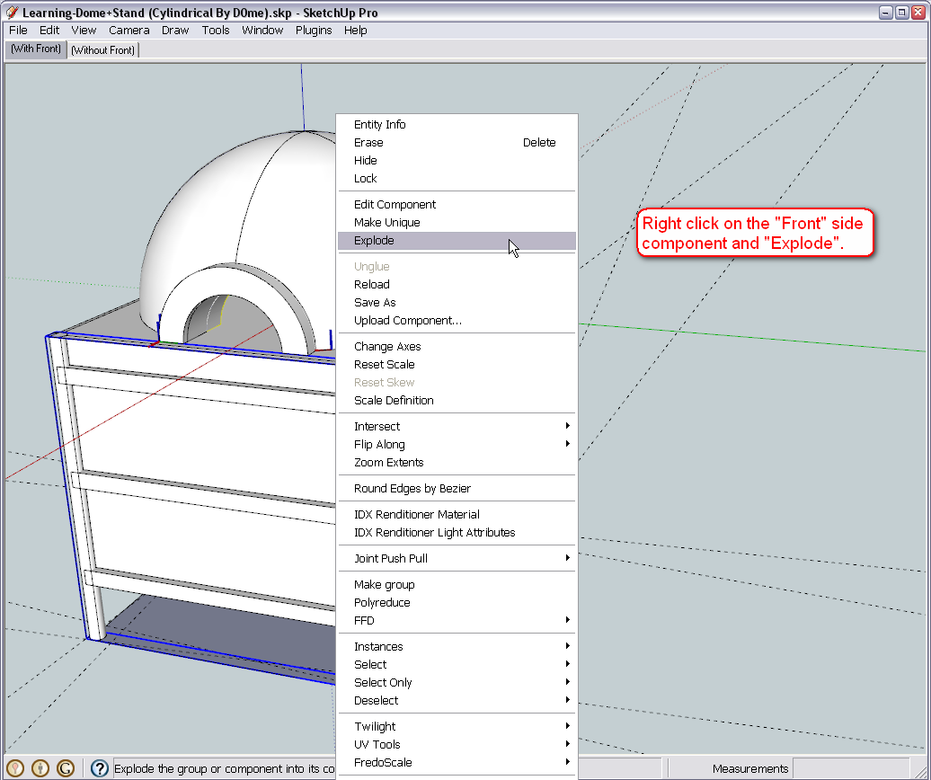
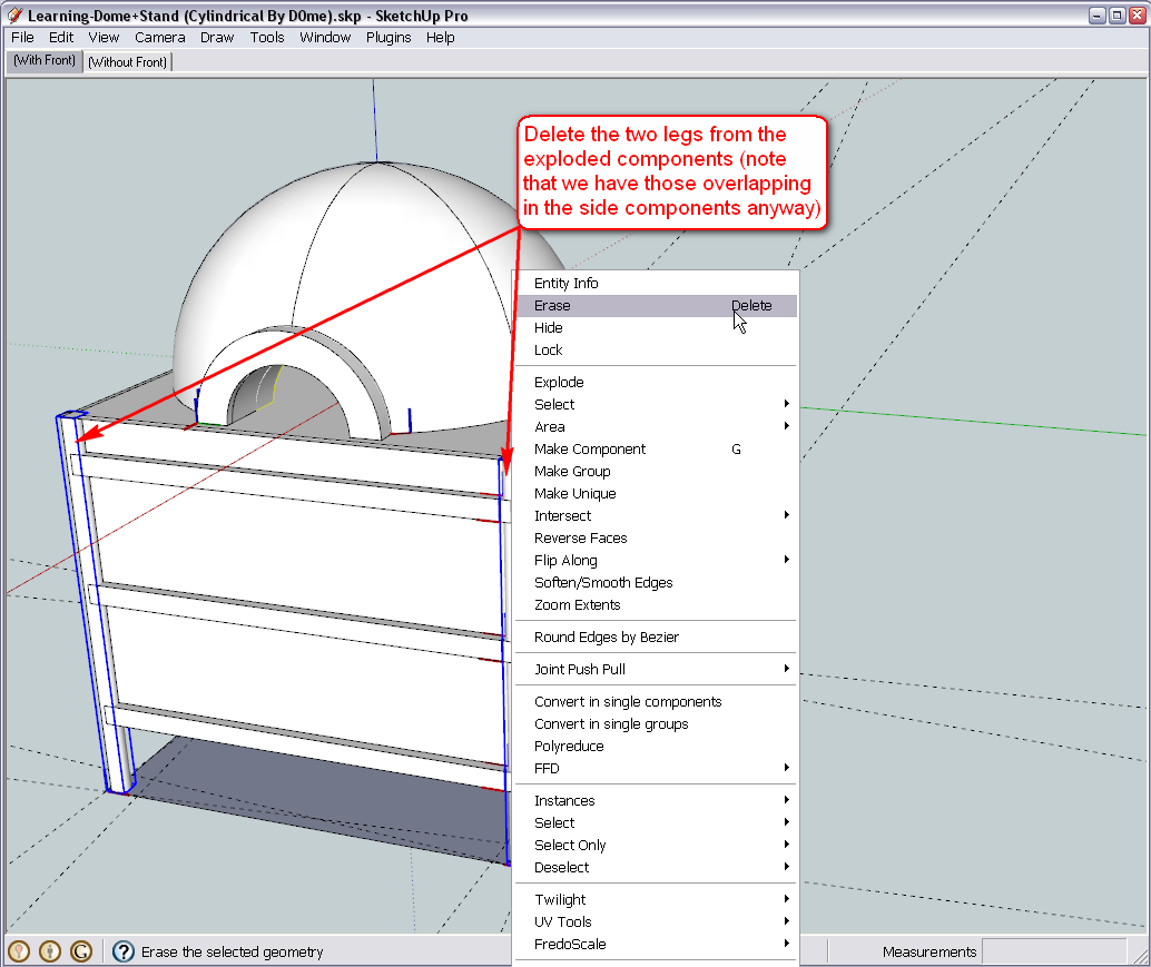
Remember that we have overlapping geometry - the legs are repeated twice in each corner - so it is high time to delete the two from the ones that we have just exploded.
(Also keep in mind for later that we still have overlapping legs in the back corners of the stand but we deal with them later).
I guess we do not need these three parts in the front (although I am not sure at this point because we have sort of modified stuff since you posted this preliminary design idea but to me, it seems just logical however tell if you have other ideas now)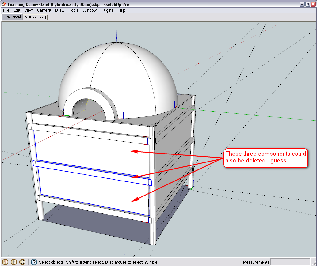
I think it's also time to do a general clean-up and get rid of all the "loose" or "raw" geometry of our original stand box so triple click somewhere on it (all connected geometry will be selected) and delete all.
(Note that after finishing at later steps, I noticed that there was still some loose geometry here and there - which was obviously not connected therefore not selected but can be deleted later as well).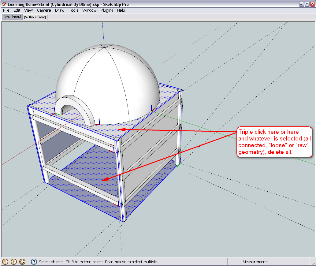
Okay, I think it is also time to deal with that huge, concrete slab. We practically symbolised it with a 2D side panel so far but it finally needs to be 3D now. So let's pick one of the side panels (logically and modelling-technically the one from the exploded front side is the most practical) and make it unique so that when we edit it, the other three instances all around won't be edited at the same time. It would not be a problem (as later below you will see that we'll delete those) but more comfortable now.After making it unique, PushPull it to the end, snapping it ti the edge of the back panel.
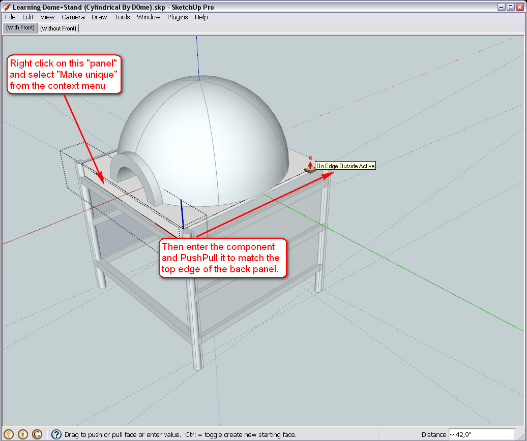
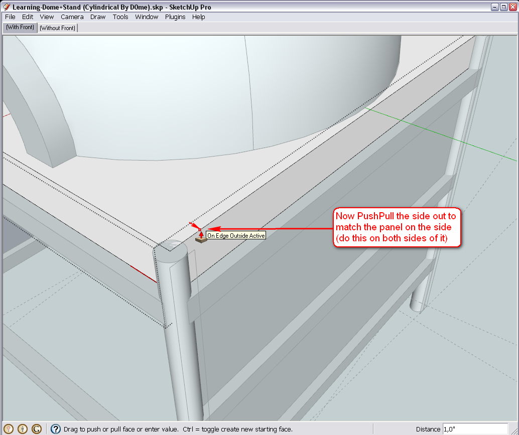
Do the same with the sides - snapping them to the edges of both the right and the left side panel (only one side is shown in the picture but do it the same way on the other side).A tip here: the PushPull tool will "remember" the value of the last PsuhPull operation. Here it is not too difficult to snap to the geometry but you can test how it works: on the other side just double click on the side face of the concrete slab and it will PushPull exactly the same amount as on the first side.
Finally, as we do not need them any more, let's delete those side panels which has been "symbolizing" our concrete slab in 2D in the side components. By editing only one instance of the three side components and deleting it from there, all other instances will be deleted, too (this is why components are handy).
We do not need them any more (unless you want to have them as some kind of "cover" on the concrete slab but then the make unique operatin should be done differently above - so tell if that is the case).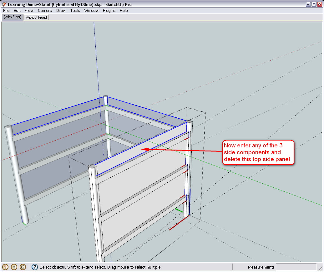
And finally the file as I have it now (note that I deleted some more loose geometry I found later and that I mentioned above).
-
Hi Gaieus
I'm on track.
I did make a small change. I pulled the concrete slab entirely over the legs and square bar.@unknownuser said:
I guess we do not need these three parts in the front (although I am not sure at this point because we have sort of modified stuff since you posted this preliminary design idea but to me, it seems just logical however tell if you have other ideas now)
Well there is 2 more addition to the front.
- is an extra piece of square bar 3 inches above the bar that is already there.
- I'm considering having a covering over the entire front that can be removed to allow me access to the inside. More like a roller shutter or door. What suggestions do you have?
Thanks
-
Well, if we add an extra bar 3" above this is what we get. Is this what you want? (Also we will still need some kind of a bottom for the base box but that's easy to add any time)

-
Hi Gai
@unknownuser said:
Is this what you want?
Yes, that looks perfect and we'll definitely need a bottom for the box.
Thanks
Regards
D0me -
Well then, it is very easy - just Copy-Move (Ctrl + ) that bottom bar up (lock on the blue axis is either the UP or DOWN arrow key). It doesn't even need an image now I guess

I will put some easy things together for that bottom (my version does have that bottom already)
-
I thought u re building a plane here .

Great lesson Boss!(u couldn t have done that without a diligent student like D0me)
All the best!
Elisei
-
Hi Gai
@unknownuser said:
It doesn't even need an image now I guess

Definitely no need for that. You've made me a pro amongst all beginners now.
@ely862me said:
I thought u re building a plane here .

Great lesson Boss!(u couldn t have done that without a diligent student like D0me)
All the best!
Elisei
I couldn't have done is without a concerned teacher like Gaieus. I've made so many mistakes along the way, but his patience kept me going.
Building a Plane, well that's next, right Gaieus? lol -
Building a plane in SU?
That's a piece of cake!

[flash=600,480:23wug0ka]http://www.youtube.com/v/QO_D3ltOilk&hl=en_US&fs=1&[/flash:23wug0ka]

-
Wonderful...now,please,teach D0me do do it.
I think he can do it!
Elisei
-
That's for the next semester.

-
U are very optimistic ... i would say..ahem..year?
 ..
..
Anyway i see him very receptive..he ll manage to learn sketchup sooner..or later .Elisei
-
That wing modelling is actually not too complicated if you look at it that way. Justin (the guy who does that) doesn't even use plugins too much (but of course, his workflow is very special in many aspects).
The tools he uses there are simply PushPull and Scale.
Hello! It looks like you're interested in this conversation, but you don't have an account yet.
Getting fed up of having to scroll through the same posts each visit? When you register for an account, you'll always come back to exactly where you were before, and choose to be notified of new replies (either via email, or push notification). You'll also be able to save bookmarks and upvote posts to show your appreciation to other community members.
With your input, this post could be even better 💗
Register LoginAdvertisement


