sketchucation logo sketchucation
    • Login
    ℹ️ Licensed Extensions | FredoBatch, ElevationProfile, FredoSketch, LayOps, MatSim and Pic2Shape will require license from Sept 1st More Info

    Final streetscape - sketchup, twilight, photoshop

    Scheduled Pinned Locked Moved Gallery
    66 Posts 16 Posters 10.3k Views 16 Watching
    Loading More Posts
    • Oldest to Newest
    • Newest to Oldest
    • Most Votes
    Reply
    • Reply as topic
    Log in to reply
    This topic has been deleted. Only users with topic management privileges can see it.
    • W Offline
      watkins
      last edited by

      Oli wrote:

      "good design doesn't/shouldn't cost any more"

      Amen to that!

      1 Reply Last reply Reply Quote 0
      • C Offline
        cadmunkey
        last edited by

        The section looks great Oli, hope your bosses are proud of it! The scheme will look great when its built.

        1 Reply Last reply Reply Quote 0
        • D Offline
          dylan
          last edited by

          You have the grass looking well now oli.
          Are you using a mask with an image of grass?

          http://dmdarchitecture.co.uk/

          1 Reply Last reply Reply Quote 0
          • olisheaO Offline
            olishea
            last edited by

            perspective section:

            (oops i mean perspective elevation!)

            http://i654.photobucket.com/albums/uu269/olishea/section_3-1.jpg

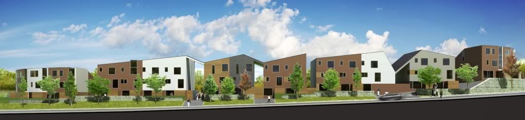
            comments welcome as always

            oli

            1 Reply Last reply Reply Quote 0
            • olisheaO Offline
              olishea
              last edited by

              In the above elevation its just raw render, but the other images are made using the grass tutorial on the twilight forum. so yeah an image underneath the masked render...then use the dune grass brush (in photoshop...make sure you lower the 'opacity jitter' aka 'foreground/background jitter' or you get transparent grass) to give the blades of grass. takes a while to get it right but worth it.

              thanks for the comments. cadmunkey: i hope my bosses are proud too!

              oli

              1 Reply Last reply Reply Quote 0
              • olisheaO Offline
                olishea
                last edited by

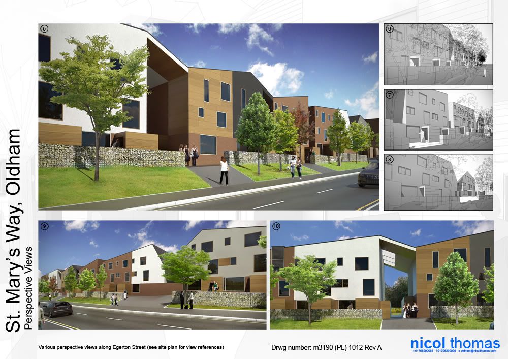
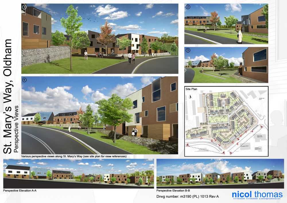
                Finally, all together on drawing sheets!

                http://i654.photobucket.com/albums/uu269/olishea/1_revA_small.jpg

                http://i654.photobucket.com/albums/uu269/olishea/2_revA_small.jpg

                oli

                1 Reply Last reply Reply Quote 0
                • 2 Offline
                  21D
                  last edited by

                  these looks amazing, did you do the PLAN in sketchup also, if not, which app did you use for that??

                  "I prefer drawing to talking. Drawing is faster, and leaves less room for lies."
                  Le Corbusier

                  1 Reply Last reply Reply Quote 0
                  • Rich O BrienR Offline
                    Rich O Brien Moderator
                    last edited by

                    Great final product Oli πŸ‘

                    Congrats on the tutorial on SUArtists, very informative and detailed.

                    Download the free D'oh Book for SketchUp πŸ“–

                    1 Reply Last reply Reply Quote 0
                    • olisheaO Offline
                      olishea
                      last edited by

                      21D: the site plan is made with autocad. All drawings were done in autocad and imported into SU.

                      Thanks for the nice comments, i'm happy how everything came out. And James.....I have to admit it's not quite the quasi-clay style...its just straight SU output with a gradient and vignette (didn't have to time to render any more). So let's call it the demi-quasi-clay style lol πŸ‘

                      In isolation I do not think the images are so spectacular but as a narrative they work very nicely IMO.

                      Thank you everyone for all your input. πŸ˜„

                      oli

                      1 Reply Last reply Reply Quote 0
                      • michaliszissiouM Offline
                        michaliszissiou
                        last edited by

                        Layouts are terrific Oli. I must say that I had my doubts about how a photo sky works with CG. As with the cut outs too. But it looks great now. Just this road texture still looks out of scale but it 'works'. πŸ‘ πŸ‘ πŸ‘

                        1 Reply Last reply Reply Quote 0
                        • F Offline
                          FoXar
                          last edited by

                          This is great! I'm really liking these drawing sheets and their with their layout, I think you've done a good job
                          combining different image types while still keeping everything in harmony. And I can go on.. πŸ˜›

                          Cheers! πŸ‘

                          1 Reply Last reply Reply Quote 0
                          • olisheaO Offline
                            olishea
                            last edited by

                            thanks michlais, james and foxar. Yes the curved road texture is a bit out of scale but the other road texture is exact to a UK road (have you tried texturing curved objects in SU? lol silly question). I had to (crudely) add the curved lines in photoshop. I understand what you mean about the sky michalis but it is not uncommon to see clouded skies in architectural photography.....it is rarely a pure gradient unless for artistic reasons.

                            I think layouts like this only work if you maintain verticals between the images. otherwise it can become very unsettling and uneasy to the eye.

                            cheers!

                            oli

                            1 Reply Last reply Reply Quote 0
                            • michaliszissiouM Offline
                              michaliszissiou
                              last edited by

                              @olishea said:

                              I think layouts like this only work if you maintain verticals between the images. otherwise it can become very unsettling and uneasy to the eye.

                              Its a common method in graphics design. Have a google search about the famous Neville Brody. My favorite.

                              1 Reply Last reply Reply Quote 0
                              • olisheaO Offline
                                olishea
                                last edited by

                                shame it took me so long to work it out! πŸ‘

                                oli

                                1 Reply Last reply Reply Quote 0
                                • 1
                                • 2
                                • 3
                                • 4
                                • 4 / 4
                                • First post
                                  Last post
                                Buy SketchPlus
                                Buy SUbD
                                Buy WrapR
                                Buy eBook
                                Buy Modelur
                                Buy Vertex Tools
                                Buy SketchCuisine
                                Buy FormFonts

                                Advertisement