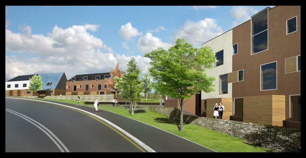
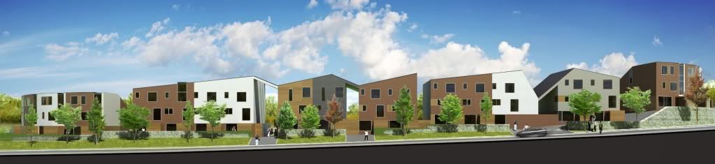
Final streetscape - sketchup, twilight, photoshop
-
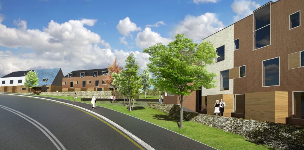
here is another one:
could do with some more contrast though....
cheers
-
different PP:
-
another angle. man im tired!
tried some dirt maps/grunge maps in this one.
comments appreciated.
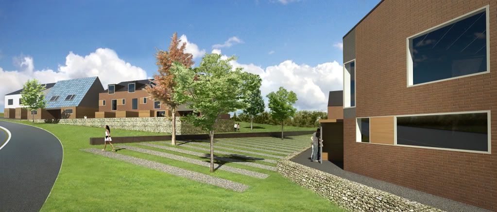
-
Mate looks like you need to play with the curves editor in PS! It can really make an image pop by adding contrast without loosing colour depth! Drag top quarter of diagonal left and bottom quarter right is a quick and dirty method to dress result!
-
hmmm. i always use curves. maybe not enough. are you saying it needs more contrast? I highly value your opinion.
here is another:
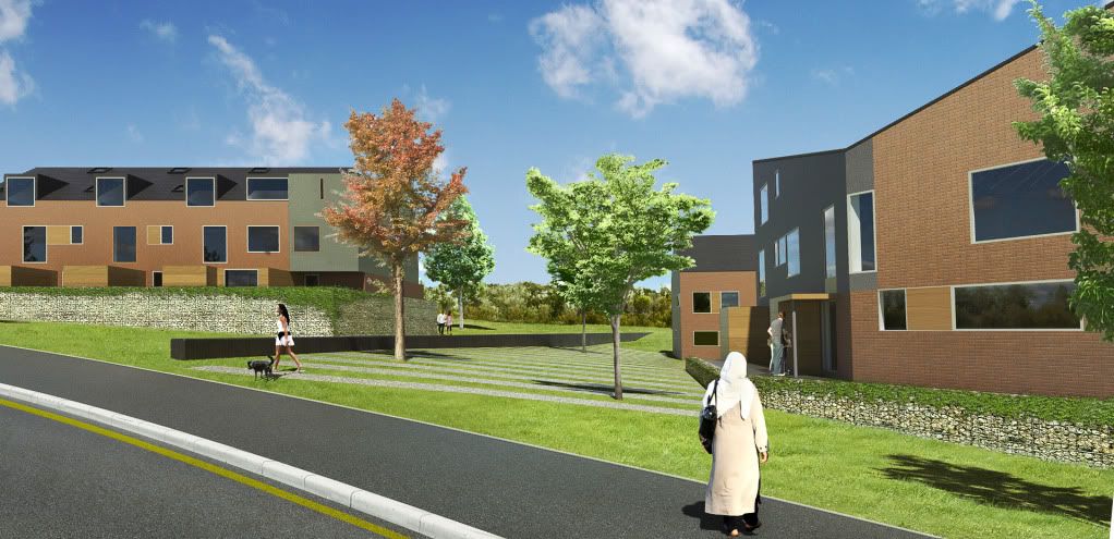
-
Oli, I think the contrast of the raw render is fine, it is probably the poor contrast of the entourage that is confusing things.
-
Dear Oli,
Perhaps some barriers at the curb side to stop children running down the slopes and straight on to the road? It would also discourage skateboard users too. Are the gambions less attractive to graffiti artists? Have you thought about external lighting to discourage vandalism?
Regards,
Bob -
Dear Oli,
I forgot to ask about energy conservation. Are these houses being designed for minimum heat loss? I ask because electricity and gas bills are a significant fraction of a low wage earner's income. Could hot water be supplied from a metered central source (per building block)? If so, then solar panels would work.
Regards,
Bob -
@unknownuser said:
I forgot to ask about energy conservation. Are these houses being designed for minimum heat loss?
of course they are, this is the 21 century. many of the houses are zero-emission level 6 eco-houses and the rest are very, very efficient. It's a landmark eco-scheme.
@unknownuser said:
If so, then solar panels would work.
can you not see them on some of the roofs?
@unknownuser said:
It would also discourage skateboard users too
They cannot skateboard on grass and gravel. The pavement is the only place they could possibly find useful...so let the ruin their boards on the curb. We are more concerned about violent assault and robberies than people skateboarding to be honest....it would actually be a blessing if people were skateboarding here...makes a change to smashing up phones boxes.

-
Dear oli,
Yes, I do realise that this is the 21st century, but you mentioned that they are council houses, and council houses (in the past, and in many case) have been designed and built to bottom dollar. Small and pokey, poor heat and sound insulation, and to a design that just begs for the wrecking ball. There are many examples of council housing estates that bear witness to this philosophy.
I thought the shapes on the roof were skylights. Are you using the roof space as living space?
Regards,
Bob -
Dear Oli,
Sorry, should have looked more closely at the roofs. As those large dormer windows? Are you using solar hot water panels or PV panels. It looks like you have PV panels on one roof.
Just interested, that's all.
Regards,
Bob -
PV and yes roof space is occupied in most cases. This is just part of a huge housing scheme, the level 6 houses are 'example' homes, a demonstration of what can be done and a move forward. it would be ludicrous for every home to be level 6. I understand your observations of past housing schemes but these are built to completely different standards and regulations. good design doesn't/shouldn't cost any more.
-
Oli wrote:
"good design doesn't/shouldn't cost any more"
Amen to that!
-
The section looks great Oli, hope your bosses are proud of it! The scheme will look great when its built.
-
You have the grass looking well now oli.
Are you using a mask with an image of grass? -
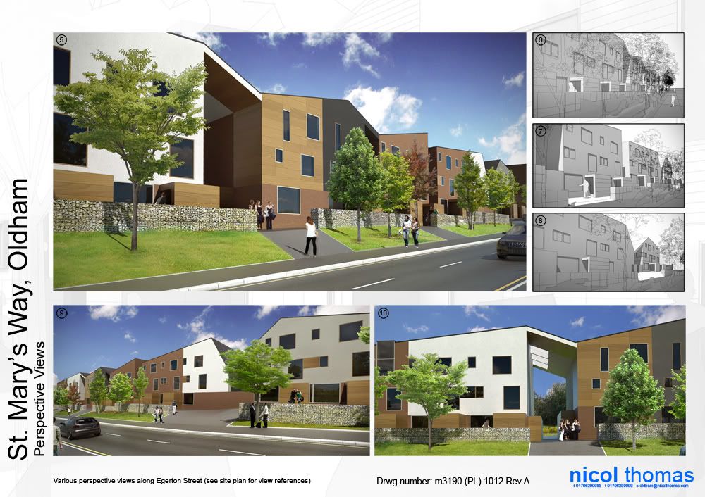
perspective section:
(oops i mean perspective elevation!)
comments welcome as always
-
In the above elevation its just raw render, but the other images are made using the grass tutorial on the twilight forum. so yeah an image underneath the masked render...then use the dune grass brush (in photoshop...make sure you lower the 'opacity jitter' aka 'foreground/background jitter' or you get transparent grass) to give the blades of grass. takes a while to get it right but worth it.
thanks for the comments. cadmunkey: i hope my bosses are proud too!
-
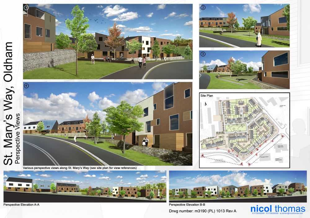
Finally, all together on drawing sheets!
-
these looks amazing, did you do the PLAN in sketchup also, if not, which app did you use for that??
-
Great final product Oli

Congrats on the tutorial on SUArtists, very informative and detailed.
Hello! It looks like you're interested in this conversation, but you don't have an account yet.
Getting fed up of having to scroll through the same posts each visit? When you register for an account, you'll always come back to exactly where you were before, and choose to be notified of new replies (either via email, or push notification). You'll also be able to save bookmarks and upvote posts to show your appreciation to other community members.
With your input, this post could be even better 💗
Register Login


Advertisement