Push/Pull Tower + model/render challenge, page 2
-
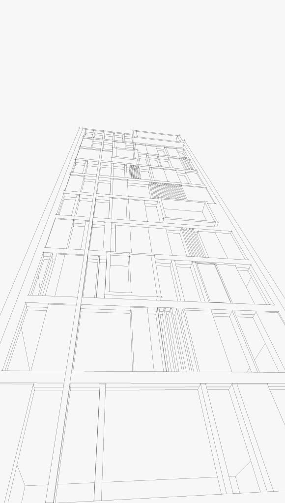
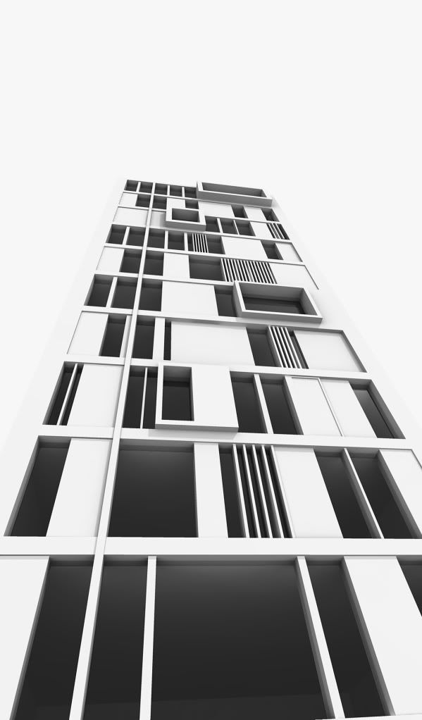
A quick tower I made using push/pull!
lines
render
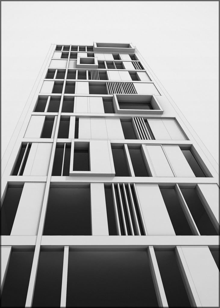
lines+render+gradients+free transform
-
Sweet! (What about trying a grey-scale sky and reflections? :`)
-
nice tests, oli!
-
heres a couple more. good idea about grayscale sky....but no sky reflections i'm afraid, podium still doesn't support hdri

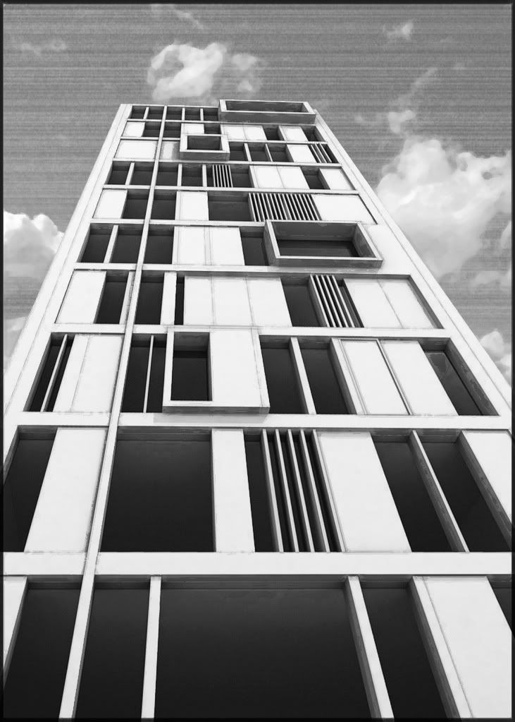
this is like a rushed watercolour
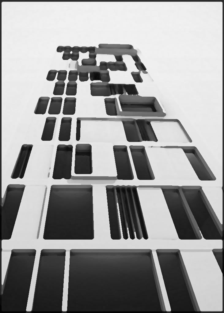
and this one is a fresco overlay, adds some grime/age I think.
-
Really good. It's looking really modern.
-
Very nice. Where does gradient come in? Do you mean in PS?
-
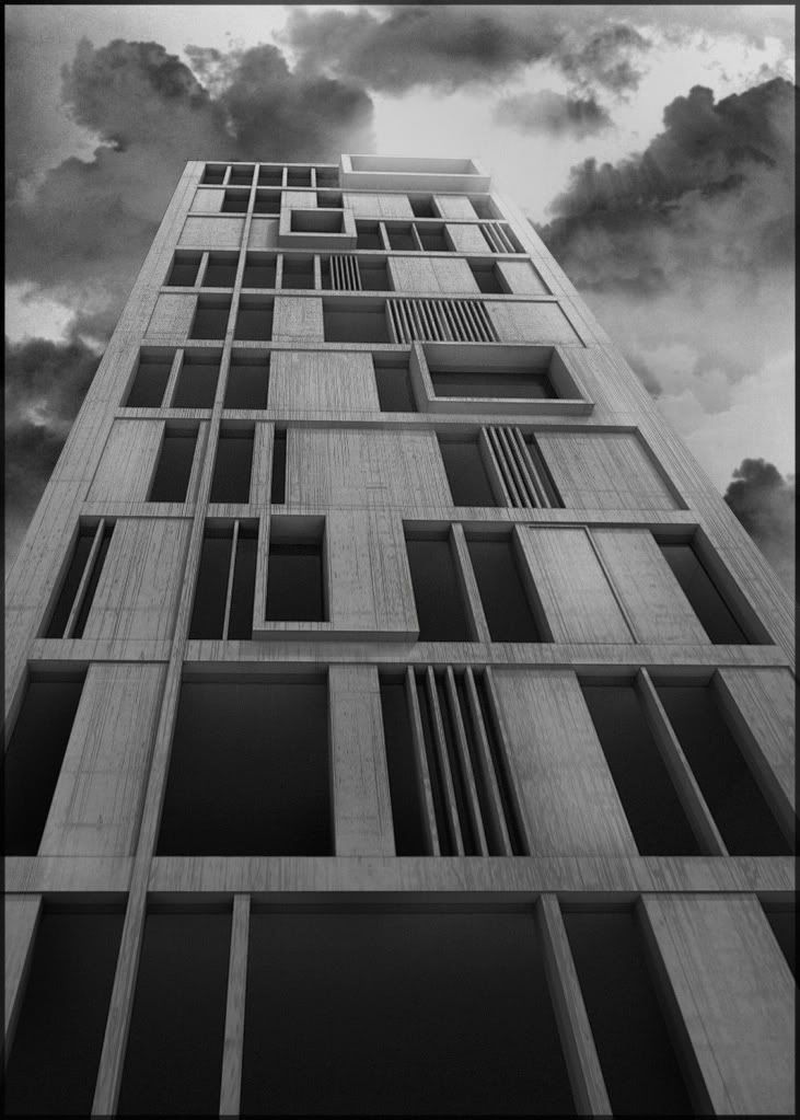
yeah in photoshop. I just added some vertical gradients to add depth (new adjustment layer>gradient.....then change blending mode and opacity). some images need gradient from the bottom, some need gradient from the top, some need both....depends on the image and the effect you want.
this is my favourite version "a la stinkie":
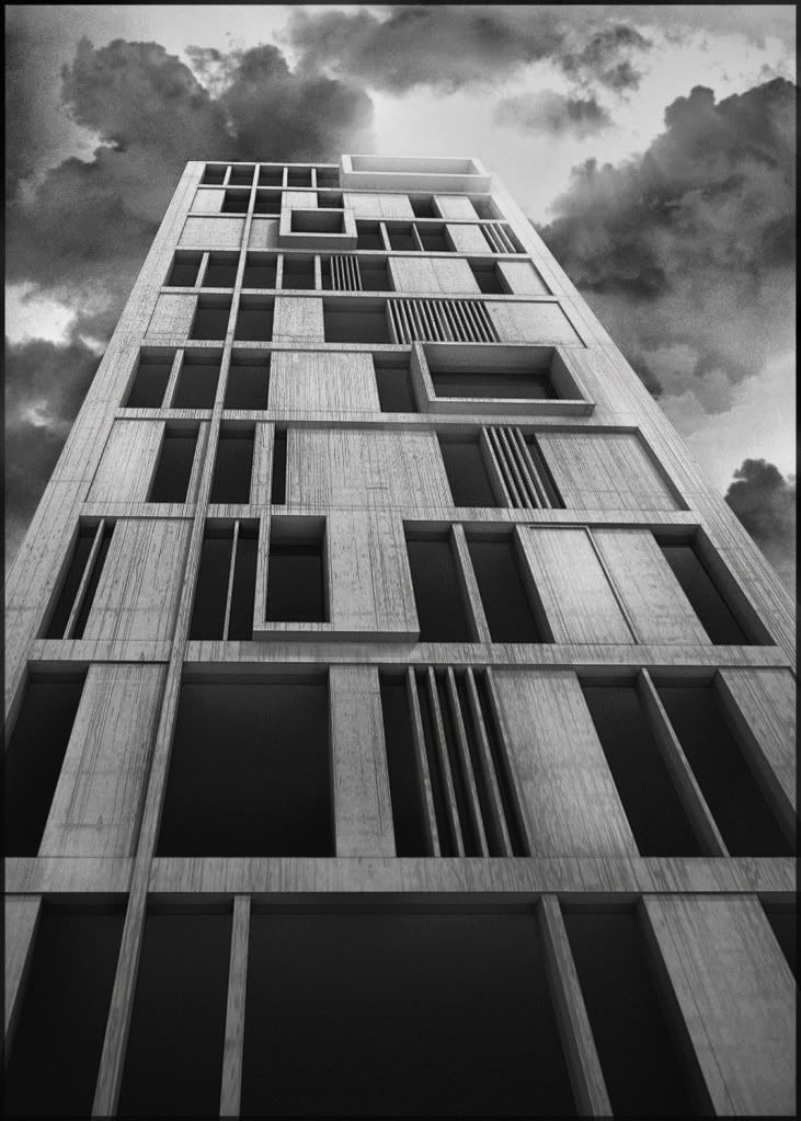
and a more contrasting version:
-
does anyone else's neck hurt??? haha... these are cool.. great to hear these pshop tricks..
-
These are great! Nice work.
-
the last two are great are you using podium for the raw renders?
-
There ya go: WOW!
-
Wow that's cool. Add some glass and some chain-link fence in the larger openings with a solid corregated railing and you have 1960's American government housing! Wow, reminds of the old buidings in my aunts old neighborhood that they demolished about 18 years ago. Whoa...

-
yes liam: it is podium.
these last two images are based on the first 'line-over' in the first post.
I applied the texture (dirty concrete bumpmap) in photoshop by stretching it into place and changing blending mode.
elibjr: the architecture isn't 1960's but the oppressive material and view certainly creates that impression....thanks for the insight.
its supposed to be intense, overbearing and almost insulting haha
-
For a quick knock up its pretty damn good. You have some very stylish renders, it is definitely overbearing and imposing. It reminds me of the towers in the old soviet block very imposing but with its ow depressive style. The type of building thats horrible to look at but every time you pass it you cant help but stare. I went on that big wheel in manchester for a laug and that big slab of concrete isnt half depressing especially as its the only thing you can see and its raining your picture reminded me of it lol you should ass some cracked plaster in very faintly.
-
I actully think it is attractive and btw 1960 architecture did not look like that.
-
thats what most people think when they see a concrete tower or anything remotely black and white.....system built housing. weird isn't it!
sid I wish 1960s architecture looked like this!
it looks amazing printed out, i got it on the office wall. my boss said : "wow, death tower"
imposing doesn't always have a negative connotation....but it certainly adds drama.
-
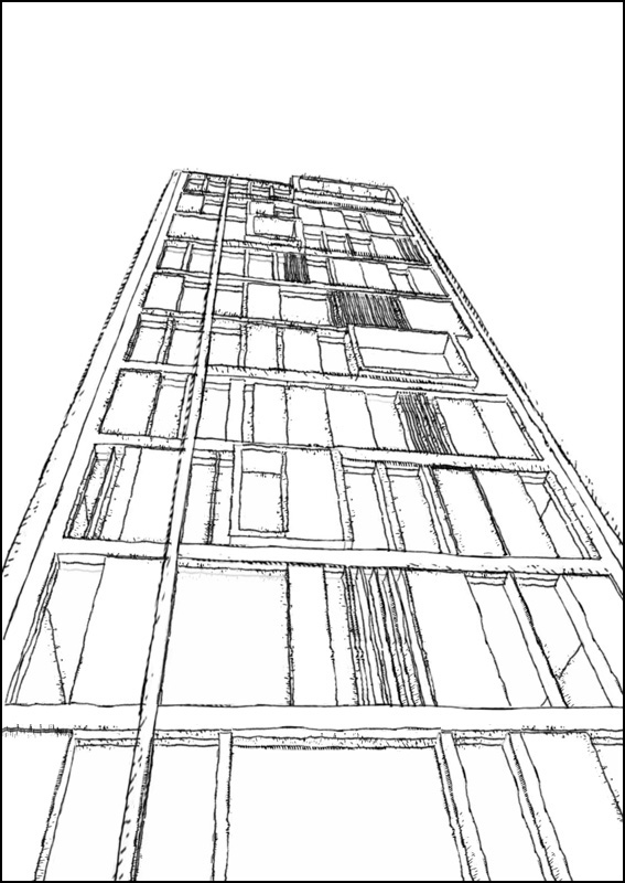
Oli you discovered an unpublished work of Le Corbusier.

Here is a preliminary sketch of the master...
-
"thats what most people think when they see a concrete tower or anything remotely black and white.....system built housing. weird isn't it!"
It is because people are conditioned by the parents aspirations and upbringing IMO.
"sid I wish 1960s architecture looked like this!"
I wish as well. Unfortunately 1960s modernity was hijacked in the name of housing people on cheap. Majority of the projects were designed by mediocre architects or in a many cases by engineers. The quality of built was appaling as well.
Concrete is as beautiful as any material. It is the way how it is used that determines the beauty or lack of it. I suggest that doubters look at the work of Corb in more depth or our contemporary, Tadao Ando. -
I didnt mean it reminded me in looks I know the style is completely off I just meant the dark colors and imposing monolithic shape on the landscape, grey dull you get the idea. I know concrete can be great but obv the stereotype is tower block stuff.
-
i understood what u meant mate don't worry!

massimo: that looks great.....is it straight from sketchup?

Hello! It looks like you're interested in this conversation, but you don't have an account yet.
Getting fed up of having to scroll through the same posts each visit? When you register for an account, you'll always come back to exactly where you were before, and choose to be notified of new replies (either via email, or push notification). You'll also be able to save bookmarks and upvote posts to show your appreciation to other community members.
With your input, this post could be even better 💗
Register LoginAdvertisement


