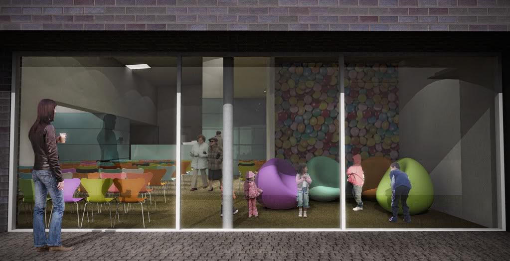
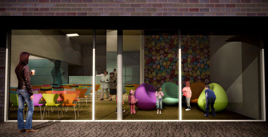
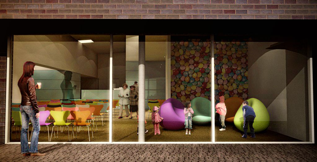
Another podium render
-
Here's a revised image of a waiting room for a medical centre im working on.
Supposed to be a study into different cladding materials as client/planners still not happy with brick choice yet.
I'm not the architect for this, I just did the visuals.
Comments please!

And these are Sepo's PP:


-
Nice and clean render...commented on P forum about people.

-
hehe mini children and giant adults, I really cant scale people!
-
it is never late to learn. here.
-
thanks edson, great link....although I didnt add the people in PP, I rendered them as PNGs so really ive got no excuse as i could have just measured their heights oops haha

-
Nice render, except for the lady smoking outside the medical centre!
Who does she think she is? She might as well be blowing smoke in the kids faces!
-
lol she's so controversial. I like it!
-
Hi Oli, I would reduce the level of details in the people. The render should draw attention to the space, not the creases in the figure's jeans. In this kind of scene, I like to use SU's 2pt perspective, then place the eyelevel of the average person on the horizon line, adjusting the height of the others to suite the presentation.
-
@unknownuser said:
Who does she think she is? She might as well be blowing smoke in the kids faces!
Would you rather her smoke inside?
-
thanks for the tips!

-
Hi Oli
Are you using a bumpmap for that cobble stone texture? Looks alittle flat. Maybe adding a little more detail to the window joinery.
-
I like those colors, they are nice and bright.
-
holmes, I did add bump but only a little bit, I'll add more next time thanks.
-
The scale of the cobble stones also looks too small relative to the size of the bricks on the wall. I agree on the woman smoking in the scene. Of course if it's for your own use that's fine but sometimes clients can have a fit over these entourage people. I remember once doing a rendering for an architect and the project had a balcony area that was going to be for the architects client. I put a man and a woman on the balcony. turns out the wife of the client had blond hair and woman in the rendering had dark hair...the clients wife suggested that he was having an affair so the architect asked me to change the woman to a blond haired woman....
I think the phrase is "perception is reality" anyway sometimes as illustrators we need to be conscious of peoples perceptions and realize that some people have a difficult time separating and illustration from reality.
-
i think maybe next time I will pick my people more conscienciously
Hello! It looks like you're interested in this conversation, but you don't have an account yet.
Getting fed up of having to scroll through the same posts each visit? When you register for an account, you'll always come back to exactly where you were before, and choose to be notified of new replies (either via email, or push notification). You'll also be able to save bookmarks and upvote posts to show your appreciation to other community members.
With your input, this post could be even better 💗
Register LoginAdvertisement


