Proposed Tower....Podium Renders
-
Really nice style
 That trees very good, as well.
 -
the images are great. i only have problems with the converging verticals which i always try to avoid.
-
beautiful conceptual images! love the subtle blur you did in pshop..
-
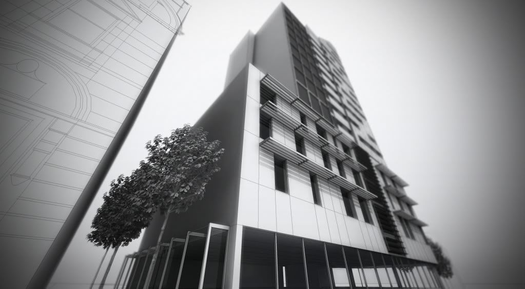
cheers for all the comments guys.....edson: yes I'm normally not keen on the verticals like this but it reduces the impact of the tower next to the listed building adjacent, I tried several FOVs and 45 degrees seemed to come out best.
thanks, oli
oh....heres another close up with depth blur and vignette (yes I know its over the top lol)
-
3rd from the top is my favourite
good job -
Mate I know your justifying the extreme non verticals but I have some issues.
Ok if for marketing, works a bit - needs colour!
If for planning / assessment the driving home of height is against the normal of wanting to prove or lessen bulk!
I love so much of your effect (really do and very much) but the verts need to be at least closer!
Although your technique is not something I'd use due to my common project type, I'd really love to hear some details on your processes if you wouldn't mind sharing your hard work there!
Again really nice work mate! Think about the verticals!!!
I'll have to search some of your other work now, nice stuff and sparked interest!
-
I understand the verticals issue, again, I was trying to fake the impact of the tower. But if that many people have commented on the convergence then I must be wrong!! maybe I'll tone it down a bit next time round. It really is HUGE compared to the landmark building adjacent, but the client requires 90 apartments so it has to be this big. This is purely a massing study by the way....not for marketing etc. I don't normally post my work here, just on the podium web site for critiques, the people there taught me everything! My process is similar to Zem's mixed media/watercolour techniques just tweaked here and there. thanks for your interest
-
Nice images Oli. I have actually had more requests recently for this bare type of cardboard model renders instead of photoreal stuff. Planners love it too!
-
I draped the CAD drawings over all the faces, quite time consuming, but quicker than modeling the whole building...it would take weeks. I exported the lines in SU as a jpeg then placed over the raw renders in PS using 'multiply' blending mode with 30-40% opacity. gives a bit more depth/sharpness too I think. I tend to do A LOT of studies like this under really tight deadlines, you can get away with doing less. The modeling, rendering and post process only took 2 days, thats the beauty of podium, no exporting/importing etc etc!
-
@olishea said:
cheers for all the comments guys.....edson: yes I'm normally not keen on the verticals like this but it reduces the impact of the tower next to the listed building adjacent, I tried several FOVs and 45 degrees seemed to come out best.
thanks, oli
oh....heres another close up with depth blur and vignette (yes I know its over the top lol)
Yes, nice blur... i'm sorry but how did you get the lines on the context building? is it just a group of lines from a cad file or is it an image file?
-
cheers for all the comments guys.....edson: yes I'm normally not keen on the verticals like this but it reduces the impact of the tower next to the listed building adjacent, I tried several FOVs and 45 degrees [edit: I mean 65 degrees] seemed to come out best.
thanks, oli
-
Here is a quick tut I did on a similar more abstract style, again, Zem pioneered this technique.
Principles are the same except I used SU wireframe and shadows export too, no particular reason, I was just playing with different overlays.
http://supodiumforum.websitetoolbox.com/post?id=3446402 [scroll down for the tut]
-
Thanks for the tut- looks good- similar to what something I have tried
 have a look at my website.
what do you think of the converging lines fix? hope you don't mind.

-
lol thanks, nice fix....but the building looks really deep now!!!
nice web site, I see what you mean.
you can get fantastic results using the lines as a mask too, check this out that smooge did, I haven't got round to doing one yet but any excuse and I'll do it!
-
oli,
in your case it is not so much the presence of converging verticals but the extent of the distortion. i know in some views some convergence is inevitable but what i see in some of your images an unreal convergence: the eye just does not see it that way.
BUT, this is just the way i prefer it. it is surely not THE TRUTH.
-
edson: i get you now, for some views it is appropriate while with others it looks plain wrong!! I know you like treating your renders almost like elevations, as evidenced in the institute of architects that you did......which worked very nicely indeed. I may be asking you for a favour in the near future.....the mesh PNG you made lol its fantastic.
-
@olishea said:
lol thanks, nice fix....but the building looks really deep now!!!
nice web site, I see what you mean.
you can get fantastic results using the lines as a mask too, check this out that smooge did, I haven't got round to doing one yet but any excuse and I'll do it!
It is deep- i agree with Edson; it's really the degree of distortion.
I like what can be done with lines as a mask! very techno. -
@olishea said:
I may be asking you for a favour in the near future.....the mesh PNG you made lol its fantastic.
you can have it anytime. it would probably help you to know how i did it.
-
Legendary!! Thanks Edson....I'll let you know when I need it!! It's a very realistic effect. Thanks again
-
Great Job Olishea !
I really like this kind of renders, which are quite rare in fact, but mostly efficient to express an architectural concept.

Hello! It looks like you're interested in this conversation, but you don't have an account yet.
Getting fed up of having to scroll through the same posts each visit? When you register for an account, you'll always come back to exactly where you were before, and choose to be notified of new replies (either via email, or push notification). You'll also be able to save bookmarks and upvote posts to show your appreciation to other community members.
With your input, this post could be even better 💗
Register Login


Advertisement