Overly dark renders, and etcetera
-
Great renders.
However, let me quote a line from those pesky Competition rules
@unknownuser said:
-Sketchup output only (and as much as i know you love rendering your models, it would be appreciated if you could hold of posting them in the gallery until after the comp.)
-
Oh, I didn't notice that... but it's not in the comp section... so we can't even post them in the gallery?
-
@unknownuser said:
Frederick:
 . Also, how do I use volume lighting to create god's fingers without slowing my render down to 1% for 10 minutes?
(I use KT)Volume lightning and soft shadows is a bad mix...

Which also makes sence, since KT is a GI render application...
Only use one of them at a time... Never together...
click Settings > Scene...
You'll now see a window with 3 tabs... (Lights, Cameras and Global Settings)
Select the Global Settings tab...
In the Ambient & Volume Lightning field, you need to check that Volume Lightning is ticked...
In the Global Fog field you just need to adjust the Scatter settings... (you may start with .05 or .1)You can find a small scene here, which you can use to play with...

Please note!
 Volume lightning will increase your render time significantly...
If you don't like longer render times, you can make Gods Ray in post pro...
-
@unknownuser said:
Oh, I didn't notice that... but it's not in the comp section... so we can't even post them in the gallery?
Correct.
-
so...do I remove them untill after the comp???
-
That is up to remus.
-
I think leave them in place this time. I'm too lazy to copy them all and put them back in after the comp

Please dont do it again, though. If i'm in a bad mood theres a good chance i'll just delete the offending posts.
-
i like the dark style but think its maybe a little too much, maybe some more lites too add more life to the renders, but good job!! i like them

-
BMW Z4
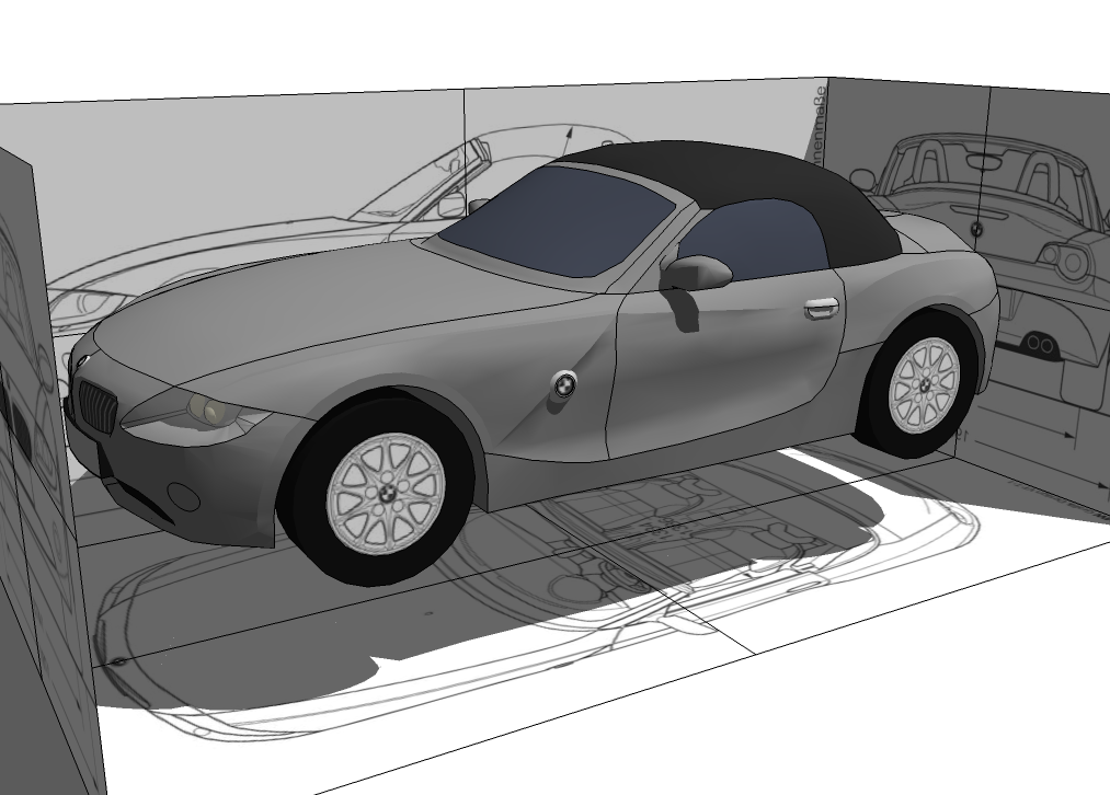
making a car in sketchup is one of those things I've always wanted to try, and this would be the first decent attempt I've had at it. Decently far into the model, still lacks a lot of details, and interior, but I'm posting it here none-the-less.
-
Some in-SU pics of one of my latest models.
Everything but textures were made by me. If you're wondering why the turrets are so bad, the file size is huge, and I want to be able to upload it to the 3D warehouse, so i have to take away a LOT of detail

(Images removed, different ones will most likely be re-posted.) -
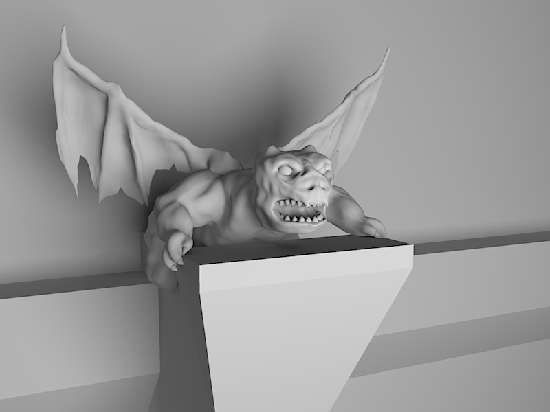
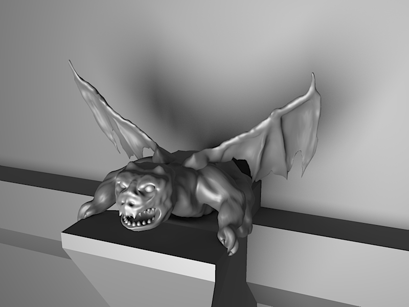
Sculpture!

50748 faces, 77242 edges
—————————————————————
-
Is this done with your under development sculpt tools?
Looking really good, if so, I cannot wait to get my hands on the final product.
-
@solo said:
Is this done with your under development sculpt tools?
Looking really good, if so, I cannot wait to get my hands on the final product.Yes, this was done with Sculpt Tools.

I've been fairly busy lately, and haven't gotten much more done on them, but I don't have too much more to do anyways. I mostly made this model just to see if I could, and to see what would make it easier to sculpt, as in visuals.
-
looks pretty awsome... do these compare to the 'sculpt' tools as integrated into modo?
-
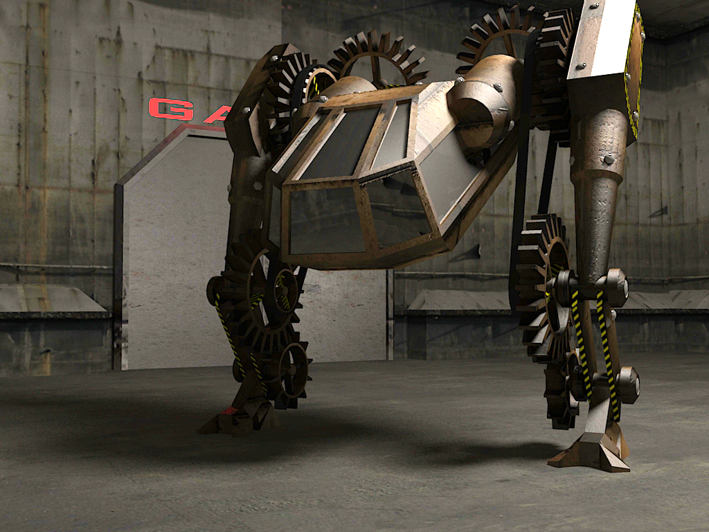
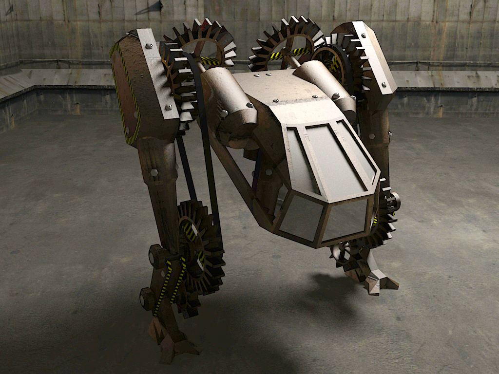
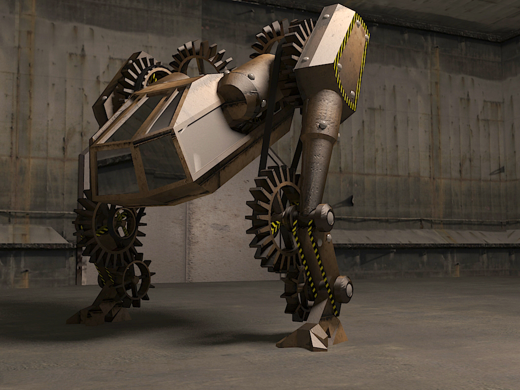
Here are your last renders after a bit of tweaking in Photoshop using levels and contrast adjustment. If these look too bright on your monitor you really need to make some adjustments or get a new monitor.
Regards
Mr S
-
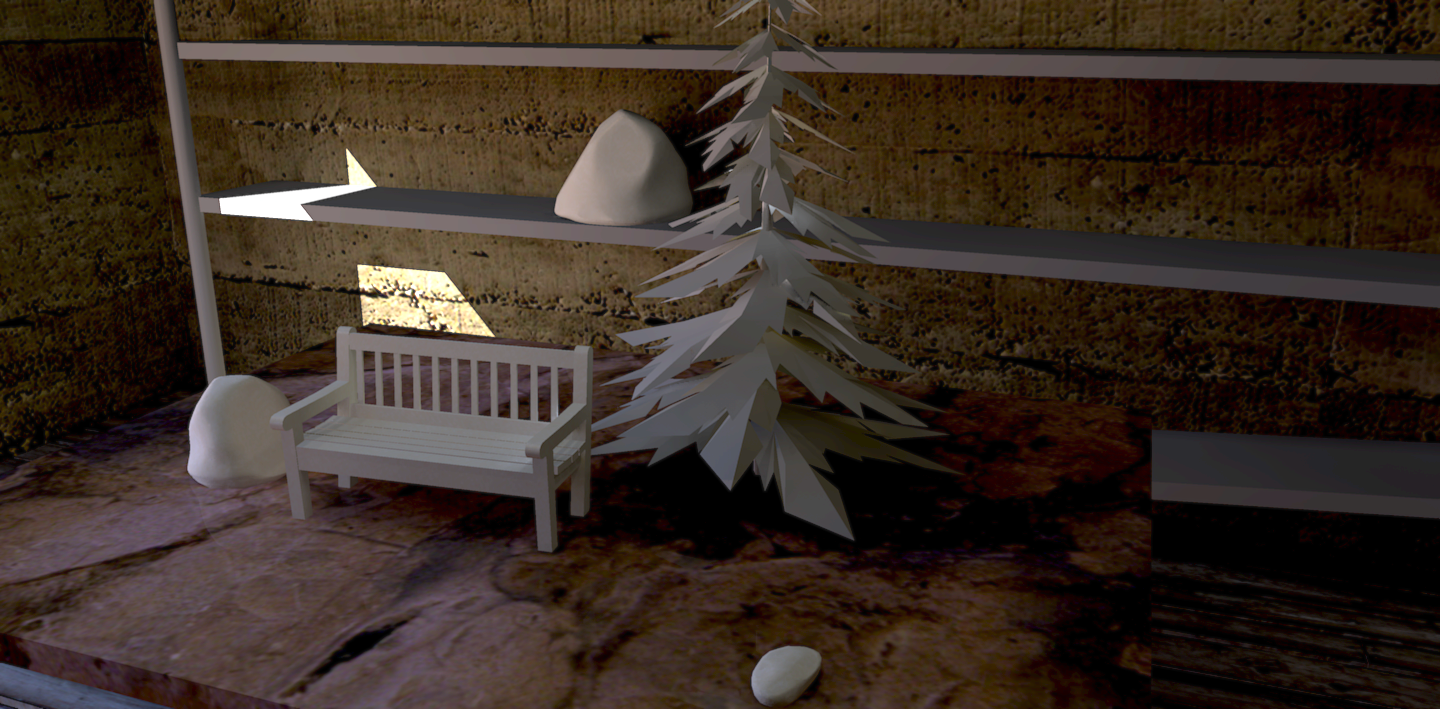
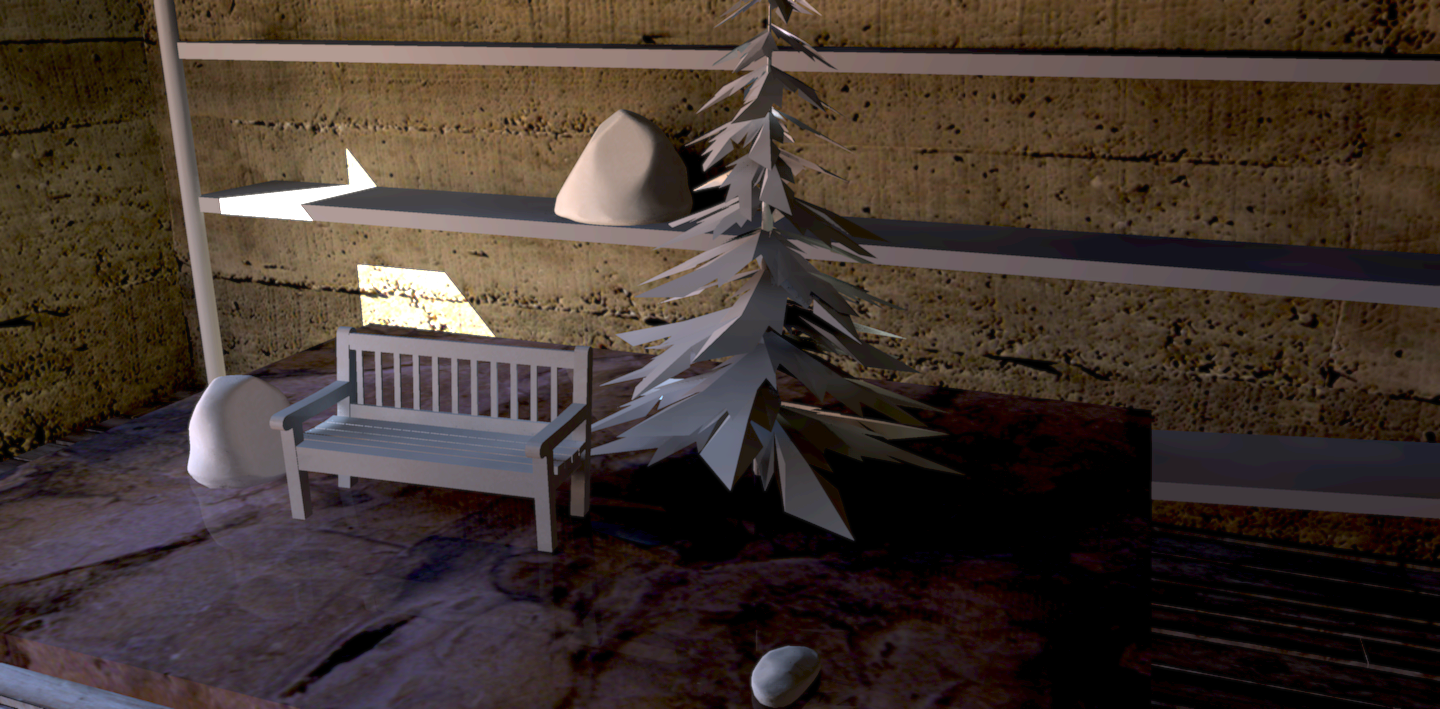
'Clay' renders. Well, sorta. Going for a more realistic look than usually.
Hello! It looks like you're interested in this conversation, but you don't have an account yet.
Getting fed up of having to scroll through the same posts each visit? When you register for an account, you'll always come back to exactly where you were before, and choose to be notified of new replies (either via email, or push notification). You'll also be able to save bookmarks and upvote posts to show your appreciation to other community members.
With your input, this post could be even better 💗
Register LoginAdvertisement


