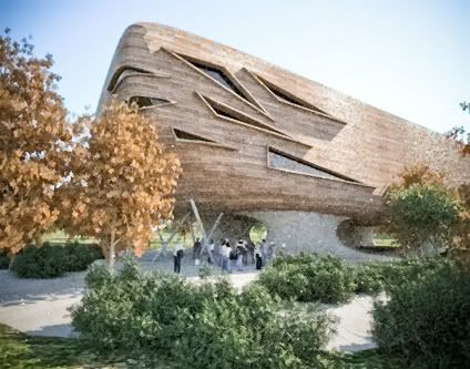
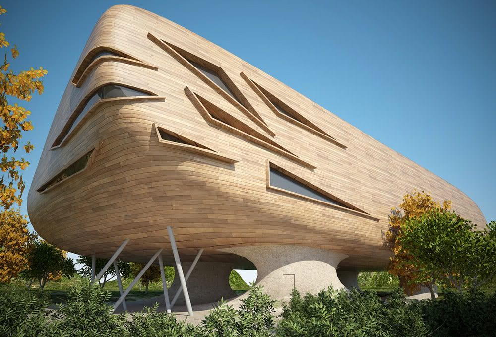
Render #22 (animation test bottom page 8)
-
Thanks Sepo and Remus.
@remus said:
Cheers kwist, looks like the long render time paid off
 Id hate to think aobut the render times if you had anything complex in there though
This is the typical quality at real size I am getting per frame, rendered for 5 minutes:

When you keep the render size small like this, the quality/speed ratio is reasonable.
Not too shabby for an unbiased engine. -
Very good job but the music almost killed me!

-
@lapx said:
THIS IS REALLY NICE DUDE
 I will have to buy this program FFD
FFD is free by the way just look it up
-
In this scene FFD ('FreeFormDeformation') wasn't used, although it could have been useful.
Instead the following was used:- Subdivide and smooth: (see smustard website).
- JointPushPull
- Surface tools
Those 4 plugins make a fine combo for non-orthogonal modeling.
-
 .
.A preliminary animation as a preview for the full version:
[flash=425,344:3exmy7jd]http://www.youtube.com/v/r0asIfICKEM[/flash:3exmy7jd]
-
so let me get this strait, you had to render EVERY SINGLE FRAME in that animation?!?!?!?!?!
holy crap! that must've taken forever!!!
great animation BTW -
The tweens in the beginning and at the end are made from stills.
The middle part was indeed rendered frame per frame. That took something less than 30 hours.
Thanks for the comment. -
Good stuff kwist, i tihnk we should put together a fund to get you a renderfarm, youd be able to do so much cool stuff!
-
Kwist , Nice work.
I would just like to point out that most of the scenes here could be achieved
much easier with a slide movie editor. Before I used pinacle studio and later pro
show producer. Most of the actions here are actually pan or zum in and zoom out. The
short sequences that would then remain could then be rendered at a higher resolution. -
Thanks Remus and Mateo.
@ Mateo: that's a good tip, thanks.
The most difficult thing would be matching the quality of the still tweens (panning and zooming) with the quality of the actual anilmation frames. -
I love the texturing on this building- especially the concrete structure underneath- it looks weathered- nice work!
-
Look great.
Typical - give you a new toy and you come up with some magic stuff

I'm a great fan of your work. All your renders have somekind of magical touch. Can you reveal some of secrets ? (like post processing in PS
 )
)Thanks
-
Likewise, i'm a big fan of your work. Always looking forward to your next render
-
Thank you. That's too kind.
-
I tihnk i prefer the vray one, looks a bit more lively somehow, i thik t might be the sky...
Slight crit as well in the texture mapping on the window frames, i reckon itd be improved if you just mappedsome straight grain textures on to it, or even the same texture yu used for the main building, just not projected on, kinda spoils the look a bit for me, although im just nit-picking really

-
I understand.
I wanted to make the upper body as 'mono-material' possible though, but I agree the frames could have used a different texture projection/scale. -
THIS IS REALLY NICE DUDE
 I will have to buy this program FFD
Ok, I meant subdivide

-
kwist, I'm a fan of your work also.
You seem to nail the texture and color combo everytime. Your forms are nice too.
Good work. -
Re-rendering the still view in Vray:
(to see full view without cropped right side: right click and..)

-
i, like remus, like the v-ray render over the originals. i think the reason it looks "lively-er" is because it's brighter. the other ones always seemed a little dark, so seeing this had a big contrast. keep it up kwist!
Hello! It looks like you're interested in this conversation, but you don't have an account yet.
Getting fed up of having to scroll through the same posts each visit? When you register for an account, you'll always come back to exactly where you were before, and choose to be notified of new replies (either via email, or push notification). You'll also be able to save bookmarks and upvote posts to show your appreciation to other community members.
With your input, this post could be even better 💗
Register LoginAdvertisement


