My recent tries
-
I find that the first light bulb looks much nicer, but thereby I'm not saying that the second is bad...

-
Nice rendering. June
-
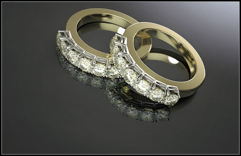
another TWi test...hope you like it
-
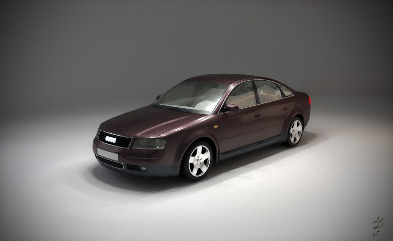
recently I prepared a car-paint material pack for twilight, that you may read more here: http://twilightrender.com/phpBB3/viewtopic.php?f=16&t=690&p=5289#p5289
and here : http://twilightrender.com/phpBB3/viewtopic.php?f=26&t=684
and this is a test , just to try some of those materials:
-
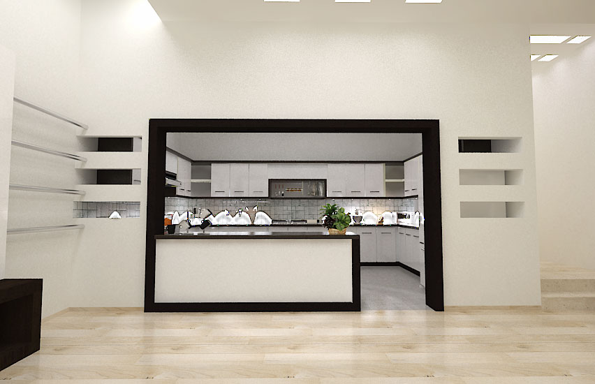
my client is interested in black and white, so all interiors are designed based on this approach, this is the first one , but will add more (v-ray renders)
-
Looks really interesting majid - but there is something happening in the kitchen area on the worksurface - ghost images ???
I love the way the black is bordering the frame into the kitchen and is followed into the kitchen area - very nice touch!! Well done
-
@dermotcoll said:
but there is something happening in the kitchen area on the worksurface - ghost images ???
 if fact I am a noob in v-ray, so unexperienced in light intensity.... they must be spots!!! I'll add more better render soon.
 -
@majid said:
here is a bath room . .... the tile pattern is not so good , i guess... btw here it is[attachment=1:20wa7n1o]<!-- ia1 -->bath detail.jpg<!-- ia1 -->[/attachment:20wa7n1o]
it is great and nice design
-
@ gafar : thanx mate.
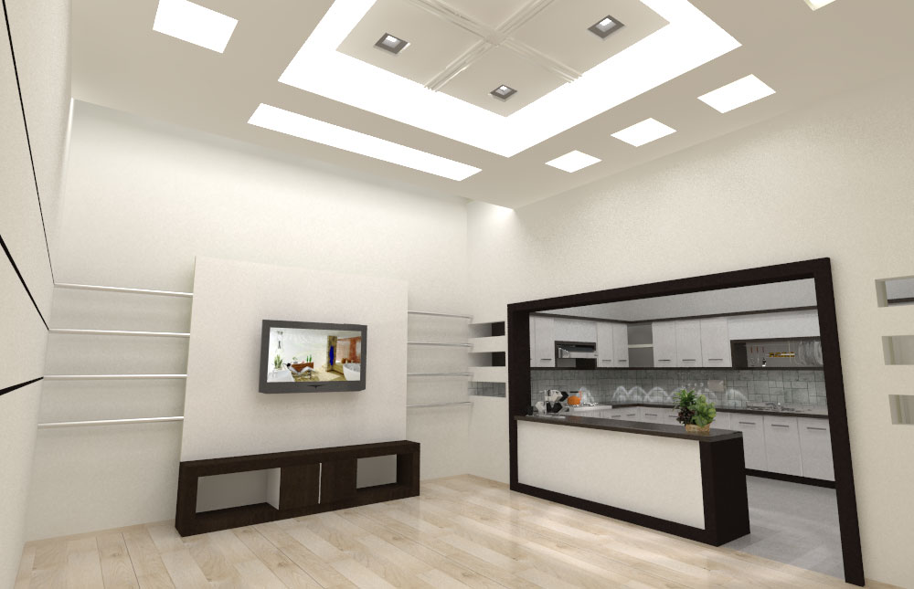
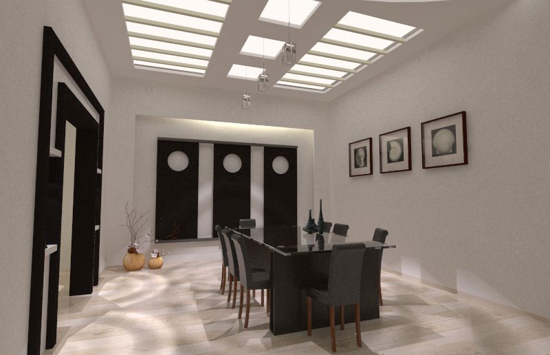
here are more render from project
-
Hey Maj, new interiors!
I think the design looks great. I esp like the ceiling.
Reminds me of some project I did.
One interesting thing for me is your switch to Vray, hopefully I can learn more about it in future!
-
thanx DSpace for your comments on ceilings. as you may discovered, I am a free app. user... usually KT and SU free...(bkz of limitation to purchase license!!). at the moment I had to use v-ray trial for fast result, it was very easy for me to understand it and overcome lighting (IES-look ones
 ) etc.... but ,as usual I am a KT follower (and nowadays TWr (a license gift from friends)). KT is always inspiring for me, but maybe here I can share my IES spot light... use the lamp-gradiant material for Opacity-map on Diffuse part of v-ray material
-
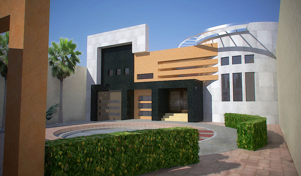
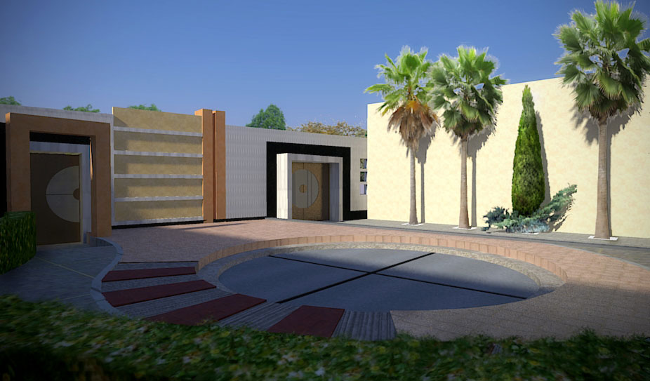
the same project, yard area, KT renders+PS
-
Those interiors are amazing and I also like the ceiling in the dining room! What renderer are you using?
EDIT: are KT its ok, ive just started using it nowhere near as good as this tho ! -
these are excellent quality majid

-
Beautiful renders, Majid...

I really like the crisp and clean interior Vray renders as well as the KT exteriors...
Only crit would be on the entourages you've used...
I'm sure that if you had been using some 3D palms it would improve the scene...
-
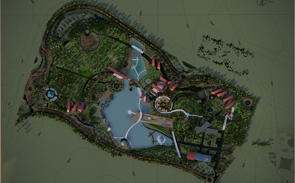
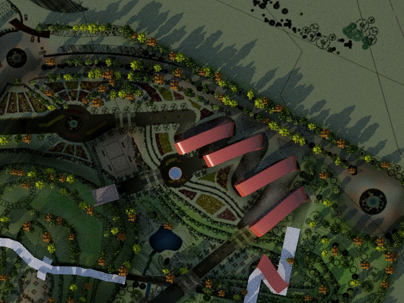
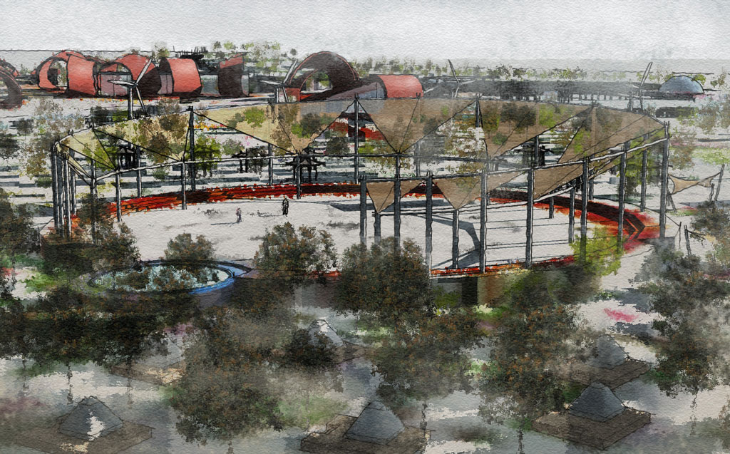
set of fast renders from my recent landscape project.

-
All this work is stunning. The landscape is a really creative way to solve a difficult subject. Well done!
And thanks for all you Kerkythea contributions.
I'm just starting to get the results I'm looking for from Kerkythea (thanks in some part to you). It is really worth the learning curve because it is so powerful. -
I really enjoy your interior renders and their quality (any tuts coming from you soon?);-) the only thing that I would adjust is "perspective" (looks like a bit to much for interior shot for the size of the room, and I would make this 2 point perspective)
-
thanx Dale
@cmoreink said:
...any tuts coming from you soon?);-) the only thing that I would adjust is "perspective" (looks like a bit to much for interior shot for the size of the room, and I would make this 2 point perspective)
thanx for comments on perspective, u r right, and about the tuts: I'd be glad to do any help, specially in KT. (have u seen this: http://forums.sketchucation.com/viewtopic.php?f=80&t=17207
or this one : http://www.pushpullbar.com/forums/kerkythea/10200-sketchup-kerky-newbie-2.html )?
I'll prepare another one on more advanced material and light tips and tricks
-
Thanks Majid

Hello! It looks like you're interested in this conversation, but you don't have an account yet.
Getting fed up of having to scroll through the same posts each visit? When you register for an account, you'll always come back to exactly where you were before, and choose to be notified of new replies (either via email, or push notification). You'll also be able to save bookmarks and upvote posts to show your appreciation to other community members.
With your input, this post could be even better 💗
Register LoginAdvertisement


