My recent tries
-
it looks real well done
-
modeling was really easy ( as I am a lazy man)...there is an option to create a wavy plane inside wings 3d...I tweaked to reach an acceptable result, then selected center faces and extruded them ( = pull/push inside SU ) continued modeling, and then subdivided it using wings..-->expoeted as 3ds and imported in SU, tweaked the model using new sculp-tool plugin , then made some light and other environment parts and exported to KT
-
thanx mate

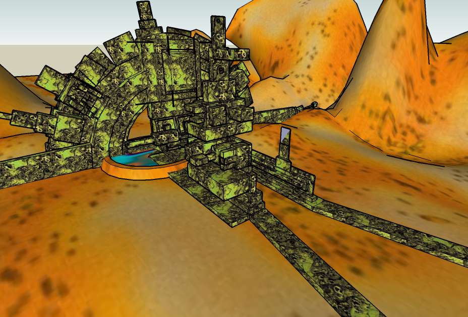
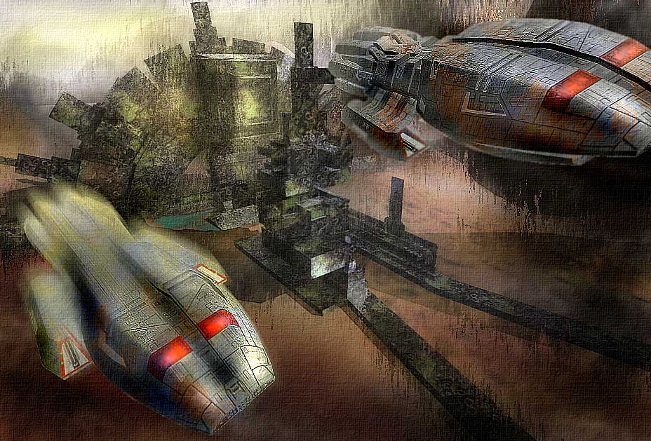
this is my first experience with SiFi scenes...playing with fog,shadow and Photoshop, and here is the result:
-
-
really nice render. nice different styles

-
-
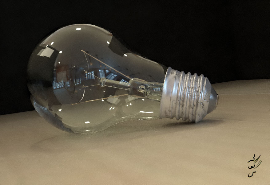
this TwilightRender render is from the one of the newone models on this topic:
http://forums.sketchucation.com/viewtopic.php?f=81&t=21965
just noise reduction.
-
Excellent render, Majid...

You've become a real TW master in a very short time...!
-
you make me feel shy friend
 , thank you for your kind words , obviousely my KT experienses had helped me a lot . I always feel myself as a KT pupil
 -
Definitely a fantastic render!!


-
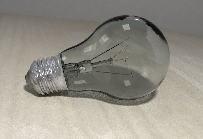
thanx mate, this is also another shot , hope you like it , it is a bit over exposed, BTW I like the whole render
[attachment=0:n7jqmg83]<!-- ia0 -->http://www.jpg<!-- ia0 -->[/attachment:n7jqmg83]
-
beautiful renders
-
I find that the first light bulb looks much nicer, but thereby I'm not saying that the second is bad...

-
Nice rendering. June
-
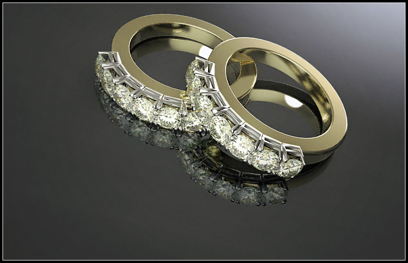
another TWi test...hope you like it
-
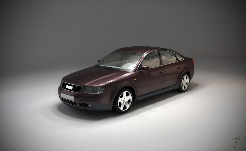
recently I prepared a car-paint material pack for twilight, that you may read more here: http://twilightrender.com/phpBB3/viewtopic.php?f=16&t=690&p=5289#p5289
and here : http://twilightrender.com/phpBB3/viewtopic.php?f=26&t=684
and this is a test , just to try some of those materials:
-
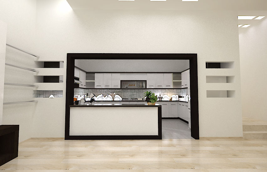
my client is interested in black and white, so all interiors are designed based on this approach, this is the first one , but will add more (v-ray renders)
-
Looks really interesting majid - but there is something happening in the kitchen area on the worksurface - ghost images ???
I love the way the black is bordering the frame into the kitchen and is followed into the kitchen area - very nice touch!! Well done
-
@dermotcoll said:
but there is something happening in the kitchen area on the worksurface - ghost images ???
 if fact I am a noob in v-ray, so unexperienced in light intensity.... they must be spots!!! I'll add more better render soon.
 -
@majid said:
here is a bath room . .... the tile pattern is not so good , i guess... btw here it is[attachment=1:20wa7n1o]<!-- ia1 -->bath detail.jpg<!-- ia1 -->[/attachment:20wa7n1o]
it is great and nice design
Hello! It looks like you're interested in this conversation, but you don't have an account yet.
Getting fed up of having to scroll through the same posts each visit? When you register for an account, you'll always come back to exactly where you were before, and choose to be notified of new replies (either via email, or push notification). You'll also be able to save bookmarks and upvote posts to show your appreciation to other community members.
With your input, this post could be even better 💗
Register LoginAdvertisement


