SU Styles + Render
-
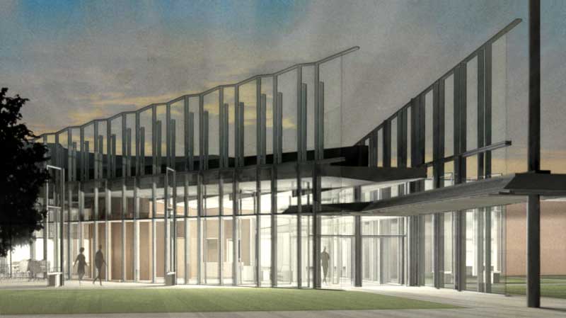
Using Tadao Ando's Nihonbashi house, I blended SU styles with Podium renders to achieve a different effect.
feel free to comment on which one would work best for a presentation.
Original rendering


-


-
Great solo,
Can you explain which style's you did use ?
-
I like the last 3 even though we don't know what styles you are using!
-
I am sorry, I forgot to document what styles I used, I was able to retrieve these four from my recycle bin, cannot be sure which styles they are by name however.


-

-
Well, I like the first image of the second post the best but you know it's just for a mother to decide which kid of hers she loves the best.
-
@gaieus said:
Well, I like the first image of the second post the best but you know it's just for a mother to decide which kid of hers she loves the best.
I couldn't agree more. That is my favorite too.
-
2nd image of 2nd post. great work as usual, solo.
-
Interestingly thats the only one with warm color balance, so the blue grey tint of the concrete is less favoured....thanks y'all.
-
Yes, solo, probably that's why I picked that one. But see, Edson likes the colder version better.
-
i love the first 2 of the second post
-
I like the second of the first post. Nice to see NPR mixed with Podium. Care to share your process?
-
Great images Solo,I love the second three,
it is difficult to decide, i really love the
vegetation. -
I do something like this fairly regularly, but with VRay and not Podium.

-
Lewis
I really like that image, it has a great ambiance to it.
-
@solo said:
Lewis
I really like that image, it has a great ambiance to it.
Thanks...supposedly it's on (or going to be on) the cover of a book...the idea was to mimic a certain architect's old airbrush style. But I find this sort of NPR/PR combo thing to be really hit or miss...sometimes it works, sometimes it turns into mud, and this is not helped by the quirkiness of the VRay interface. More than half the time, for instance, the rendered view from VRay is slightly different from that out of SU itself, even if I force VRay to use the same resolution and to base its camera on the SU viewport.
Out of frustration I've become interested in using other programs (Blender's node renderer and Rhino's Penguin 2.0) that permit one to assign rendering style (in other words, degree of NPR versus the other thing) on an object by object basis. If I survive my client meeting this morning, I want to finally do some tests of these with some basic models at least partially made in SketchUp.
-
Lewis,
I share your annoyance at the viewport & rendered output mismatch. The only workaround is using a zoom at about 0.7-0.8ish and also low lens shift values if there is a requirement for proper 2 point perspective seeing as that function also isnt replicated correctly in VfSU

I do like the style's of both Solo's and your image.
-
@dzinetech said:
Lewis,
I share your annoyance at the viewport & rendered output mismatch. The only workaround is using a zoom at about 0.7-0.8ish and also low lens shift values if there is a requirement for proper 2 point perspective seeing as that function also isnt replicated correctly in VfSU

I do like the style's of both Solo's and your image.
I'm almost certain I have tried those settings and everything else by this point...I generally resign myself to converting either the SU ouput or the VRay rendering to a Smart Object in Photoshop and then painfully tweaking it with the Warp transform tool until the one overlays the other acceptably.
-
They all look great, Solo. If I had to pick a fav, though, probably the last one - it's not too dark, too bright, and all the detail is there.
Hello! It looks like you're interested in this conversation, but you don't have an account yet.
Getting fed up of having to scroll through the same posts each visit? When you register for an account, you'll always come back to exactly where you were before, and choose to be notified of new replies (either via email, or push notification). You'll also be able to save bookmarks and upvote posts to show your appreciation to other community members.
With your input, this post could be even better 💗
Register LoginAdvertisement


