Leaf Cluster Building
-
The inspiration for this building was the leaf clusters that sometimes fall from oak trees.

These clusters often have a sculptural/architectural quality to them. I wondered for quite a while how to make a building that reflects some of that form. The resulting building is abstracted a bit from the inspiration but I think that's OK.


-
Fred,
Very interesting and totally cool. You have a vivid imagination seeing architecture in everything around you.
Thanks for sharing your visions with us.
Allen
-
Thanks Allen,
Appreciate the feedback. As I've looked at the last image I have the sense that maybe the building could use a little cap. Maybe I'll add a curvy leaf shaped beret tomorrow.

Fred
-
Dear Fred,
The building has a lovely feel about it, and if I may say so, very un-American. In the EU we are very used to compact cities, but my impression of American homes (from trips to see friends) is that you like your square acre and boundary fences.
I also note that very few developments show-cased on this forum (housing, office blocks etc) include solar heating and/or solar energy generation as part of the design. Why is this? Your leaf building uses natural lighting very well, which is an energy saving plus. Is piped in energy still so cheap that that alternatives are still too expensive.
Perhaps we should start a new initiative to design housing, shopping complexes etc that use solar heating and energy generation, promotes the use of natural light and includes passive cooling to minimise the use of air-conditioning.
Regards,
Bob -
Nice. I love organic design.
-
@watkins said:
I also note that very few developments show-cased on this forum (housing, office blocks etc) include solar heating and/or solar energy generation as part of the design. Why is this? Your leaf building uses natural lighting very well, which is an energy saving plus. Is piped in energy still so cheap that that alternatives are still too expensive.
Bob, Thanks for the feedback. Regarding US building design related to energy use. There are huge variations across what is a huge country. New York, Boston, Philadelphia, Chicago and a few other cities have very dense housing and as a result relatively low per-capita energy use. However, I think the real answer to your question is that people in the US just responded rationally -at least in the short term- to twenty or so years of very low energy prices. Many alternative energy companies, products and practices that were started in the 1970s couldn't make a go of it when oil prices became really low. This left a residue of cynicism in the US design community which has only recently, with high oil prices, started to fade away. There is still an underlying fear that oil prices could fall again, wiping out the efforts of those who go whole-hog into green design. If energy prices in the US stay high then you will see very rapid adjustments in our building practices. Sustainability has mushroomed into a huge issue in just the last couple of years and it is impressive to see how rapidly the design community is responding.
Fred
PS A video of Norman Foster speaking on these issues is available here:
-
Fred,
I love the design concept. It reminds me of the stacked architecture in Greece (only these are not white:)
The more I look at this building the more it gives a real peaceful feeling. Maybe a little more detail to the scene (trees, shrubs, people, etc) and it would be a stand out.
Nice work.
Scott
-
We have quite similar - terraced - buildings however not that "curvy" mostly. Actually I used to live in one and I even live in a "semi-similar" one with a terrace of about 20 sq metres.
Yours remind me of those pueblo buildings in the SW of the US.

-
Fred that is wonderful. Very peaceful indeed and you captured the leaf cluster very well.
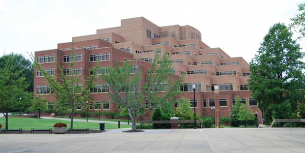
This building reminds me of the John C. Hodges Library at the University of Tennessee in Knoxville (my Alma mater).

However not as elegant as yours.
-
Thanks for the feedback guys!
Boo, Thanks for sharing the image of the Hodges Library. From what I can tell from looking at other images the terraces don't seem to be accessible. How are they surfaced?
Gaieus... Pictures!!! ...and yes, definitely a pueblo feel to the model
Scott, Thanks to what I've learned on this forum I'm gradually adding more context detail to my building models. I'm looking to make this more an integrated aspect of my design process rather than an afterthought. Thanks for your encouragement to keep heading in this direction.
Ecofeco, I'm with you on the love of organic architecture... whatever that is.

Fred
-
@fbartels said:
Gaieus... Pictures!!!
Yes, I know. I was trying to find some on the net but couldn't. Now I have to go and take those photos...

-
Hey Fred,
Love your work and sorry for being critical.
The thing I most like about the cluster of leaves, in your picture, is the pockets of shaded areas created by the overlapping and curling leaves. Your imagery doesn't address that aspect of it. Maybe the terraces could cantilever over the window walls to create shade.
Just a thought. -
Fred,
I have just had a thought (rare for me I know), but if you were to hollow out the centre to form an atrium, which you could then glass over, you could funnel light to the inside walls of the ground floor apartments The atrium could then be used as a source of heat in winter, and a source of ventilation in summer.
I'm still thinking 'green'.
Regards,
Bob -
@cheffey said:
Hey Fred,
The thing I most like about the cluster of leaves, in your picture, is the pockets of shaded areas created by the overlapping and curling leaves. Your imagery doesn't address that aspect of it. Maybe the terraces could cantilever over the window walls to create shade.
Just a thought.cheffey,
Thanks for the constructive criticism! I'd been thinking maybe some sort of sun shading would be a good idea and you convinced me of it. I think these are a significant improvement, both esthetically and functionally. Cantilevered terraces would be easier, and you could adjust the cantilever to be larger on the south side of the building, but I wanted to give the sun shades a try.

fred


-
@watkins said:
if you were to hollow out the centre to form an atrium, which you could then glass over, you could funnel light to the inside walls of the ground floor apartments The atrium could then be used as a source of heat in winter, and a source of ventilation in summer.
I'm still thinking 'green'.
Bob,
Cool idea. Something of that nature would solve the problem of lack of natural light in the interior spaces of the lower floors.
Fred
-
Now those new images are super cool. Love It
I love the shade.Almost looks like those mushrooms that grow off of trees.
@fbartels said:
Thanks for the feedback guys!
Boo, Thanks for sharing the image of the Hodges Library. From what I can tell from looking at other images the terraces don't seem to be accessible. How are they surfaced?
I am sorry but I just don't know. When I was at UT I was actually in Landscape Design school and did not pay much attention to architecture. I don't think I made it past the second floor during studies either.
-
I like the shading devices. You could even take them a step further and use Boo's mushroom picture as inspiration. Maybe allow them to create some movement on the structure. Like on the south you could drop some of them down to create a light shelf. See the link below.
In general horizontal fins work best in southern exposure and vertical fins work best on east/west exposures. On the north side you can leave them off all together.
Mr. Bruder used vertical fins in an effective way on the Phoenix Central Library.
http://www.commercialwindows.umn.edu/case_pcl.phpHere is a good book on the subject.
http://www.amazon.com/Heating-Cooling-Lighting-Methods-Architects/dp/0471241431 -
I'm not sure how familiar you are with these guys but you might like their work.
So, if you get a chance take a look at Bart Prince, Friedensreich Hundertwasser, Bruce Goff and of course Gaudi. Always a pleasure to see the freedom that you design with. -
Damn!! I only stumbled on this thread now. Fred those look amazing.
I can so see those a reality.

-
@cheffey said:
I'm not sure how familiar you are with these guys but you might like their work.
So, if you get a chance take a look at Bart Prince, Friedensreich Hundertwasser, Bruce Goff and of course Gaudi. Always a pleasure to see the freedom that you design with.To add to Cheffey's list, I would recommend the book "A pattern language" by Christopher Alexander - especially the chapters about construction (however impracticable?)might give ideas about how things like this and others of your ideas could be built.
Anssi
Hello! It looks like you're interested in this conversation, but you don't have an account yet.
Getting fed up of having to scroll through the same posts each visit? When you register for an account, you'll always come back to exactly where you were before, and choose to be notified of new replies (either via email, or push notification). You'll also be able to save bookmarks and upvote posts to show your appreciation to other community members.
With your input, this post could be even better 💗
Register LoginAdvertisement


