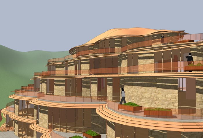
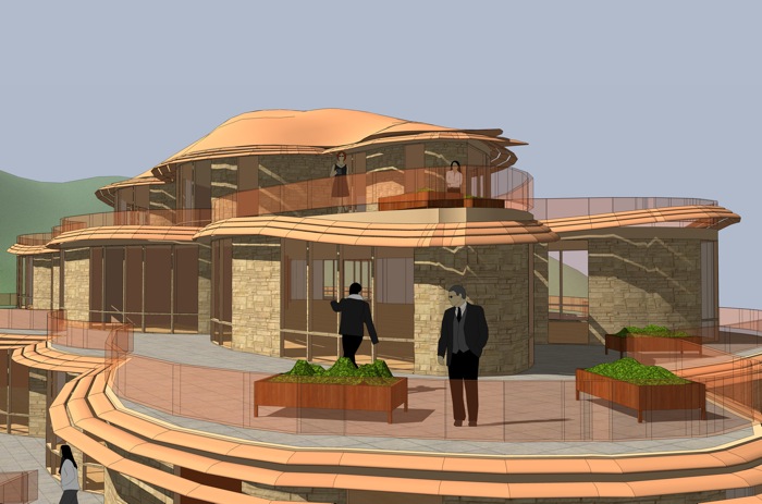
Leaf Cluster Building
-
Hey Fred,
Love your work and sorry for being critical.
The thing I most like about the cluster of leaves, in your picture, is the pockets of shaded areas created by the overlapping and curling leaves. Your imagery doesn't address that aspect of it. Maybe the terraces could cantilever over the window walls to create shade.
Just a thought. -
Fred,
I have just had a thought (rare for me I know), but if you were to hollow out the centre to form an atrium, which you could then glass over, you could funnel light to the inside walls of the ground floor apartments The atrium could then be used as a source of heat in winter, and a source of ventilation in summer.
I'm still thinking 'green'.
Regards,
Bob -
@cheffey said:
Hey Fred,
The thing I most like about the cluster of leaves, in your picture, is the pockets of shaded areas created by the overlapping and curling leaves. Your imagery doesn't address that aspect of it. Maybe the terraces could cantilever over the window walls to create shade.
Just a thought.cheffey,
Thanks for the constructive criticism! I'd been thinking maybe some sort of sun shading would be a good idea and you convinced me of it. I think these are a significant improvement, both esthetically and functionally. Cantilevered terraces would be easier, and you could adjust the cantilever to be larger on the south side of the building, but I wanted to give the sun shades a try.

fred


-
@watkins said:
if you were to hollow out the centre to form an atrium, which you could then glass over, you could funnel light to the inside walls of the ground floor apartments The atrium could then be used as a source of heat in winter, and a source of ventilation in summer.
I'm still thinking 'green'.
Bob,
Cool idea. Something of that nature would solve the problem of lack of natural light in the interior spaces of the lower floors.
Fred
-
Now those new images are super cool. Love It
I love the shade.Almost looks like those mushrooms that grow off of trees.
@fbartels said:
Thanks for the feedback guys!
Boo, Thanks for sharing the image of the Hodges Library. From what I can tell from looking at other images the terraces don't seem to be accessible. How are they surfaced?
I am sorry but I just don't know. When I was at UT I was actually in Landscape Design school and did not pay much attention to architecture. I don't think I made it past the second floor during studies either.
-
I like the shading devices. You could even take them a step further and use Boo's mushroom picture as inspiration. Maybe allow them to create some movement on the structure. Like on the south you could drop some of them down to create a light shelf. See the link below.
In general horizontal fins work best in southern exposure and vertical fins work best on east/west exposures. On the north side you can leave them off all together.
Mr. Bruder used vertical fins in an effective way on the Phoenix Central Library.
http://www.commercialwindows.umn.edu/case_pcl.phpHere is a good book on the subject.
http://www.amazon.com/Heating-Cooling-Lighting-Methods-Architects/dp/0471241431 -
I'm not sure how familiar you are with these guys but you might like their work.
So, if you get a chance take a look at Bart Prince, Friedensreich Hundertwasser, Bruce Goff and of course Gaudi. Always a pleasure to see the freedom that you design with. -
Damn!! I only stumbled on this thread now. Fred those look amazing.
I can so see those a reality.

-
@cheffey said:
I'm not sure how familiar you are with these guys but you might like their work.
So, if you get a chance take a look at Bart Prince, Friedensreich Hundertwasser, Bruce Goff and of course Gaudi. Always a pleasure to see the freedom that you design with.To add to Cheffey's list, I would recommend the book "A pattern language" by Christopher Alexander - especially the chapters about construction (however impracticable?)might give ideas about how things like this and others of your ideas could be built.
Anssi
-
cheffey,
Thanks for the links and architect leads. I'll take a look at all. I did some very quick and dirty playing with the sun screens, doing some vertical movement of them on the top three floors. I think there is some potential there but I'm too lazy to pursue it now. (Curiously, I made a very curvy light screen first then decided I didn't like it and made the rest straight. (2nd photo))
Feel like I'm getting an education today.


pete, thanks for the encouragement!
-
Hi Fred,
That's a cool experiment you are running.
Keep in mind though that you will have a dark space on the lower floors.
Light doesn't penetrate over an infinite distance.
That's the problem with designing cluster architecture.
It could work on a mono-functional (e.g office) building by creating patios enclosed....
much more difficult though for appartments. -
@kwistenbiebel said:
Keep in mind though that you will have a dark space on the lower floors.
Light doesn't penetrate over an infinite distance.
That's the problem with designing cluster architecture.
It could work on a mono-functional (e.g office) building by creating patios enclosed....
much more difficult though for appartments.Chris,
The sunlight penetration on the lower floors is definitely an issue. From the start I've imagined this as an office building and sort of figured there could be uses for the lower floor interior areas that don't require natural light. Things like auditorium space, mechanical space, and storage space. Above the first couple of floors I don't think there would be too much of a natural light problem.
Fred
-
@anssi said:
To add to Cheffey's list, I would recommend the book "A pattern language" by Christopher Alexander - especially the chapters about construction (however impracticable?)might give ideas about how things like this and others of your ideas could be built.
AnssiAnsii,
Thanks. I've got A Pattern Language and a few other of Alexander's books. I haven't looked much in Pattern Language for years but I'll crack it open and give the construction areas a look.
Fred
-
...or you could build the whole thing from glass

more seiously, another wicked design form the mind of fbartels. I really like those little sun shade things you did, they remind me of something that i just can quite place my finger on

-
Nice work and a great idea to draw from nature for inspiration
....i have a suggestion, if i may indulge..........and that would be to have two different colours of masonry to create 'bands of colour' running horizontally of course.....you could make them continuous bands or perhaps discontinue them randomly to avoid monotony and predictability.
It would have the effect of adding some additional light and shade by adding one more colour, and where natural light and shade hit the additional colour you will get additional variation in colour themes.
-
Elegant design, love the way the terraces allow the inhabitants to interact with the outdoors on all floors, and the addition of the sun shade works well with the building.
Is the sun shade retractable?
Hello! It looks like you're interested in this conversation, but you don't have an account yet.
Getting fed up of having to scroll through the same posts each visit? When you register for an account, you'll always come back to exactly where you were before, and choose to be notified of new replies (either via email, or push notification). You'll also be able to save bookmarks and upvote posts to show your appreciation to other community members.
With your input, this post could be even better 💗
Register LoginAdvertisement


