I am thinking of doing an image looking for comment
-
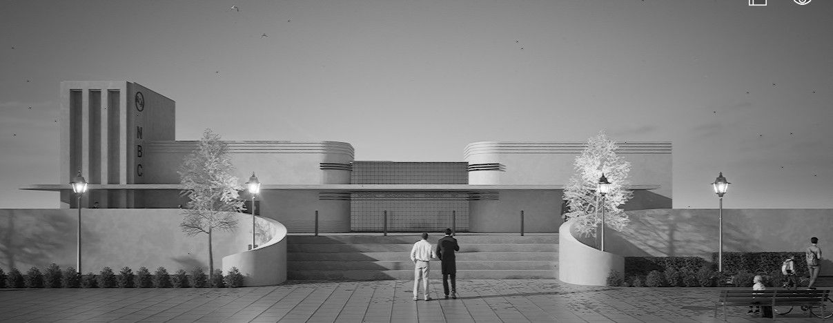
I am thinking of doing an image looking for comment/advice. I came about this composition of one of my prior Art Deco model I posted a week ago on here. I was surprised and exited by is I desaturated it. I do not know what to get rid of and what to keep but have some ideas. This is just a screenshot. Does anybody think this image is as cool as I think it is? Would love to get some feedback before I start experimenting with it.

-
@L-i-am it's a nice image. I would reduce the brightness of the lamps on the poles significantly. The tree to the left of the steps need to be moved toward the right so it's a syymetrical with the right side and the far right lamp needs to move to the right to match the spacing of the lamps on the left. I would try a render without the tree on the far left to eliminate that shadow. Maybe raise the camera slightly or reduce the height of the lamp posts so the lamps aren't at the same height as the horizontal overhang on the building.
-
- Camera Position:
- Angle: Lower the camera angle for a more imposing view of the building, or shift slightly to one side to reveal side details.
Distance: Move closer to make the building the dominant feature.
- Angle: Lower the camera angle for a more imposing view of the building, or shift slightly to one side to reveal side details.
- Framing:
- Rule of Thirds: Align the building with the upper third line for balance.
- Foreground: Use lamp posts to frame the building, position the bench prominently if relevant.
- Subjects: Place people off-center and in motion towards the building for dynamic composition.
- Details: Ensure architectural features like steps are fully visible.
- Additional Elements:
- Foreground: Add subtle objects like bicycles for depth.
- Background: Include sky for context but keep it secondary.
- Technical:
- Lens: Use a wider lens but avoid distortion.
- Lighting: Use lighting to highlight architectural contours.
I think looking at shots by the likes of Julius Shulman or Fernando Guerra for inspiration would levitate your render further.
- Camera Position:
-
@Dave-R I agree with those observations and the align with my plan. I was thinking of you amongst others. This is because apart from the exceptional Architecture it looks like an architects elevation of the period with the (Art Deco period) temporal juxtaposition of mixing it with contemporary 3D shadows. I think that will drive the intent. What interests me are your period renders of machinery which also look like period drawings. Any hints on that?
-
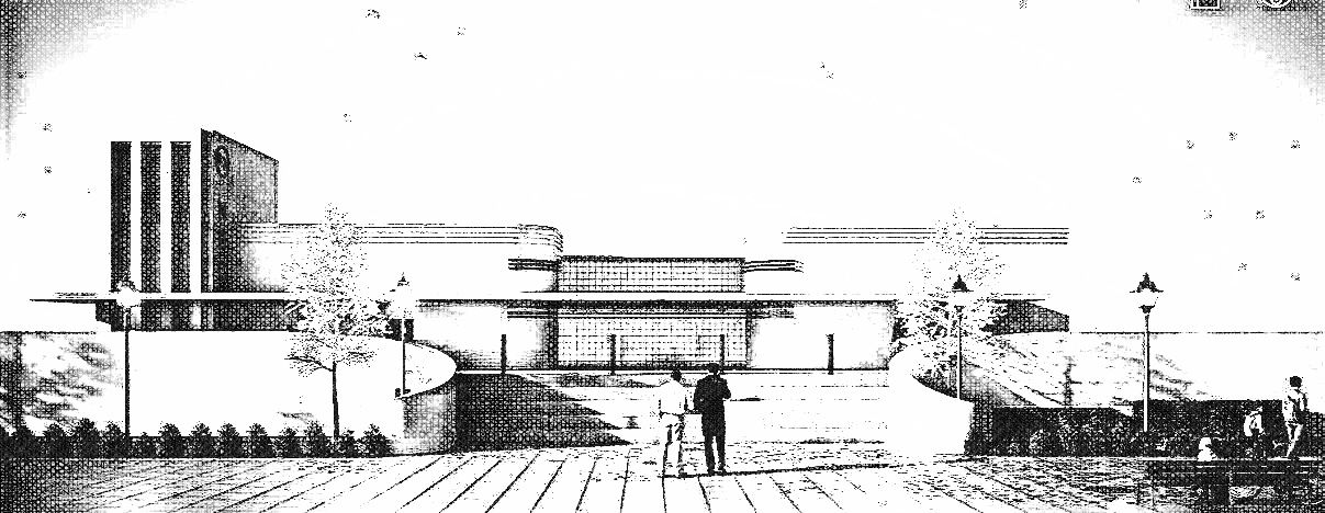
@L-i-am if you wanted to make it look less photographic you could use the rendered image as a basis for a hand-shaded sort of look. Combine it with a hidden line export from SketchUp Maybe use a sketchy line style or the straight line styles. Maybe enable extensions for some of the lines
This is just a quickie shaded thing. I'm not sure it's totally right but a start.

Hello! It looks like you're interested in this conversation, but you don't have an account yet.
Getting fed up of having to scroll through the same posts each visit? When you register for an account, you'll always come back to exactly where you were before, and choose to be notified of new replies (either via email, or push notification). You'll also be able to save bookmarks and upvote posts to show your appreciation to other community members.
With your input, this post could be even better 💗
Register LoginAdvertisement


