Atmospheric approach
-
Mates,
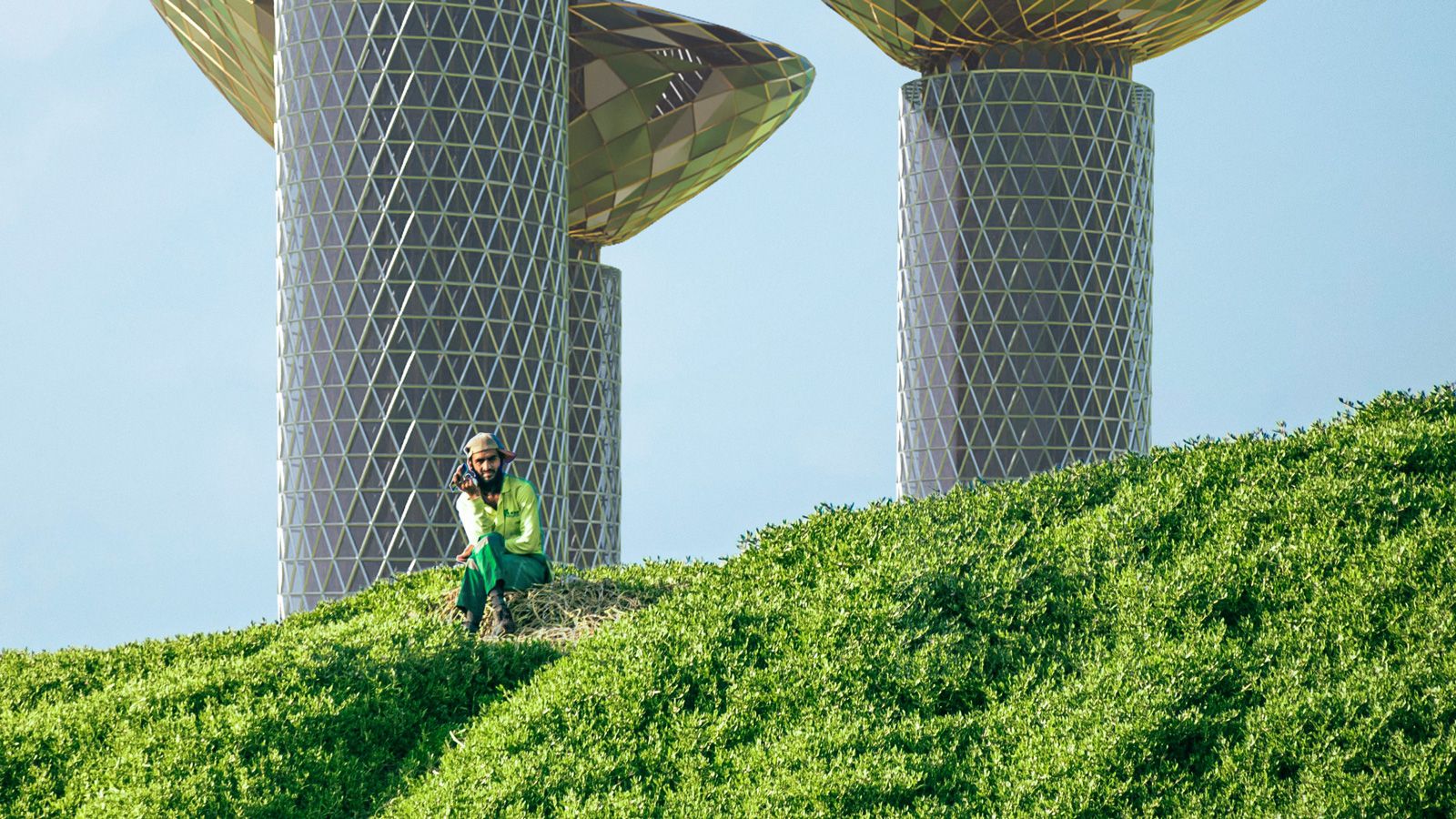
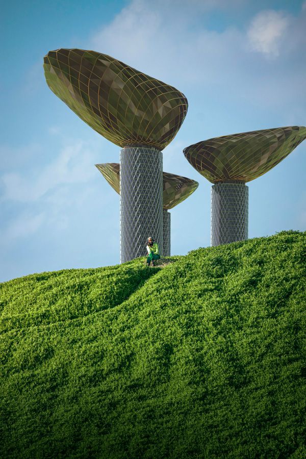
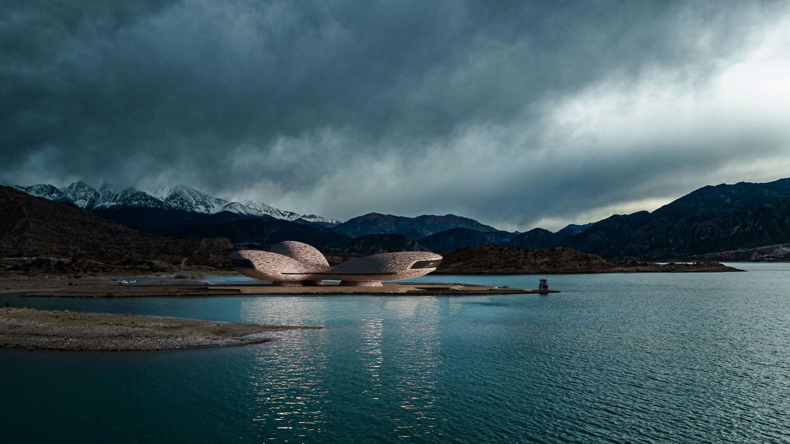
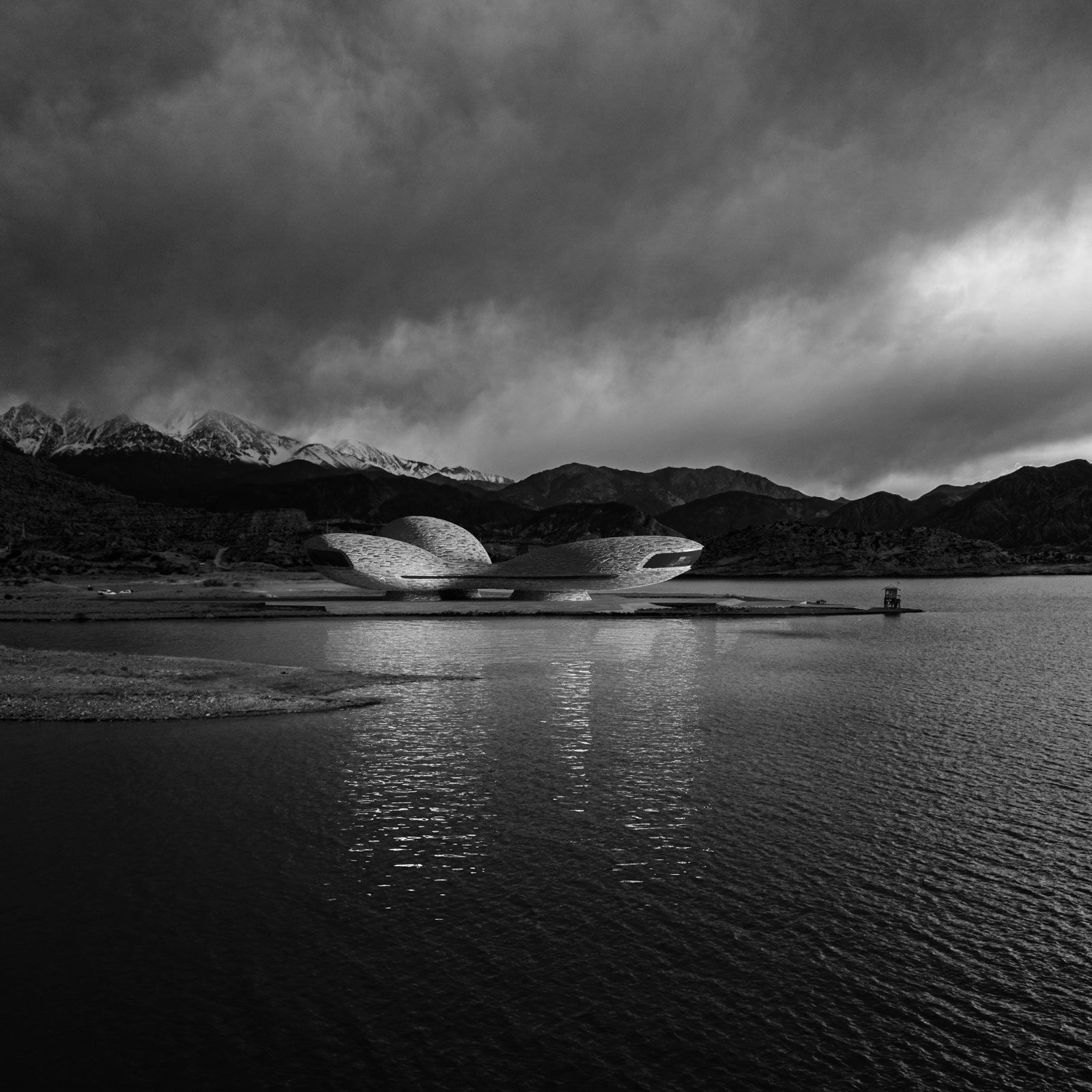
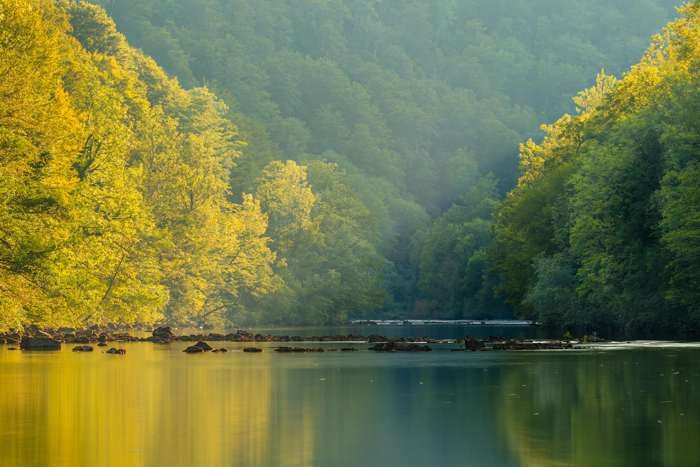
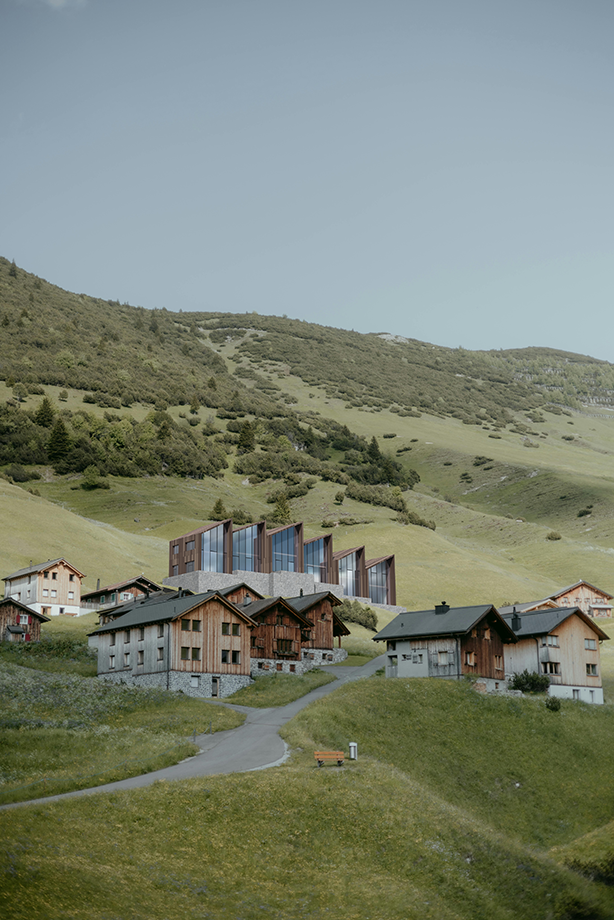
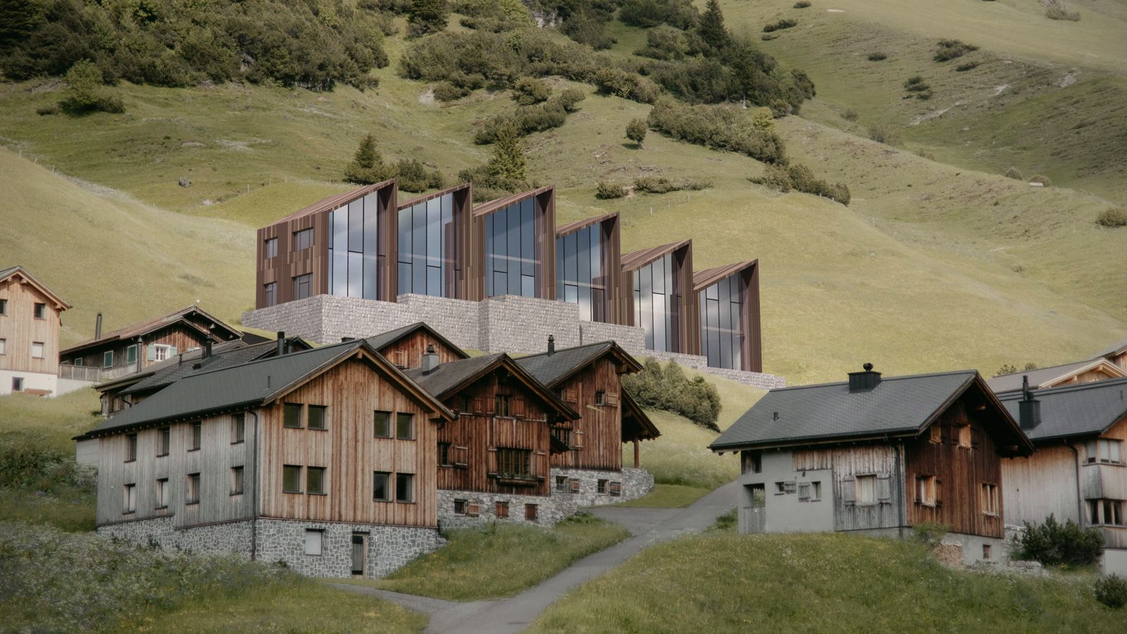
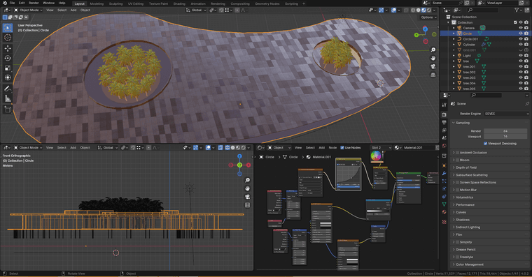
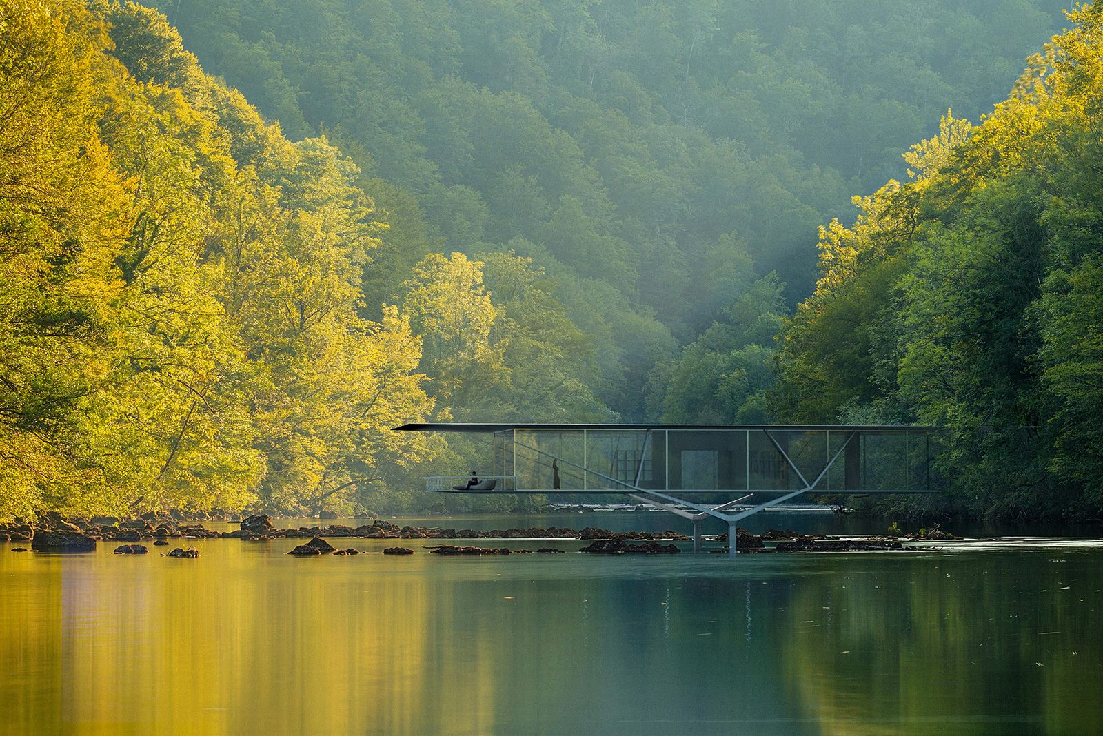
Although the modeling and rendering are done entirely using Blender, I thought the approach could be inspiring, that is why instead of corner bar, I shared it here. Also the job could be done using SketchUp obviously.
Nowadays there are plenty f rendering engines -that provide a wide range f candies assets- and the result has too much taste of CGI.
I am old school guy so prefer atmospheric photographic approach instead of CG look
Here is the glimpse of what I have been busy doing past 4 days for my portfolio!


-
More and behind the scene images
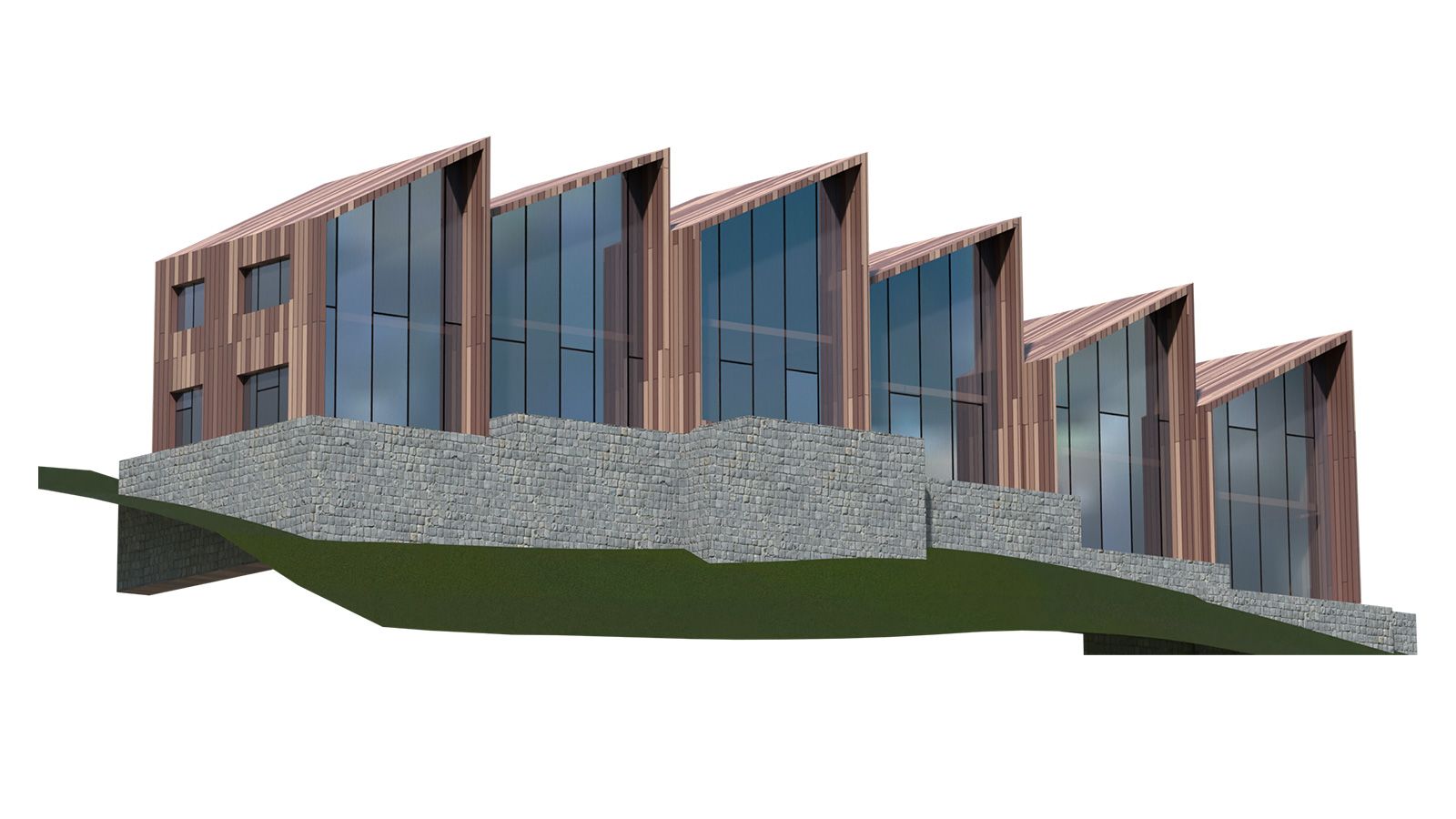
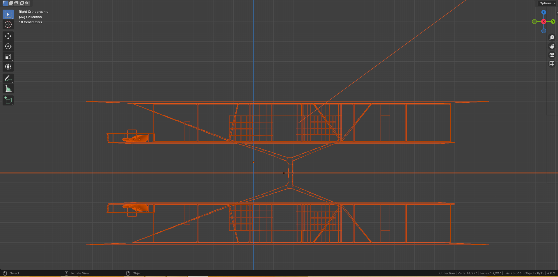
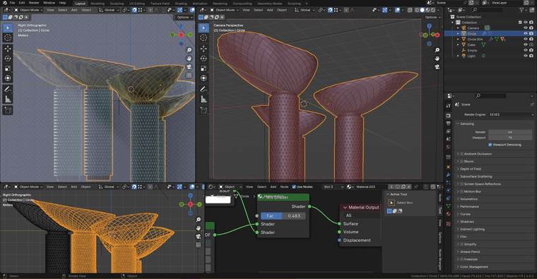
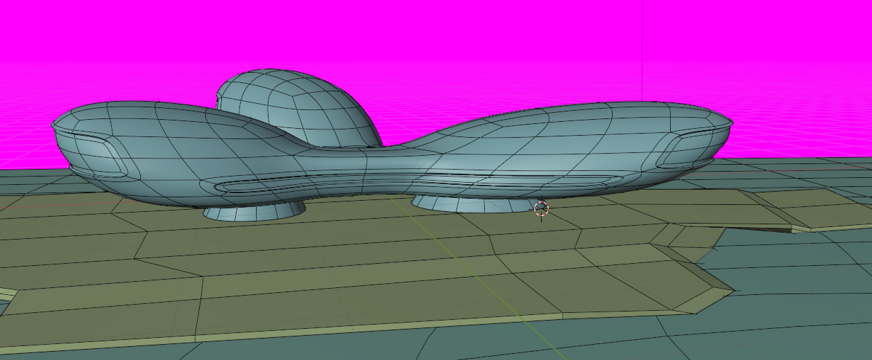
-
I love the dwelling with the skeletal structure above the water

-
@L-i-am in all of the designs the concept has been to be in harmony with the context. Pebbles, Branches and river, flatness, etc...
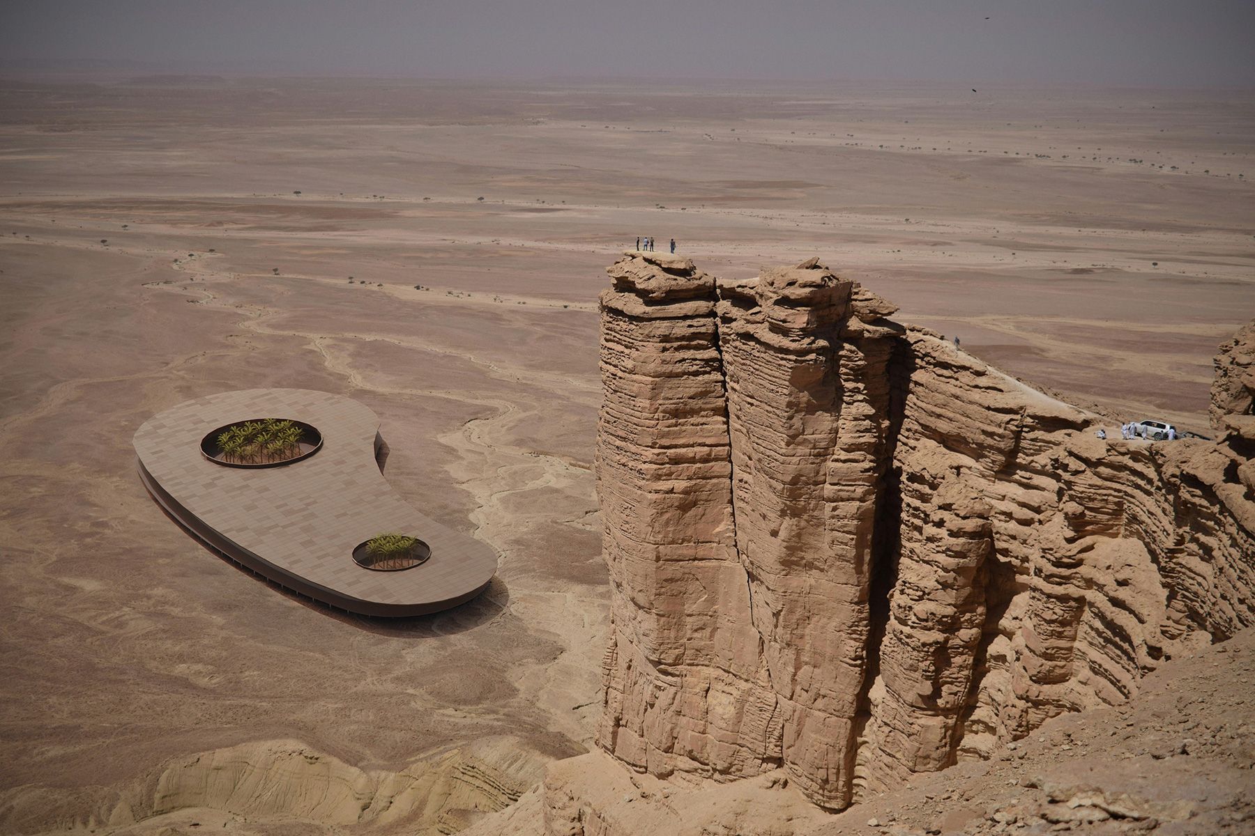
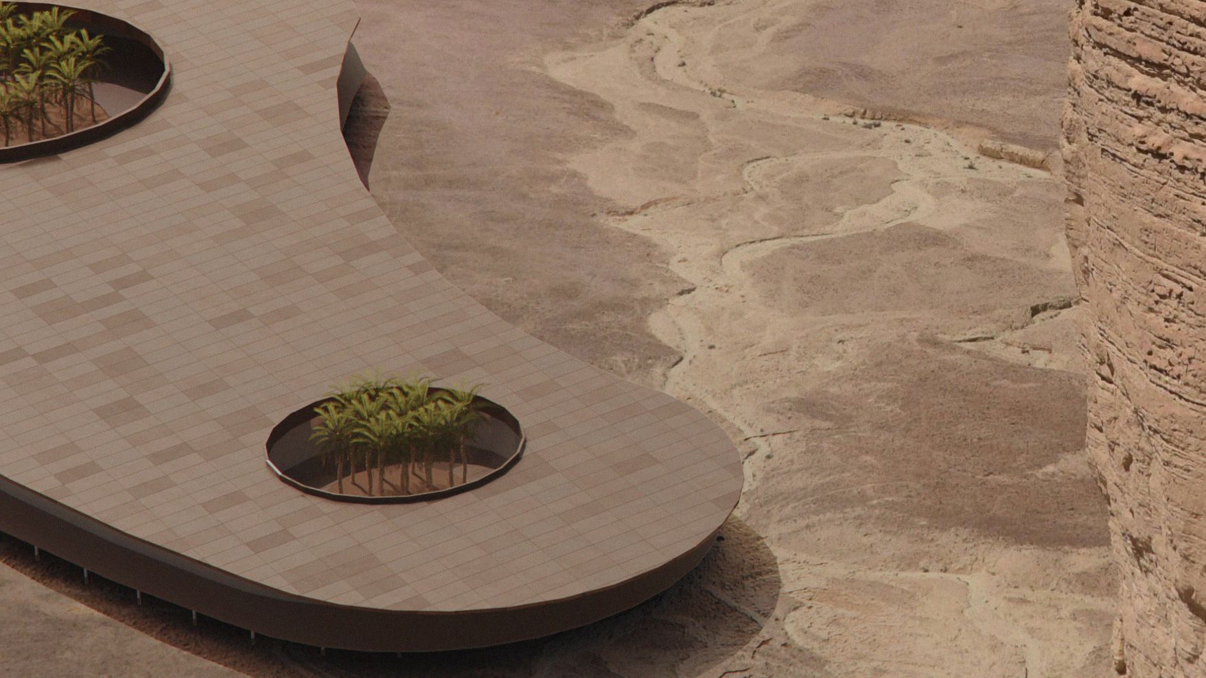
-
@majid Those latest images look like a Mars colony.

-
Crazy people - great concepts and renderings...
-
@Rich-O-Brien Sort of,
When I was looking at the photo, I imagined what would be the right structure down there that might be attractive to people... and fits best to the environment.... Then started making my story.... sketched and developed the idea.... -
Excellent work!
-
Your penultimate picture reminds me of a landscape in my home country.
This is what it could look like there in 50 years...
(Bastion in Saxon Switzerland National Park)
By crazy people I mean the people who drive their cars onto rocks like this...
(Image source: misjatravel.pl)
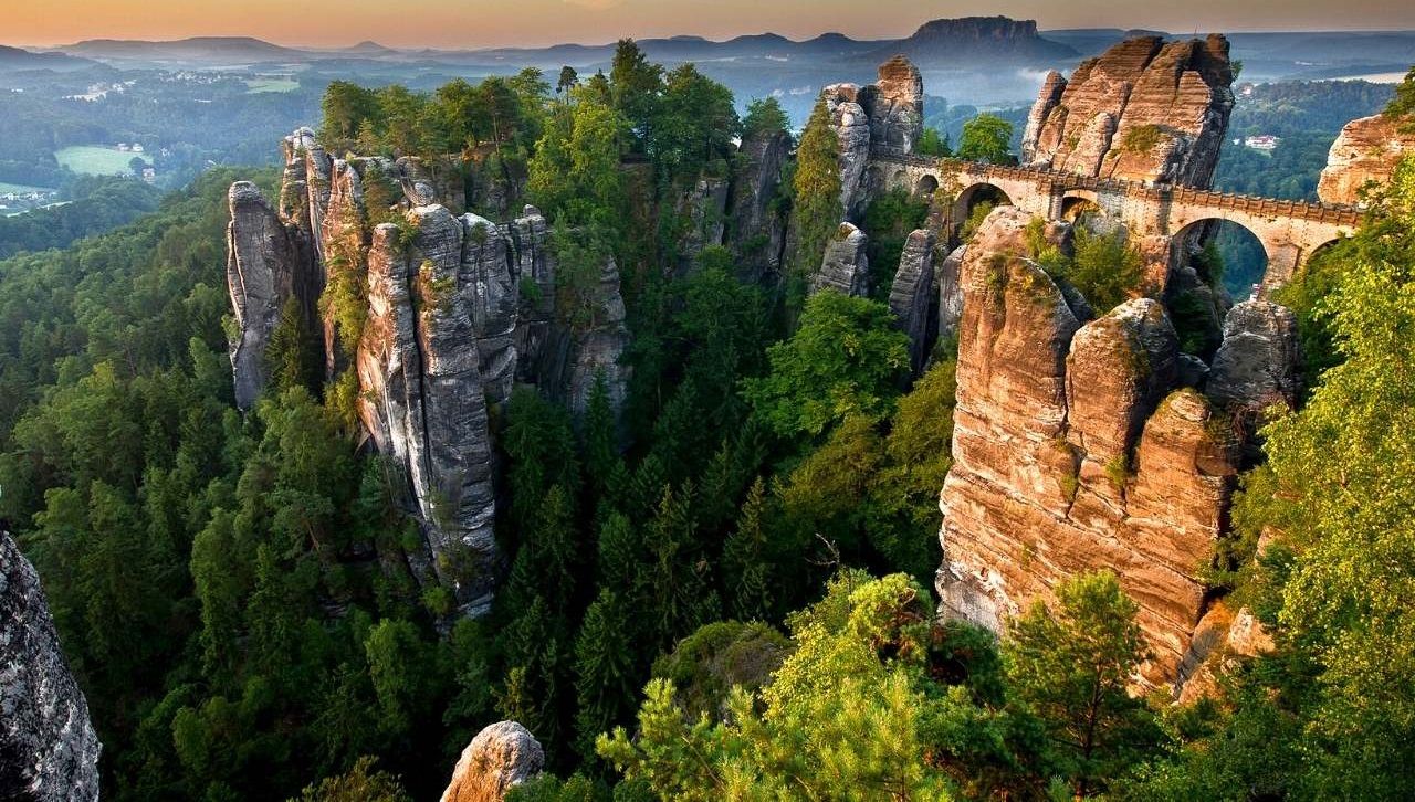
-
@faust07 Wow, What a beautiful place...
yeap, this is insane to walk on those rocks, yet helped me to convey a feeling and resonate with the viewer. -
@majid
It is a while since I have an eye on MIR studio renders:
https://www.mir.no/ -
@majid awesome work, as usual!
-
Thank you mates,
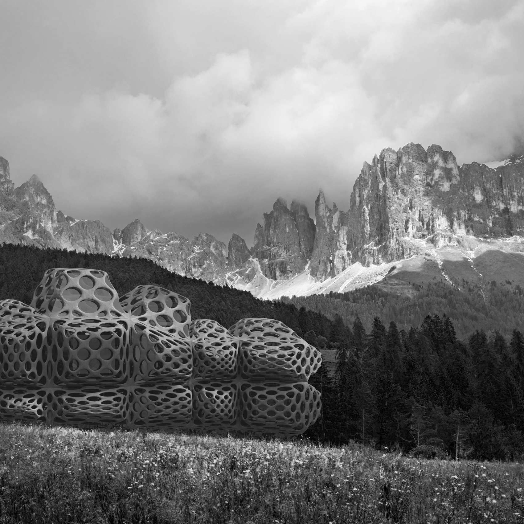
The same approach, another example. Just adjusted the level, so that the darkest point is not 100 black to match the distance and made a customer brush to erase the lower part so that matches the landscape: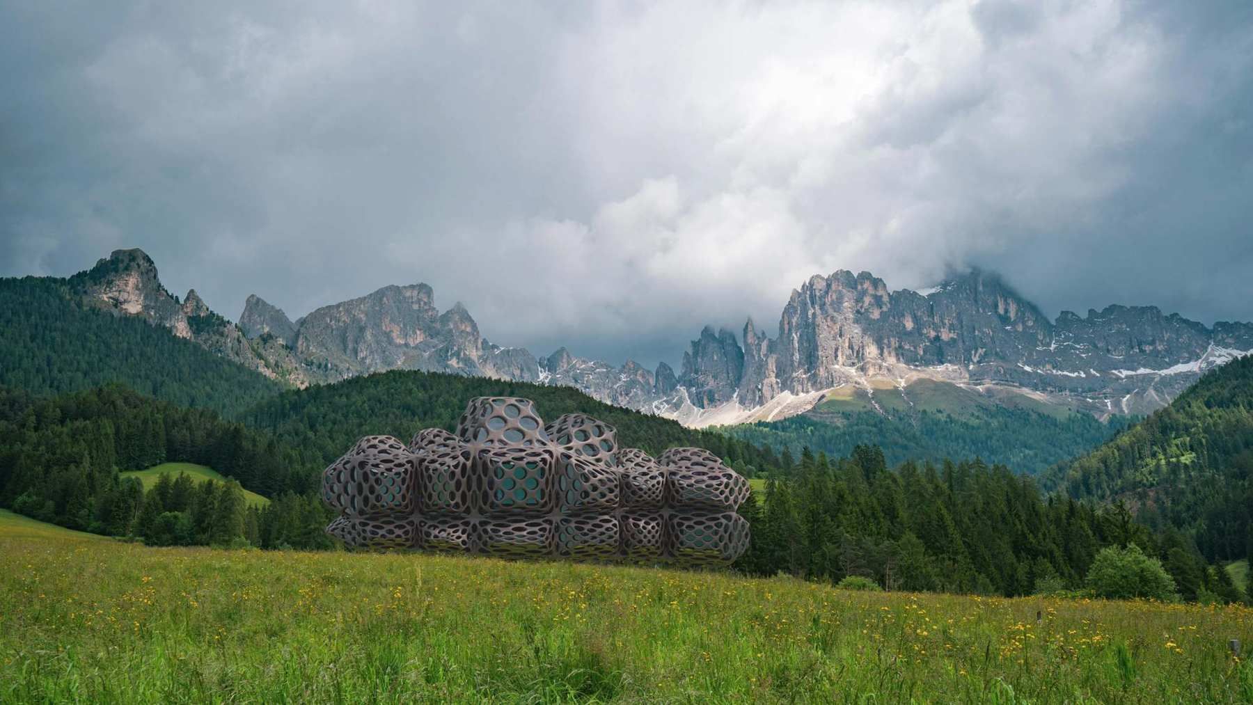
-
I am thinking of changing the building design... maybe to a more pure form.
-
Absolutely wild design!
-
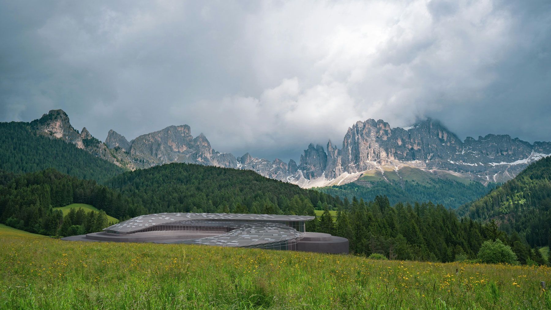
@Bryan-K Thank you mate and here is the other design.
-
Quite nice! I like the way it blends into landscape with its low profile .
Hello! It looks like you're interested in this conversation, but you don't have an account yet.
Getting fed up of having to scroll through the same posts each visit? When you register for an account, you'll always come back to exactly where you were before, and choose to be notified of new replies (either via email, or push notification). You'll also be able to save bookmarks and upvote posts to show your appreciation to other community members.
With your input, this post could be even better 💗
Register LoginAdvertisement


