Weekender Render
-
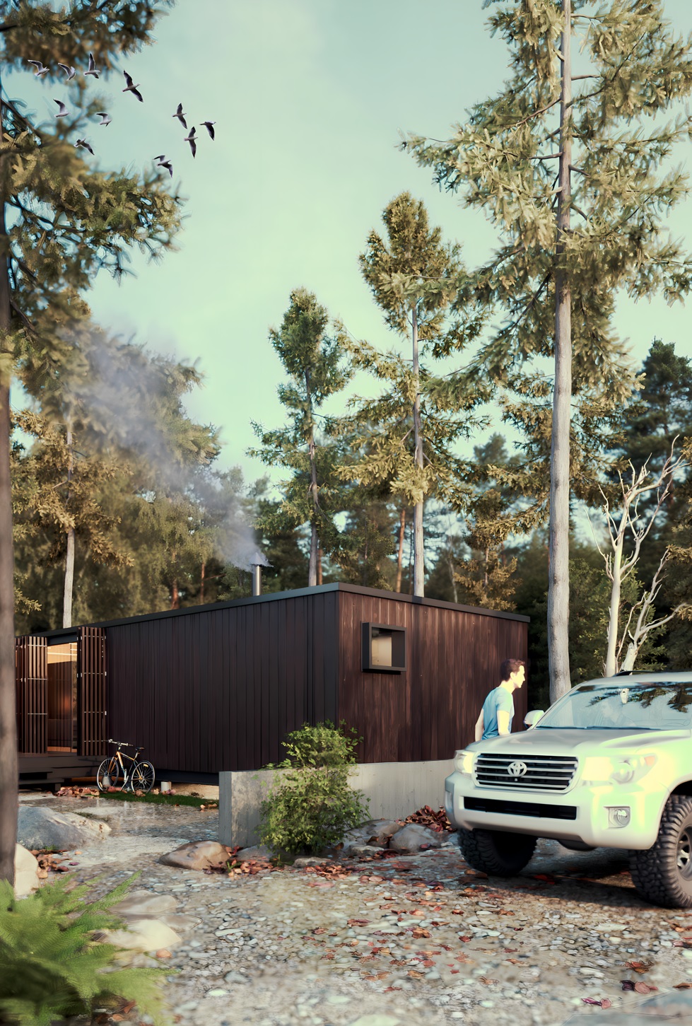
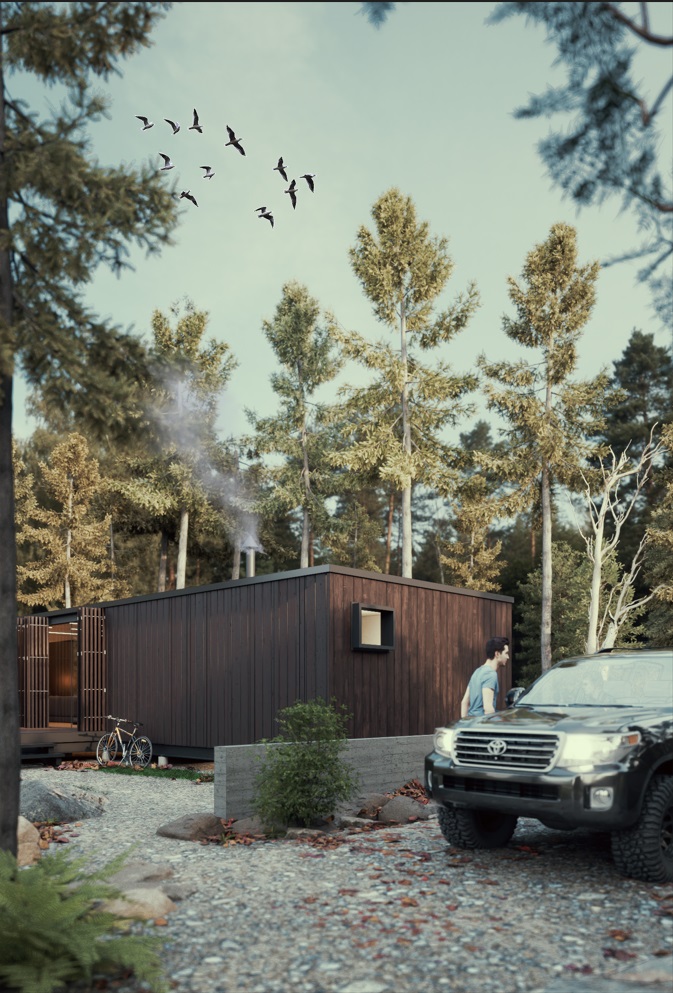
Weekender Render, Sketchup/Twinmotion/Kritta/ PT on. 460 samples. 11 Bounces.

-
The prior image was over exposed to the lower right of the frame. Just put some trees to filter the Sun

-
Perfect.

-
2nd render looks more like a photo.


-
@ntxdave said:
2nd render looks more like a photo.


Thanks nxtdave and Bryan. Yes the second one is better. I intensionally do that to make the point about self critism and how that is a good motivation for improvement. I will sit on an image for about 24 hrs and then take a fresh look and learn something new every time, unless others like Rich and others who find fault.........that is gold to me
-
Magic, a better start to the daym seeing these,

-
Thanks Mike nice to know
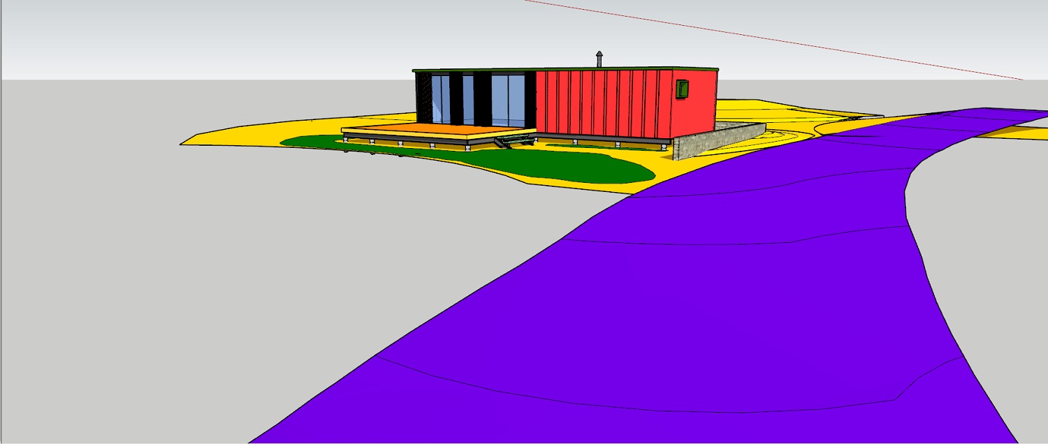
 I just saw a post by Majid asking another to show the SKP model, and I also feel it is best practice
-
definitely like the second image better..think the darker truck helped balance it out a bit. nice work.
-
@marked001 said:
definitely like the second image better..think the darker truck helped balance it out a bit. nice work.
Thanks Markd, yes the darker colour works better for the compostion, but the main thing was overcomming the over exposure in that area by filtering the light with trees. Such a simple fix but was not obvious at the time

Hello! It looks like you're interested in this conversation, but you don't have an account yet.
Getting fed up of having to scroll through the same posts each visit? When you register for an account, you'll always come back to exactly where you were before, and choose to be notified of new replies (either via email, or push notification). You'll also be able to save bookmarks and upvote posts to show your appreciation to other community members.
With your input, this post could be even better 💗
Register LoginAdvertisement


