Render: The conversation
-
So I think it would be great to learn from you. Maybe a checklist that includes the main ideas.
-
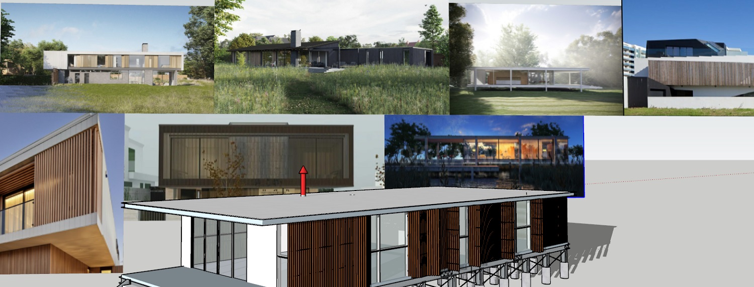
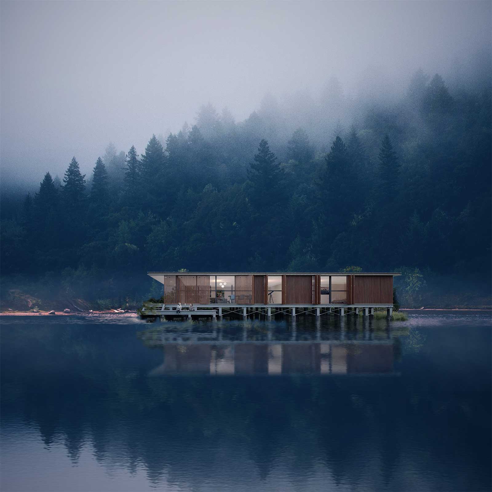
I do not always use the same methodolgy but the synthisis of this image was I simply wanted a horizontally orientated and liked the idea of water and the wilderness. So I searched for images I liked and that had aspects of an image such as lighting Architecture and atmosphere.
I studied Industrial Design and fine arts at art school and everybody, be they fine arts, Ceramic majors, jewery design, Sculpters, graphic designers, industrial designer or Achitecture students always had a board with images as inspiration, to refere to.
In the image I have shown along with the model. I would bash together the referrence images taking aspects of them that I liked to make an image of my own. Kind of like feeding words or images into AI for a single image result.Some time ago I would find images I liked and copy them to understand how the artist used light and copmosition amongst other things. If this seems like cheating it is not. Every oil painting students of the past would copy a masters work. And if people do not try this they are behind the eightball in my opinion. As far as chimney smoke and children and folage rocks etc, they were to lead the eye around the image and to give it depth.
                                           Model and design=8 hrs
                  Render work (adding assets in twinmotion)=2hrs
           Materilas (downloadin and creating normals maps)=2hours
        Lighting" (choosing skydomemes) and lighting design=11hrs
Post production ( Adding shove fog, smoke playing with levels)=2hrs

-
@majid said:
So I think it would be great to learn from you. Maybe a checklist that includes the main ideas or articles.
I do not always use the same methodolgy but the synthisis of this image was I simply wanted a horizontally orientated and liked the idea of water and the wilderness. So I searched for images I liked and that had aspects of an image such as lighting Architecture and atmosphere.
I studied Industrial Design and fine arts at art school and everybody, be they fine arts, Ceramic majors, jewery design, Sculpters, graphic designers, industrial designer or Achitecture students always had a board with images as inspiration, to refere to.
In the image I have shown along with the model. I would bash together the referrence images taking aspects of them that I liked to make an image of my own. Kind of like feeding words or images into AI for a single image result.Some time ago I would find images I liked and copy them to understand how the artist used light and copmosition amongst other things. If this seems like cheating it is not. Every oil painting students of the past would copy a masters work. And if people do not try this they are behind the eightball in my opinion. As far as chimney smoke and children and folage rocks etc, they were to lead the eye around the image and to give it depth.
                                           Model and design=8 hrs
                  Render work (adding assets in twinmotion)=2hrs
           Materilas (downloadin and creating normals maps)=2hours
        Lighting" (choosing skydomemes) and lighting design=11hrs
Post production ( Adding shove fog, smoke playing with levels)=2hrs

-
Wow, thanks for sharing!
This is almost the same process that I go through except for an extra emphasis on "conveying the concept". So sometimes I even chose NPR method for that reason.
The story of the scene, the mood.... what the designer is going to express...
If I were you, in this case, I would like to show the cool/warm contrast and the tranquility of the design, besides other views. So this is my raw composition sketch:

-
Wow factor right there.

-
Cheers Majid that does look amazing and with an epic landscape> I am going to try to get a similar composition with geometry. Was the backdrom image royalty free? and if so your source? I would go with geometry for trees as will but Twinmotion will not handle mist with pathtracing on

-
Liam, I searched for free wallpaper lake images but did not check the copyright to be honest.
It is a raw sketch so the perspective is totally wrong, I did not match the shore and weed/bushes with the image and there are some other flaws. -
@majid said:
Thanks Liam, I searched for free wallpaper lake images but did not check the copyright to be honest.
It is a raw sketch so the perspective is totally wrong, I did not match the shore and weed/bushes with the image and there are some other flaws.I understand the image was just an example and not finished. Do you have the image without the PP work? I was thinking I could do an image search if you posted the image on here to see the original size and copyright status. I just did an almost comprehensive search using you search phrase........nothing suitable found

Hello! It looks like you're interested in this conversation, but you don't have an account yet.
Getting fed up of having to scroll through the same posts each visit? When you register for an account, you'll always come back to exactly where you were before, and choose to be notified of new replies (either via email, or push notification). You'll also be able to save bookmarks and upvote posts to show your appreciation to other community members.
With your input, this post could be even better 💗
Register LoginAdvertisement


