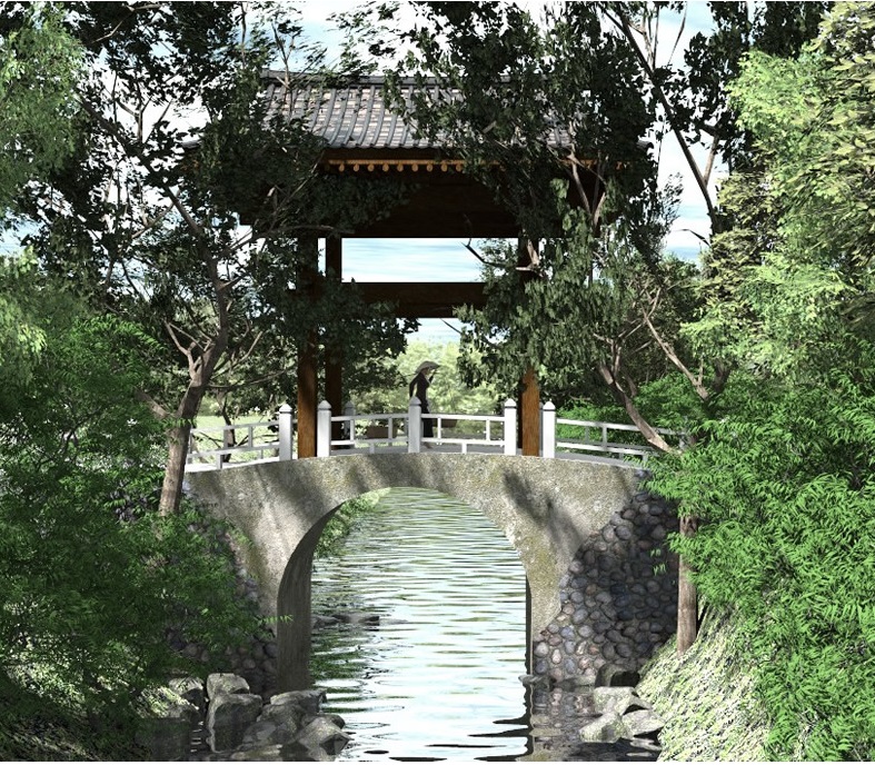
Old Korean Bridge
-
Nice work Bryan
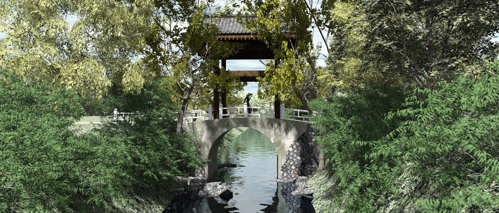
 Just food for thought. I fell into the trap of using the default aspect ratio of the Sketchup veiwport and leaving it at that. I have only recently learnt to use different apect ratio formats to improve composition for some subject matter. I have taken the liberty of reframing your image as an example. I would further consider reframing the image so that the person is 2 thirds down the image employing the rule of thirds revealing more sky perhaps wit a bird or 2 to add interest.
-
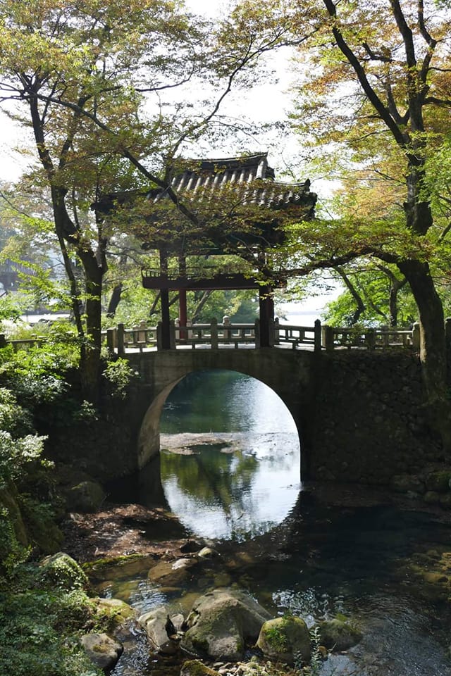
That's almost exactly the composition of the original picture!

-
Hey Bryan, you have taken a few leaps in this image. firstly you made landscape topography and mare imortantly you used a reference image as inspiration. Learning by trying to reference another image is absolute key to learning and improving skills. If anybody asked me the key learning modelling and rendering that would be my advice do that until you do not have to do it anymore


-
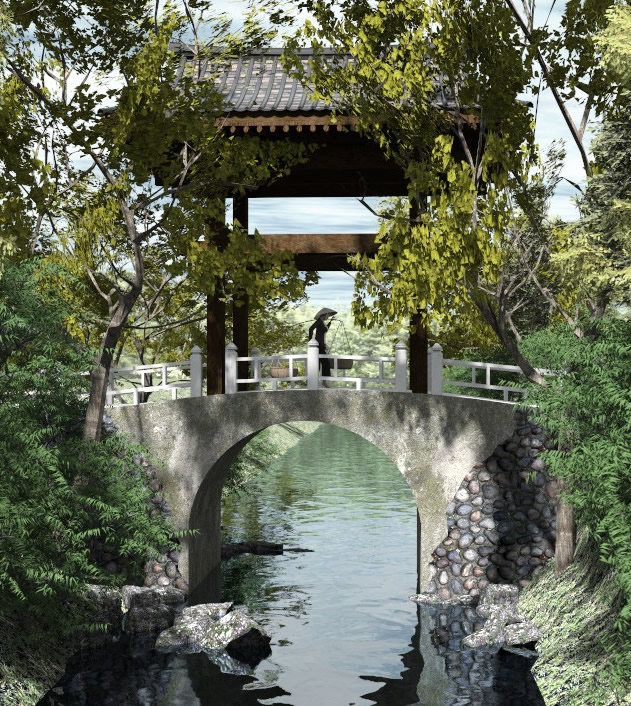
Update.

-
As vertical vignette.

-
Magic.

-
Lovely Bryan

-
Beautiful photo, Bryan. So when are we gonna see the model

Very nicely done, I'm jealous of your talent.
-
Thanks Mike!
Thanks L i am!
Thanks hellnbak! It took me years and years and I am still learning and practicing and trying to improve.
-
Excellent work Bryan. Really like the last image the best I think.


-
Thanks tuna!

-
@l i am said:
Hey Bryan, you have taken a few leaps in this image. firstly you made landscape topography and mare importantly you used a reference image as inspiration. Learning by trying to reference another image is absolute key to learning and improving skills. If anybody asked me the key learning modelling and rendering that would be my advice do that until you do not have to do it anymore


I am in total agreement with you.
BTW, Nice render Bryan!
Advertisement


