A home Office in a Square Metre!
-
Again, interesting concept. Would it be possible to have an optional pad for the back rest as well?
-
Your doing some interesting design concepts Mike.
Alas... I too am claustrophobic. But I think you could do a claustro version by simply removing the end panels and have the shelves cantilever. If not, you could consider removing the panels above desk height.
I love the chair. Well thought out.
Dale -
@ntxdave said:
Again, interesting concept. Would it be possible to have an optional pad for the back rest as well?
Yes, it would be possible and I have given the possibility some thought. The situation as it is currently has a lateral back rest support with two 'nodes'. From research it seems that these nodes can be therapeutic. Still, I take your point and will look at ways of incorporating a back rest cushion.
-
@dale said:
Your doing some interesting design concepts Mike.
Alas... I too am claustrophobic. But I think you could do a claustro version by simply removing the end panels and have the shelves cantilever. If not, you could consider removing the panels above desk height.
I love the chair. Well thought out.
DaleThanks Dale, I take your point. I think it may be a possibility to have the section of side panel which would be to the left of a right-hand user, attached to the folding doors. I really would like to retain the ability to close off the unit when not in use.
I will do a version when I have time over the next few days.
-
It's a piece of genius design frankly, very nicely done Sir.


-
@mike amos said:
It's a piece of genius design frankly, very nicely done Sir.


Well thanks Mike, all praise humbly accepted.
I have now modified the workstation design to accommodate those amount us the are somewhat claustrophobic.
The following images show the changes.
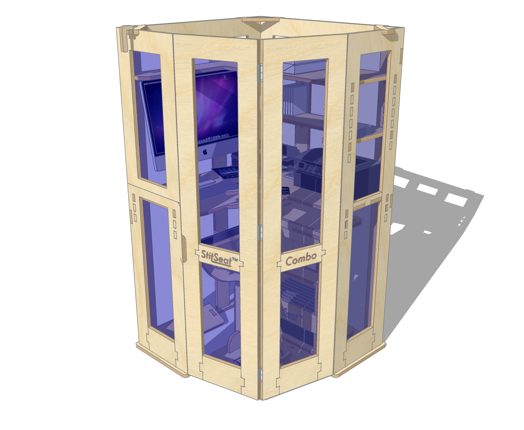
This image show a modification to the left-hand panel. The panel is now in two sections, the lower part is attached to the base plate and the upper section is attached to the bi-fold doors.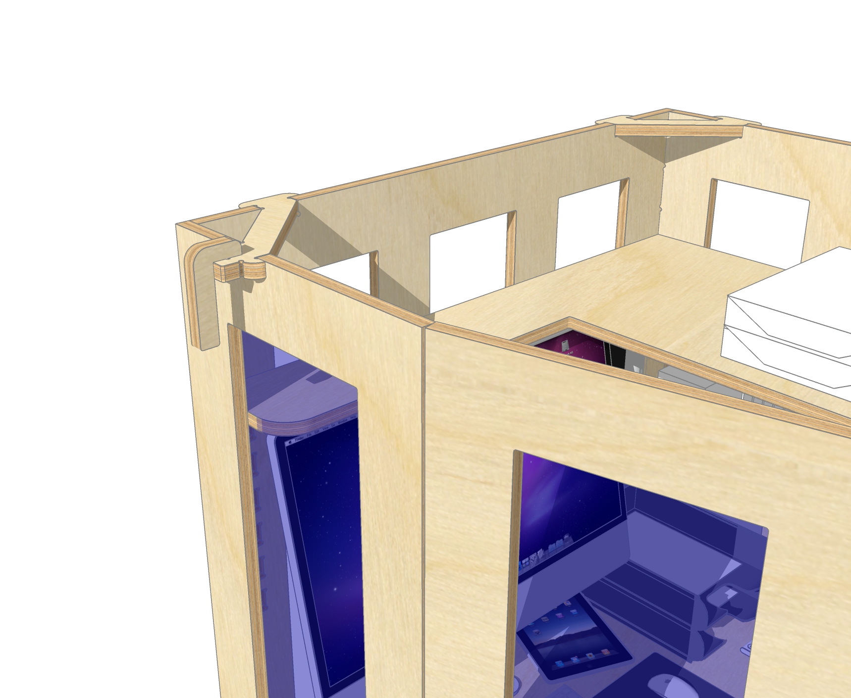
I am still making use to the corner brace. Now it has become a simple lock with a handle. While is adds no real security it does prohibit kids from getting in too easily.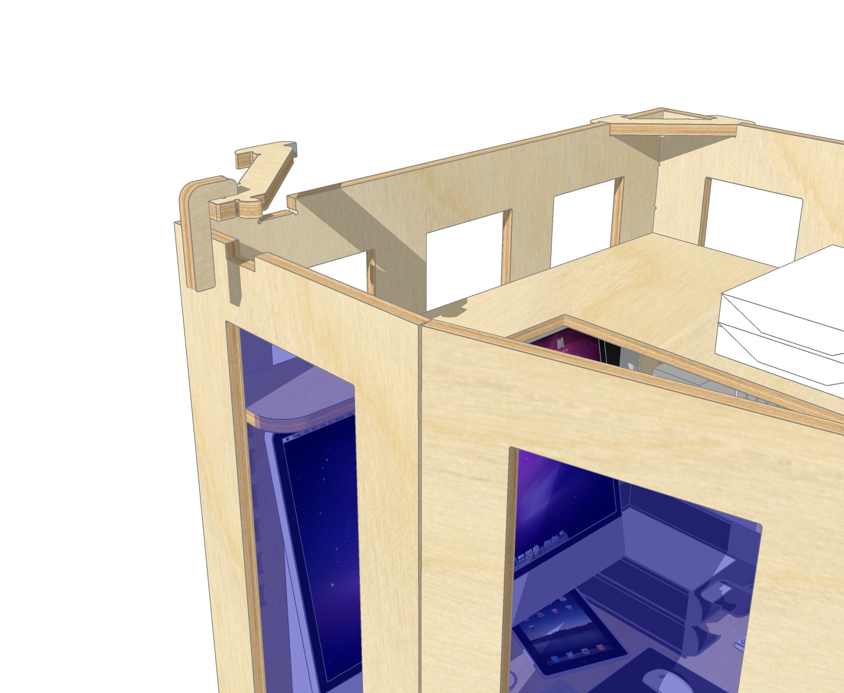
This image shows the lock lifted.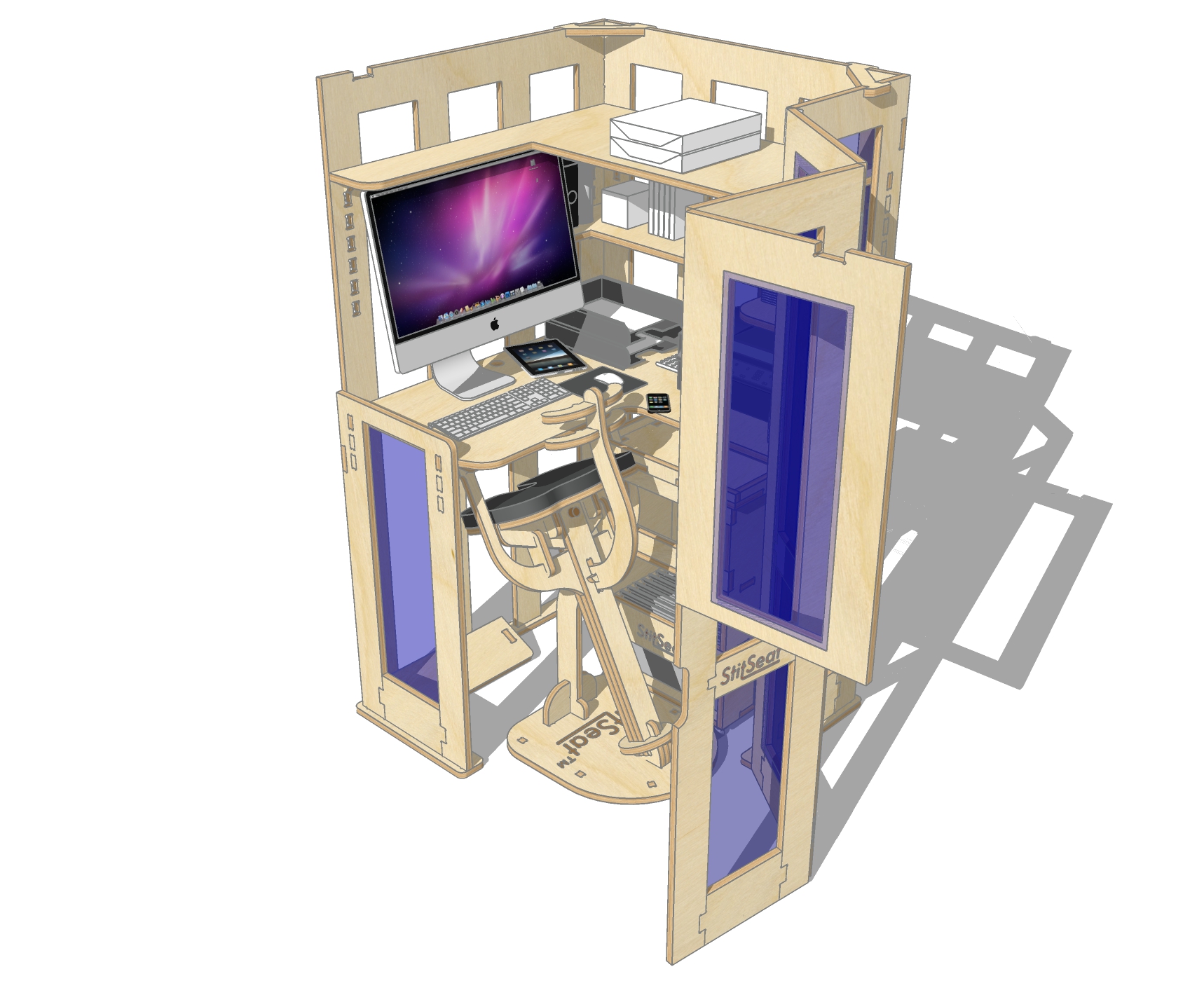
This image show the bi-fold doors opening, now with the half panel.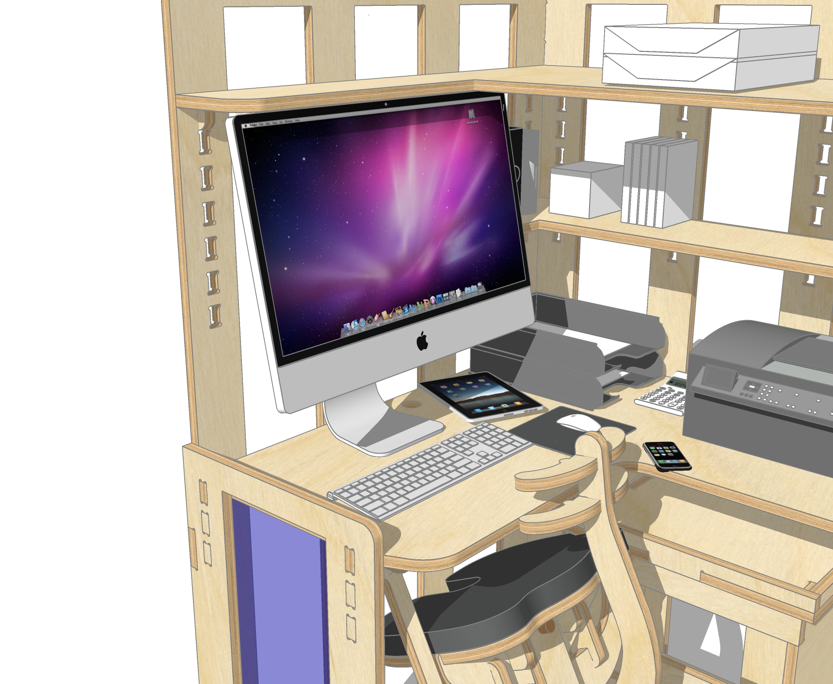
This image shows a far more open working area with a rounded corner to the lower panel.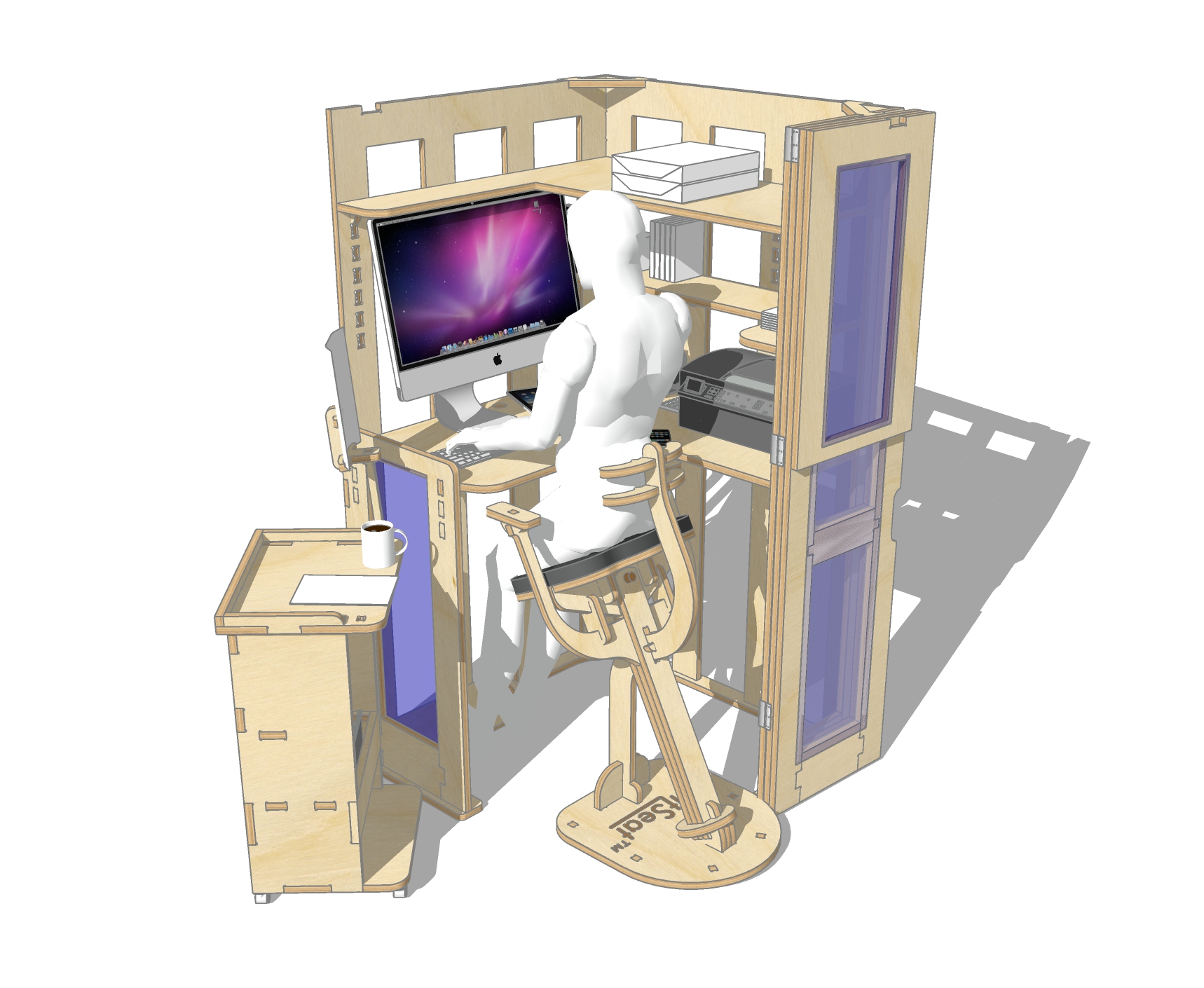
The Roll Out is now more beneficial as the user will now be able to view reference pages on the extended page holder more easily....also easier to grab their mug of coffee!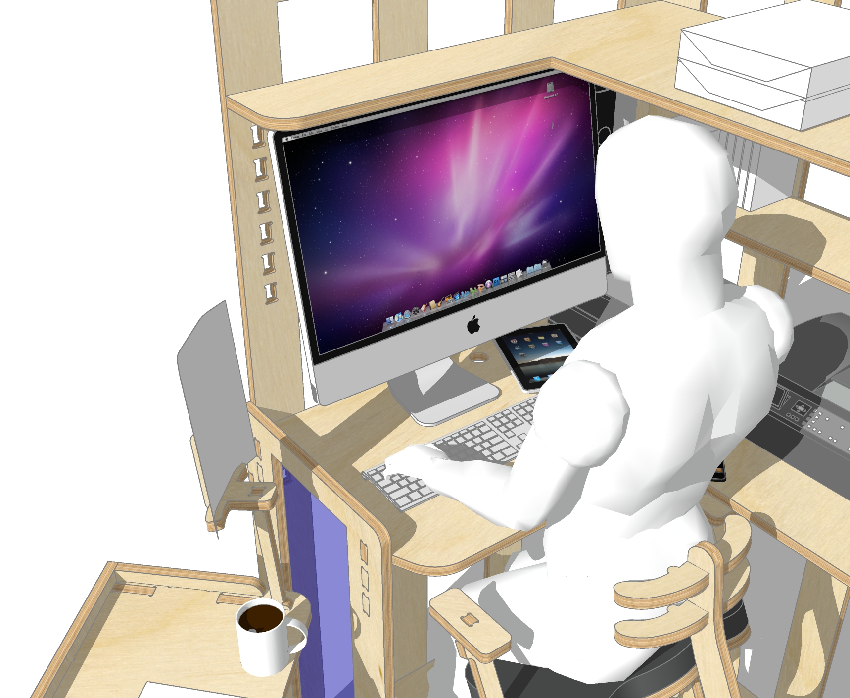
This is an enlarged view of the working area.Thanks guys for your very constructive comments / suggestions. I will continue to work on the StitSeat back and see if I can locate a suitable cushion.
-
Very nice revision Mike. In essence I think that both versions of the product design are viable. Very well thought out.
Off topic, but have you ever heard of Desall. They hold design contests, sometimes with very substantial prizes. I note this because they currently have a contest sponsored by a company called Sassi. It is for a modular furniture display system for children's books. Your work here on the modular desk reminded me of this.

Sassi Modular Furniture by SASSI
New *product design* contest on desall.com: Sassi Editore and Desall invite you to design the concept of a modular furniture system dedicated to shops and other shared spaces, which offers the possibility of composing areas with a display, play and educational function.
Desall.com (desall.com)
Cheers
Dale -
@dale said:
Very nice revision Mike. In essence I think that both versions of the product design are viable. Very well thought out.
Off topic, but have you ever heard of Desall. They hold design contests, sometimes with very substantial prizes. I note this because they currently have a contest sponsored by a company called Sassi. It is for a modular furniture display system for children's books. Your work here on the modular desk reminded me of this.

Sassi Modular Furniture by SASSI
New *product design* contest on desall.com: Sassi Editore and Desall invite you to design the concept of a modular furniture system dedicated to shops and other shared spaces, which offers the possibility of composing areas with a display, play and educational function.
Desall.com (desall.com)
Cheers
DaleThanks dale. I checked out that link for Desall and it look very interesting. Also the prizes are quite good, €3,000 and €2,000! Those amounts are very respectable. I read the design brief and am giving it some thought.
-
Over the weekend I was preparing the Tool Paths and Layouts for the CNC. This process is a pain trying to squeeze the various parts into the 1220x2440 sheets with 25mm (min) margins.
[attachment=6:142bus7d]<!-- ia6 -->StitSeat Extended & Adjustable Work Top A.jpg<!-- ia6 -->[/attachment:142bus7d]
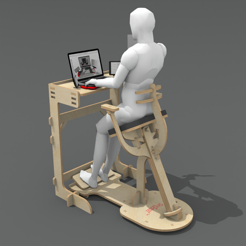
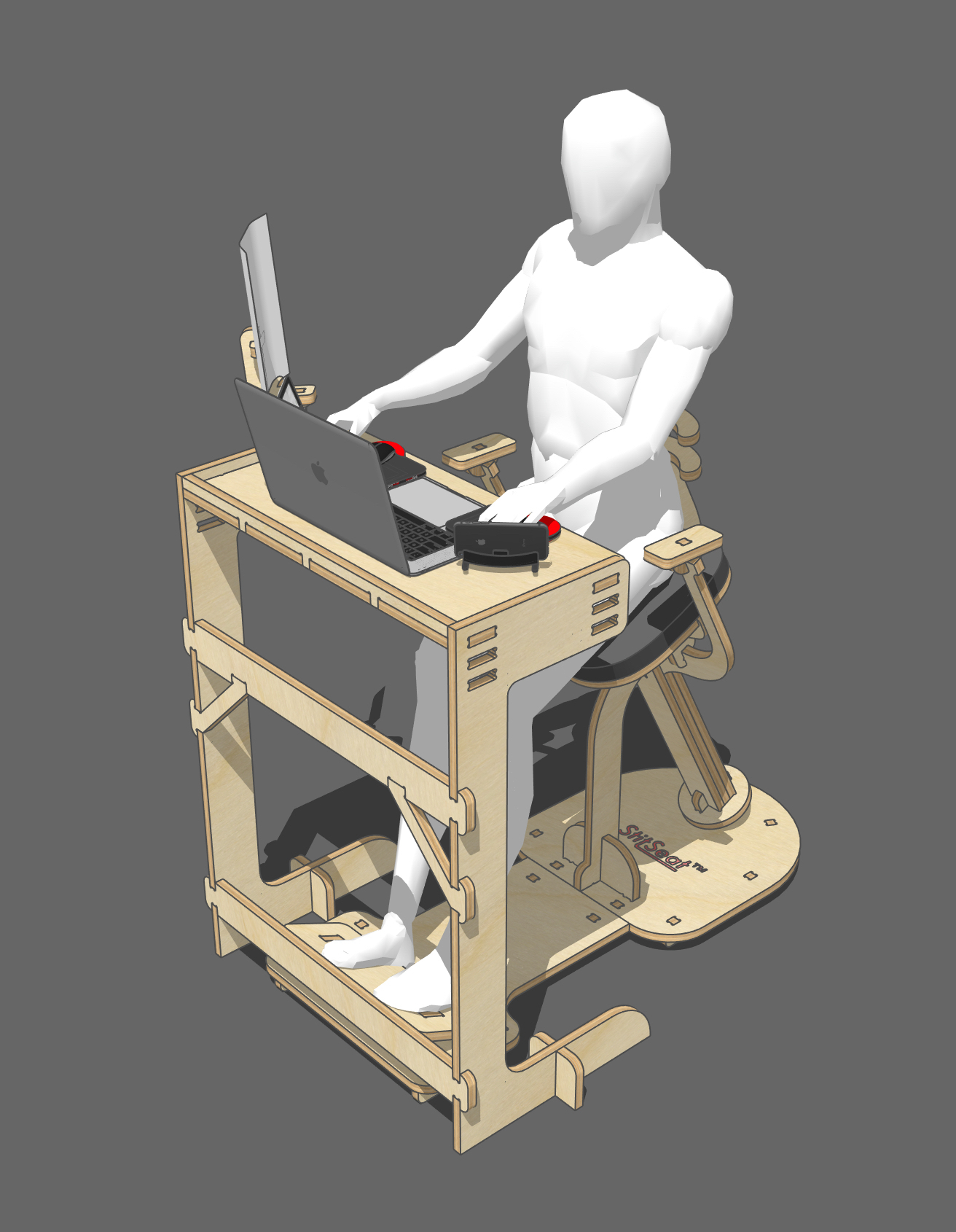
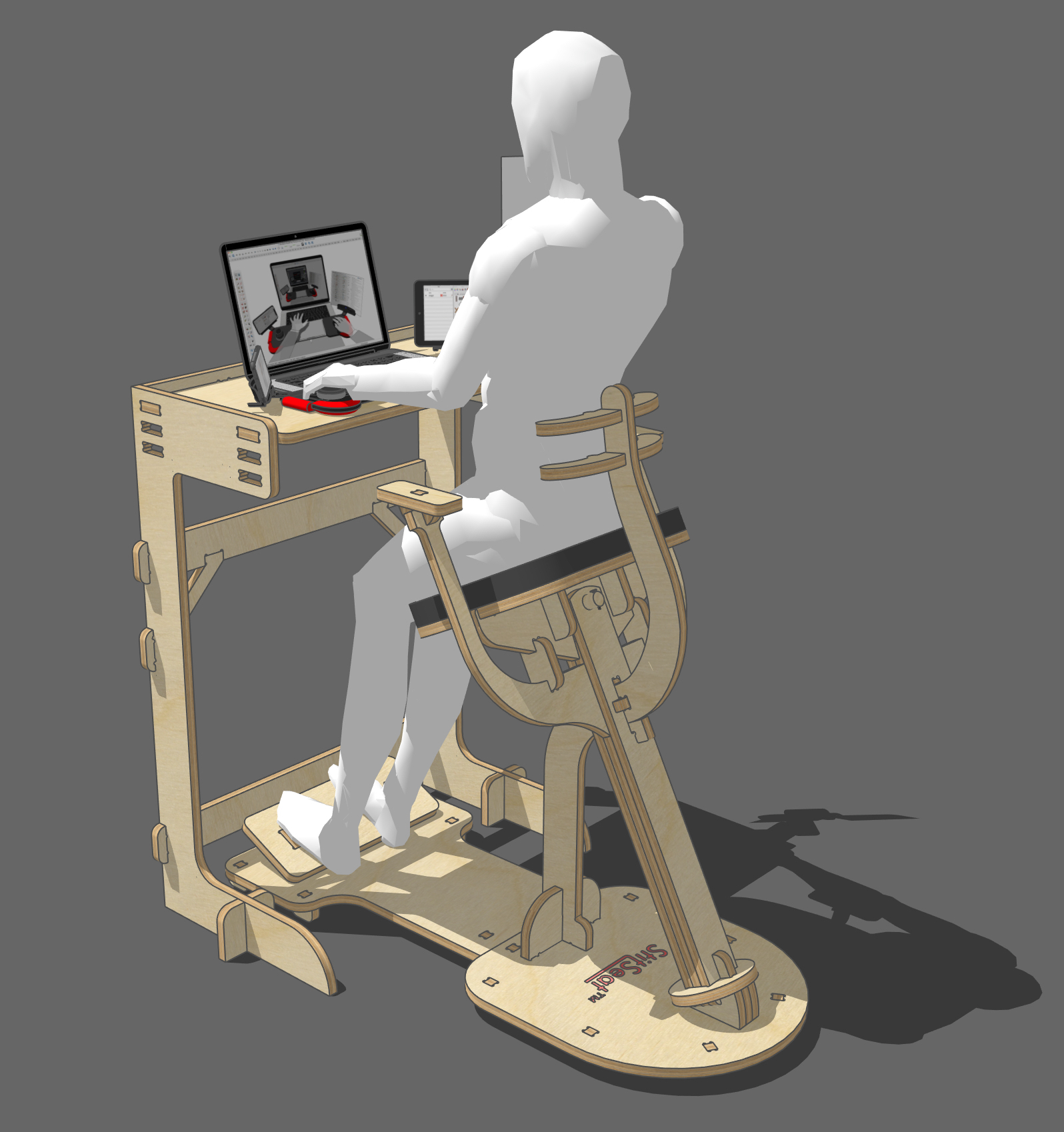
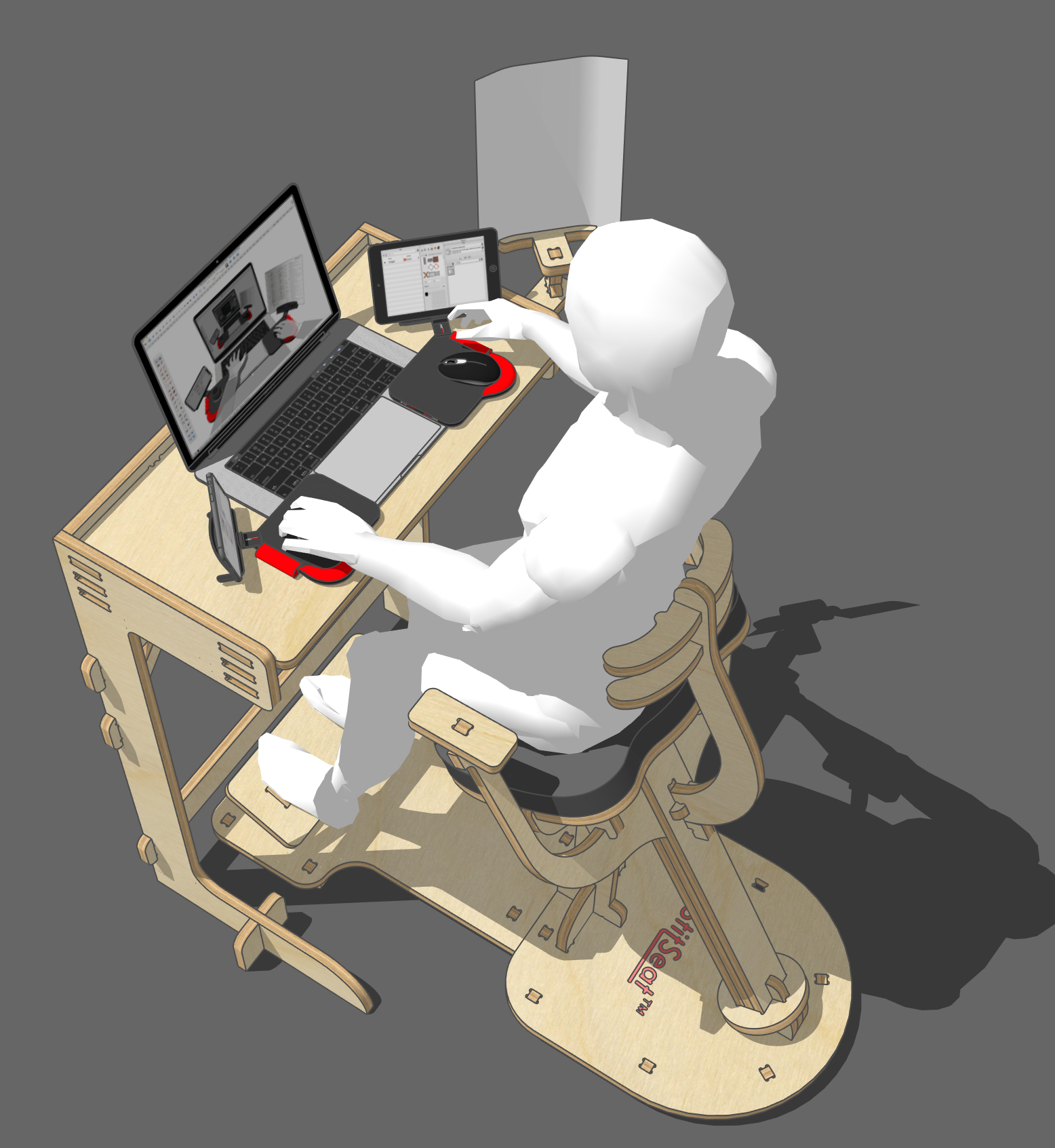
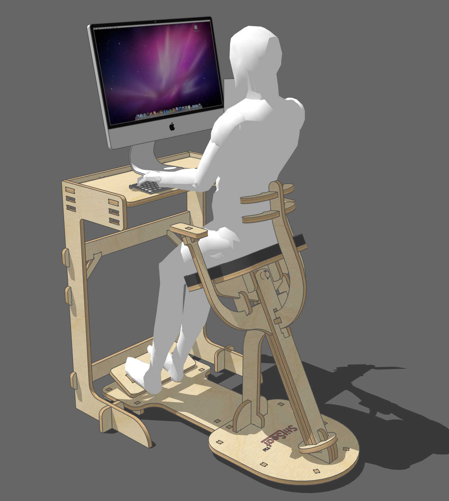
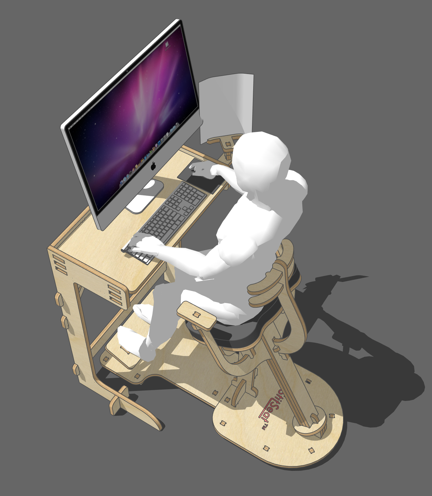
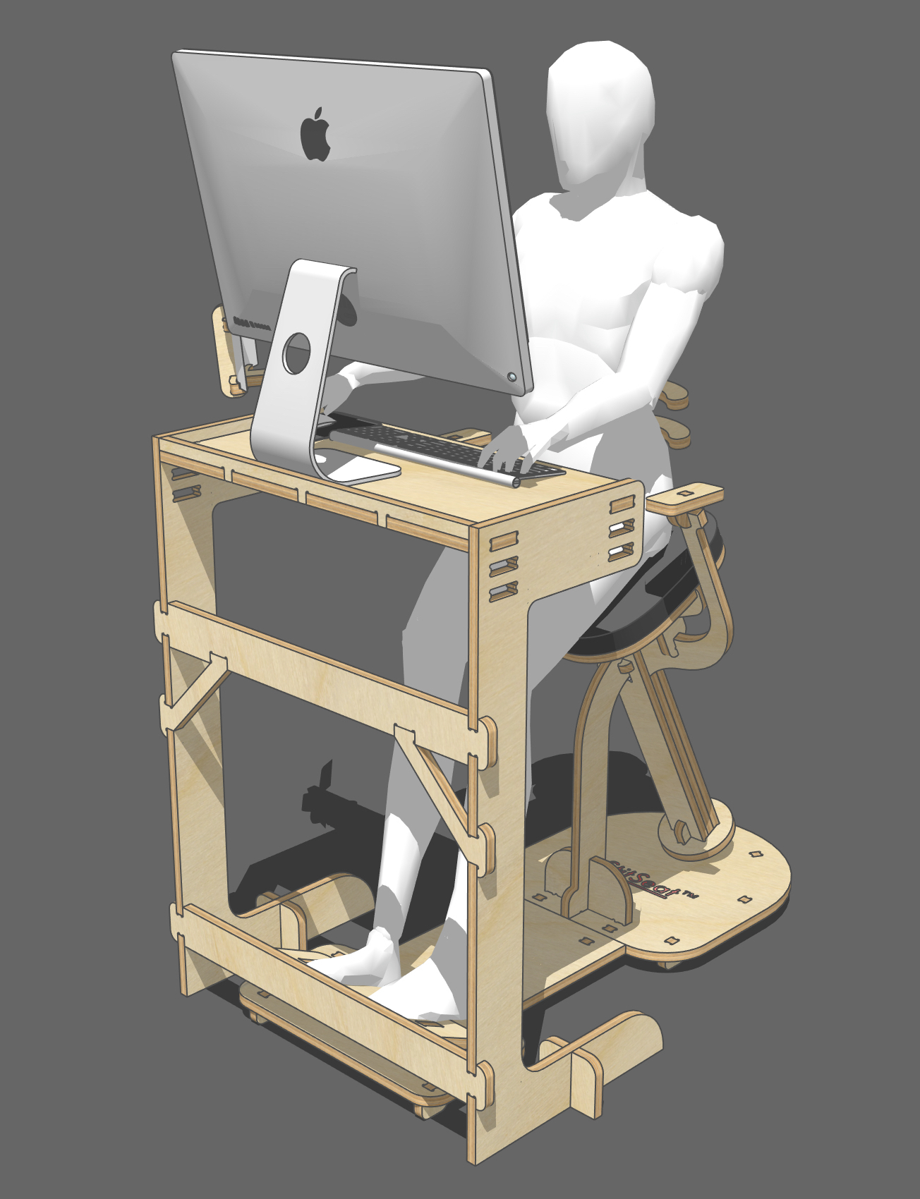
I managed to get the StitSeat Combo (Workstation and Roll Out)into 3 Sheets. The StitSeat took up a half sheet. However the guys that provide the service provide full sheets so I thought about how I might fill the remaining half sheet. I decided on providing an extension to the StitSeat and a small Adjustable Work Top. The work top can be set up from 900 to 980mm over floor level.
This gives the option of just CNCing a single sheet that provides a basic Workstation, StitSeat and Work Top.
Here are some pics of what I have come up with.
[attachment=5:142bus7d]<!-- ia5 -->StitSeat Extended &. Adjustable Work Top 01.jpeg<!-- ia5 -->[/attachment:142bus7d]
[attachment=4:142bus7d]<!-- ia4 -->StitSeat Extended &. Adjustable Work Top 02.jpeg<!-- ia4 -->[/attachment:142bus7d]
[attachment=3:142bus7d]<!-- ia3 -->StitSeat Extended &. Adjustable Work Top 03.jpeg<!-- ia3 -->[/attachment:142bus7d]
[attachment=2:142bus7d]<!-- ia2 -->StitSeat Extended &. Adjustable Work Top 04.jpeg<!-- ia2 -->[/attachment:142bus7d]
[attachment=1:142bus7d]<!-- ia1 -->StitSeat Extended &. Adjustable Work Top 05.jpeg<!-- ia1 -->[/attachment:142bus7d]
[attachment=0:142bus7d]<!-- ia0 -->StitSeat Extended &. Adjustable Work Top 06.jpeg<!-- ia0 -->[/attachment:142bus7d]
-
Very clever design.

-
^ He is completely correct, making design this relevant look this good takes some doing, if it does not sell like hot cakes folk are missing something.

Hello! It looks like you're interested in this conversation, but you don't have an account yet.
Getting fed up of having to scroll through the same posts each visit? When you register for an account, you'll always come back to exactly where you were before, and choose to be notified of new replies (either via email, or push notification). You'll also be able to save bookmarks and upvote posts to show your appreciation to other community members.
With your input, this post could be even better 💗
Register LoginAdvertisement


