Signs Designed - First
-
I haven't been feeling real inspired again lately. So I decided to pick something easy to do.
I used to be a sign designer WAY back when, when the illustrations were done be hand, so I thought I would try my hand at it again.
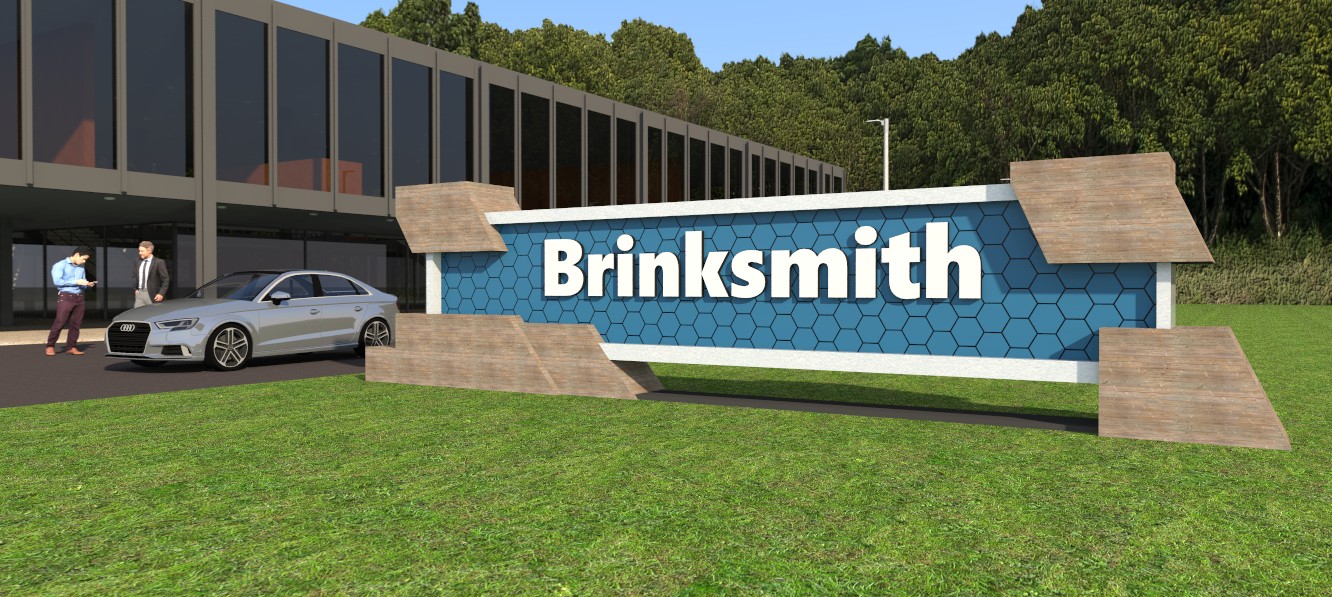
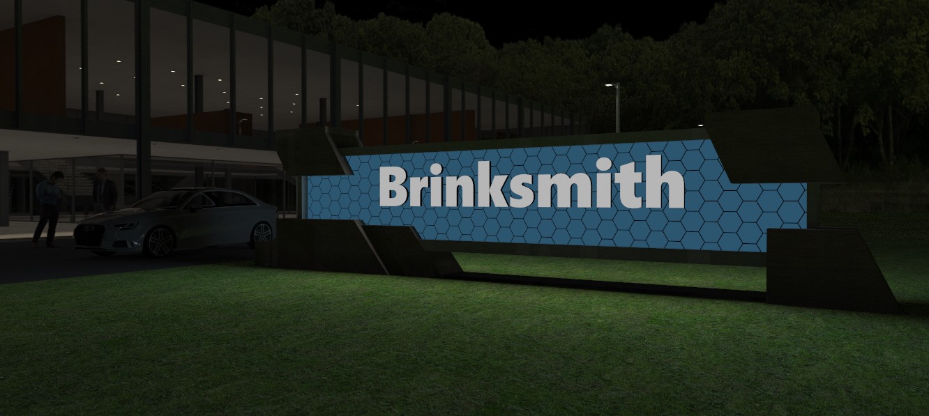
Here is what will be the first in a series of signs. This is a simple one, not very flashy. Somber and suitable for a suburban office park. I will post one or two more variations of this one and then move on to an entirely different sign and setting.
I may also do a short, day to night transition animation/video.
Raylectron render. 12 minutes for the day scene and 11 hours for the night scene.


-
Interesting affect on the night version.

-
I think it's great, a change from the norm that is welcome.

-
A thumbdown Dave?


 (just kidding)
But thanks. The night effect turned out pretty nice for me.

-
@bryan k said:
A thumbdown Dave?


 (just kidding)
But thanks. The night effect turned out pretty nice for me.

Oops, I meant for it to be a thumbs up.


-
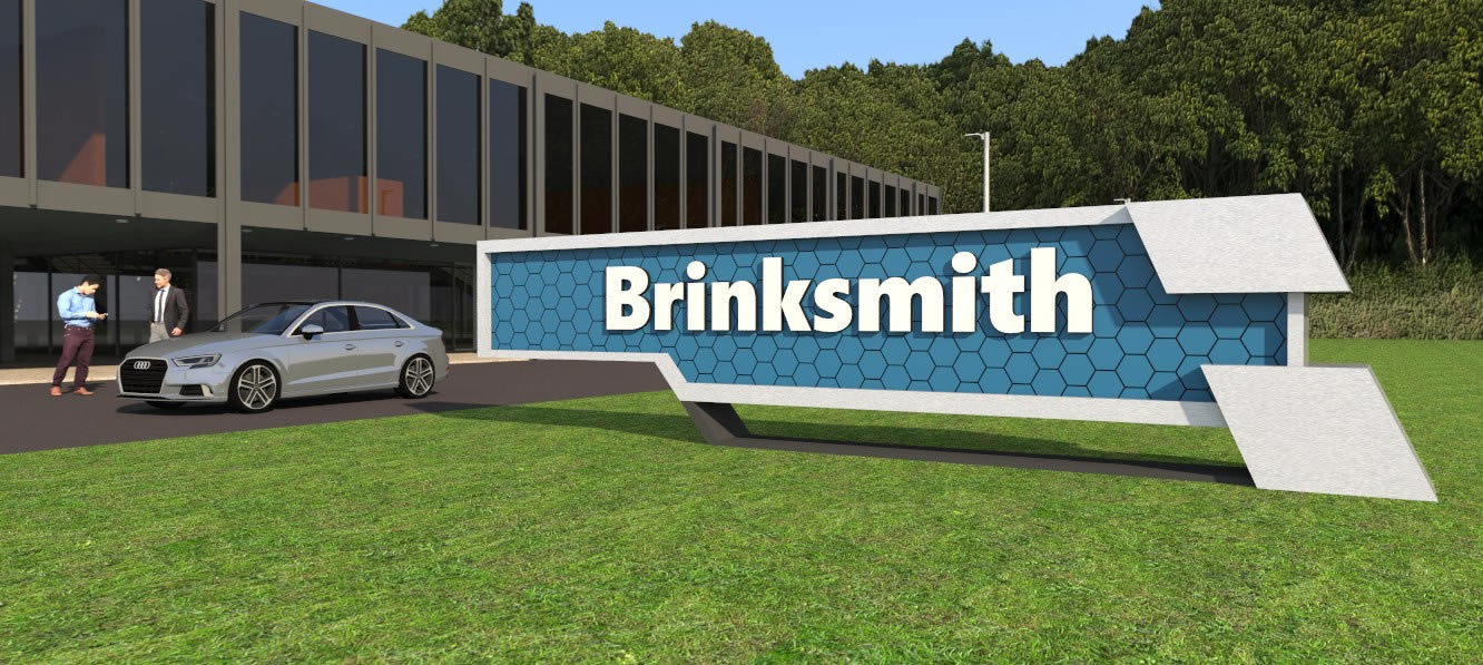
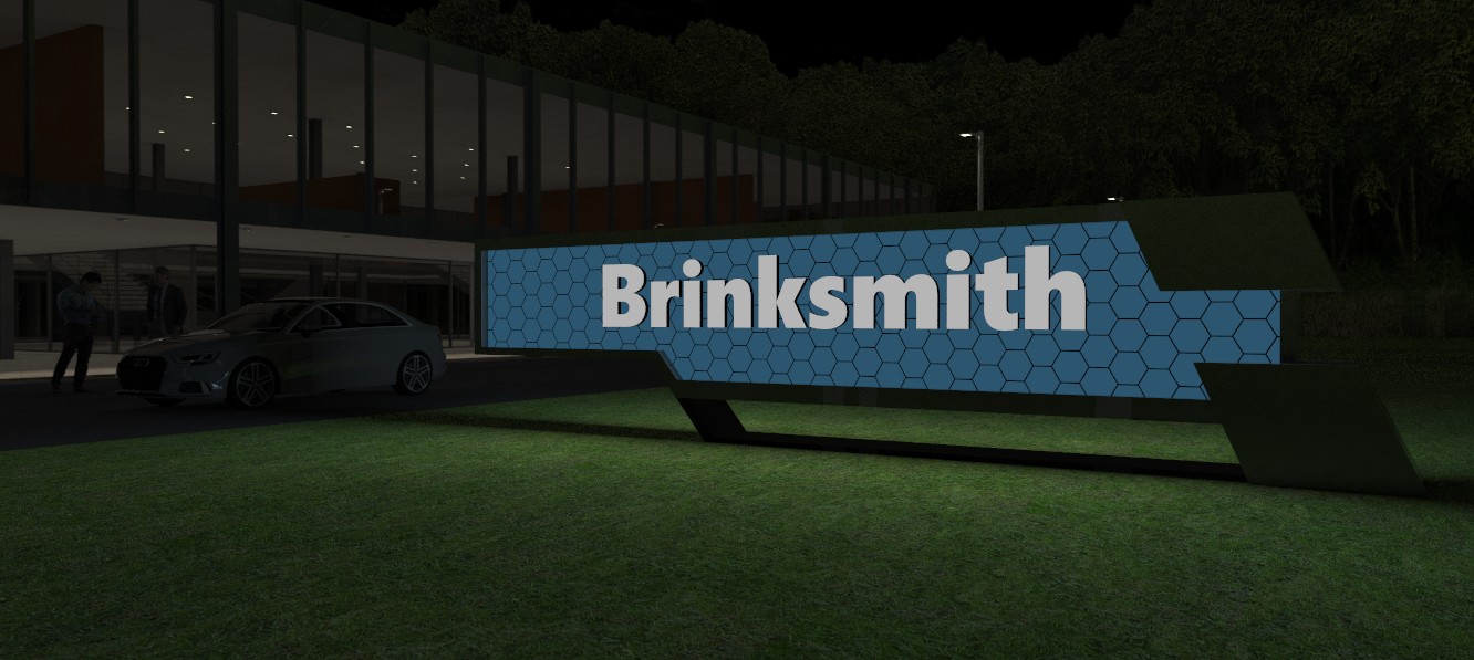
2nd variation.


-
Just an opinion, I still like the first one a little better. In particular, I like the night view of the first one a little better than the second one. However, both are good IMO.
Looking forward to see some of the others....


-
Thanks!
-
I think this looks pretty good. Keep on polishing your skills! I will check out your portfolio later.
Hello! It looks like you're interested in this conversation, but you don't have an account yet.
Getting fed up of having to scroll through the same posts each visit? When you register for an account, you'll always come back to exactly where you were before, and choose to be notified of new replies (either via email, or push notification). You'll also be able to save bookmarks and upvote posts to show your appreciation to other community members.
With your input, this post could be even better 💗
Register LoginAdvertisement


