Change SketchUp UI from painful light to awesome dark
-
@cmoreink said:
I mean come on man, why would you even think that this dark UI would be a main feature?
If you look at what new features SketchUp has released with each new version there are typically less than a handfull and at the best one or two of them has anything to do with fixing problems in SketchUp.
It took loooots of years before we finally got the fix for the dreaded shadow bug.
Now it's been years of complaints for things like camera clipping and better texturing. Quad faces workflow built into SketchUp. Better materials with reflectivity and such.(I have several SketchUp ideas that I think would be nice but I've intentionally been holding them back because I'm a bit afraid they would actually find them great and do them instead of more important stuff.)
I guess everyone has his own wishlist.
-
I wouldn't mind having an option for a dark interface but I wouldn't use it myself. Something that's strangely quite unique for SketchUp is how it feels like you are working with a real, physical object when many other programs make it feel like you work with a diagram. Besides the good camera control I think the light colors are the reason for this. Also the light gray background in the user interface follows the well established conventions which is another great thing about SketchUp. You don't have to learn and get used to something different, you have File, Edit, View etc and it looks as you are used to from other software. As an optional setting I approve of a dark theme but I think the default look and feel should be kept just as it is.
-
Well here we are again discussing to death what a user in today's world should be expecting from a pro software. As usual, the old timers have a hard time with change, but why are you guys so set on making the rule for every one else? Why does it have to be the same appearance to the end of all times?
There are very good arguments brought up and it being an option to choose from to fit your needs, why the heck not? And alleging it is a a feature that's not much asked for is not at all true. Just because some old timers here talk any progressive idea down, doesn't mean there aaren't enough who would appreciate the request.
I support this 100%. -
@unknownuser said:
why the heck not?
Because nowadays CG software companies tend to issue 'updates' with zero new features, just some cosmetic icon jerking. Requesting things like this one would potentially support this unhealthy trend.
P.S. Adding things like autosave in background\true curves\max-like edge extrusion is over 9000 more important then UI whims.
P.P.S. I wouldn't mind to see an 'Expert mode' (=toolbars\trays on\off) toggling in the next version though. -
But this could be a real problem for some people, more than whim. I don't feel that way myself. But calling people old timers isn't helpful, implying they don't support progress. Actually the norm was dark (DOS and AutoCAD) before it was light. Also why not have choice for all palettes and windows to be dark, but leave the main window as it is (if you like)?
-
Would love to have the option in SU as well. Just saying

-
It would be very good, at night the eyes get very tired of the white bright light from the monitor.
-
@cmoreink said:
I meant no disrespect to you Pixero but for the sake of the preferences let's have an option of switching between dark and light UI and that way everyone will be happy.
I would also like to have such an opportunity. It seems to me that this will only improve the attitude towards the program.
-
Uuuuuggghhh....this just kills me. Why is Sketchup the only program I use that has this awful eye-killing white interface...? I search for this every couple months and always come across this thread. I know they can barely manage to eek out a few minor updates & bug fixes with each year's 'new' version...but come on? (but I still keep paying them every year because push pull is king) I know all of us Dark UI lovers have seen other people's screens that magically have a dark UI. I guess they are computer programmers...? If you're reading this....hook me up, I'll pay!

I'd hate to take resources away from SU fixing a bug that should have been fixed years ago,... but I'm a +1 for a dark UI option. -
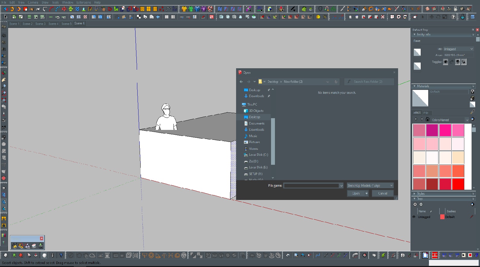
My theme for Skethup. Actually, this is a Paper win 10 theme I’ve found on Deviant. Tile of undock icon can’t read but it’s not a big deal, icon and text clear enough… enjoy
Hello! It looks like you're interested in this conversation, but you don't have an account yet.
Getting fed up of having to scroll through the same posts each visit? When you register for an account, you'll always come back to exactly where you were before, and choose to be notified of new replies (either via email, or push notification). You'll also be able to save bookmarks and upvote posts to show your appreciation to other community members.
With your input, this post could be even better 💗
Register Login


Advertisement